Why buy local?

I was thinking today about getting new envelopes printed. In itself, it is a trivial matter. Since I bask in trivial matters, I was thinking about how we could have much cooler envelopes if the printing shop had more selection and options. Then in occurred to me that there are probably loads of good print shops that could produce our envelopes that would offer loads of options – they just aren’t on PEI. Not problem – I think I dealt with the local printer completely via email and phone anyhow.

Then the thought comes – as I’ve been programmed to think – I should probably keep my business local. Then – out of nowhere – another thought: why? Why is it any better for me to spend my money in the town or region where I live than in any other town or region? I’m sure there’s a printing company in Chicoutimi (randomly selected town that I don’t live in) who would love to have our business (and may offer a cooler selection of envelopes).

At my business we don’t expect people to go with us because we are ‘from here’. We are also glad that our clients don’t ‘shop local’ – since many of them are not from this fair Isle.

I know there’s an environmental cost of shipping goods unnecessarily. But doesn’t that only apply to things whose raw materials are produced locally? For example, if I buy my turnip from Uzbekistan (randomly selected county that I don’t live in and whose existence have only discovered recently) then I cause an unnecessary plane trip that pumps all kinds of bad stuff into the atmosphere when I could have just grown the turnips in my backyard or bought them from my neighbour. However, when it comes to goods where the raw materials come from elsewhere, does it even matter? I mean, the local print shop is probably getting the envelopes from Malaysia anyhow.

It seems that you only want people where you live to buy local. If our clients did it, we’d be out of business. I learned in philosophy 101 that a good way to test a concept is to see if it applies universally. This doesn’t.

I suppose it has a lot to do with which groups and regions you associate yourself with. I’m from Charlottetown, I’m from Prince Edward Island, and I’m from Canada. Trouble is, I don’t really identify myself with any of those groups in any strong way. I’m glad I live in a country where you don’t get shot at and you can think what you want – but it was just dumb luck (or a cruel and vengeful god, for the religious types) that I was born here and some poor chap was born in Somalia. I don’t feel any more connected to the guy at the local print shop than I would do the print shop in Chicoutimi (again, randomly selected).

So tell me, why should I buy local?


it’s a designer eat designer world

AIGA, the American Institute of Graphic Arts has a site on User Experience called Gain. Ironically, it takes quite a bit of patience to navigate. If you do manage to find your way around, you might come across an interesting graphic illustrating the distilling of the many pioneering web-firms into the few struggling behemoths we have today.

Because their site is based in flash and pop-up windows, I can’t link to it. How’s that for #$!@ing user experience. They do have a PDF version of the chart, but it obscures the interesting data in its own totally X-treme way (note to graphic designers, most of you suck).

Since I can’t link to it and even if I could, you’d be annoyed by the flash interface, I’ll sum up the most interesting info with words (they can be so handy sometimes).

+ Razorfish
Avalance
CHBi
Spray Network
Sunbather
I-Cube
TSDesign
Lee Hunt Assoc.
Medialab AG
+ Studio Archetype
Sapient
Adjacency
E-Lab
+ Rare Medium
i/o 360
Circumstance


= Razorfish = Sapient = Rare Medium

Oddly, Sapient also designed the website for AIGA. Hmmm… They should read some Edward Tufte.


Windows Messenger tells you off, politely

I got this message from Windows Messenger this evening. It’s a clear and simple message that asks me to finish up any conversations as the service will be shutting down for maintenance in 5 minutes.

While the obvious ideal would be for the service to never shut down, this is a smart and simple way to handle any downtime. It would also be nice if they told me how long they would be down (although I sympathize with their tech people). This message would go a long way to preventing a zillion confused, lonely, and disgruntled users.

Good call MicroShaft.


Windows XP: rough around the edges

I resisted my well known irrational urge to upgrade as long as I could, but this weekend I gave in and installed Windows XP. A good rule of thumb: never upgrade your operating system simply because you are bored.

My initial reaction is that the fancy UI effects make things feel a little sluggish, but there are some very interesting improvements as well (and the visual effects can all be turned off). What struck me most about the new visual style in XP is that it is full of little glitches and holes. None are particularly significant, and this may seem nitpicky, but as Blink 182 puts it so well, it’s All the Small Things.

Behold some stupid little things that I couldn’t help but notice and criticize.

Icons Old and New

Old Icons
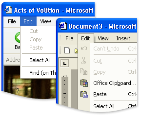
First, the icons – most are new and beautiful. However, this makes the new that are neither new nor beautiful all the more jarring.

You’ll see ugly old icons like this all over the place, but most are from old, non-microsoft programs. That’s understandable. This left over icon for Offline Web Pages is just weird. I don’t understand – did they forget it?

Old Icons
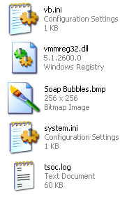
Even within the icons that were clearly designed for XP, there are odd inconsistencies. As you can see here, there are both icons with an angled perspective, and traditional rectangular icons. Not sure why.

In addition to that, notice how the two rectangular icons (vmmred32.dll and Soab Bubble.bmp) don’t even line up.

The end result of all this is a really wacky looking screen full of waggling icons.

The worst offender in terms of icons is in the administrator components of XP. Did they think the pretty new icons would frighten techies? (not a totally unreasonable fear, mind you). These are some of the icons from the admin section of the otherwise beautiful Control Panel.

ugliest icons ever

Rough Around the Edges – Literally

Warning - Sharp Corners Ahead
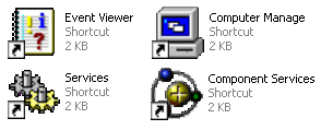
This next point may seem to cross the line into obsessive, but I with all the other eye candy going on (alpha blending fading menu shadows, etc.) it’s a fair point. If they can smooth the edges of your fonts, why can’t they smooth out the corners of the windows? Perhaps there are good reasons for this – and I concede that this is getting to be a little too nitpicky – but I still noticed it.

Give Your Pretty Widgets Room to Breathe

I also noticed several places throughout the UI that looked like they needed a little room to breath. Spacing and padding are critical to a comfortable looking layout. Notice the areas pointed out by the green arrows.

give them some room to breath

Innie or an Outie?

While the subtle gradients and shadows used throughout the UI are generally well implemented, there are a few areas that confuse the eye. Note the shadows in the top and bottom of this small window pointed out by the right green arrows. When the eye has trouble discerning depth (is that a rise or a depression?) it can be visually disruptive.

like dark riders, they are

Also, notice what appears to be two versions of the same icon in the image above (by left green arrows).

Oh, I see, Office XP

The next two images are not specific to Windows XP, but to inconsistencies between Microsoft’s Office XP and the rest Windows XP. Notice the two different menu styles: the Windows XP default on the left, and Office XP on the right.

why are these menus different?

Srolling can be fun
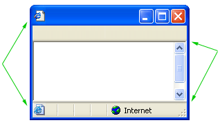
Another odd discrepancy between Office XP and Windows XP – the scroll bars. For some reason, Office XP doesn’t use the new XP scroll bars. Holy 1995.

Having trouble following the rules in-house can make it all the more difficult to police other developers.

Buying Music Isn’t Hard to Do

My final criticism is not visual. In fact, it looks great. Trouble is, it smacks of the overwhelming advertising tactics of RealPlayer. While browsing folders, there are panes with common commands on the left of the window. For the most part, they are quite handy and intuitive. However, when you are browsing a music folder, the following ‘helpful’ option shows up.

anti-trust is the key go a good anit-relationship

Final Thoughts and Compliments

You’ll also occasionally catch a glimpse of the scaffolding behind this pretty OS. When opening a new window, or expanding a new tree in the start menu, if your computer is working at something else you’ll often see the old Win2k grey before the pretty new colors load in. This only happens for a split second, but it undermines the feeling of stability (which can be just as important as actually stability in terms of customer satisfaction).

Despite all of this criticism, I am generally pleased with XP so far. The ‘Thumbnail’ view for images is more refined and much faster than in Win2k. Also, the sorting and grouping options for files and folders are simple, but quite handy. For example, you can group a folder of images by file size or actual image dimensions.

If you have a folder with 3000 images, a third of which are thumbnail, another third large images, and the rest icons, sorting by dimensions is fantastic. See an example grouping by date. For someone who deals with a lot of images, these features are a nice touch.

These points are mostly quite trivial on their own. Together, though, they can undermine with feeling of stability and consistency of the system.

More thoughts as they come to me.


errors don’t have to be so mean

design not found
The folks at 37signals churn out another enjoyable site. Design Not Found: The best and worst of contingency design is a set of examples of what some popular websites cough up when they get confused. In their words: “real-world examples of good and bad contingency design”.

It’s a good site and a good idea.

I do have a few nitpicks of my own about the site though:

  • The featured review titles and graphics on the front page should be clickable.
  • There should be a clearer link to the Snapshot Library on the front page – after all, this the bulk of the site.
  • Why all the pop-up windows?! One window is enough for Google, so its good enough for you.
  • Fixed-size fonts. If I have a visual disability, I can’t increase the size of the fonts. In their defence, they are not alone in this – but I think everyone is wrong.

Don’t get me wrong though. This is a great site and a great idea but someone has got the be the gadfly for the gadfly.


the new identity crisis

Prompted by the awkward mass @home.com to @rogers.com email address change, Peter Rukavina tackles the fickle impermanence of email addresses (go read his comments and then come back and read on).

I’ve been having similar problems with phone numbers lately. I have a home phone at my apartment, but I’ll probably only be at that apartment for maybe two years or so. I share the apt with a room-mate, so we can’t both take the number with us. I also have a cell-phone, but it’s a ‘work’ cell-phone, and a normal ‘work’ number. I’m never sure which number to give to my insurance company or doctor.

I have the same problem with mailing addresses. I have most things mailed to my work as it is my most permanent address. Email address, as Peter has pointed out, are the worst of all.

There is a bigger problem here – that of identity. In search of a permanent email address, I, like Peter, am lucky to work at a web company and can have whatever address I can find a domain for. Currently, I’m both steven@silverorange.com, my work address (and professional identity) and steven@actsofvolition.com my sort-of-personal address (Acts of Volition identity).

This works well for me, but is full of holes. For example, people I’ve met through my personal web log often end up being people I related to professionally as silverorange. For example, I often reply to posts on Reinvented.net, from the perspective both of Acts of Volition writer and silverorange representative.

Peter Rukavina’s Reinvented.net has gone part way to a solution to the dual-identity problem by merging his web log and company website. However, while frank honesty is one of the best attributes of this site, I’m sure this arrangement occasionally forces Peter to avoid some subjects knowing that his clients – both current and potential – will be reading.

I’ve wandered into two different issues here. First, there is the problem of different identities (steven@work, steven@home, steven@civil_disobedient_mob). The best solution to this is to be as honest and ‘yourself’ as possible in all situations – to only have one identity. This is easier said than done. I doubt there will ever be a solution to ‘worlds colliding’ situations, like seeing your teacher buying condoms. We often refer to this as “killing independent George” thanks to a Seinfeld episode on the subject.

Second, is the problem of the transition and currency of contact information (phone, email, instant messaging, and mailing address). This problem is a little easier to solve; by proxy.

Each person should have a unique identifier, perhaps a name or something like email address to avoid duplicates. This identifier could then be used as phone, email, instant messaging, and even mailing address.

For example, I mail a package to my girlfriend with only her unique identifier on it – no address. The post office, as an entity to whom I’ve given the right to my actual information, then converts the identifier into my current physical address. If I move, I just change the address in my central profile.

This is a simple concept, and there would be plenty of problems to work out. Privacy would be a key issue, for example. But in the hands of a trusted ‘identity bank’ – if there could ever be such a thing – having all contact run through a pointer or proxy could be a great protector of privacy.

Microsoft is vying to be this identity bank with their Passport service. Already they have gone farther than anyone else in merging the email and instant messaging identities of Hotmail and MSN Messenger users. The integration of Passport into their new OS, XP will no doubt speed its adoption.

For a system like this to be universally adopted, I suspect it would have to be a protocol rather than one proprietary service (like Passport). If only because the zillions of Slashdot readers will never ever sign up for a Microsoft service.

Does this make any sense? I’m sure it can’t be a new idea. How do you manage your multiple identities?


* appologies to Peter for hijacking his post and to Nick who came up with the idea of having one proxy postal address
 

if your audi tt sucks, then give it me

To the man or woman that found our website by searching Netscape Search for “my audi tt sucks”, I will trade you my toyota for it, sight unseen (it’s a good starter too).


OS Interface Prediction

A key to establishing yourself as in influential industry player seems to be making bold predictions about software.

I predict that both Microsoft’s Luna interface for Windows XP and Apple’s Aqua interface for Mac OS X, will be toned down in subsequent versions (particularly in terms of color and complexity). This may take at least two versions to come about.

Check back here in 2003 and see I am a visionary or a moron (I’ll only accept one of those two titles).


laughing at (or with) the unemployed

Derek Powazek links to an amusing short flash film about being an unemployed dot-com casualty (includes audio).


g00gle 0wnz j00

Recycled Google artA new, easter-egg-esque, Google language is available! It is such great fun. Go play!