Why I am the Future of Radio

First of all, I should be clear. When I say “radio”, I mean music and speech, not necessarily broadcast via radio waves.

Since November of last year I have been occasionally putting together short (30-50 minute) radio shows comprised of music I want to share along with my nerdy voice telling the listening world why they should love this music (or at least why I love it).

From the point of view of traditional radio, there are some serious problems with my humble show:

  • There is no mechanism for artist compensation
  • I ramble and stumble over my words
  • I am generally a fool

The first problem isn’t up to me to fix (beyond throwing some cash at the EFF to try to affect change in our copyright system). The second and third problems are beyond my ability to fix (I think).

What’s important, though, is that these two problems are from the point of view of traditional radio. You and I are not traditional radio.

To a small group of people, my rambling/stuttering-foolery is bearable – maybe even sometimes enjoyable. These are my friends and a few kindred passers-by.

My Taste and Rambling Do Not Scale

The music I chose, and even more so, the commentary I record, has limited appeal. It is unlikely that it would ever be downloaded regularly by more than a few hundred people, if that. However, that doesn’t matter.

The cost for me to record and distribute my show is negligible. The joy I get from choosing the music and sharing my thoughts is by far sufficient motivation to produce the show. The feedback get from the small group that do listen regularly makes it all the more rewarding.

The hardware and software to put together a show like I have are already in the hands of many, if not most, people on the web.

I am Not Alone

Fortunately, it’s not me alone that will comprise the future of radio. That is the key. There are others.

So far, I’ve been listening to these web radio shows:

Some of these might sound like audio punishment to you, but that is part of the beauty of downloadable internet radio: you will never hear these unless you want to. You will never stumble across one of these shows when you are flipping through stations in your car.

While I’m listing to music geeks and geek geeks, you can find (or produce) radio on the subjects that you are passionate about.

Small shows produced by enthusiasts with small audiences don’t show up in Billboard charts or Nielsen ratings, but they can be a far more rewarding experience for the listener and producer than traditional broadcast radio.

I spoke and wrote a bit about this subject back in 2002. Re-reading my post I think the points about audio making sense for some applications and text for others still holds up. Music, of course, is one of the greatest applications of audio.


What is it about Weblogs?

I gave a short talk last fall at the Zap Your PRAM conference about how some of the ideas and technology that have made weblogs so successful can be applied elsewhere on the web. However, the talk was cut short due to a tight-schedule (the conference was run by amateurs – including myself). What follows here is the substance of my talk – some of which I had time to share at the conference, some of which I did not.

What is it about weblogs?

What makes a weblog a weblog? Is it the permalinks, the reverse chronological order, the personal voice, syndication? The exact definition of a weblog is an excersize of in semantics that doesn’t particularly interests me. What does interest me, though, is what makes weblogs so engaging and powerful as opposed to standard websites.

First, let us look at some of the key distinguishing features of weblogs when compared to the rest of the web. Note that none involve any kind of real technological breakthrough or innovation. Most a simple adaptations of existing technology.

Weblogs are easy to publish
The process of making a post on a weblog is often as simple as sending an email or creating and saving a word processing file. As simple a change as this is from creating HTML files and getting them to a web server, the results are dramatic. All of the sudden the process of publishing is easy enough that the possible group of users is dramatically larger. Also, the easy of publish affects what, when, and why, we publish – the general result of the ease of publishing being more and more often.
Weblogs have a tendency toward simplicity and consistency in design and structure
Most weblogs are built on popular weblog platforms. Blogger, TypePad, MoveableType, Bloxom, Radio Userland, etc. Each of these tools, and the others like them, all include templates that make it easier to create a simply designed weblog with a structure that follows a whole series of design and usability conventions. Alternatively, if you give 100 people a variety of web development tools and ask them to create a website, you’ll end up with 100 completely different designs and structures – great if you’re into diversity, terrible if you’re trying to find something.
Weblogs have permalinks
Since the ease of publishing weblogs encourages more volume and frequency of publishing, often in small chunks, it is important that these chunks of content be accessible via individual links. On a weblog, the post is the basic unit of content, as opposed to the page. Again, a seemingly simple and subtle feature, the ability to link to each piece of content, affects great influence on the way content is produced, discovered, and read. Permalinks give authors the tools to easily share and interlink content. The resulting community and ecosystem is a great example of how it is best to give simple tools and architecture to people and let them go wild.
Weblogs often allow reader feedback
On many weblogs, if you disagree with the author, you post a reply right there on their own website and let them know. Often, they’ll reply to you in turn. There is usually no registration or signup required – just a simple form asking for little more than your name and your thoughts.
Weblogs are easy to syndicate
While syndication tools available on most weblogs (typically an RSS feed) are seldom used to in the tradition print media definition of syndication, they go a long way to making weblogs easier to follow and read. Where as one could previously keep up with a handful of sporadically updating websites – using an RSS reader to read weblogs takes into account the difficult imposed by their usually irregular publishing schedule.
Weblog tools help share photos
A more recent addition to weblog tools is the ability to easily upload and share photos. Where previously it was difficult to get photos into the appropriate size and format, upload them to a web server, and then create links to them – new weblog tools will do with automatically. While there have been tools to publish photos on the web before, none were as accessible as those already built into a weblog.

When examined individually, none of these distinguishing features of weblogs seem particularly interesting or innovative. Most, or all, of these features have been available through one for or another before. However, when combined, they create an environment where people can connect and communicate easily on a variety of scales.

Living Examples

Each of these attributes of weblogs can also be applied outside of the world of websites. RSS feeds can be used to share all kinds of data. I wrote, last year, about how RSS is used on the Sloan band website to syndicate four different types of data.

Amazon.com, for example, has taken great advantage of allowing reader / user feedback (mostly in the form of book / product reviews). Of course, Amazon.com has a “permalink“ for each book – as each book lives on its own page. However, Amazon.com does not offer “permalinks” for reader reviews, which limits the ability of external authors (like webloggers) to interact with the world of Amazon reviews.

I find these basic attributes of weblogs are helpful to keep in mind when developing other website and web systems. This doesn’t mean you should stick an RSS feed on every site you build. Rather, it is helpful to keep an eye out for parallels between the world of weblogs and your project and draw on your experience as a weblog reader and writer.


How Websites Learn

A look at how Stewart Brand’s classic work of social and architectural criticism, How Buildings Learn, applies to web design and development.

How Buildings Learn: What happens after they’re built, by Stuart Brand

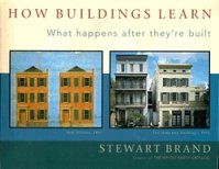
First, if you are in any way interested in design, history, or architecture, which I assume you are by your presence here, read the book How Buildings Learn: What happens after they’re built, by Stewart Brand. Building on Jane Jacobs’ classic criticism of city planning, The Death and Life of Great American Cities, Brand looks at what happens to buildings over the fourth dimension: time.

As I began to read How Buildings Learn, the initial concepts tickled me as familiar in a way that great and simple ideas often do. When written clearly, they seem obvious. However, when we look at the world around us, these ideas are clearly not obvious – or if they are obvious, they are ignored. Further in to the book, the basis for this familiarity becomes more obvious. Idea after idea and concept after concept, clear parallels emerge between the architectural issues dealt with in the book, and those issues we deal with every day as web developers.

Brutally oversimplifying Brand’s premise, he argues that modern architecture and building practises are ignoring what happens to buildings after they are built. Buildings are designed to be impressive on opening day and in 3D computer models, but not to be livable in the long term. When the ribbon is cut on opening day, many architects see their jobs as finished. So too are many websites designed to look good in the portfolio of the designer, no deeper than the front page. They aren’t designed to be lived in – they are not designed to be used, either by the visitors or by those who maintains the site.

Building for Change

Stuart Brand

Brand’s most fundamental edict is that of building for change. Perfection is a doomed goal. When building, whether it be a house or a website, if you try to freeze time and build for a perfect present (or your own concept of an ideal future), you are damning those that will maintain your creation to work within your flawed construct of perfection. Aware of this pitfall, the time-aware builder puts trust in the knowledge and experience to be gained by the tenants of his creation. He knows that after 10 years of living in a building (or ten months of managing a website), the original builder is no longer the expert. Rather, those who have come to occupy the building will be the experts – having dealt with the thousands of small challenges and decisions that confront an occupant through the years.

One, two, or three years after you’ve built a website, there is a strong chance that someone else will then know a lot more about it than you. They may thank you for your clear foresight in not over-specifying the structure of the site. They may also curse you for choosing a proprietary database or for not documenting your code.

Brand highlights the practises of builder / designer John Abrams as a great example of how to document your design for the next generation of occupants and builders. During construction, Abrams would photograph each wall before it was closed in – capturing the position of all service elements (electrical wiring, stud-spacing, plumbing, etc.). These photos were eventually compiled into a book that was passed on to the owner of the building when construction was finished.

The clearest parallel to this type of documentation in the web world is documenting and commenting of code. Code should be written and documented in a style that intends an audience other than yourself. Other seemingly trivial examples can be a life-saver for long-term maintenance, such as keeping original photo and vector art files or documenting and storing any fonts used in the project.

Use Local Materials

Brand also suggests that designers and builders use, as much as possible, local materials. Wood and masonry from the locale of the building site is far more likely to be available down the road when needed for repairs and replacement. While exotic masonry or roofing tiles may be an enticing conversation piece, it will turn into a maintenance nightmare when they start to crumble and the next owner of the building is unable to find suitable repair and replacement materials.

As there isn’t really such a thing as ‘local materials’ when it comes to web development, we must abstract the advice: Use materials that will be easy to maintain and build upon in the long run. While much has been said of the long term benefits of standards compliant XHTML on the front end of web development, little has been said of the long term effects of the back-end structure and choice of development platforms. If your site happens to be a collection of static pages, then strict XHTML compliance and careful structuring of code will help ensure long-term access to the content. However, many sites are more like an iceberg, with the generated HTML showing only a hint of of the server-side programming that lies beneath the surface.

Gregory Bateson

In an extreme but brilliant example of ensuring ample maintenance supplies for future generations, Brand tells of a story by anthropologist / philosopher Gregory Bateson [sic]:

New College, Oxford, is of rather late foundations, hence the name. It was founded around the late 14th century. It has, like other colleges, a great dining hall with big oak beams across the top, yes? These might be two feet square, forty-five feet long.

A century ago, so I am told, some busy entomologist, went up into the root of the dining hall with a penknife and poked at the beams and found that they were full of beetles. This was reported to the College Council, who met in some dismay, because where would they get beams of that calibre nowadays?

One of the Junior Fellows stuck his neck out and suggested that there might be on College lands some oak. These colleges are endowed with pieces of land scattered across the country. So they called in the College Forester, who of course had not been near the college itself for some years, and asked him about oaks.

And he pulled his forelock and said, “Well sirs, we was wonderin’ when you’d be askin’.”

Upon further enquiry it was discovered that when the College was founded, a grove of oaks had been planted to replace the beams in the dinning hall when they became beetly, because oak beams always become beetly in the end. This plan had been passed down from one Forester to the next for five hundred years. “Your don’t cut them oaks. Them’s for the College Hall.”

A nice story. That’s the way to run a culture.

Excerpt from Stewart Brand’s How Buildings Learn.

The true architect builds with a clear understanding of the limitations of his current vantage point, before a building exists, rather then blindly ignoring them. When building your next web project, be sure to plant oaks for the next developer.

Embracing the Low Road

Building well architected systems with well thought-out directory and file naming schemes and well commented code is all well and good when you have the time and resources. However, what about that little side-project that you don’t really have time to do anyhow? You’re not getting paid much for it, and you don’t have time to do as good a job as you would like.

That’s fine, as long as you keep a few simple things in mind. The method of building and designing that Stewart Brand argues we need is not one of big budgets and over-planning. On the contrary, Brand embraces simplicity, common sense, and frugality in what he calls the low road.

“A young couple moves into an old farmhouse or old barn, lit up with adventure. An entrepreneur opens shop in an echoing warehouse, an artist takes over a drafty loft in the bad part of town, and they feel joy at the prospect. They can’t wait to have at the space and put it immediately to work. What these buildings have in common is that they are shabby and spacious. Any change is likely to be an improvement. They are discarded buildings, fairly free of concern from landlord or authorities: “Do what you want. The place can’t get much worse anyway. It’s just too much trouble to tear down.”

Low Road buildings are low-visibility, low-rent, no-style, high-turnover. Most of the world’s work is done in Low road buildings, and even in rich societies the most inventive creativity, especially youthful creativity, will be found in Low Road buildings taking full advantage of the license to try things”

Excerpt from Stewart Brand’s How Buildings Learn.

Your quick and dirty little side project is not intended to be a monument for the ages. You’re not building the pyramids here – you’re just trying to get something done on time and on budget (if there even is a budget). Brand’s low road of building and architecture is all about quick and dirty solutions. The redeeming feature is that it be quick and dirty enough that you can tear down or dramatically renovate without anyone missing the original.

The second key to building on the quick and dirty low road is to remember that even if you don’t intend something to be used for very long, if may well be.

Temporary is Permanent

Architecture is full of examples of hastily built buildings intended for a temporary use living long and fruitful lives well beyond the scope envisioned by their original builders. This phenomenon is sure to be familiar to most web developers; that web site for the university department that you built in an afternoon in 1998 is still up; that sloppy web-based application system you doubted would even work then somehow went on to handle loads of traffic.

We’ve all had projects like these. The next time you go to build something “quick and dirty” or do an ugly hack on an existing system, remind yourself that this code will probably live on far longer than you may intend.

These are only a few of the parallels between Brand’s great work, How Buildings Learn, that can be applied to web development. The book is full of other anecdotes and examples that can help any web designer or developer.


Thoughts on Template Design

Doug Bowman and Adaptive Path have done great work with the Blogger redesign. The entire system feels simpler, more mature, and generally better. It is a pleasure to watch someone with such talent apply their craft.

Much has been and will be written about the new design. I agree with much of the positive response. Rather than adding to the chorus of praise (again, which I mostly agree with), I have some criticism of the templates.

Bowman brought in some heavy hitters of the web design world. Todd Dominey, Dave Shea, Jeffrey Zeldman, Dan Rubin, and Dan Cederholm all contributed templates that are freely available for Blogger sites.

While all of the new templates are stylish and well implemented, I found many of them to be lacking in the attributes fundamental to template design.

A good template is difficult to design. The designer must step back and imagine the many types of content that will be framed in their design. Some weblogs will consist of dozens of one or two-line posts per day. Others will have thousand-word essays. Others will consist mostly of photos. The templates will be filled with lots of different languages and many varied color schemes once customized.

Snapshot Sable Blogger template by Dave Shea

Several of the designs are deeply infused with the personal style of the designer. While this may have been what they were asked to do, I don’t find it works well in template design.

Take, for example, the templates of the talented Dave Shea, Snapshot Sable and Snapshot Tequila. While Shea’s designs are sharp and attractive (granted, this is subjective), they include visual elements (a photo of a road and a subway map) that fight for attention with the writer’s own material.

TicTac Blogger template by Dan Cederholm

Dan Cederholm, who has a strong esthetic that I admire, produced two templates: TicTac and TicTac Blue. Both templates look great. Judging purely on their visual style, these are my two favourite of the new Blogger templates. However, I find Cederholm’s personal style is almost too strong. Rather than seeing my Blogger site, I see a Cederholm template with my writing. Granted, this will not be an issue for most people who are not familiar with the web design weblogging community.

Minima Blogger template by Doug Bowman

Of the new templates, Doug Bowman’s own “Minima” (Minima, Minima Black, Minima Blue, Minima Ochre) and “Rounders” (Rounders, Rounders 2, Rounders 3 are a good example of quality template design. The templates are stylish, simple, and attractive, yet they do not overpower the writer’s own content. They are also relatively easily customizable for color variations.

Scribe Blogger template by Todd Dominey

Another good example of quality template design is Todd Dominey’s template, Scribe. Dominey writes about the design:

So the creative challenge, for me anyhow, was to develop a template design that had personality and a general creative concept, but (like the old Blogger templates) wasn’t so visually overbearing that it distracted readers from the real content of the page.

This design shows that a unique and strong visual concept can be executed in such a way that leaves room for flexible content and does not impose itself too much on the writing and content of the site.

Given these criticisms, I extend my congratulations to Doug Bowman and all the talented people who worked on the new Blogger design and template set. Good work to all.


A New Side-Project: silverorange stuff

silverorange stuff

Working in a place were the peer pressure to purchase new stuff is overwhelming, we have finally found a way to capitalize on our reluctant materialism. The silverorange stuff website is a collection of reviews of stuff that we at silverorange have owned and used.

As the “about silverorange stuff” page describes:

Sites like CNet and DPreview offer extensive and helpful review of thousands of products – we certainly aren’t going to replace sites like these (you’ll notice some of our reviews linking to these sites).

Our reviews will consist mostly of things we research, bought, and have used ourselves. While professional journalists can provide extensive specs, professional photos (we’ll do our best with photos), and review a far wider range of products, we feel there is also value in reviews that start with lines like “I’ve owned this camera for three years?”.

The idea for the site came from already-avid-reviewer and president of the internet, Dan James. Only two days later, we have site a filling up with reviews.

My first contribution is a review of the Salon Premium subscription service. A review of my car and a few others will show up soon.


Kinja as Free Public Weblog Aggregator

84 Fitzroy Building plus KinjaAs with many other curious webloggers today, I tried out Kinja, a new web-based RSS aggregator tool. It is intentionally simple, not offering the power of most other aggregators in favour of being more palatable to new users.

After trying it out, I was a bit surprised to see that my list of sites was automatically shared to the public. I don’t mind sharing my site list, and I even do like the idea of having lists be shared by default, but I would have appreciated some warning.

Then, while reading some of the rationale behind Kinja, the mention of how it was modeled after the format of a weblog, in reverse-chronological order, led me to think that Kinja could work well as a free weblog aggregator for public consumption, rather than just personal use.

More and more aggregated weblogs have been cropping up lately, especially in the open-source development world. For example, there is an aggregated Gnome weblog, an aggregated Fedora weblog, and many more. There is even an open-source project to develop the code behind these aggregators. Well, Kinja may be a quick and simple way to produce an aggregated weblog.

Setting up an account does require an unique email address (I have email addresses up the wazoo, so this wasn’t a problem). As an example, I created an aggregated weblog for the Weblogs of 84 Fitzroy St. — the building in which I work along with several other webloggers.

While I don’t expect this is really the intended use of Kinja, it can only be good for them, since their revenue is generated by advertising. The only thing that is really missing is having an RSS feed of the aggregated weblog — something I can imaging Kinja doesn’t have because it is already an RSS aggregator. Maybe they’ll add feeds for this purpose.

Update: Perhaps this is obvious, but something I forgot to mention in my original post: many weblog platforms allow you to have RSS feeds per category. So, if there were a group of weblogs that all talked about their cats, and about technology XYZ, you could aggregate the RSS feeds from their “technology XYZ” categories and people interested could get the groups view, without seeing pictures of their cats.


Shame on MSNBC for their broken web features

I’ve long enjoyed the photos in the MSNBC feature, The Week in Pictures and The Week in Sports Pictures. However, during a recent redesign, the format and display of these features has gotten much worse.

Update: A reader has pointed out that though it is still Flash-based, the MSNBC Week in Pictures feature now works in Firefox. Thanks.

If I go to The Week in Pictures using Mozilla Firebird, my default browser, and a popular standards-compliant browser, I see an error graphic telling me “Sorry. Your browser is not compatible with this interactive feature.

MSNBC's sloppy error message

Well, it’s not that my browser isn’t compatible with their “interactive feature”, but rather that their “interactive feature“ isn’t compatible with standard web browsers.

The features do work in Microsoft’s Internet Explorer. However, I suspect we would be giving them too much credit to assume that MSNBC intentionally cripples features in non-Microsoft web browsers. Rather, I suspect that this is a matter of bad web development. If I’m wrong, though, and it is intentionally, then the behaviour is abhorrent, and given their anti-trust history, I hope illegal.

The Week in Pictures feature is now displayed in Flash. Flash is great for some things — but this isn’t one of them. Thanks to their use of Flash, I can’t, for example link to the individual images. I can’t even link to the entire slideshow due to their sloppy overuse of JavaScript.

What bothers me most about this is that they aren’t using some wacky Microsoft-only technology to display the photos. Mozilla Firebird can handle Flash quite happily. If you view the source HTML code on the page with the error message, you’ll see the URL of the actual Flash file. If you open this URL directly in Firebird, you’ll see that the feature actually does work in Mozilla Firebird.

Interested geeks can take a look at the JavaScript code they are using to incorrectly determine which browsers can access their feature.

Shame on MSNBC — I’d like to view their fine feature content — but I can’t.


Linky: A great extension for Mozilla Firebird

One of the many great things about the Mozilla Firebird web browser (go get it now if you aren’t using it), is a decision the developers made early in the project. In order to keep the application simple, fast, and elegant — any features that aren’t essential or may be limited in appeal to a fringe group of users are not included in the browser. Rather, they have made it easy to build (and easy to install) add-ons to the program, called Extensions.

Linky ScreenshotWith this simple decision, the Mozilla Firebird team has managed to avoid one of the great pitfalls of open source development — creaping featuritis. Whenever someone asks for a new feature, the answer is almost always: that should be an extension (and it usually already is an extension). Extensions can also serve as a test bed for features that may eventually be rolled into the core (under the watchful and discerning collective eye of the core development team).

What prompted this ode-to-extensions was an extension that I find particularly useful. Called Linky, this simple extension adds an extra menu item to the context menu when you right-click on a selected portion of a web page. You can select a portion of a page (a paragraph with a few links, a group of linked thumbnail images, or a list of links), right-click, and choose Open Selected Links in Tabs.

This simple feature is a great time-saver (what I’m saving my time up for, I’m not sure).

There over 100 other extensions available as well.


Why we need the web

The web browser and the technologies that live inside it (primarily HTML/CSS but also JavaScript and the server side scripts that power web applications) have many limitations when compared to “real” applications. When I say “real applications”, I mean an application that runs outside of a web browser on your own computer (a Win32 app, OS X app, Java app, etc.).

These “real” applications can take advantage of the power of your local computer to provide better user interface toolkits and interactivity. They can also store data locally. This makes great sense for applications like email, newsgroups, mailing lists, RSS reading, or media distribution, like Apple’s iTunes Store (which is more like a hybrid web/real app, to be fair). These applications don’t have to have clunky user interfaces built in the limited world of HTML.

Why, then, do we use the web for so many of these activities rather than these custom applications. Web-based email is becoming as popular as traditional email clients. Many people still browse web news and weblogs rather than use RSS readers, Google Groups has taken newsgroups onto the web, and most mailing lists now have web-based archives.

Why? The simple power of the hyperlink. You can’t link to a newsgroup posting in a newsgroup application. You can’t link to an item in an RSS feed. You can’t link to an email on a mailing list.

This key feature is so important that it is often worth living in the limited world of the web-based interface just to keep the ability to link to the things we create.

You can, though, have the best of both worlds. RSS is the prime example of this. RSS readers give you all the benefits of being real native/local application, but the content they serve is all available through a normal web-browser — where it can be linked to. This is why, even if everyone one eventually reads our weblogs via RSS, we still need the HTML-based version.

Most mailing lists also do this well. Most interaction (reading and posting) is done through a traditional email client). However, a web archive gives you a place to link to when discussion older posts.

We need the web. Other applications are complimentary — not replacements.