Doug Bowman and Adaptive Path have done great work with the Blogger redesign. The entire system feels simpler, more mature, and generally better. It is a pleasure to watch someone with such talent apply their craft.
Much has been and will be written about the new design. I agree with much of the positive response. Rather than adding to the chorus of praise (again, which I mostly agree with), I have some criticism of the templates.
Bowman brought in some heavy hitters of the web design world. Todd Dominey, Dave Shea, Jeffrey Zeldman, Dan Rubin, and Dan Cederholm all contributed templates that are freely available for Blogger sites.
While all of the new templates are stylish and well implemented, I found many of them to be lacking in the attributes fundamental to template design.
A good template is difficult to design. The designer must step back and imagine the many types of content that will be framed in their design. Some weblogs will consist of dozens of one or two-line posts per day. Others will have thousand-word essays. Others will consist mostly of photos. The templates will be filled with lots of different languages and many varied color schemes once customized.
Several of the designs are deeply infused with the personal style of the designer. While this may have been what they were asked to do, I don’t find it works well in template design.
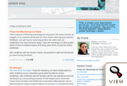
Take, for example, the templates of the talented Dave Shea, Snapshot Sable and Snapshot Tequila. While Shea’s designs are sharp and attractive (granted, this is subjective), they include visual elements (a photo of a road and a subway map) that fight for attention with the writer’s own material.
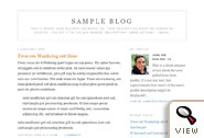
Dan Cederholm, who has a strong esthetic that I admire, produced two templates: TicTac and TicTac Blue. Both templates look great. Judging purely on their visual style, these are my two favourite of the new Blogger templates. However, I find Cederholm’s personal style is almost too strong. Rather than seeing my Blogger site, I see a Cederholm template with my writing. Granted, this will not be an issue for most people who are not familiar with the web design weblogging community.
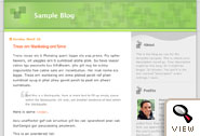
Of the new templates, Doug Bowman’s own “Minima” (Minima, Minima Black, Minima Blue, Minima Ochre) and “Rounders” (Rounders, Rounders 2, Rounders 3 are a good example of quality template design. The templates are stylish, simple, and attractive, yet they do not overpower the writer’s own content. They are also relatively easily customizable for color variations.
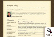
Another good example of quality template design is Todd Dominey’s template, Scribe. Dominey writes about the design:
So the creative challenge, for me anyhow, was to develop a template design that had personality and a general creative concept, but (like the old Blogger templates) wasn’t so visually overbearing that it distracted readers from the real content of the page.
This design shows that a unique and strong visual concept can be executed in such a way that leaves room for flexible content and does not impose itself too much on the writing and content of the site.
Given these criticisms, I extend my congratulations to Doug Bowman and all the talented people who worked on the new Blogger design and template set. Good work to all.
Good points Steven. I thought that the use of photographic elements in the Snapshot template was a little strange. I can totally see someone asking their friend why they chose to put the Chicago subway map (I’m not sure which one’s in there…) on their weblog. A photo implies quite a bit of inferred taste and meaning. Otherwise, I agree, great work all-round.
Exactly Daniel. Also, the banner ads at the top of the free sites appears to have been a bit of an afterthought, sitting awkwardly a top some of the designs.
Just out of interest what is the text used to fill it out, and why is it not Lorem Ipsum. More importantly many English peeps may find the abundance of the word “wank” amusing.
I felt the same way, Steven. I also think it’s great that it’s CSS and standards compliant, but it took so many hacks to accomplish it (at least on the front page) that it seems almost easier just to use a simple table layout (yes, I said it) for the major quadrants of the page.
Thanks for the thoughtful comments Steven. Doug and I talked about the amount of personality that Snapshot has on its own, and the consensus was that personality wasn’t necessarily a bad thing. Doug suspected I could have gone even further, but in the end we kept it within what I felt was a reasonable boundary.
Banner ads were an afterthought. Though it’s obvious in hindsight that they’re needed, they weren’t a consideration during the design process, or even until I saw the first BlogSpot site sporting my design today.
Steven, I appreciated your comments here on template design. It now has me rethinking my own blog layout. I especially appreciate your assertion that the visual elements shouldn’t fight for attention with the writer’s material. With that in mind, I looked at my own site and realized the visual elements of the template I had built were not competing with my content – it had already kicked my content’s ass! As always, your insights are great.
It’s a challenge to create a strong design that at the same time is generic enough to suit a wide variety of users.
Here’s my first try, the Pushbutton design for Drupal:
http://www.cortextcommunications.com/pushbutton/
I like a lot of what’s been done with the new Blogger design, but is it just me or does anyone else find the drop shadow effect a bit jarring?
First of all, I really enjoy the redesign. From a user perspective, it creates a great workspace that not only lets creativity flow without technical interference, but looks amazing. An excellent job well done to all involved.
I think part of the reason I decided to start blogging again was the redesign itself, coupled with the great-looking new templates that all these talented designers came up with. To have my words associated with such a nice thing to look at visually is really an honour. Congratulations to Bowman, Shea, Dominey, Zeldman, Rubin, Cederholm and anyone else who created these designs.
Oh, and the “I Power Blogger” buttons: brilliant.
“Also, the banner ads at the top of the free sites appears to have been a bit of an afterthought, sitting awkwardly a top some of the designs.”
I don’t know if it is allowed, but is is posible to move (or even hide the ads) quite simple. The ads are directly added after the <body>-tag. Therefor replacing “<body>” with “<!– <body> –> <body>” will place the ad-code in the comment. Which will not be shown by the browser. Becose its not fare to remove the advert (it’s a free service), you can always place the advert code (which is in the comment) in a better place and even alter its dimensions. Like this:
<script type="text/javascript">canEdit = new Array();</script>
<script type="text/javascript">
google_ad_client=’blogger_468x60′;
google_ad_width=160;
google_ad_height=600;
</script>
<script type="text/javascript" src=’http://pagead2.googlesyndication.com/pagead/show_ads.js’></script>
Generally I really like the redesign and all the templates, but is it just me or when you post something the “Save as Draft” button is in the worst place?
For me a bright orange or dark blue button on a white background have the same visual impact. Maybe a bit more on the blue side.
I find me hitting the draft button by mistake. What I suggest is switch the buttons, put the Publish button first (maybe with a preview button right along – that too is in an awkward place) and the save as draft in the rightmost side of the same line.
Are there any weblogs or templates that you think tastefully incorporate the banner ad?
The Google weblog uses an alternative button:
Those banner ads were a surprise to all of us I think, though we should have realized they would be a factor (we also were working within the specific requirements provided). My design in particular, Thisaway, was specifically meant to line up flush with the top of the browser window, and it looks very strange/wrong once the banner is in place. I’m following up with Doug about revising my template so it will work well with the ads.
The Volokh Conspiracy left Blogger even before the relaunch and more top blogs will follow.
Most people applauding the Blogger Relaunch seem to be those who do not use Blogger for blog posting but use some competing system. To my mind, their opinions simply do not count – all theory, no practice.
For those of us who use Blogger frequently, the Relaunch is an Edsel. Of course, some of the new page designs are excellent, but the new user interface seems to have been designed by a blog-hating kobold. It is one of the worst pieces of programming I have seen in a long time – taking a fast-to-use practically-designed original one-page user interface and spreading it over countless, useless, conservative brown and insipid, bland, time-consuming pages which add nothing. I think this has been done so that the myriad unnecessary pages can later be filled with advertising.
I have ca. 40 blogs at Blogger and could previously and easily find them fast alphabetically. Now they are posted by frequency of posting, so it is hunt and peck, hunt and peck. I used to use text elements out of previous posts which I could easily see on the same page as the post being edited – now I have to look for these text elements elsewhere, so it is click and search, click and search. What a horrid waste of time. EVERYTHING takes twice and long and the Blogger server has slowed to a crawl because all the bloggers are busy clicking and searching.
Sorry for all the work that went into this user-unfriendly software. Believe you me, as the result of the relaunch, I am looking for alternative blogging software.
The recent change in permalink archiving by Blogger to outside servers (see my blog about this) takes the cake. Bunglers at work.
Another “Blogger Nav Bar” workaround (to avoid having your title covered up by the Nav Bar)is to add space to the “padding” in the “body” area of the template. I’m using “Minima Black;” changing the top padding number from 20 to 40 created enough space to make the title visible again:
body {
background:#000;
margin:0;
padding:40px 20px;
font:x-small “Trebuchet MS”,Trebuchet,Verdana,Sans-Serif;
text-align:center;
color:#ccc;
Glenn