Floppy Disks: They’re not floppy at all!

Slashdot is running a story on the slow and painful death of the 3.5″ floppy drive. I would like to see the major manufactures start to default machines without a floppy drive. While we’re at it, let’s include an on-board Ethernet adapter by default and lose the parallel, serial, and PS/2 ports too.

As Ben Brown put it so well, “What good is a parallel port!?”

According to PC World New Zealand, “Sony, Dell, Hewlett-Packard and IBM won’t even let you ditch the floppy drive when you customise a standard consumer desktop PC.” Gateway does sell PCs without the floppy drive.

Much respect to Apple, who has way been ahead of the game on this one.

iMac ports

While checking our Dell’s options, I noticed that they now hightlight options as “Dell Recommended” – a nice touch for Mom & Dad who don’t know megabytes from pixels.

Dell Recommended highlights at Dell.com - click for full view - and notice the zero choice on the floppy option
 

Jakob Nielsen on Flash

After his now infamous (and totally fair) October, 2000 column, Flash: 99% Bad, usability dude Jakob Nielsen and his Nielsen Norman Group, are joining up with MacroMedia to help product usability guidelines for Flash developers (see the press release).

Jakob cites usability improvements in the tools, such as a common set of UI controls and the restored functionality of the browser’s Back button.

This is obviously more about PR for MacroMedia than usability, but I’m curious to see the results of the Nielsen Norman Group’s research.

I was also unable to link directly to Jakob’s post about this news on his site UseIt.com, since he doesn’t have permanent links for news posts. In related criticism, CNet says of Jakob’s UseIt.com site:

“…no wonder Nielsen thinks people won’t spend any time reading Web sites. His site makes me feel like I’m in the bathroom.”

Ouch. Fair criticism though – I’d love to have a day with UseIt.com. I can think of a zillion little visual improvements that would improve the esthetics and the usability of the site.


Kids don’t distinguish between content and advertising

Jakob Nielsen’s research suggests that children do not distinguish between advertising and content on the web. Apparently the kids were aware of privacy issues. “Don’t give your name to strangers” is burned into the neurons, but parents aren’t teaching their kids what advertising is and how it differs (if it does) from other content.

Media literacy, or whatever you want to label it, is important. See the related AlertBox Column, the complete report ($125 to download), and coverage of the report in Newsweek.

I wonder if the children were frightened of Jakob?


fancypants keyboards

As I read Ars Technica, I came across a post and then a discussion about fancy new keyboards. The following caught my attention and facinated me:

Projection Keyboard

In the future, this will be used on the moon
This little device was the first one to catch my attention. Sadly, they don’t seem to discuss the technology used in its creation. Effectively, it will project a little keyboard onto a flat surface, and as you type on that, it will detect your keystrokes. Yahoo seems to have a better picture of it than the actual site of the producers, who only seem to have artist’s renderings of the device. They do claim to have “resolved technological hurdles” in order to create this device. So we’ll have to wait and see.

Senseboard

Looks comfortable
I’ve seen a couple variations on the Senseboard some are little finger-grabbing rings, etc. Apparently they’re supposed to sniff the ways your hand moves (Senseboard claims to use AI to assist in this process). I wont believe this until I try it. If this worked it could be great because people could type anywhere (no flat surface) with no over-bulky unit. If these things ever shrink along with the rest of technology, maybe we’ll all have them. There’s a thought. If keyboards became so easy to carry around and we all had them, would public phones remove their dirty buttons? Same with Interac machines, or drive-throughs.

Half Keyboard

Looks comfortableFinally, this Sinbad-approved little keyboard brags of simple one handed usability that can be picked up in a handful of minutes. The way it works is you get a left-side of a keyboard, and if you want to use a key on the other side, you hold spacebar and it works like shift. Tapping spacebar will still provide a space. The part I found cool, was that it mirrored the right half of the keyboard. So the P and the Q share a key. I guess the brain finds it easier that way. They have a nice little How It Works section which is worth playing with (they have Flash!). They even have what seems to be a one-hand simulator where you can test your skills with your own keybaord. Try it, it’s fun.

Looks like we’ll have to decide how dependant we are in that ‘tapity-tap’.


Banking feature request: Simple spending categorization

I use either my credit card or debit card for almost everything purchase I make (curse Tim Horton’s for their cash-only policy!). It follows that somewhere, a robot (also known by its more innocuous name, ‘computer’) knows what I’ve bought, when and where I’ve bought it, and how much it cost.

This is all the information I need to really understand where my money goes every month. However, the format I get it in isn’t much use to me. Every month I get a few out-of-date account information mailings from my bank and credit card provider listing my purchases in chronological order. I could sit down with a calculator and figure out how much of my money goes to food, entertainment, utilities, etc.

Sure, I could do that, but this isn’t people work, its robot work.

Here’s what I want, a simple new feature on my web-banking. I want to be able to create categories of spending (and maybe even sub-categories) that I can use to label each of my purchases. For example, I would create a category called Groceries which I might break up into subcategories (Real Food, Junk Food, Other Stuff). Other categories would include Utilities (phone, electric, etc.), Insurance (car, other insurance I should have, etc.), Rent, Car (gas, repairs, racing stripes, etc.), Entertainment (movies, games, clowns, etc.).

a simple example of how the categorization would work - click to a larger view

I would be able to run through my purchases, labeling each of them as one of my categories. Then, I could get a simple breakdown of my monthly spending by category. Wouldn’t you love to know how much you spend a year at the Quick-E-Mart!

I could do this myself with a spreadsheet and some free time, but it would be such a simple addition for existing web-banking systems (see a simple mockup). Perhaps some already have something like this? If only the banks would compete for my petty accounts.

For more dreamy web-banking, see 37signals’ 37FAKEBANK.


thoughts on iMac and the future of the universe

Rob calls it the monopodMy thoughts, since I know you are all eagerly awaiting them, on the new iMac:

  • Design is ok – kinda dopey looking. I’ll reserve final judgment until I’ve seen it in person.
  • Concept is good – those who watched the Keynote Address in shitty QuickTime video will notice how Jobs explained why they went with the ‘two-piece’ design (he said something like “Let each component be true to itself” which was moderately embarrassing). Computers are should be simpler and take up less space – this is a good extension of the original iMac in that regard.
  • Having the display on an arm is a great idea if done well. I’ve long wished I could just grab my monitor and move it. It would be even better if the monitor was on an arm connected to the end of my desk, so I could push it away and have all of my desk space free (if my shower head can do it, why can’t my monitor). While making it easy to move is nice, it is more important for it to be stable when stationary. Can you imagine how annoying it would be if your screen wobbled slightly when people walked by?
  • The NVIDIA graphics card (a pretty good one) has a fan on it. You may recall the fan-less silence of the iMac – which I think was one of it’s best features. They claim this one is still quiet – again, I’ll check it out in person and report back.
  • Another of the nice features of the previous iMac was the tray-less CD drive. Tray’s are so 2001 – yet it’s back. Possibly so they could hide the drive with a cover? Lame.

Steve Jobs uses phrases like “never been done before” and “revolutionary” like nobodies business. It’s interesting though, I think that the quiet revolution in personal computing is happening right now and it has to do with things just working.

Douglas Adams said that technology is a term for stuff that doesn’t work yet. Good call. Slowly – very slowly, computers are starting to just work. Now don’t get me wrong, I could list loads of instances where computers have failed me in the past month, but things are improving.

A few examples of technology that “just worked”:

  • We have an HP LaserJet 1100 that has 1 button, no settings, and just works. If you print an envelope, it is smart enough not to suck in your 8″x11″ paper – it waits for you to put in the envelope.
  • While visiting my parents today, I plugged my laptop into their DSL and I was online – no settings.
  • Stuck with a file on a laptop with no floppy drive or Ethernet – we sat it next to another laptop with an infrared port. To my complete amazement (it was my first time), the machines politely mentioned that there was another computer “nearby” (seriously) and asked it we’d like to transfer files – which we did, thank you. No setup, no configuration.
  • I have a second hand account of one laptop dialing on to the internet – another plugging into it with a crossover Ethernet cable under Windows 2000 – one click to turn on Internet Connection Sharing and both were online.
  • Stick a CD with photos into a Windows XP machine and it will ask you if you’d like to see a slide show (and ask how you’d like it to handle similar CDs in the future). Same with MP3 CDs, audio CDs, and DVDs.
  • When I unplug my network cable a bubble pops up and says – “A network cable is unplugged”. When I plug it back it – it picks up where I started – no hangs or reboots necessary.
  • Copy some text and images from a website into Microsoft Word 2002. You’re presented with a non-intrusive icon that disappears if you don’t click it (very important – it doesn’t interrupt users you don’t like or understand it) – if you do click it, it gives you three options: Keep Source Formatting, Match Destination Formatting, and Keep Text Only. That makes so much more sense than having to choose “Edit – Paste Special”.

I’m sure I could compile a must longer list of less successful technical endeavors but I do think these features are becoming more common. It is these small things that will eventually make computers accessible to more people. Apple’s Movie, iTunes, iDVD, and new iPhoto software seem to do well to make these functions more accessible to more people. Windows XP does its part in this respect as well (good handling of photos, digital cameras, etc.). Even applications like Microsoft Word, Excel, and PowerPoint have matured to a point where there are starting to feel simpler even as they become more complex.

What similar experiences have you had with technology recently?


volunteer work for Apple’s marketing department

I know I’m playing right into the hands to Apple’s marketing people, but I can’t help it – I find good marketing entertaining. I’ve criticized Apple fans on this site before (I’m suspicious of anyone who ‘loves’ a computer company, but maybe that’s just a defense mechanism) but I don’t criticize Apple’s own marketing though – they are good at it. They make me want to know what the next product will be (even though I’ve never owned an Apple product in my life).

The hype over their new iPod portable MP3 player was way beyond what any product could live up to. It’s a cool toy, but people’s expectations were just too much (ala Segway, which is really cool, regardless of how revolutionary it may or may not be). This time, it’s Apple themselves that is blowing the hot air. In preparation for the MacWorld Expo in San Francisco on January 7th. Yesterday the Apple website said (in their proud and recognizable font): “This one is big. Even by our standards”. Today, in response to a flurry of web-rumors about the launch the site read, “Beyond the rumor sites. Way beyond.”.

I admit with some shame, that I am excited about this. Even though I don’t buy them, I enjoy watching Apple’s products evolve.

I posted this topic on MetaFilter this morning and the mac-crazies came crawling out of the woodwork. One particularly good post summarizes the most popular possibilities of what the announcement may be.


monson snowboard design competition

Winter - an entry in the Monson Snowboard Design Contest - I'm not sure who it's done by
I’ve never been big on design competitions. Especially when the prize consists of your work being used without financial compensation. If you want good design, find a good designer and pay her.

That said, the Monson Snowboard Design Contest caught my attention because of the caliber of some of last years winners (I voted for Snow Burner and Relax 163) and because of the ultra-hip-hot-pants sponsors (k10k, surfstation, three.oh, designiskinky, etc.).

This year, the list of sponsors is longer and cooler, including Australian INFront and recent aov-linkers Coudal Partners. I thought about entering, but didn’t get around to it. Then yesterday, my good friend Ffoeg (the one in the yellow sweater-vest on Moses Media’s sweet xmas splash page) stopped by with his designs and encouraged me to whip up something quick. I did.

The trouble with a contest like this is, since the finalists are chosen by public vote, it’s more battle of who can design the best little-JPGS-shaped-like-a-snowboard rather than who can design the best actual snowboard. It’s hard to imagine these things five feet long. Still a fun excercise though.

Voting starts next month, but you shouldn’t vote for my designs, you should vote for Ffoeg’s drac or RoBo or one of these other beauties.

Some of my favourites include snowypeaks, flame, Giraffes Think, Paisley and pure novelty, see hotdog and slotcar.

Most clever entry: //STYLESHEET//. Best use of type (I tried to do something like this, failed, and gave up): racefortheprize. Generally cool: king of m.

Best entries so far, in my opinion:
Van Gogh Summer and winter. I can’t get enough of that Super-Mario-World-meets-Windows-XP soft gradient illustration style.

My humble entries are slice and blues.


Yeah, what he said.

I love it when people say plainly and clearly what has been ambiguously bouncing around in my head, slightly beyond my ability to structure and articulate. This is how I felt when I read Don Norman’s The Design of Everyday Things and C.S. Lewis’ Mere Christianity (for those who only know Lewis from the Narnia series, I strongly recommend looking up some of his grown-up books – The Great Divorce is a good place to start).

The British Rail logomark

The defensible and “damn-near-timeless” design of the British Rail logomark

I had this feeling again today, when I read an article by Adam Greenfield in this week’s double issue of web-design-weekly A List Apart. Adam explores and contrasts the art and science of design as problem solving against the art of style as expression. Without shitting on anyone, he draws a line between the designer and the stylist.

The article, The Bathing Ape Has No Clothes: and Other Notes on the Distinction Between Style and Design expresses, better than I could myself, how I feel about design. Design and style are not mutually exclusive, but they are different.

Also worth a look, dicovered via v-2.org (warning – this site breaks your Back button), a site by the author of the aforementioned article, Gasoline Signs: corporate identity in the real world.


Windows XP: rough around the edges

I resisted my well known irrational urge to upgrade as long as I could, but this weekend I gave in and installed Windows XP. A good rule of thumb: never upgrade your operating system simply because you are bored.

My initial reaction is that the fancy UI effects make things feel a little sluggish, but there are some very interesting improvements as well (and the visual effects can all be turned off). What struck me most about the new visual style in XP is that it is full of little glitches and holes. None are particularly significant, and this may seem nitpicky, but as Blink 182 puts it so well, it’s All the Small Things.

Behold some stupid little things that I couldn’t help but notice and criticize.

Icons Old and New

Old Icons
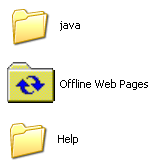
First, the icons – most are new and beautiful. However, this makes the new that are neither new nor beautiful all the more jarring.

You’ll see ugly old icons like this all over the place, but most are from old, non-microsoft programs. That’s understandable. This left over icon for Offline Web Pages is just weird. I don’t understand – did they forget it?

Old Icons
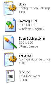
Even within the icons that were clearly designed for XP, there are odd inconsistencies. As you can see here, there are both icons with an angled perspective, and traditional rectangular icons. Not sure why.

In addition to that, notice how the two rectangular icons (vmmred32.dll and Soab Bubble.bmp) don’t even line up.

The end result of all this is a really wacky looking screen full of waggling icons.

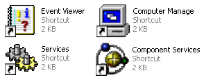
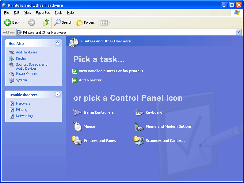
The worst offender in terms of icons is in the administrator components of XP. Did they think the pretty new icons would frighten techies? (not a totally unreasonable fear, mind you). These are some of the icons from the admin section of the otherwise beautiful Control Panel.

ugliest icons ever

Rough Around the Edges – Literally

Warning - Sharp Corners AheadThis next point may seem to cross the line into obsessive, but I with all the other eye candy going on (alpha blending fading menu shadows, etc.) it’s a fair point. If they can smooth the edges of your fonts, why can’t they smooth out the corners of the windows? Perhaps there are good reasons for this – and I concede that this is getting to be a little too nitpicky – but I still noticed it.

Give Your Pretty Widgets Room to Breathe

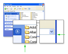
I also noticed several places throughout the UI that looked like they needed a little room to breath. Spacing and padding are critical to a comfortable looking layout. Notice the areas pointed out by the green arrows.

give them some room to breath

Innie or an Outie?

While the subtle gradients and shadows used throughout the UI are generally well implemented, there are a few areas that confuse the eye. Note the shadows in the top and bottom of this small window pointed out by the right green arrows. When the eye has trouble discerning depth (is that a rise or a depression?) it can be visually disruptive.

like dark riders, they are

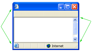
Also, notice what appears to be two versions of the same icon in the image above (by left green arrows).

Oh, I see, Office XP

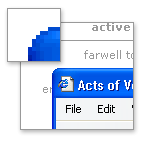
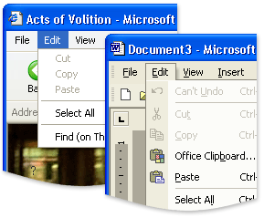
The next two images are not specific to Windows XP, but to inconsistencies between Microsoft’s Office XP and the rest Windows XP. Notice the two different menu styles: the Windows XP default on the left, and Office XP on the right.

why are these menus different?

Srolling can be funAnother odd discrepancy between Office XP and Windows XP – the scroll bars. For some reason, Office XP doesn’t use the new XP scroll bars. Holy 1995.

Having trouble following the rules in-house can make it all the more difficult to police other developers.

Buying Music Isn’t Hard to Do

My final criticism is not visual. In fact, it looks great. Trouble is, it smacks of the overwhelming advertising tactics of RealPlayer. While browsing folders, there are panes with common commands on the left of the window. For the most part, they are quite handy and intuitive. However, when you are browsing a music folder, the following ‘helpful’ option shows up.

anti-trust is the key go a good anit-relationship

Final Thoughts and Compliments

You’ll also occasionally catch a glimpse of the scaffolding behind this pretty OS. When opening a new window, or expanding a new tree in the start menu, if your computer is working at something else you’ll often see the old Win2k grey before the pretty new colors load in. This only happens for a split second, but it undermines the feeling of stability (which can be just as important as actually stability in terms of customer satisfaction).

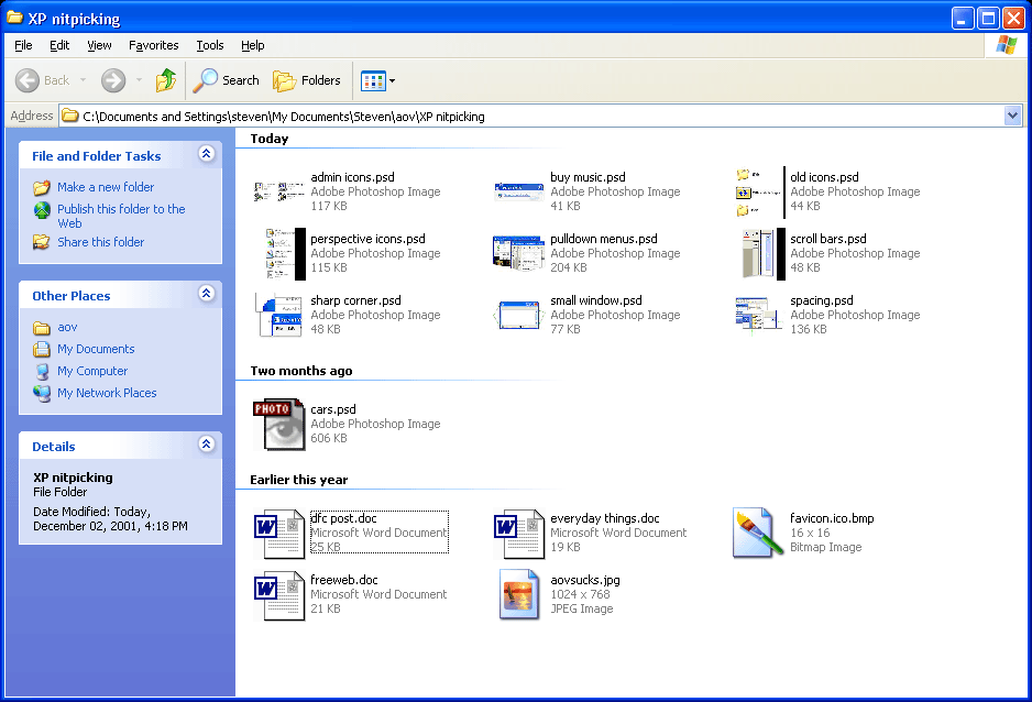
Despite all of this criticism, I am generally pleased with XP so far. The ‘Thumbnail’ view for images is more refined and much faster than in Win2k. Also, the sorting and grouping options for files and folders are simple, but quite handy. For example, you can group a folder of images by file size or actual image dimensions.

If you have a folder with 3000 images, a third of which are thumbnail, another third large images, and the rest icons, sorting by dimensions is fantastic. See an example grouping by date. For someone who deals with a lot of images, these features are a nice touch.

These points are mostly quite trivial on their own. Together, though, they can undermine with feeling of stability and consistency of the system.

More thoughts as they come to me.
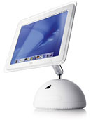