Standards Save the Day

Last year I was doing some painting with a paint roller. The arm of the roller broke and we were stuck with a half-painted wall on a Sunday afternoon (all the hardware stores were closed).

It occurred to me to see if the broom handle, which screws into the broom head, would also fit into the paint roller.

Perfect fit. I don’t know if this is an actually official standard of some kind, or it if was just done to save manufacturing costs for Handle Co. Either way, it saved the day.

There is a lesson here.


The ultimate Weblogging system?

User interface critic and man-about-New Zealand, Matthew Thomas has outlined his view of the The ultimate Weblogging system. We’ve run our system against his checklist.

Good points all around. We ran our weblogging system against his list – citing where we’ve met his requirements and where we have not. While we are missing a fair number, I think we’ve done very well considering that our system was not built with the intention to be marketed or used by others. For example, you can pretty quickly rule out a Blogger import system by asking the three eventual end-users of your system, “Does anyone here use Blogger?”.

Some of the points are things I hadn’t considered and will be implemented thanks to Thomas’ suggestion (RSS feeds for categories, in particular).

I would encourage those with weblogging systems intended for wider use run their own system against this checklist as we have done here.

Here’s my annotated version of Matthew Thomas’ list:
(Note: grey text is from Matthew Thomas’ original post, bold text is our own. When I say “nope”, I’m not disagreeing; I’m saying that we don’t meet that given requirement.)


  • Forward compatibility

    • License under the GPL (minimizing lock-in, architecture rot, and wasted development effort). (nope – we’re a bit tied down here due to our reliance on proprietary code)
    • Work with at least one Free database (e.g. mySQL). (nope, but PostgreSQL support may be coming)
    • In case of emergencies, allow entries to be exported to XML. (nope)
    • Use entirely non-crufty URIs. (check)
      • Give individual entries URIs (permalinks) of the form http://base/2003/05/02/oneMeaningfulWordFromTheTitle. (close, we have the word archives in there, though I think we’ve hit the mark – 6 for 6 on this list – down with linkrot! Also, we’re generating an automatic “shortname” for the URL based on the title, but it is human-editable in case the robot’s suggestion doesn’t work out.)
        • No irrelevant system-specific cruft (e.g. mt-static/, msgReader$, or weblog.cgi). (check)
        • No ? characters, so all entries get indexed by search engines. (check)
        • No irrelevant filetype-specific cruft (e.g. .html, .php, or .xml). (check)
        • Every entry is on its own page, not just an internal anchor on a daily/weekly archive (which makes search engines and statistics tools less useful). (check)
        • Net effect: Even with a stupidly worded inbound link (e.g. “I came across this”), a reader can tell a lot about an entry (host, date, and hint at subject) from glancing at its URI. (check)
        • Something Thomas didn’t mention: support for the old URLs of imported content – we’re handling the old ColdFusion based URLs from two years of Acts of Volition transparently.
      • Give daily archives URIs of the form http://base/2003/05/02/. (we don’ have daily archives)
      • Give monthly archives URIs of the form http://base/2003/05/. (close enough)
      • Give yearly archives URIs of the form http://base/2003/. (close enough)
      • Give category archives URIs of the form http://base/name-of-category/2003/05/, etc. (close enough)
      • Theory: URL as UI, Cool URIs don’t change.
      • Practice: Making clean URLs with Apache and PHP.
  • Metadata
    • Each entry has a title, a category string, contents, time posted (auto-generated), and one or more objects (e.g. images). (not quite)
    • Invite (but do not require) the author to provide a summary for any item longer than n words, for use in mobile editions and RSS feeds. (no, but we are generating relatively good automated summaries with a brief excerpt, and word count – human-written summaries coming soon)
    • Categories are faceted. I may categorize an entry by subject, by current location (integrating with GPS devices), by mood, and so on. (nope)
    • Each category facet can be hierarchical. (For example, an “interface design” subject category could be subdivided into “desktop application design”, “Web design”, “appliance design”, and “signage and artifact design”.) (we didn’t think this was necessary for our humble blog, but it is a good point)
    • Invite (but do not require) an author to subdivide a category whenever it collects more than n entries (rather than forcing them to be architecture astronauts specifying all their categories at the beginning). (nope)
    • An entry may have multiple values for each category facet. (For example, one post might be about both CSS specifications and buggy Web browsers.) (check)
    • Why does all this need to scale so deeply? Because when you’ve been keeping a Weblog for twenty or thirty years, and you can’t remember any semi-unique words you used in a particular entry, finding it will be horribly difficult, and you’ll need all the semantic help you can get. (interesting – Stuart Brand would be proud).
  • Syndication
    • Provide an RSS feed for the Weblog as a whole. (check)
    • Provide an RSS feed for any category. (great idea! – coming soon)
      • Because of the faceting, category feeds will need to be dynamically generated, but they should still send correct caching responses. (we are not caching)
    • Automatically ping Weblogs.com. (check)
    • Automatically convert Slashdotted entries to static pages, and switch back to dynamic generation once the traffic subsides. (oh, to be slashdotted… nope)
    • Integrate support for Creative Commons licenses. (not yet)
  • Management
    • Web interface. (check)
    • Native LinuxSTEP interface. (huh?)
    • Accept entries from software on any other platform or device, using the metaWeblog API. (not yet)
    • Accept entries sent by e-mail. (nope)
    • Make it easy to send entries from a mobile phone (e.g. by replicating the features of Textile). (nope)

  • Backward compatibility

    • Import entries from Blogger, Radio, Manila, Movable Type etc. (not automatically, but if you are a database wiz…)
    • Keep URLs the same for legacy entries, while still allowing control over their appearance. (check)
 

Update on my week with a Mac

A few updates on my Mac experience since I posted the original review:

  • A two-button mouse makes a huge difference. OS X has fantastic support for the right-button. To say that Mac is based on a one-button mouse is no longer true. They just still sell a mouse with one button.
  • When browsing network drives on machines with a file system other than Apple’s HFS, OS X leaves hidden files all over the place (apparently to save folder-specific Finder settings). This is a deal-breaker. Any way to disable it?
  • My criticism of the tactile transparency of the Internet Explorer icon (you can’t click on holes in the e) is apparently limited to that one icon and doesn’t apply to the rest of the OS. Good. Update to my update: while no other icons (that I know of) are as bad as the IE icon (with a hole in the middle), most icons do have none-clickable areas in the box, but around the shape (around the edges of a folder, for example).

The scale of the reaction has been surprising. It has mostly been quite positive (thanks for all of the wonderful compliments).

A lot of people brought up the fact that I didn’t have the most recent hardware. I don’t want to debate the details, but I don’t think the hardware hindered my experience on the OS significantly. I’ve worked on a wide range of systems and have a good feel for when more horsepower would solve a problem. That said, the overall experience would no-doubt have been more pleasant with better hardware.

I’m not a journalist with a hardware budget and Apple doesn’t send me free hardware to review. I’m just a schmo who happened to have an old iMac sitting around.

A lot of people said a lot of kind and interesting things. A lot of people said the same thing over and over (which is somewhat understandable – I don’t expect people to read though over 100 replies). A few people said nasty things, but my new Mac posse stepped in to defend me.

Also, the article may be getting translated into Chinese for a web-magazine in Taiwan. Cool.


A Windows user spends a week with a Mac

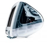
A Graphic iMacI’ve been conducting a user interface experiment with myself as the subject. A long-time Windows user and armchair graphical user interface critic, I have spent a week working in Mac OS X. What follows is my review of the experience.

The Scene

My primary computer is an IBM ThinkPad T30 laptop running Windows XP. Most of my time at the computer is spent using a web browser (Phoenix/Firebird and Internet Explorer 6), reader/writing email Outlook 2002, and doing web development work (PHP/XHTML/CSS via HomeSite and graphics via Photoshop/Illustrator).

The mac I’ve been using is old graphite iMac we have at work for testing web applications. It has a 15″ CRT, a 400MHz G3 processor, 192 MB of RAM, and is running OS X 10.2.5. Not the latest and greatest hardware – and it showed – but it was sufficient for most work.

I’ve always been familiar with macs, but I’ve never spent enough time with one to actually make a fair judgment on their quality and usability. Using a mac always felt to me like trying to use a computer with boxing gloves on (much respect to Strong Bad). I’ve often wondered if it was simply due to my familiarity with Windows conventions rather than any difference is quality of design This is my third full-workday on the iMac and my experience has been interesting. Here are my observations.

The Boxing-Glove Effect

First, it look me a full day to get beyond the simple differences between Windows and OS such as basic key combinations, window/application switching, and the location of the special keys (Control, Alt, and the whatever-the-hell-you-call-that-thing mac key). For the most part, these differences are innocuous – neither better nor worse on one platform or the other – but a serious hurdle in switching between the two. It doesn’t help that my ThinkPad has an annoyingly non-standard location for the Ctrl key. My hand muscles are more confused than they were during puberty, but as I did then, I’m mastering them.

The hardware is an odd combination of great and crap. The CRT is a great quality, though 15″ & 1024×768 is way too small for me. I tried not to judge too much based on the screen-size, as larger screens are obviously available. An LCD would be nice too – also available (read my initial reaction to the release of the flat-panel iMac).

The slot loading CD drive is a nice touch. Perhaps there are engineering reasons why more manufacturers don’t do this – but it is great in practice. The little speakers are all right for general use, but you won’t want to throw a party with them (I tried, but only one person showed up).

The keyboard and mouse are crap. I know Apple has since replaced the puck-mouse, and bashing it is passé, but holy crap is it bad. The mouse is perfectly round, making it difficult to feel which is the front and back – important piece of special knowledge when using a mouse (as it determines the direction of the cursor). The keyboard has tiny arrow keys and tiny home/pg-up/pg-dn keys. Luckily you can easily replace a keyboard and mouse. Otherwise these unfortunate components would be a deal-breaker.

One major problem with the iMac: it made me look like a dork. Those who know me understand that I am one who can rely solely on my physical appearance to get through life. Having a cute-looking gum-drop computer on my desk caused my co-workers to laugh every time they enter my office/cubby-hole. Don’t underestimate this – the dork appearance factor is probably killing sales of the Segway. Granted, I would look like a total bad-ass with a 17″ titanium Powerbook or a new 17″ flat-panel iMac.

The Software

The software proved more interesting (and is more up-to-date) than the hardware, I’ve criticized OS X for being over-designed. I stand by that criticism, but it was not an impediment to using the computer. In fact, I found that the GUI had a more solid overall feel than Windows XP (which is quite rough around the edges). Everything is smoothly anti-aliased the visual elements (windows, widgets, menus, etc.) gave an impression of depth and integrity.

OS X Close-Window control indicating unsaved changesI came across a few particularly nice touches in OS X. When working on a document that has been changed since last saved, the window-close control (the little red orb), has a dot in the center. This indicates that if you click the close button, you will be prompted to save or discard your changes. This is a smart and unobtrusive feature that proved very useful (I happened to be working with a lot of HTML files this week).

Closing an unsaved document brings up another nice feature; Rather than the floating dialog boxes of Windows and previous versions of MacOS, dialog windows (a.k.a. “sheets” in applespeak) are attached to the title bar of their parent window. The subtle animation of the sheet sliding in from the title bar of the parent window helps reinforce the association between the dialog and the window. Nice simple improvement.

A simple unsaved document warning dialog also highlights something MacOS has always done better than windows: wording of dialogs and controls. Take these two examples of a save-warning in Notepad on Windows XP and TextEdit on OS X. Windows asks me “Do you want to save the changes?” and presents three buttons: “Yes”, “No”, and “Cancel”. OS X asks a similar question “Do you want to save changes to this document before closing?”, but the three buttons presented has a powerful differences: “Don’t Save”, “Cancel”, and “Save”. See screenshots of the OS X and Windows XP save dialogs.

While some dialogs were well worded, I did find inconsitencies. For example, the Empty Trash confirmation dialog has “Yes” and “No” options rather than the better alternative of “Cancel” and “Empty trash

The OS X scheme forces me to click on the action I want to perform. If I want to save, I click “Save”. If I don’t want to save, I click “Don’t Save”. On Windows XP, I have to figure out (as simple as it seems), what “Yes” and “No” mean. This forces the user to understand the question before clicking (if it said “Discard changes”, then clicking “Yes” would delete your work). Also, the “Don’t Save” button, the most dangerous option, is located farthest away from the “Save” button to reduce the possibility of accidentally clicking on it.

The Dock

Screenshot of the OS X dock with several applications, both active and inactiveThe infamous OS X dock confused me for quite a while until I understood that it can contain three distinct types of objects: Shortcuts to applications that are not currently running, icons of all applications currently running, and icons for any minimized windows (oh, and a trash can). See a diagram of the three dock-item types. At first, the inclusion of both application shortcuts and applications that are currently running in the dock seems like an odd design choice. However, I grew to appreciate the diminished distinction between applications that are actively running and those that are not running (the only visual difference between the two is a small black arrow with the icon – see the screenshot to the right). However, I did find this made it easy to unintentionally leave a trail of opened applications with no documents open after a while.

The thumbnails of minimized windows in the dock proved surprisingly useful if kept sufficiently large (though I’m not sure they are worth the screen real estate and I expect most power-users have their dock set to be quite small). However, the general window management proved awkward and frustrating for an experienced Windows user. Windows provides a tile in the task-bar for all open windows. OS X only shows minimized windows on the dock. This led me to the following frustrating scenario several times: I have several windows from several applications open. I open a new window that is larger than all the other windows, completely hiding all other windows. I have now have no way to get to the other applications without first moving or minimizing my current window. Pain in the ass. I can imagine this being a significant long term annoyance with OS X. Update: Several readers have pointed out that you can Command+click (or right click, or click and hold) on an active application icon to get a menu of the current windows. So noted.

The Finder

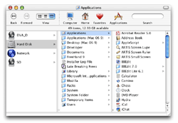
The Finder was another area of the Mac that seemed to be polarized – some great things and some real crap. Plenty of smarter people than myself have written about the OS X Finder. The three-pane view, a relic from the NextStep OS, is fantastic. Part of the work I’ve done on the mac this week involved editing a large number of HTML files buried in a deep hierarchy of folders (on a Windows NT 4.0 machine, no less). The three-pane column view was much better than the Windows explorer-tree (which is quite good).

The icon view in the finder also had a nice feature that Windows could learn from. Icons with extra info in OS XThe icon view shows additional information about objects when there is room (eg. image dimensions, or the number of items in a folder). Nice, but I’d like to see it taken further: add a “zoom” control to the finder icon view, the closer you zoom in, the more detail you can display about objects (see Eazel’s Nautilis).

Working with both Linux and Windows (98, 2000, NT, and XP) machines on the network proved surprisingly smooth and seamless – this is a massive improvement from my experience with previous versions of MacOS.

The “spring-loaded folders” feature is something I will miss in Windows. Pickup an icon and drag it over a folder, if you keep holding down the mouse button, the folder will open, you can then hover over child folder, which will open. You can repeat this process indefinitely, making it easy to navigate deep into a folder hierarchy. Then, when you finally drop the icon, it is deposited in its final location and all the windows you opened close. It works well.

Elsewhere in the System

The System Preferences was generally well organized, though I was completely confounded by the bar along the top of the System Preferences window. It contains duplicates of icons in the System preferences window. It is customizable, and I suppose it is intended as a place to put frequently-used items. Duplicating icons in this already crowded window seems to be an odd choice. This is particularly puzzling since other applications use a similar-looking icon row at the top of a preference window in the same way tabs are traditionally used. I welcome any insight into this design decision.

Apple Safari browser iconThe Safari browser (I was running Beta 2) is shaping up nicely. I’m not sure about actual rendering speed, but it felt faster than IE5.5 or Camino (which is also a very nice application). I even got used to the brush-metal appearance of the Safari window (something I started off hating). I did find that there was insufficient feedback when a link was clicked. If a server took a few seconds to respond, the only indication that a link had been clicked is the blue bar in the location box (and it remains motionless while waiting for the server to reply). As a result, I found myself clicking links repeatedly before realizing that they were already loading from the first click.

Another feature I’ll miss in Windows is the highlighting of active form fields. The active form field is highlighted with an unobtrusive but strong blue halo. I was mystified that using the Tab key (or Shift+Tab) to move through form elements only selected text input boxes, skipping radio buttons, pull-down menus, and check-boxes. Can anyone offer an explanation for this? You also can’t tab through buttons in a dialog box (“Save”, “Don’t Save”, and “Cancel” for example), meaning mouse is required for something that can be easily (and quickly) done with the keyboard in other windowing systems. Is it possible to operate a mac without a mouse?

Internet Explorer icon with transparency maskAnother annoyance: while icons have nice visual transparency, they also have tactile transparency. This basically means that if an icon has a hole in it, and you click in the hole, you haven’t clicked on the icon. What!? The Internet Explorer icon is a good example: the gaps in the “e” (not to mention all the white-space around in icon) are mouse-click dead zones (the orange-pattern highlighted area in the image to the right is not-clickable). The dock gets around this by making the entire icon area clickable – the finder should do the same.

On the even more nerdly front

I’m not an expert in Unix or Linux, but a friend who is tells me that the integration of the GUI with the command-line-type functionality (super-user permissions in GUI dialogs, etc.) is better than RedHat or anyone else has been able to do. For more on the Unix aspect of OS X, see this 1-hour presentation by Apple’s VP of Software Technology and alumni of the friend-linux-GUI Eazel project, Bud Tribble. The presentation is an interesting look beyond the marketing gloss at Apple. Tribble seems as wary of hard-core mac fandom as I am. He also talks about how Apple listens to its customers, and then often chooses to say no to feature requests – a smart move, if done properly (this topic is discussed at CEOBlues.com).

So what does all of this mean?

I’m not going to run out and buy a mac tomorrow (sorry Dave). However, I am more impressed with the operating system and interface than I expected to be. Previous experiences with the mac never lasted long enough to get past the simple brain-cruft of familiarity with Windows. I’ve caught a glimpse of what it is that seems to make mac fans just that, “fans”.

By the way, here are a few corny posts titles I rejected for this post:

  • The OS X-Files
  • An outsiders’ tales from the Apple orchard
  • A Taste of the Forbidden Fruit
 

Open Software Development Process

When you spend much of every day in front of a computer (which you probably do if you are reading this), you come to know the intricacies and quirks of your software much as a musician comes to know the feel of their favourite instrument. Sometimes the smallest bugs can become the biggest annoyance.

Internet Explorer is a program I use frequently. In general, it is a good program. However, it has quirks that drive me mad. Many of these quirks affect many users and could probably be fixed in a matter of hours. However, I don’t report these issues to Microsoft. Why is that?

I don’t think Microsoft will listen. I don’t think Microsoft is a bad company (you should be suspicious of anyone who claims it is). However, Microsoft is not a particularly open company, and they are enormous. Would my feature request or bug fix request ever get through to a person who would be able to evaluate it effectively? I doubt it. This isn’t necessarily Microsoft’s fault, though I’m sure they could improve both their responsiveness and my perception of their responsiveness. It may simply be that there are too many people like me with too much feedback to reasonably parse.

This is where smaller and more open software development processes can really shine. In the past few months, since Apple’s Safari web browser project was announced, there has been a lot of discussion and an enormous amount of feedback on the browser. I’m sure there was a lot of noise, but there has certainly been a lot of useful feedback.

Add to this an open and responsive developer, and things get interesting. David Hyatt was hired by Apple to work on the Safari project. He publishes a weblog on which he regularly posts progress, requests for input, and explanations of choices from the Safari project. Apple was brilliant to let him do this.

Take for example, a public exchange that took place between a Safari user (and web expert), Jeffrey Zeldman, and Safari developer David Hyatt. Zeldman posted a detailed comparison of his site on the Safari browser and the Mozilla/Gecko-based Chimera (now called Camino – good name choice, by the way). The next day, Hyatt posted a response explaining the reasoning behind the differences.

Hyatt was equally open and responsive to input when weblogger Mark Pilgrim posted his initial feedback on the Safari beta.

Hyatt is not alone in his process. Dave Winer (formerly) of Userland Software, Ben & Mena Trott of MoveableType, Brent Simmons of NetNewsWire, and many others all communicate and collaborate with the users of their software.

It is important to note that none of these projects are open source. Some, like Apple’s Safari project work with open source projects (the KHTML rendering engine, in the case of Safari), but they are not open source themselves.

This openness makes me want to use their software. It makes me confident that my input will be considered and my problems with an application might disappear in an upcoming version. I’ve seen desire for openness in software development drive software choices in a corporate development environment as well.

This is obviously not a large concern for all users. My parents are not interested in communicating with the developer of their browser – they just want their Hotmail. However, there is a large community of wannabe experts like me that collectively bear significant influence on choice of software (my parents are using Mozilla, because I installed it for them).

I would love to see other key Microsoft and Apple developers blogging (let’s see some key Microsoft and Apple executives blogging while we’re at it).


Taking our struggle with CSS font sizes public

Those readers not interested in web design issues, please pardon this post. For the rest of you, the following is a series of posts I made on the corporate intranet at work. We’ve been struggling with CSS font-size issues. It’s nothing original, but it is my hope that posting the explanation of the problem and one (of many, I’m sure) potential solution I wrote for my co-workers might be of help to others dealing with the same issues.

I’m also interested in feedback on the techniques we used. What did we miss? I’ve tested across a wide range of browsers, but if you notice any weirdness – please let me know.

My first post was an explanation of the problem – basically written so I could straighten it out in my head:

Posted to the silverorange Intranet by Steven Garrity
– January 3, 2003

We’re having some difficulty with font size issues with CSS and I thought it might be helpful to lay out everything we’ve been talking about in one location.

First, some history. We are using CSS percentages (eg. font-size: 75%;) to do font sizes on most of our current sites. We discovered last year that some Mac browsers were inheriting the font sizes recursively (since we put font-size: 75%; on all [td] tags, any table in side a table would be 75% of 75%, eventually getting to the point of being ridiculously small.

We couldn’t replicate this Mac browser inheritance issue ourselves, but it is documented, so we now sniff out all Mac browsers, and all Netscape browsers (on any platform) and show them pixel-based font sizes (eg. font-size: 12px;).

Pixel font sizes are by far the most reliable font sizing technique across all browsers, but unfortunately, none of the IE/Win browsers (including 4, 5, 5.5, and 6 – basically everyone on the internet), allow the user to resize fonts specified in pixels. This is really shitty – it was on Jakob Nielsen’s Top Ten Web-Design Mistakes of 2002.

Some browsers, like all mozilla/gecko-based browsers and Opera, allow the user to resize any fonts – regardless of how they are specified (including pixels). However, the majority of web users are running IE 5, 5.5, or 6. So pixels are easy to work with – but limit IE users from resizing.

The solution we have on most of our live sites right now (Horton Brasses, NovaScotian Crystal, The silverorange Intranet, etc.) works ok (percentages for smart browsers, pixels for dumb browsers). Any kind of browser sniffing is messy, but it works.

The trouble came when we started the move towards XHTML 1.0 (from HTML4.01). Using our current percentage font-sizing technique, if you change the DOCTYPE from HTML4.01 to XHTML, in IE 6, things go wacky. All of the sudden, IE decides to use the inheritance model correctly (which sounds good, but we were taking advantage of it’s weakness in this area – serves us right for leaning on bugs).

So, to make the move to XHTML, we have to figure out a different way to do font sizes. This really sucks, because we are very close to being XHTML compliant – it wasn’t nearly has hard (other than this issue) as we had anticipated.

Here are the options as I see them, let me know what I’ve missed:

  1. Switch to pixels entirely
    This would be a breeze from our perspective, but we would be locking font sizes for squinting IE users everywhere. We could make a font sizing widget in the pages themselves to resize, but I’ve always hated those.
  2. Stick with HTML4 for now
    We don’t have to move to XHTML. Stay with HTML4 would let us continue with our current tried and true font sizing technique.
  3. Avoid nesting of classes
    Inheriting percentage sizes only becomes and issue when you nest classes (or put classes on items that get nested themselves, like [td] tags). Wired News uses this technique to create a fantastic CSS layout with flexible font sizes in all browsers. This is my preference so far – however, it involves some annoying reworking of the way we use classes to avoid nesting.
  4. Use CSS font size keywords
    CSS has keywords that work much like the old [font size=”-1″] HTML tags. These work well, except for an inconsistency in IE5 and IE5.5 – but there is an elegant hack to get around this. Keywords don’t inherit – so a small inside an x-small is the same as outside. Sounds good – however, the default sizes aren’t great. For example, you can’t the equivalent of the 70% Verdana we use so widely (here on the Intranet, for example).

Ok – that’s the state of the union address on font size issues. I wanted to write it out to get all of us and I all on the same page – but I also wanted to write it out to help sort it out in my head. What a mess.

I might post this publicly (linked from aov, maybe) to see if we can get any helpful feedback, but I doubt it. [note: I thought I’d leave this in to show how resentful I am of all of you morons when in private 😉 ]

I think our best bet might be to follow the lead of Wired News (using option 3 in the list above). They’ve made a wicked site with out inheritance issues anywhere. However, this would prove to be very time consuming on existing sites. Maybe keep the current sites at HTML4 for now, and start our next site (and update small, easy-to-convert sites, like silverorange.com) using this technique and XHTML?

Bah.

Then, after some sleep and a night of feverish delieum battling the flu, I posted this possible solution:

Posted to the silverorange Intranet by Steven Garrity
– January 5, 2003

My subconcious brain has been working on this problem all week. Now, I think I have a potential solution for our CSS font sizing issues. This proposal is implemented on the stage silverorange site. Please report any weirdness. I’m going to do more testing before going live, but so far so good. Here’s what I’m doing:

  • I’ve moved from including the styles from a PHP file do doing the browser sniffing outside the CSS file. This allows us to include actually .css files rather than embedding the CSS in the HTML (browsers can cache the CSS – saving time and bandwidth).
  • I’ve simplified the browser sniffing. We were sniffing out Netscape 4 and below and all Mac browsers and showing them Pixels rather than Percentage font sizes. Now I’m only sniffing out NS4 and below (I’m not longer sniffing out Mac browsers). The trouble on the mac was with inherited percentages – and I’m not using them anymore.
  • There are three CSS files:
    • All browsers:
      • core.css – this file includes any styles (or part of styles) that are safe in all browsers
    • Netscape 4 (and below):
      • dumb.css – this aptly named file contains Pixel font sizes and a few other variations (line spacing is smaller, etc.)
    • All browsers other than NS4 (and below):
      • smart.css – this file is includes the combination keyword/percentage font size solution described below
  • Font size:
    • Netscape 4 and below sees only pixel font sizes – if we decide to ditch Netscape 4 at any time, we can lose all browser sniffing for stylesheets!
    • For all other browsers (on all platforms, including the mac), I’m using the Wired News solution: Declare keyword (small) font size as the base font size (for [body], [td], and any other key containers)
    • IE 4, 5, and 5.5 make the font size keywords one step larger than every other browser in the universe. There is a hack called the ?box model hack? that gets around this.
    • This base keyword font size is the basic full size Verdana used as the body text.
    • Any other font sizes (titles, and the beautiful smaller Verdana text used often on the site) and sized as a percentage of the keyword base font. These styles are never nested, meaning there are no inheritance issues.
    • This means that it you want the base font size (full size Verdana), then no style is needed at all (as it’s the base font size for the document).

I’ve done a bunch of testing and haven’t found any cracks in this method yet. However, dealing with the browsers is voodoo, so I’m going to do a bit more testing before implementing.

What separates this solution from the options listed in my previous post on the subject (above) is that I hadn’t thought of using CSS keywords as the base font size setting.

The solution discussed in this second post is now implemented at silverorange.com. Please let me know of any issues.


Hiding in the FedEx logo

I’m sure that most of those of you that will care will already have noticed this, but for the few, like me, who hadn’t: the FedEx logo contains an arrow in the negative space created by the E and the x. Beautiful.

Hey - there's an egg hidden in the 'D' too!

I guess that’s why I’ve always thought that FedEx was a progressive and forward-thinking company and didn’t know why.


Edward Tufte’s Graphic of the Day

Edward Tufte's Graphic of the Day: Princeton University Acceptance LetterFrom Edward Tufte’s Graphic of the Day, the brilliant Princeton University Acceptance Letter.

Does anyone know how to pronounce Tufte’s last name? I’ve been calling him “tuft”, but I’ve recentely been told that it’s actualy “tuftee” (with the emphasis the second sylable pronounced as a long ‘e’). If so, I’ll add this to the long list of names I’ve long been mispronouncing (appologies to Derek Powazek, Dave Winer, Jason Kottke, and Matt Haughey). Such is the danger of a text-based medium.


Excuse me Microsoft, the people have a beef.

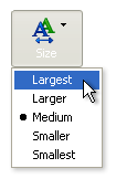
Well-known figures of web development are calling out to Microsoft. The complaint is that Microsoft’s Internet Explorer on Windows doesn’t let users resize fonts if they are specified in pixels with stylesheets. The optional Font Size selection toolbar element in Internet ExplorerI’m not going to go into the details of the feature here, but it is an important accessibility issue, and they are right.

However, I’m more interested to see how, and if, Microsoft will reply to these demands.

Although many have asked for this before, the well-known Jakob Nielsen has drawn further attention to the issue with his Alertbox column; Let Users Control Font Size (he gets right to the point – you’ve gotta give him that). Jeffrey Zeldman rings in too, pointing out that designers are doing the best they can, and reiterating the demand to Microsoft. Scripting.com’s Dave Winer, JoelonSoftware.com’s Joel Spolsky, and many others join in as well.

It will be interesting to see if Microsoft is willing and able to respond to a demand like this. I’m not expecting them to ship a fix tomorrow morning, but it would be smart for them to at least acknowledge that they hear these demands. Is it even possible for a corporation of such girth to form a timely and human response to an issue like this?


Predictable spam whinning

SpamAssasin from DeersoftThere have been endorsements for a spam filter called SpamAssassin all over the web in the past few weeks (see Salon article). As the amount of spam I’ve been receiving has been increasing lately, I tried it out myself.

As I understand it, SpamAssasin in an open source Unix based spam filter (check out that title graphic!). However, an oddly-named company called Deersoft has released a commercial version for Windows/Outlook – that’s me.

I used the program for the free two-week trial, during which it mislabelled one email as spam, and caught at least 90% of real spam. The program also allows you to “Allow” or “Block” any given sender. I was annoyed that you could only allow/block one email at a time. I wanted to be able to go to a folder in Outlook and “allow” all senders (clients, for example).

I emailed Deersoft and requested the feature. I got a quick response acknowledging that this is an important missing feature. A few days later, I got another email letting me know that if I download the update (updates now download automatically), I can now allow/block multiple emails simultaneously. They actually said “ask and ye shall recieve”. Nice.

I’m sure they didn’t implement the feature solely because of my email – it was obviously needed – but I was impressed that they kept my email on file and bothered to let me know of the update. This was enough to make me feel they had earned the $29.95US registration fee – but what really got me to register was the fact that the software works.

While this is a good short-term solution, there are obvious problems with relying on filters for spam. First, the spammers will get smarter, and get good at beating the filters. For example, I got an email last week with the subject line that had something do to with electricians. When I looked at the message, they were not electricians at all, and they were doing nasty things to each other. Also, spam filters make my life easier, but they don’t make life any easier for those that maintain my email server – spam still eats up valuable bandwith and storage space.

I don’t know what to do about spam, but it is certainly pushing me towards other modes of communication. Particularly towards closed, permission based, medium like intranets and instant messaging (between these two medium, I have dramatically reduced by reliance on email).

Perhaps the swelling of spam will encourage the development of more powerful communication protocols. Jakob Nielsen used to talk about giving people, or companies, limited-use tokens to contact you. For example, if you buy a product from Automaton-Waterfowl.com, you give them an electronic token that will allow them to contact you three times (one for a receipt of your order, and two more in case of a problem). This is a good idea.

If anything, you have to give credit to the spammers for their occasional amusing subject lines – and I’m gonna miss getting mail like this.