Meetings need margins

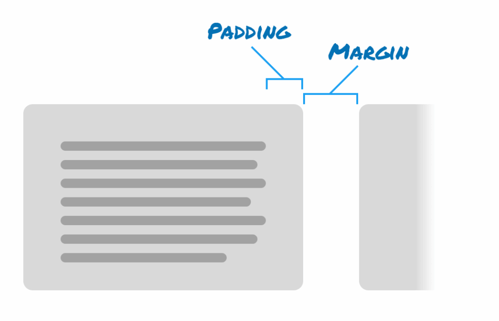
In the world of CSS, there are two different types of spacing between elements:

  1. Margin is the space outside of an element
  2. Padding is the spacing inside of an element
Diagram showing how padding is the space inside a rectangular element and it's contents, and margin is the space outside the element between it and other elements.

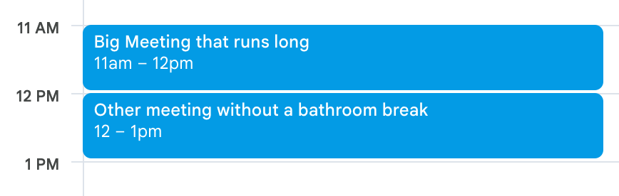
I’ve come to believe that scheduled meetings have MARGIN and PADDING too. Meeting Margin is the space between two meetings. This needs to be explicit. The screenshot below shows two meetings with no margins. They’re bumping up against each other.

Meeting Padding is the space inside a meeting required to make space between other meetings/activities before and after. For example, if I show up immediately after a previous meeting, I’ll still need a minute to find my notes, or run to the bathroom.

Screenshot from Google Calendar showing two meetings running right up against each other. The first is "Big Meeting that runs long" and the second is "Other meeting without a bathroom break"

I try to give meetings Margin so they don’t end up with too much Padding. I try not to put two meetings immediately adjacent on the calendar. I don’t always success.

I wish calendar tools like Google Calendar would make this basic human requirement a bit more obviously part of the flow of booking meetings. Let me know that this meeting runs right into the next one, or that the person I’ve invited has zero minutes between their previous meeting and the one I’m scheduling.


Printers are the new trucks

Everyone knows that if you have a truck, you have a social responsibility to help your friends and family move stuff. It’s in the Bible.

Now, if you have a working printer, you have a social responsibility to help your friends and family print stuff. I humbly accept this responsibility.


YouTube is making money on scams

This week YouTube started showing me an ad with an obviously (to me) fake video of Canadian Prime Minister Mark Carney asking people to sign up for some AI program. The link points to a form hosted on TypeForm.

YouTube screenshot showing an advertisement with an AI-generated Mark Carney standing outdoors with a Canadian flag in the background and a prompt button to Register here.

I’ve reported this ad as a scam at least three or four times, yet YouTube continues to serve it to me.

I can see how it would be infeasible for YouTube to screen every video they host – but as soon as they accept a penny from an advertiser, they take on the complete burden of filtering out (at least obvious) scams.

I would also expect that some facial-recognition might be in order for a G7 world leader.

Shame on YouTube.


Hanson + Smashing Pumpkins + Fountains of Wayne + Cheap Trick

Did you know there was a super-group that released an album in 2009 that consisted of:

  • 🎤 Taylor from Hanson (the MMMbop dudes!) on vocals
  • 🎸 James Iha of the Smashing Pumpkins on guitar
  • 🔊 Adam Schlesinger (RIP) of Fountains of Wayne on bass
  • 🥁 Bun E. Carlos of Cheap Trick

Weird but true. Enjoy Kind of a Girl by Tinted Windows.

Update: I learned from Wikipedia that the guitar play from the Lemonheads also performed with Tinted Windows. And the Lemonheads have a great new song out.


Figma annotations inaccessible for free accounts

I learned this week that the Annotations feature in Figma is not accessible for people with free accounts. Instead, you need to have a paid account with Dev Mode access.

This is a major hindrance and disincentive to use the feature. While I understand that Figma will want to drive subscriptions, and I’m happy to pay for the tool, this is one more stone on the “Figma alternatives” side of the scale.

It was even more frustrating to learn this after our team had been using annotations for a while. I’m sure the documentation and announcements of the feature may have explained the paid-account requirements, we missed this and you may have too.

Screenshot from Figma showing a green circle with the number 1 and a note reading '1 annotation in Dev Mode'
 

Our long Google Slides keyboard nudging nightmare is over!

You know how in many design apps you can select an object and move it with the keyboard arrow keys? Often, if you hold SHIFT while using the arrow keys, the object will move at larger increments. Until recently, Google Slides had the opposite behaviour – with large move increments by default and the SHIFT modifier for smaller increments. It was an outlier, and annoying.

Well friends, all that changes today (or earlier this week – I don’t know). As of today, Google Slides how has the de facto standard move keyboard behaviour (small increments by default, SHIFT for larger increments).

Thanks!