1981-1992: The Good Old Days
For my formative years growing up on Prince Edward Island, our vehicle license plates looked like this:

As we tend to do with things from our formative years, I consider this the golden age of license plate design for Prince Edward Island. With a family that would travel to the United States by car, we would often have people ask about the plate. They could clearly read the large lettering, and as many weren’t familiar with PEI, the inclusion of “CANADA” was helpful. The design was informative and an effective, uh, vehicle, for promoting our province.
I suspect cost and complexity kept the design as simple as it was, but whoever designed this did a great job within the boundaries (Let me know if you know who it was).
1993-1997: The Clip-Art Years
In 1993, things took a dark turn on the back of PEI cars.

The 1993 redesign did keep the large “PRINCE EDWARD ISLAND” lettering, but lost the helpful “CANADA” qualifier. It also included the addition of a low-quality illustration of Anne of Green Gables and Green Gables House.
I have no objection to the reference to Anne of Green Gables. When I tell people I’m from PEI, the Anne character is often their first or only reference point. It’s also a pretty good book. I object to the illustration, which is somehow too detailed for the scale, and not detailed enough, and gives of a 1,001 Clip Art CD-ROM vibe.
I heard first hand many years ago from one of the graphic designers who worked on the project. They were asked to provide a quick mock-up and were surprised to see their incomplete draft (it’s missing windows/bushes) ended up on the final product.
1997-2022: The Photoshop Years
In 1997, the PEI license plate was redesigned again. This time, it included the wild addition of gradients. There were variations featuring the historic Province House in Charlottetown and the remarkable Confederation Bridge.


The 1997-2022 era included several redesigns and variations on PEI plates. Again here, I have no issue with the topics. The Confederation Bridge is an incredible engineering feat and I still marvel at it 25 years after it was built. Highlighting the early adoption of wind power on PEI is also great (despite setbacks, PEI has done well with wind power generation).
All three major design variations are just too complicated for an object that is usually seen covered in dirt, moving at high speeds, and at a distance. Simplify, man!
2022-: The Glorious Redemption
Finally, after over a quarter-century of Photoshop feathering, gradients, and clip-art collages, things got better! The Province of PEI introduced a new redesign of the PEI license plates.
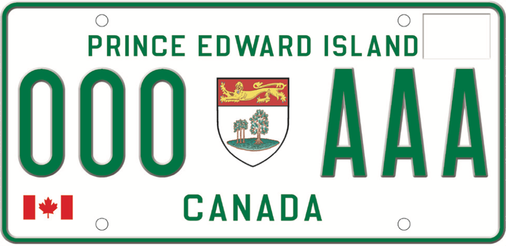
The redesign revealed in 2022 is finally a worthy successor to the 1981 classic. This design is simple, readable at a distance, and includes the key information in the largest font size possible. The “Canada” qualifier has returned with an improvement: the simple and recognizable Canadian flag.
The coat-of-arms of PEI, with its imperialistic lion, and three small and one large oak trees is featured as it was in the 1981 design, but this time with much more detail. This is a case where the added detail helps. While you won’t discern the details of the crest at a distance, it simplifies into a recognizable shape. This is a textbook case of Edward Tufte‘s principle: To simplify, add detail.
There are a few variations of this plate design tied into current PEI government campaigns, but I’m just happy the simplest version exists.
The announcement doesn’t credit the designers. To whoever designed this and whoever had the authority to commission and approve it: Thanks, it looks great.
Thanks to those who maintained the Wikipedia page about Prince Edward Island license plates for the history and photos.