![]() Back in October of 2003, I wrote an article with a series of criticisms and recommendations for the branding and visual identity of the Mozilla software projects. Partially, I suspect, due to my cheap and somewhat inaccurate use of the “2.0” version in the title of the article, it got quite a bit of attention. There was a Slashdot article about it, with loads of Slashdot-esque replies.
Back in October of 2003, I wrote an article with a series of criticisms and recommendations for the branding and visual identity of the Mozilla software projects. Partially, I suspect, due to my cheap and somewhat inaccurate use of the “2.0” version in the title of the article, it got quite a bit of attention. There was a Slashdot article about it, with loads of Slashdot-esque replies.
In open source software development, the usual reply to any requests, suggestions, or criticisms is the classic refrain: “Where’s the patch!?” This reply is a (sometimes) polite way of saying, if you don’t like it, fix it. That’s how open source software development works. Therein lies its beauty.
Since the recommendations in my article were not the kind of things that can be fixed with a software patch, I got the graphic design equivalent of a “where’s the patch” response. Bart Decrem from the Mozilla Foundation contacted me and asked if I would be interested in helping out with the branding work (i.e. “where’s the patch!?”). A few months later, I’m the lead of the Mozilla Visual Identity Team.
Our tasks is to improve the quality and consistency of the visual elements of the Mozilla products. Icons/logos, default themes, and other visual aspects of the software are all on our radar.
The team includes two of my co-workers at silverorange, Daniel Burka and Stephen DesRoches as well as other volunteers from a bunch of different time zones. Kevin Gerich and Steven Horlander have done the Mac OS X themes for Firefox and (soon) Thunderbird. They’re also working with Daniel on the default them on other platforms.
Our first major piece of work was to create a new logo and icon set for the Firefox browser, which was newly renamed (formerly Firebird).
Jon Hicks did the illustration of what is now the new Firefox logo and icon. The form was based on an idea by Daniel Burka, and a sketch by Stephen Desroches. Other icons in a similar style will follow for Thunderbird and other appropriate locations.
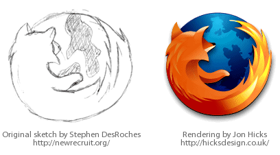
Jon has made a great post about the design process on his weblog. I stole a few of the graphics from his post — thanks/sorry Jon!
 I asked Joh Hicks to help out after having seen the custom icons he did for Camino based on The Great Wave by Katsushika Hokusai. This is possibly the best icon/icon-set I’ve ever seen — it is a work of art. We’re lucky to have Jon working on the visuals with us (thanks Jon!).
Such is the open source world; when a developer looks at something that they don’t like in an application, they fix it (or try). Those of us who are picky about visual and user-interface consistency and polish are looking at the Mozilla applications, and fixing what we don’t like.
There is something truuly significant about the way I was able to go from user and critic, to participant and contributor. I would like to see the same thing in politics and other spheres of life. If you don’t like how something is done, and think you can help improve it, then get involved. Don’t expect someone else to do it.
The Mozilla Visual Identity team is only getting started too. Look for the Mozilla applications, especially Firefox and Thunderbird to get better, slicker, smoother, etc. Thanks to everyone on the team for their great work.
Lots of really great work, Steven. I think you put together a great team of people, and the results are outstanding.
I would be using the new Firebird right now if Mozilla weren’t down.
Thanks for sharing the process. It’s good to see that contributions other than code are appreciated.
Really spiffy graphics there Steven, great work all!
Really love the new artwork.
I’d like to see an 80 x 15 pixel blog button (the current one’s 94 x 15 which is unconventional). I did Photoshop one by removing the “Get” so it just says “Firebird”. That is not violating any copyrights, is it?
Congratulation SG:
Your work has always been great, and this one’s no exception too. Kudos.
Great work to all the team!
Just a question, does this mean that Arvid Axelson’s work (i.e. the Qute skin for FF and TB) will be slowly replaced (the icon has already been replaced, in fact)?
Really impressive new version 🙂
if you’re missing brandwidth to download it, try here ( french mirror ) :
http://www.clubic.com/t/fiche2711.html
Just wanted to give a huge THANK YOU to Steven and his team. The experience of working with this crew is unbelievably productive. These guys not only have great process and great, flame-free, team work, but they also consistently crank out really beautiful art.
I think the creation of this team may be one of the most important positive developments for the Mozilla project this year.
Can’t wait for the new Thunderbird and Sunbird logos – assuming their names don’t change too 🙂
Gorgeous icon! I can’t get enough of it and the new banners and about screen, especially love the colors and layout. Proper job. Thank you for your hard work! I also can’t wait for the TB icons 🙂
Now, I love what you’ve done, and no I’m not going to pop in a criticism about your work after buttering you up. What I’m curious about is, what’s going to happen to Arvid Axelsson? He’s the one that has done the Windows icons and themes for both Phoenix (*cough*Firebird*cough*FireFox*cough*) and Thunderbird. Is this new team planning on including him in the process?
It’s a gorgeous icon, too bad the browser is pretty horrible. I’ve already submited 15 new bugs that weren’t in the last one. No scroll bars ever. No back and forward button ever, etc. etc. Firebird 0.7 is still the default. They shoot, they air ball.
I have lubed properly, and am now accepting your feet into my A$$. I just realized I was using an out-of-date theme. That took care of almost all errors. My appologies, I was pissed.
But still no word on why the name change occurred? I was kind of fond of the solid-sounding Firebird.
Insightful post and impressive work. I use Safari almost all the time, but I’m curious enough to try out Firefox on the basis that it I like the branding. Ah, the power of marketing….
I’m so glad Firefox has an icon that reflects how delicious it is to use.
And, what a coincidence, I list Code Name: Foxfire on Orkut as one of my favorite TV shows ever and lo and behold, Mozilla Firefox … uncanny …
Willem: Why the name was changed.
My best regards for your team’s great job.
The efforts of the Mozilla developers community really needed a presentational refinement to be ready for the prime, and now they have it.
Now, I’m a bit curios about your plans for mail app name: the previous couple, Firebird/Thunderbird, was strongly linked together thanks to the -bird… are you going to thinker about a new name for Thunderbird too, or you’d rather prefer to stick with the current one?
The Firefox logo is good (interesting that the inspiration, seen here, looks so much like the Napster logo).
The ‘Take Back the Web’ logo is genius.
Hi,
very nice logo. I am a phd student of biochemistry, but I also have a small “design studio”. Since one of my friend is one of Mozilla team in my country (czech republic) I did some illustrations for him (for mozilla). Maybe someone can find it usefull. On my page (sorry but the page is in czech language only) you can download the logo of Mozilla in vector format and a small icon set for Mozilla calendar. The links are as follows:
http://www.biographics.cz/experiments/exp_0001/
http://www.biographics.cz/download/
::.m.art.in.::
The new logo is really good. I use Mozilla and Mozilla Firebird very long time and I think that the new name Firefox is better than Firebird. I like also the icons on mozilla.org website!
Great job!
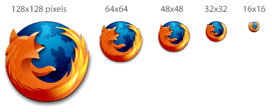
Some absolutely great work – I’m especially impressed at how the logo’s maintain their clarity even at smaller sizes
It’s a great icon. The only thing I can complain about is that you can’t see the fox’s face. 🙁 It would be cool if the fox was used elsewhere doing other things.. ie walking, posing, beating IE with the lette I. Just to put a face and make the mascot more personable – much like Tux is in Linux.
Hi
Will you respond to comments?
I think the new firefox icon is really good and the theme is good here and bad there… So using your artistry, maybe improve theme?
Any chance you guys will be making a full Firefox
icon pack (i.e. an icon for each type of Firefox window)?
I’d love to see this included at
http://iconpacks.mozdev.org/installation.html
LenW: Yup – we’re planning on creating the rest of the icon set. In particular, we have nice document icons almost ready. Keep an eye out for them in nightly builds (could be a few weeks before you see them though).
Steven, thanks – looking forward to an iconpack.
One more question/request. I don’t know how common it is,
but on my winME large-font config, the icon in the
window’s titlebar and the icon in the desktop toolbar
are both 20×20 px.
Any chance of adding a 20×20 icon to the set, as the
interpolated one looks a bit ragged on a light background.
Cheers,
-LenW
I should add that the ico file I am using is from
http://members.lycos.nl/mozillafirebird/firefox/firefox.ico ,
which I found through Mozillazine.
Don’t know who actually made that file, as I couldn’t find
one on an “official” site.
a few of my friends from art school were over the other day and while they were looking at my desktop they saw the firefox icon. “hey man, that’s a great graphic, what program is that for.”
“oh, it’s just this cool open-source web-browser based on the engine in mozilla,” i replied.
“i dunno what the hell you just said about mozilla or engines or whatever, but that is a really well-done icon, where can i get the program?”
so i pointed them to the site. i was impressed that the illustration and graphic designers both liked it with equal measure..
just wanted to let you know that you had the stamp of approval from some pretty talented students at school here.
regards,
spear
Lovely work. This line rang true with me:
“There is something truuly significant about the way I was able to go from user and critic, to participant and contributor.”
I’m involved with the development of the visual identity (inc XHTML/CSS) for http://www.cacert.org – I too moved from making suggestions to actually implementing changes. We could do with more graphical skills too!
I love your contribution to the Firefox effort. Without a doubt one of the most impressive pieces of artwork for the web I have seen. My question is, when are we going to have your artwork added to the nightly builds of Firefox? I love to download the latest work nightly, but I must confess everytime I do so I look for the new icons and am disappointed when they do not appear. Any chance of the new logos being ported to the nightlies soon?
Thanks again for your incredible contributions.
Dr. G
And now you can get the firefox logo on a trucker hat.
http://forums.mozillazine.org/viewtopic.php?t=56216
hahaha
Stephen,
I was a fine of your branding article when it first came out. I think you are spot on. The one thing that is worrying me about the new logo and name (it looks beautiful) is that it doesn’t mesh currently with Thunderbird. How are you planning to link visually the two? Are the names going to change? Did no one take your suggestion to eventually drop the names and go to Mozilla Browser and Mail?
Answer all that you feel you can. Good work.
I thought the new FireFox logo was very much like the FireBird logo by Jairo Boudewyn, which can be seen at http://skins4.wincustomize.com/JairoBoudewyn/dock/firebird_2_jpg.jpg. Did he base his design on someone elses design that I haven’t seen? If not, I think he should get some credit here.
*drool*
You’ve been “mozillazined” as has Jon Hicks. Better take a screen shot for posterity. Congratulations!
awesome love it. it just looks so great, its your fault I am surfing the web instead of studying
I love the new browser which performs like a very fast fox, sly,quick, cunning, mobile, and best of all useful and safe. The icon is outstanding. Keep up the great work.
“Therein lies it’s beauty.”
— “its”
“I’m the lead of the Mozilla Visual Idendity Team.”
— “Identity”
Is there a way to modify the installation files to make a customa installation with a custom name?
I have been using my own version of FireFox with additional search plugins (including sourceforge, amazon, barnes & noble, PubMed, and Wikipedia) with default features (including session only cookies), a default cookper.txt and bookmarks files (perfect for my workplace), and a smaller cache (10MB). This was nice to install in workplace where I do not have to do all the above every time. I used to do that in Mozilla using:
http://www.mozilla.org/unix/customizing.html
http://www.geocities.com/pratiksolanki/
I could not find a document relating to FireFox. The startup page is still annoying me. I still think that users should be prompted to choose a defualt name during the installation when using the “custom” rout.
I’d like to see the world as it really is in the background. I mean, this is Earth, and Earth people are going to be using this browser, so why not have Earth in the background? There is some sci-fi planet behind the Firefox. It looks goofy.
John, there are a surprising number of ramifications to drawing a true globe in the logo. There was actually a good discussion on this topic during the development of the concept. If you show North America, as some of us North Americans on the team would have expected, then is it excluding the rest of the world? People in different parts of the world are actually quite sensitive about that kind of thing. Hence, a representative globe makes the most sense, whether or not it looks a little goofy.
Have you thought about producing SVG versions of the images?
Don’t change the name!
I’ve been using Firefox and Thunderbird for a good while now and I’ve been extremely happy with them. The new Firefox logo is really beatiful. Hopefully we’ll see the TB logo work follow the same lines.
Now if could just get a site like Burning Edge for Thunderbird, I’d be extatic. With Firefox it’s relatively easy to follow the changes/fixes, but with TB we don’t have that visibility.
What would be the problem with having a “rotating globe”? Since most OS’s don’t support animated icons on the desktop, you could simply change the default icon every time the firefox executable is started.
Thus, you would see the FireFox over each continent… or at least Atlantic and Pacific oceans 😉
Hi,
Thanks for the great work on Firefox. I tried for ages to get a friend of mine to dump IE for Phoenix and then Firebird, but only with Firefox have I managed to finally convince him. Firefox is just so cool I’ve placed links on my site to the Firefox download site… On the subject of graphics, I’d have to agree with some of the other posters here: it would be cool to see the fox’s face at some point, and I’d definitely go with the idea of the fox beating/out-foxing IE in some way as a graphic, perhaps on the Help>About menu or something… Keep up the good work.
Well, I believe an Chrystal theme as default would help firefox a lot. Unfortunately Firefox looks very bad on Win98 maschines as it uses the default grey background.
I think Mostly Crystal is an outstanding wrap. Would be great as default.
I LOVE Firefox, and love the icon design…..but where can we download a copy of it as an .ICO file, so we can actually get our Firefox to USE it as an Icon? So far, I can only find PNG files, and although they are VERY nice renderings, Firefox has admitted that they have a glitch so they don’t have the icon embedded in the program, and I gotta stare at that stupid Windows icon. PLEASE convert it to a ICO file for those of us who don’t have that ability…. Thanks
I downloaded Foxfire, and like it……but, I’m told
that I’m missing a file called “editor.xul”. I did Yahoo, Google, Microsoft, Dell, and no one seems to have ever heard of such a file. What happens is that
clicking on a “.doc” file in My Documents brings up
this notice, but no files. Know where I can download
This file??? Hate to bother you with this, but can’t find any “official” website for such a request.
Thanks for any help.
Firefox is the browser for the *me* generation!
There is a problem with the Sunbird.
Now that the line of birds is broken it seems a litttle bit off to still have two birds in the stack. I think Sunbird must be renamed.
The fox is sniffing up stuff on the net, and fetching pages, that makes sense.
The bird flies in with the mail and stuff… that makes sense.
So, shat could be suitable for a calendar? Something about organizing, or something seasonal? A fish? A lizard? A sqid?
I don’t know, but “Sunbird” has to go…..
I don’t know if this is in anyway official but there is a SVG Firefox icon as part of the Nuvola Gnome theme (part of gnome-themes-extras). The icon is only in CVS but you can grab it from ViewCVS [link]
Thanks for the great logo, very cute!
This Article was mentioned on actsofvolition.com