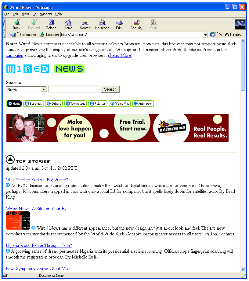
I’m sure you’ll see this on every weblog around in the next few days, but I thought it was worth posting here in light of my open letter on CSS and the response it got. Wired News has completely redesigned their entire in standards compliant XHTML/CSS. It looks great, you can re-size the fonts in your browser, and Netscape 4 users (or any older browser) will just see the plain old content (screenshot) – not pretty, but completely accessible.
This certainly defeats the misconception that XHTML/CSS can work for simple weblog sites, but not realistically for a major content site. The next step will be to see a big name ecommerce company make the move.
Netscape 4 users are going to notice a pattern in the next year – sites are going to start looking a lot more like they did in 1997.
it’s time to show netscape 4 users what they are missing by not upgrading to the latest web standards. It would almost be classic to see the sites that no longer support the older browsers show a screen shot of what they are missing and could be experiencing.
I like the fact that I can re-size the fonts for only that website and it doesn’t affect everything (meaning any other site I go to).
At many sites, such an upgrade would be a blessing. I’d rather see many sites in the “Stripped down for Netscape 4” than in their “designed” state. The coming XHTML wave could be a blessing in ways we haven’t yet predicted.
Oh damn, they did it.
Text-size selected at the cookie/session and browser levels? Liquid? Table-less (least important, but … table-less?!). Media-specific stylesheets @imported for Netscrape’s protection? And it degrades?
Jesus.
What’s significant about this is the trinity: relative text-sizing, CSS-only layout (also relative), and XHTML semantic coherence. Guess my (personal site) redesign isn’t almost done.
If nothing else, it’ll no longer be enough to preserve browser-level text-sizing. I’ve done it and pretended along with everyone else that there are more than 54 folks out there actually using it. Skin-able text sizes just became something more than nice to have.
I’m not convinced text resizing widgets are a good thing. Better to pick a suitable default and allow resizing via the browser, even if most people aren’t aware of it, than have every site on the web cluttered with text-sizing controls, each of which would look and work slightly differently. Also, I think some are perhaps using widgets to deflect criticism (people slagging off your miniscule text? Just bung in a widget).
“It would almost be classic to see the sites that no longer support the older browsers show a screen shot of what they are missing”
That’s a good idea I’ve not seen suggested before, I might do that (very tactfully) for the next version of my weblog (which certainly won’t look pretty in NS4).
Matt, I totally agree. No-one should have to re-learn how to resize text on every website. If my vision is poor, it doesn’t change from site-to-site.
Fortunately, Wired chose to let the browsers resize the text with their settings, something that a lot of CSS site are not alowing these days. See my cool graphic of the setting in IE – in the same post you can read about how I agree with Jakob Nielsen that you should always let the user control the font size. On of the first things I do when setting up a new computer is change the toolbar in Internet Explorer to include the Font Size control (see screenshot).
Also, text resizing widgets (and style-changing widgets) have always struck me like ‘skins’ (I’ve written at length about why skins suck – see my original skins rant, dating back almost two years, but I still feel the same way, and see my thoughts on skins in Winamp3).
The impact of the Wired redesign is setting in. They actually use header tags (H2, H3, etc.) for their headers! It’s a revelation! These are the humble beginnings of a return to HTML as semantic markup. I’m looking forward to doing the same with a redesign of aov (which, like any great work, will appear when its ready).
On a semi-related note, here’s a power-user font resizing tip: In IE on Windows (perhaps elsewhere as well), if you hold down the Control key, the scroll wheel on your mouse will adjust the font size up and down. I use this all the time when tiny fonts are hard to read – easy to whip up and back down when you’re done. However, this will further highlight the frustration of browsing sites that don’t allow the browser to resize the fonts.
No-one should have to re-learn how to resize text on every website.
Ordinarily I’d agree. Using a website shouldn’t be like learning a new application. Still …
Text Size : A A A A A
… is pretty straightforward, and is presented unobtrusively at Wired News: you don’t feel like you have to do it. I just don’t see the harm, especially considering that browser-selected size remains. Maybe session-level control is best, rather than cookie persistence. Folks could get lost in the layers.
I sense a remote control TV-volume metaphor wherein a user remembers on this channel that two clicks up is just right. Then it sticks, but for this sitting only. Next time I sit down to watch, the volume has returned to normal. But I know how I like it and can get there in two clicks.
Folks who never notice the feature or don’t try it carry on as before.
Lou: I agree that if you are going to have a text-sizing widget on your site, what Wired has implemented is a good example – not intrusive – simple and intuitive – so I don’t want to drag the issue out too much.
That said, to try and turn your metaphor back on you, is not lot like have the volume button move around on the remote depending on which channel you’re on?
To get really picky, if you are going to have the control, it would be nice if it had a visual indication of the current setting (it does after you use it once, but not before you’ve clicked it at all). To resize the font, you first have to fish with a few clicks to see where you are before you can decide where to go.
Yep, the moving volume control is a problem. Ever used a TV remote (in the dark) with a 4×3 numeric keypad instead of the standard 3×4? A design nightmare.
Still, you can ignore the widget, and it could easily be fixed to display current state. I’ve screwed with such a device ten times and never implemented it. If it can be done right, Wired News is close.
Beneath all of this, of course, is the fact that careful preservation of relative text-size is wasted on a clueless general user base. I do want users to know they can magnify text, and they aren’t getting it. Browser-level controls are inscrutable to them. They see my web application, perhaps unwisely, as the application in fact.
If Netscrape4 users should prepare for change then maybe general users could do with some as well: change in favor of choice right now, within perspectives we can’t wish away. The browser doesn’t make clear what is possible, and isn’t going to. Perhaps we should.
this debate seems a bit of non-starter, i fail to see why the user should need to alter any component of a properly designed site, bar disabled users.
isn’t the onus on designers to simply build things that work? readibility lies first and foremost with designers, not browser developers. and certainly not with users, of whom i’m sure 99% are and prefer to be (and rightly so) passive.