 I owe these guys – they taught me a lesson that was key to the success of Acts of Volition: never promise anything. No regular content, no deadlines, nothing.
Kaliber10000 (aka k10k) was an enormously popular (enough to have backlashes) web design ‘portal’ (I’m sorry to use the word portal, but it’s true). In 2000, they opened up their news section to an elite group of web hot shots and the site became the collective weblog of the design community.
Though often saturated with design-for-designs-sake crap, the site was still always a great read because it was a casual congregation of interesting people (currently featuring Derek Powazek and former Slice of the Month, Jeffrey Zeldman).
How did they teach me this lesson of ambiguous publishing schedules? Last year they decided to take the summer off and close down the site until September. The site was down, almost a year, until yesterday.
People criticize, but they defend themselves by saying, $#@! Off – we run the site for free. Fair enough. When people tell me that Acts of Volition should do this or that, I say “sure, and you should give more money to charity”. It’s a logically questionable analogy, but effective in conversation.
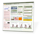
I usually try to avoid linking to ultra-popular links that are on every web log and site on the web. Whatever it is, I figure you’ve probably already seen it. I break from tradition today and link to a fine site, worth the ridiculously long wait: Kaliber10000 (www.k10k.net).
For those interested in the frequently update news box on k10k, but not interested in loading the whole slew of iframes – you can bookmark the newsbox itself.
Not much different than the old k10k. Still hard to read, follow, use. Still slow to load too. Not a fan.
Perhaps I’m in a super-minority (old regular readers of K10k who view the web on an 8×6 screen) but I’m at least the old site fit on my screen. This one drips off in all directions. Yeah, I have a monitor on my other computer which I can crank up to 20/20 users only mode, but when I surf for fun, I use the iBook with the Wi-Fi because the couch or bed is way more fun than the office chair. I entirely agree with Randy, but yet, my designer roots make me hold an affinity for “design for design” sake sites which totally disavow themselves of all the usability and IA I’ve taught myself in the past year.
Steve: that link to the news rocks. You should have listed that on the front page instead of hiding it in here!
There are plenty of good criticisms of k10k – too big, too slow, to small, and so on (see metafilter thread). I don’t really disagree with any of these criticisms (take a look at the sites I’ve helped design – certainly not k10k inspired). However, I do think that many of these criticisms are just not worth making. Saying k10k has too many graphics is like saying McDonalds is greasy – that’s the point.
What k10k really has going for it right now is the fantastic roster of news authors. They’ve been acused of being a design elite in the past. Well the current roster is the design elite – and it’s not all pixel-monkeys – Powazek and Zeldman are in there.
I’ve put in a request for an RSS feed of the news. This would allow all the complainers to get the great news feed in 48-point Arial if it so pleases them.
I’m an old regular reader of K10k too. and i guess k10k target was never be standard support, or bandwith saver, in fact they said they website was made for 1600×1200 screens resolutions and t1 connections… that’s their target, so people who waits to see a fast loading website production will get a really bandwidth consumer website, i dont have any idea how much bandwith can consume that big website, but i guess it’s not so less than any guy can pay…
I am too a pixel-monkey! Eep! Eep!
Haha – alright Derek. We’ll let you be a pixel-monkey.
As far as the K10k discussion, I have to completely agree with Steven. Sure the site has a million+ graphics and takes forever to download. If they were telling us this site is the ideal site for everysite and the best way to design for your clients – that would be another discussion.
K10k has helped connect many people to a world not many of us would ever be allowed to connect to – or even know about. Their information and Internet wide news allows us as web developers to simply grow.
A Hat tip to these guys and deep wishes to be on the author list (as so many of us have dreamt about) 🙂
What about that they helped more to connect people… i guess they helped to develop new wave of design, while in early 1998, designs where really bizarre and not so cool than before k10k rave… after k10k lot of people started to develop a common style… then some people did variations and a new wave came out… thats a good phenomenon. I hope people will keep this emotion on design.
Great as it is, i can’t help but feel there’s a hell of a lot of
poorlyweirdly appropriated content (read: clutter). Stereotypography.com, on the other hand, is a godsend.Just wanted to pop in & drop my 2 Danish kroner. First of, standards support – we’re all about the standards support, baby – the only reason the site doesn’t validate completely is because:
a) we’ve kept in the leftmargin, marginheight, etc, tags for older versions of IE
b) we’ve had to place form elements between “tr” tags because otherwise they would move things around in IE 4.5
The site works (and rocks) in all standards-compatible browsers – which a simple view source would have confirmed.
As for usability, the “site dripping”, etc, I couldn’t disagree more – and to be honest it really annoys me when people automatically fire off a comment like “the usability is bad” just because it doesn’t look like useit.com, and the font sizes are fixed at 10px. Usability is not a set a fixed values, it’s not a one size fits all-thing – usability is a dynamic concept, which can be changed & modified according to your target audience, their experience, and what they expect from you. It reminds me a bit of the comments we got off our Moodstats application – people were saying that it was an example of bad usability because it didn’t look like a “regular” application, which to me makes no sense at all.
I find the site structure extremely simple to understand – issues to the left, features in the middle, news to the right – and everything is nicely boxed up in its little area. There’s a lot of stuff going on, yes, but that’s because it’s a large site – which is really not something we should be penalized for.
Lastly, bc, have you tried using the customize-button in the menu to set the size of the frontpage? The small setting fits within 800×600.
mini-d: well, actually we say the site is optimized for “two 48 inch Cinema Displays on 4.2 gHz powermacs on big fat T3’s” 🙂
mschmidt: The two points you mentioned that break standards compliance (pre-IE margins and ‘improperly’ nested forms) are the same two that are keeping most of the commercial sites I develop from validating as well.
Fair or not, in their success, the k10k crew has come to represent a certain design esthetic. When you come to represent a vague movement like this, you become a lightning rod of sorts. On the opposite end of the spectrum, this is exactly what has happened to Jakob Nielsen; Constructive and just criticism is dwarfed by the overwhelming number of people shooting from the hip with broad and often inappropriate criticism.
Of course, being in a position like this also has its positive side. For Jakob, that means getting $10,000 for a one-day seminar. For the k10k crew, that means PowerBooks and shout-outs in Wallpaper.
Thanks for posting, mschmidt. Nothing grounds a conversation about someone like having them walk right in on it. It’s good to remember that we’re talking about actually people behind the pixels. Trés Design For Community.
Wow, I just tried the customize option on k10k… It’s impressive, to say the least.
That is whack web design my friend, Keep the glide in your stride.
Hey, just like to mention that when I initially replied to the size issue (above) I had tried the customize option, but it didn’t load right for some reason (could be that I have a crummy 28.8 connection and was running it in a Mozilla beta– so that’s to say “not exactly fair”) and I based my judgements on that.
However since that time, I tried it in IE5 (mac) and saw it work (the small version actually doing away with the features in the middle) and tried again with success (thanks to patience) in Moz. After it worked in small mode, I still felt a little cheated because I had half an animation running (couldn’t see the full “we adobe” signage until I maximized my browser, dragged the window way off my screen to the left, and extended the window till I could see the ends of the footer and headers in their entirety), and because the “features” were simply removed from the screen. I would have put them simply at the bottom of the screen (scroll down to see).
On my third visit, I achieved peace with myself, knowing what the headers and footers said, and not missing the middle “features,” because I was most interested in the news portion (honestly, I use the link that Steven posted for the ‘news-window-only’ mostly, because it loads wicked fast [kinda like a xml syndication/ web service] and news is what I come for). But the bottom line is, in this unique case: a designers 4 designers 4 design’s sake site I don’t really care that it doesn’t rock my world at 8×6. If I want to see it in all its glory, I can fire up my Studio Display and crank the res up real high. No biggy. I’m a Dane (er, Danish-American) who can put Jakob-esque usability in perspective: here 90% of it simply doesn’t apply.
Nevertheless, ‘word up’ on your efforts M, for some quality coding and other fine detailing on the site: which of course is the beauty of K10k.
“Usability is not a set a fixed values, it’s not a one size fits all-thing”
Exactly, and K10K doesn’t fit for a lot of people so don’t be surprised if they criticise it. Add “It is my personal view that..” to the start of such comments if you have a problem taking the flack, but don’t assume they’re all written by useit.com fans.
Be flattered that the site stirs up strong opinions!
k10k may be “kewl,” in some abstract design-for-design’s sake sense, but I sure hope no one actually expects to use that type of design for anything useful — like conveying information, selling products, or communicating. Good for artists, maybe — but usable? Not in this lifetime — and I’m at a university with a fast connection!
Urb