We’re the readable blog of the week! I’m blushing.
Gnome Outliner: A Project is Born
Wow. Earlier this week, I posted a draft spec for, Gnome Outliner, a project I hoped to see developed. The response has been remarkable. Only four days later, there is a beggings of implementations in Java, Python, and C. It looks like, as I had hoped, I’m not the only one who would like to have a nice outliner for Gnome.
We have create a project on SourceForge to act as a home for the project. This will provide a bug database, patch tracker, CVS, and mailing list. So, if you are interested, please sign up on the mailing list (gnomeoutliner-devel) and get involved.
Thanks for all the great feedback.
We’ll be meeting our local Green Party candidate
Gnome Outliner: A Proposed Application
Since I’m now using Gnome as my primary desktop environment on Linux, I find myself wishing I had a simple outlining application along the lines of OmniOutliner. However, there doesn’t appear to be such a thing for Gnome (despite some old/abandoned projects).
Unfortunately, my limited skill set does not include the skill necessary to create such an application. So, instead of coding, I’ve started a draft of a specification for an application-to-be: Gnome Outliner. I’ve written this in hopes of generating developer interest to create such an application.
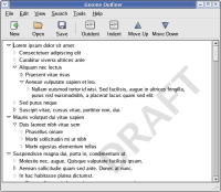
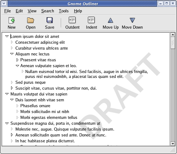
I’ve written up the idea and done a basic mock-up of the interface. Please let me know if you have any interest in the project.
UPDATE: There is now a project for this on SourceForge: Gnome Outliner.
George Orwell would use Firefox

When the Mozilla Foundation announced the name change for their web browser from Firebird to Firefox, there was a predictable response of skepticism. It was the second name change and people were understandably skeptical that the name would continue to change.
Even though the Mozilla Foundation was clear that Firefox was indeed the final name and was subject to a significant amount of scrutiny to avoid any future pitfalls with the name (trademarks, etc.), people still felt the need to chime in with suggestions.
And no, Thunderbird will not be called ThunderFox. Ever.
All of this was something of a tempest in a teapot – with the world of developers and webloggers (each of us a marketing expert) with an opinion (see the Slashdot thread – or don’t). Fortunately though, the final name change took place just before Firefox began its foray into the mainstream.
As the good Mozilla Foundation folks predicted, there was a small fire-storm of criticism (thunder-storm?), and then, only a few months later, Firefox has been generally accepted and the name changes forgotten.
While it’s not on the scale of the great Orwellian WWF-to-WWE switch, our own little Orwellian name switch has gone quite smoothly. Except for one hold-out office mate who insists on calling it it “firecat”, people have gotten comfortable with the new name, and with the rate of growth and exposure that will come with the 1.0 release this summer, a growing percentage of the Firefox users will never have even known the previous names.
Firefox is Firefox, Thunderbird is Thunderbird, and we all live happily ever after. Onward to 1.0!
Following rules makes you stupid

Salon is running an article by Linda Baker about a new line of thinking in traffic design that lets people govern themselves. The idea is a bit counter-intuitive, but the article explains it well. The basic concept is that when you have no rules and as little division between roadway, sidewalk, and common area as possible, transportation can actually be safer than with more rules. As the article states, “It sounds insane, but it works.”
While I’m intrigued by the idea, I’m not writing to advocate traffic law reform. Rather, it was a greater idea behind this new school of traffic design. The idea is that people will act in according to the responsibility and freedom they are given.
This idea is articulated in the article by urban designer Hamilton-Baillie: “The more you post the evidence of legislative control, such as traffic signs, the less the driver is trying to use his or her own senses.”
This is not a new idea. Stripping people of their individuality to encourage obedience and efficiency has been practiced by the military for centuries (it’s part of the reason new recruits have their heads shaved and are often forced to carry out meaningless tasks without opportunity to question their superiors).
This same phenomenon can be found, to varying degrees, in government and private corporations. I once ordered a sandwich at a local Tim Horton’s and was told they were out of bread. Seeing that they had bagels, I asked if I could just have the sandwich on a bagel. This request was met with blank stares that suggested an inner-dialog along these lines of “We don’t make bagel-sandwiches” or “There’s no button for that on the cash register”.
Had this sad employee been at home with a hankering for sandwich, some ham, and a bagel, I can only assume they would be able to put the ingredients together. Instead, they were worrying about how my simple request fit into their basic regiment.
I’ve always been bothered by organizations where people are no empowered to use their common sense. However, until I read Linda Baker’s article, I hadn’t considered that it may be even worse than it appears. When governed too tightly by rules, people forsake their own common-sense and offload their decision making process onto the system that governs them.
Perhaps this should be an amendment to Garrity’s Law of Inverse Congregational Intelligence.
RedHat is looking for a designer – after Garrett’s departure, the Linux desktop needs your help to be more beautiful!
A good article: Cold Turkey by Kurt Vonnegut
Congratulations Dan and Becky
When a close friend reaches a new stage in life, it can rock your world. When that close friend grew up with you, is close to your age, is in a similar place in life, and regularly plays Nintendo with you, it can rock your world all the more.
Today my great friend Dan James is getting married. I’m honoured to be the best man – especially since my best-manly duties include driving a bad-ass gangster-mobile.
Since we’ll be driving around to various ceremonial shenanigans in such a sweet ride, I thought I should prepare some music that suited the transportation. My Chrysler-300-wedding-day-drive-mix is as follows:
- Big Sugar – Diggin’ A Hole
- AC-DC – Thunderstruck
- Blur – Song 2
- Cake – The Distance
- Crystal Method – Busy Child
- Crystal Method – Magic Carpet Ride (Techno Remix)
- Jimmy Eat World – A Praise Chorus
- Joy Electric – sugar rush
- MxPx – Chick Magnet
- MxPx – Kings of Hollywood
- Pluto – The Goodbye Girl (Pop Goes The Girl Radio Remix)
- Smashing Pumpkins – Today
- The Darkness – I Believe In A Thing Called Love
- The Hollies – He Ain’t Heavy, He’s My Brother
- U2 – Hold me, Thrill me, Kiss me, Kill me
Congratulations to Dan and Becky. Thanks for including me.
Amazon A9.com Search Review

When Amazon’s A9 search service was released last month, I put together a quick A9 Firefox search plugin and tried it out as my default search for a week.
I’m back with Google as my default now and I’ve written my thoughts in a brief review of A9 at silverorange stuff.