Video from GUADEC, the GNOME User and Developer European Conference

GUADEC logo

The GNOME User and Developer European Conference (GUADEC) is underway this weekend in Stuttgart, Germany. For those, like myself, who are unable to attend, the fine open-source media company, Fluendo is providing live streams and archived videos of the talks.

The talks from GUADEC day one are now available for download. The videos are encoded in the free/open-source Ogg Theora format. On Linux, anyone using a Gstreamer player, Helix, or VLC can play the videos. Windows users can install the plugin for Windows Media Player, and Mac users can use VLC

Thanks to Fluendo and the conference organizers for providing the videos.

Update: The talk by Ralph Giles of Xiph.org (the organization behind the Ogg Vorbis audio codec and the Theora video codec mentions that Yahoo is shipping the DirectShow (Windows Media) plugins for these open-source formats with their Yahoo Music service download. In simpler terms, this means that people who have download the Yahoo Music player can automagically play Ogg Vorbis and Theora files in Windows Media Player. Nice.


The new music video for “Danse Macabre” by Wintersleep (RealVideo) is one of the best I’ve seen lately


I don’t know where it came from, but this animated gif movie is very cool


Who owns your wedding photos?

Matt Round writes on his weblog about how strange it is that many wedding photographers retain ownership of negatives (or high-res originals, in the case of digital photography) and charge clients for additional prints. Indeed.

The photographer who’ll be documenting my upcoming nuptials includes all negatives in his general fee.

Oh, and is it just me, or does “nuptials” sound like a dirty word?


Thoughts on Tabs and Windows

Tab screenshot

If you had asked me, before Firefox came along, if tabs were a good idea for a web-browser, I would have said no, absolutely not. The old Mozilla Browser had them, and Opera had them. Both were clunky and intrusive.

The real reason I would have thought it was a bad idea, though, is that tabs introduce a whole new metaphor to desktop document management. We already have windows – adding tabs inside windows just messes everything up. You can’t use existing operating system window management techniques to switch between tabs, such as Alt+Tab or the window-list taskbar. Why should some documents be in tabs and in a window, while others are each in their own window. It would be anarchy!

Yes, all of the above criticisms of tabs are true, but it doesn’t matter. Regardless of broken and mixed metaphors, after about two years of using Firefox (and the betas that led up to it), I use tabbed-browsing extensively.

Having used them for a while now, I have some thoughts one why tabs do work well for web browsing:

  • You don’t have to use tabs. You can use the browser without even knowing that tabbed-browsing is possible. Just go about your pre-tab browsing business and you’ll not be bothered. No one is forced to learn a new metaphor.
  • Tabs Work well maximized. A lot of my friends and family, especially those with relatively low screen resolutions (800×600 or 1024×768), always run all windows maximized. When running only maximized windows, tabs work almost exactly like new windows.
  • Windowing applications and documents is not always a great system. This article about the file-system browser in Gnome quotes a 1995 study by Microsoft that concluded that “[a]ll but the most advanced users did not understand how to manage overlapping windows efficiently.”
  • Tabs allow grouping of pages, like multiple workspaces in Linux/Unix systems. You can have a set of weblogs open in one window, and a set of work-related pages open in another. This isn’t a killer feature, but I’ve noticed myself doing this.
  • Tabs don’t need to be “managed”. Windows often need to be resized, moved, and rearranged in order to make the best use of their contents and of the rest of your desktop. This isn’t so with tabs. You can’t do any of those things to tabs. I suspect this is one of the reasons people often run all windows maximized – this also eliminates the need to ever move or resize windows.

One of the big disadvantages of tabs compared to windows is that you can never see the contents of two tabs simultaneously. With windows, you can arrange two windows side-by-side, or only partially overlapping. While this is useful in some cases (visual comparing two documents, typing in one windows while using another for reference, etc.), it is not often needed when browsing the web. You just don’t often need to see two web pages side-by-side, and in the few cases where you do, you still can (using windows).

It’s a good thing I wasn’t in charge of the user interface design for Firefox, because I was completely wrong. This is a good reminder that you cannot rely solely on your own intuition when designing software that people interact with.


Robert McNamara has published a remarkable and startling essay on the state of nuclear arms in the US


Windows 95, a study in good design?

Windows 95 Start Menu

We don’t often think of Windows 95 as a shining example of user interface design and usability. It was slow on the hardware of the day, it crashed often, and many of its claimed “innovations” were copied from Apple and others.

All of that said, Windows 95 was a big leap for visual user-interfaces at the time. Even if it didn’t break new ground in design, it was significant if only because it brought many of the visual user-interface design innovations of the previous decade to a massive audience.

I was a huge geek/dork, still in high-school, at the time of Microsoft’s development Windows 95. I was one of thousands who paid $49.95 to order a special preview of Windows 95, which was still code-named “Chicago” at the time. Yes, that’s right, I paid for a beta. I can still remember, it came on 37 floppy disks (seriously).

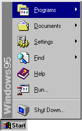
Both Microsoft and their Windows product-line are often considered lumbering behemoths, often with justification. It is surprising to learn that the design process at Microsoft that led to such interface staples as the Start Menu and the window-list task-bar grew out of a small team (approximately twelve people, with another twelve programmers for implementing designs).

The Windows 95 user interface design team used an iterative design process where they would come up with an idea, build a quick/rough implementation, and try it out on users. Then, based on how people fared using the design, they would try again. Rinse, lather, repeat.

This process proved that basic design intuition is often wrong:

“Our first design idea for making window management easier was not very ambitious, but we weren’t sure how much work was needed to solve the problem. The first design was to change the look of minimized windows from icons to “plates”. (See Figure 6.) We hoped that the problem would be solved by giving minimized windows a distinctive look and by making them larger. We were wrong!”

All of this comes from a case study on the interface design of Windows 95. The phrase “We were wrong!” shows up several times in the document. The case study is a fascinating look into what went on, for better or for worse, to be one of the most widespread user interfaces in the history of computing.

Thanks to David Feldman for his article on file browsing in Linux that pointed out this Microsoft case study.


The Science of the Hitchhiker’s Guide to the Galaxy on CBC Radio science program, Quirks & Quarks (audio available in MP3 and Ogg)


Mike Doughty gets his audience to hold up their cell phones at a concert – cool photo


Good audio interview with Bruce Schneier, author of Beyond Fear about the absurdity of “homeland security”