When looking at the podcasts I enjoy, the topics vary from Web and technology (not surprising, given my career) to politics to music. Though I spend a lot of my time thinking about design, I haven’t found many podcasts about design that I enjoy. I think we designers tend to be insufferable when we talk about our ‘craft’.
What does connect the podcasts I love is simple: People talking to each other about things they love.
The Shop Talk Show is two people who love the Web and love talking about front-end Web development.
The Accidental Tech Podcast is three people who love tech (and cars?), and maybe most importantly, each other.
The NPR Politics Podcast is a group of people who clearly love journalism, reporting, and telling stories.
The wonderfully-named R U Talkin’ U2 2 Me podcast is two people who love U2 (and later, REM & Talking Heads) and dragging out a comedy bit to the bitter end.
The Slashfilmcast podcast is about three people who love movies so much, I can enjoy listening to them review a movie I know I’ll never see.
While it may be obvious that people will tend to talk about the things they love, it is that love that I find so compelling.
It reminds me of something a friend told about about the band I was in back in high school. They told me they enjoyed our band not because we were good (this was said with love), but because we so clearly loved what we were doing.
So, maybe Interstellar was right. The fifth dimension is love!
I love playing video games but haven’t played many since I had kids about a decade ago.
In the past year, I did squeeze in a bit of time and replayed a few old favourites (like an older person who never gets past the music they discovered as a teenager, which is also true for me). I played through the Half-Life series and the StarCraft series. Both were filled with nostalgia and were fun.
I also got in a much newer (by my standards) game, Sayonara Wild Hearts – which I loved.
In addition to having more limited free time, I’ve noticed another change in myself over the last ten years: the idea of simulating shooting other people for fun feels deeply problematic.
What I enjoyed most about these games is the simple sense of progression and accomplishment. I’m not looking for an “open-world” experience where I can do anything – I get enough of that ambiguity in my life. When I’m playing a game, I want to be told what to do, do it, and then get a pat on the back for it.
I’m not sure it’s healthy to seek a sense of accomplishment from video games, but there are worse vices.
After finishing up a nostalgic replay through the campaigns in StarCraft II recently, I turned to a different source for the sense of accomplishment and progression: online web development tutorials.
I’ve come across a lot of talk of “gamification” in my work as a Web designer. I’m automatically skeptical when I come across a new term. I’m especially skeptical about gamification as it was often used as a euphemism for ‘manipulating people into using our thing’. One notable exception is Duolingo, which I see as a positive and effective example of using game-style achievements to help encourage learning a new language (disclosure: I have worked with Duolingo through my job, and they do make money when you use their service).
I’ve found that a simple Web development tutorial seems to hit the same spots in my brain that a good game does. I worked through the NextJS framework tutorial and the RedwoodJS framework tutorial. Each took less than an hour (which I did in 10 or 20 minute blocks with frequent interruptions).
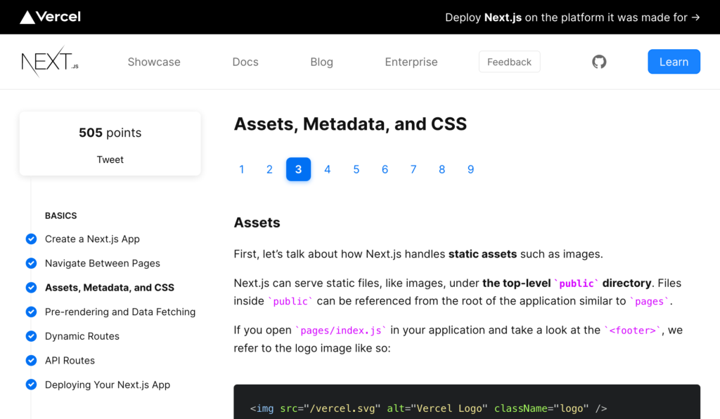
A screenshot of the Next.js tutorial. Look at those page numbers… so linear.
I found the NextJS tutorial particularly well written and designed. It was written at a level that I could handle (my strengths are in HTML/CSS and design, not in JavaScript or other programming languages). It didn’t feel needlessly “gamified”, except for a goofy “points” system they encourage you to tweet about. This was easy to ignore.
What I learned here is that a well-architected learning pathway can be as engaging and rewarding as a great video game. There’s also less simulated violence.
Today I learned about the “birthday rule” in the insurance industry. As described in the Web interface to my health insurance provider:
All insurance companies use the “birthday rule.” The parent with the date of birth that’s earlier in the year submits the claim to their plan first. Then the other parent submits the leftover amount to their plan.
~ Giant insurance company
I’m pleasantly surprised to learn of such a simple consensus having emerged in an industry I don’t associate with simplicity (sorry insurance-folk).
I’ve run into an issue working on a side-project with the CSS Grid. I’m not sure if it’s something I don’t know how to do, or if it’s not possible given the constraints I’ve got.
This delightfully simple no name® branded cocoa powder made clear something I had never realized: The English and French spellings of cocoa / cacao just swap each “o” for an “a”.
I’m fascinated by this on several levels. First, I like that it’s a simple request. If you have an urgent need, you could ignore it and sign-in anyhow. It didn’t involve a complex new sign-in management feature in their web application.
On the other hand, I’m curious about what the bottlenecks are, and why is it OK for anyone to sign in on Fridays, Saturdays, and Sundays?
I’ve noticed that most financial market charts in the news zoom in on the area of change, rather than start with a base of zero. In some respects, this makes sense. When you’re discussing a sudden change, focusing on that part of the chart can highlight the change and illuminate details within it. However, with focus comes a loss of perspective.
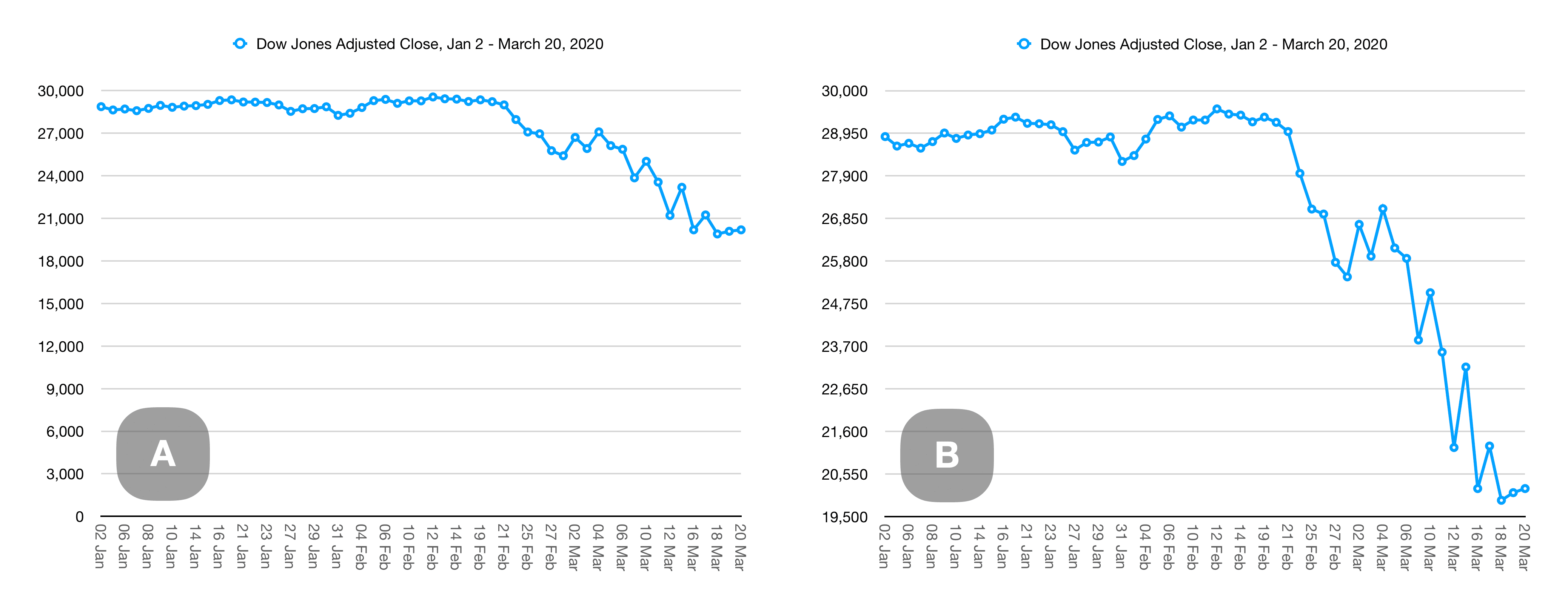
Take these graphs, for example. They are based on Dow Jones closing averages from January 2 through March 20, 2020 (from the trustworthy-sounding source: Yahoo!) and are made with the Numbers app for macOS.
Changing the baseline
Charts A and B both show the exact same source data. The only difference is that the baseline of chart A is 0, while the baseline of chart B is 19,500. One looks bad, the other looks like the end of the world—like all wealth has evaporated. Chart B highlights the change, but also hides the vast bulk of value hidden below the baseline. Which looks worse to you?
Two charts, same data. Chart A has a baseline of 0. Chart B has a baseline of 19,500.
Changing the scale
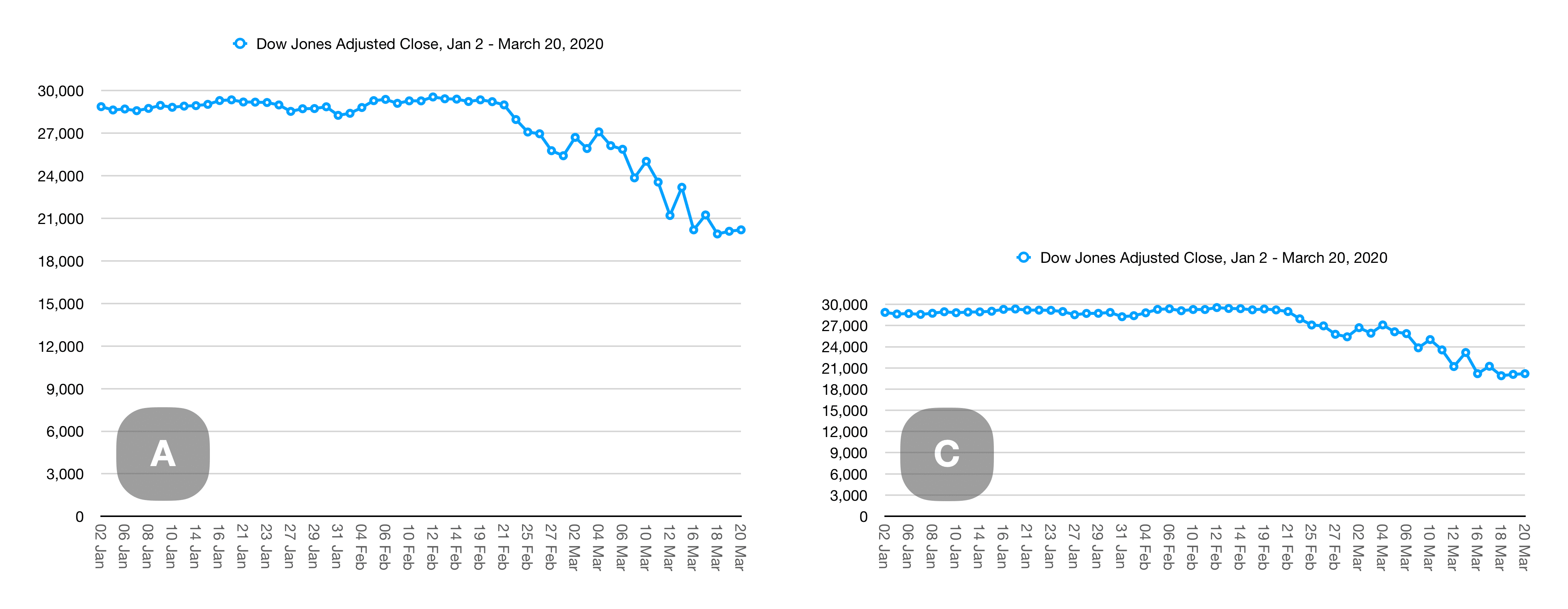
Charts A and C are also based on the same source data and both share the same zero-baseline. The only difference here is that chart C is squished to about half the height, while keeping the same width as chart A. The drop in chart C looks much less significant, but the numbers are identical.
Two charts, same data. Chart B is just compressed vertically.
Changing the baseline and scale
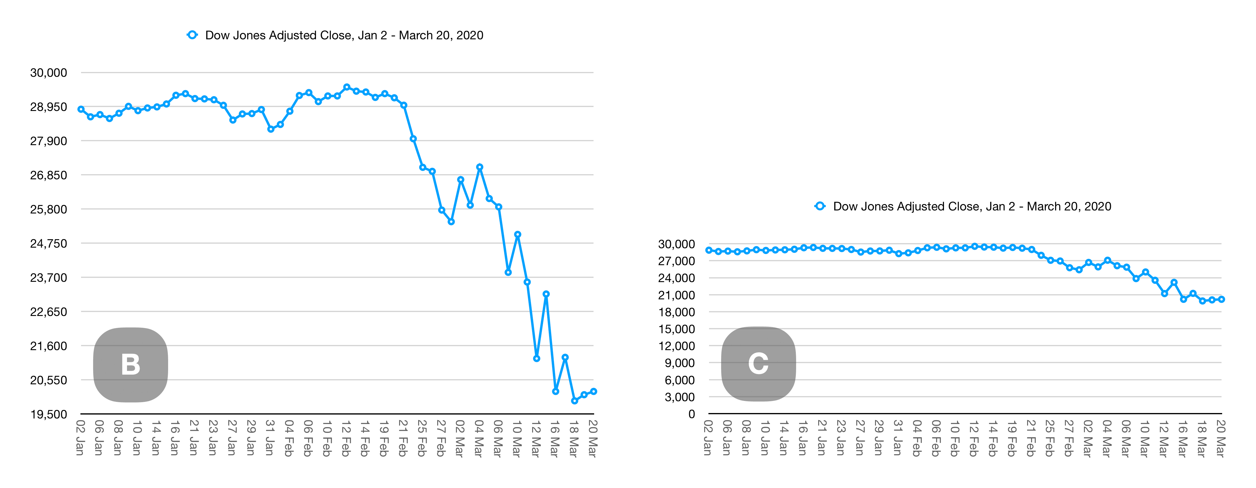
Let’s combine our two methods of distortion. Chart B and chart C still show the same source data. The only differences between the two are the baseline (chart B starts at 19,500 while chart C starts and zero), and the height of chart C is squished to half the height of chart B:
Two charts, same data. Chart A has a baseline of 0. Chart B has a baseline of 19,500 and is compressed vertically.
While all Canadians live in the long shadow of American politics, we have no direct influence on the US political system. It is against US law for me to contribute to US campaigns. Occasionally, I’ll get outraged to the point of being driven to make some kind of small action or donation locally.
Paraphrasing Hersh, a political hobbyist is a person who follows politics, knows a fair bit about it, but doesn’t contribute meaningfully to it, and the interest is mostly self-serving. This is me.
The concept and discussion rattled me. I know my relationship to ‘current affairs’ can be a bit like eating junk food. It’s more than that though — it’s like eating something you think is good for you, but isn’t. It’s like those granola bars that are just candy-bars in healthy-looking eco-packaging.
I haven’t made any real changes yet, and I’m not even sure I will. It continues to rattle around in my head though.
On a more positive note, I do find some real joy in podcasts. When I look at most of the podcasts I enjoy, political or not, they tend to share a common trait. They’re built around a person or small group talking about something about which they care deeply. I don’t even have to care about the thing — what matters is that they care and that makes me care too. It can be politics, movies, running a digital agency, or front-end Web development. The key is that the host love what they’re talking about.