The latest episode of The West Wing features weblogs breaking a news story before the mainstream press. It’s a cute episode in which weblogs pick up a story of a White House staffer test driving a huge SUV right into a brand new Toyota Prius hybrid.
Author: Steven Garrity
Mystery Door Repair
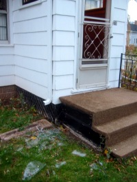
A few weeks ago in a large windstorm, the outside screen/glass door on my house blew open and caught the wind, bending some of the spring mechanism, pulling some of the hinges out of the wall, and most noticeably, smashing the large glass pane. I wasn’t home at the time, so when I got home, I was greeted with a large pile of broken glass on my door step and front lawn.
The door was old, so I wasn’t too disappointed about the prospect of replacing it with something newer. I intended to go get a replacement door, but didn’t get around to it. Then, I went to California for a few days, and when I came back, the glass pane was replaced in the old door with new glass.
At first I figured my parents had done it, since they often help me out with things around my house (thanks mom & dad), but they were as confused as I was – especially wondering why I would replace the glass when I wanted to replace the whole door. My girlfriend knew nothing of it, nor did any of my friends and co-workers.
So, I don’t know who did it! I have two witnesses that saw a glass company truck at my house doing the work, so it was professional, but they don’t remember which company.
I’ll call around the to glass companies in town next week and I’ll post an update here if I solve the mystery.
Anyone here have any clues?
Today in (My) History
Inspired by Peter Rukavina’s post in which he looks through the history of his weblog on November 19th, I would like to do the same:
- November 19, 2003
- Like Peter, I was celebrating the launch my friend and co-work, Daniel Burka’s weblog Delta Tango Bravo. My witty post title: “DeltaTangoBravo.com? Roger that.” It’s been a great site since – especially when Daniel talks about me.
- November 18, 2002
- I didn’t post anything on Nov 19th in 2002, but on the 18th I posted a reply to Joel Spolsky’s Law of Leaky Abstractions. My clever post title: “Abstract Abstractions”
- November 19, 2001
- I posted about a Windows XP billboard that had been hacked to read “Suddenly Everything Sucks”, which also made for a great post title. The site I linked to no longer has the image, but they were kind and wise enough to link to a new location for the photo.
- November 19, 2000
- In 2000, when this weblog was only a few months old, I posted about CBC Newsworld’s Alternative Election Debate. This alternative TV debate included many of the fringe parties not included in the primary televised debate, including the Community Party, The Marijuana Party, and The Natural Law Party. Boring post title, with lame all-lowercase capitalization: “tonight: the real debate”.
It’s fun to look back. Thanks Peter.
Work is being done to measure and improve the boot time for Linux, resulting in some cool Tufte-esque graphs
The Photoshopping of Firefox
Yesterday’s Firefox launch garnered a lot of press. I noticed a peculiar pattern emerging on some of the news sites. There seems to be a whole weird underworld of hastily-photoshopped graphics for news sites.
Here is a collection of some images from some Firefox 1.0 launch news articles I found across the website with color commentary. It’s too bad Salon.com hasn’t done a story on Firefox, because their article graphics are like works of art.

|
Enterprise Linux IT (day 1)I call this one “Firefox Christ”. If I’m interpreting it correctly, it depicts the ascension of Firefox back to heaven after having spent three days in hell. |

|
Enterprise Linux IT (day 2)Apparently not content with their apocalyptic graphic from day 1, the Enterprise Linux IT site went tech on day 2. We can assume that the ones and zeros are some kind of “data”. |

|
Linux InsiderOne of several sites that surrounded the logo in a blurry halo. This is somewhat understandable, as it was probably a way to mask the edges of the logo since they probably had to just crop a low-res version from the Mozilla website. That doesn’t excuse the Times New Roman text title here. |

|
News.comI get the “1.0” road sign, but I’m really confused about the little Firefox rolling in the background. Maybe it symbolizes the “roll to 1.0”? |

|
VNUnetI like what they did with the close-cropping, but they went a little crazy with the JPEG compression. |

|
CNNA simple image of the logo seems like something that would be hard to get wrong. CNN.com decided it needed a peach/orange background gradient. Maybe that was a screenshot from somewhere I don’t know about? |

|
BBC NewsThe best of the bunch, but I think that mostly because this is a screenshot of a graphic I made for the Mozilla.org home page. Still, it is simple, straightforward, and doesn’t include any wacky photoshopping. |
Today as the first day we had snow in 2004 here on PEI
Firefox 1.0 is here!
It is 4:51AM Atlantic time and I am sitting in bed with my laptop on my lap. One minute ago, Ben Goodger gave me the final word and I made this CVS commit to the mozilla.org website:
steven%silverorange.com 2004-11-09 00:50
People of Earth, I give you Firefox 1.0
It’s been a long time coming, but Firefox 1.0 is here. See 1.0 announcement posts on Mitchell Baker’s weblog and Ben Goodger’s weblog.
It is an honour to be a part of this announcement.
Wiretap on CBC Radio
I’m not exactly sure what the CBC Radio program, Wiretap, is. Comedy, I guess. Regardless, it is fantastic. Jonathan Goldstein has a perfect dry radio voice. Here is a 9.6MB MP3 of Wiretap from Nov 6, 2004. Worth a listen – highly recommended.
Firefox 1.0: Coming Tuesday November 9, 2004

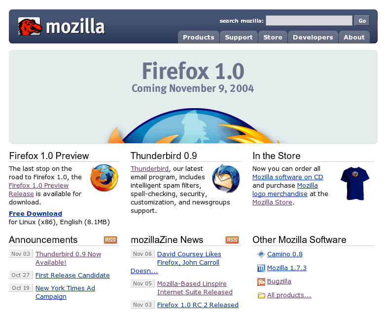
Rob Davis on NPR’s Future Tense about the Firefox New York Times ad campaign