I’ve noticed that most financial market charts in the news zoom in on the area of change, rather than start with a base of zero. In some respects, this makes sense. When you’re discussing a sudden change, focusing on that part of the chart can highlight the change and illuminate details within it. However, with focus comes a loss of perspective.
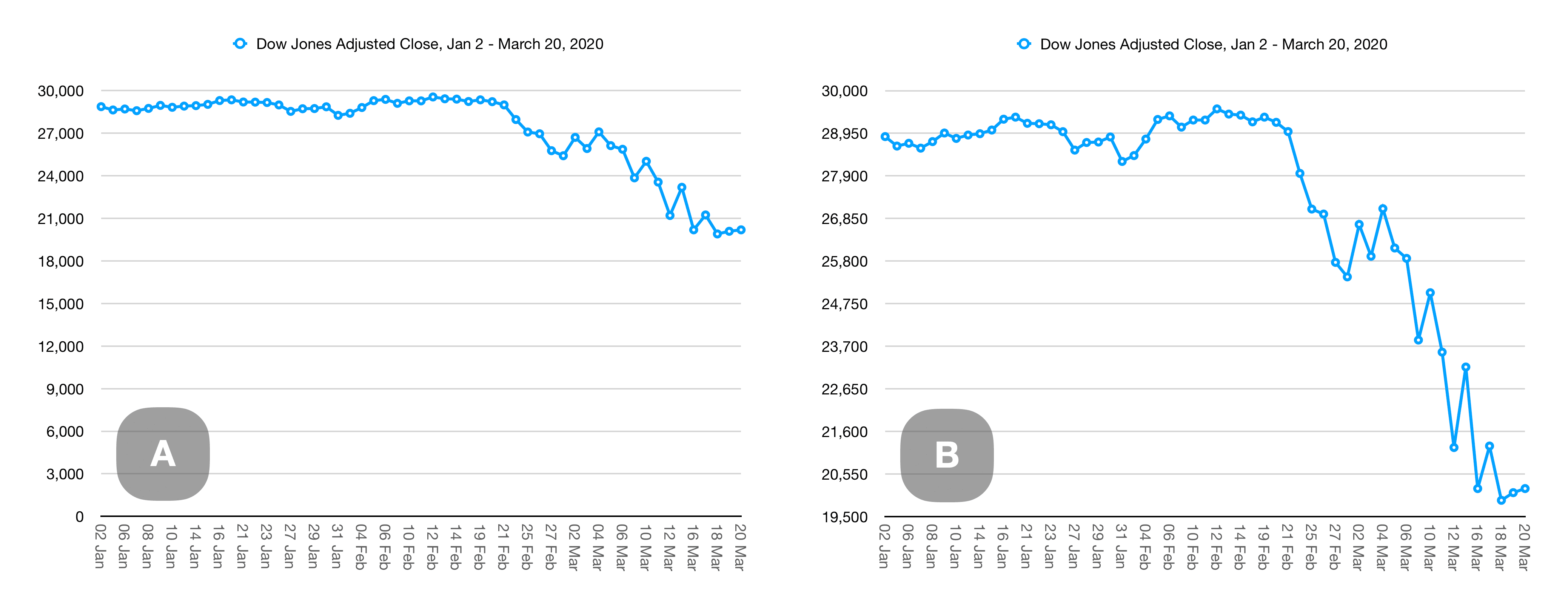
Take these graphs, for example. They are based on Dow Jones closing averages from January 2 through March 20, 2020 (from the trustworthy-sounding source: Yahoo!) and are made with the Numbers app for macOS.
Changing the baseline
Charts A and B both show the exact same source data. The only difference is that the baseline of chart A is 0, while the baseline of chart B is 19,500. One looks bad, the other looks like the end of the world—like all wealth has evaporated. Chart B highlights the change, but also hides the vast bulk of value hidden below the baseline. Which looks worse to you?
Changing the scale
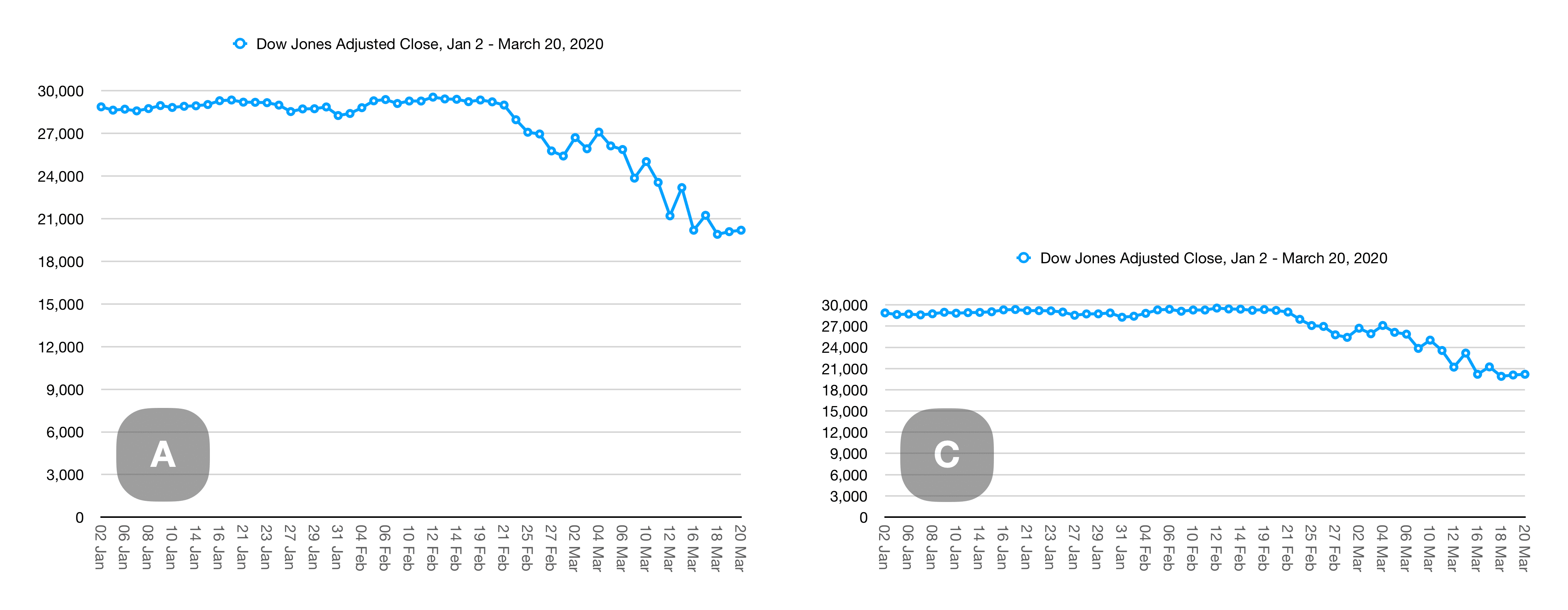
Charts A and C are also based on the same source data and both share the same zero-baseline. The only difference here is that chart C is squished to about half the height, while keeping the same width as chart A. The drop in chart C looks much less significant, but the numbers are identical.
Changing the baseline and scale
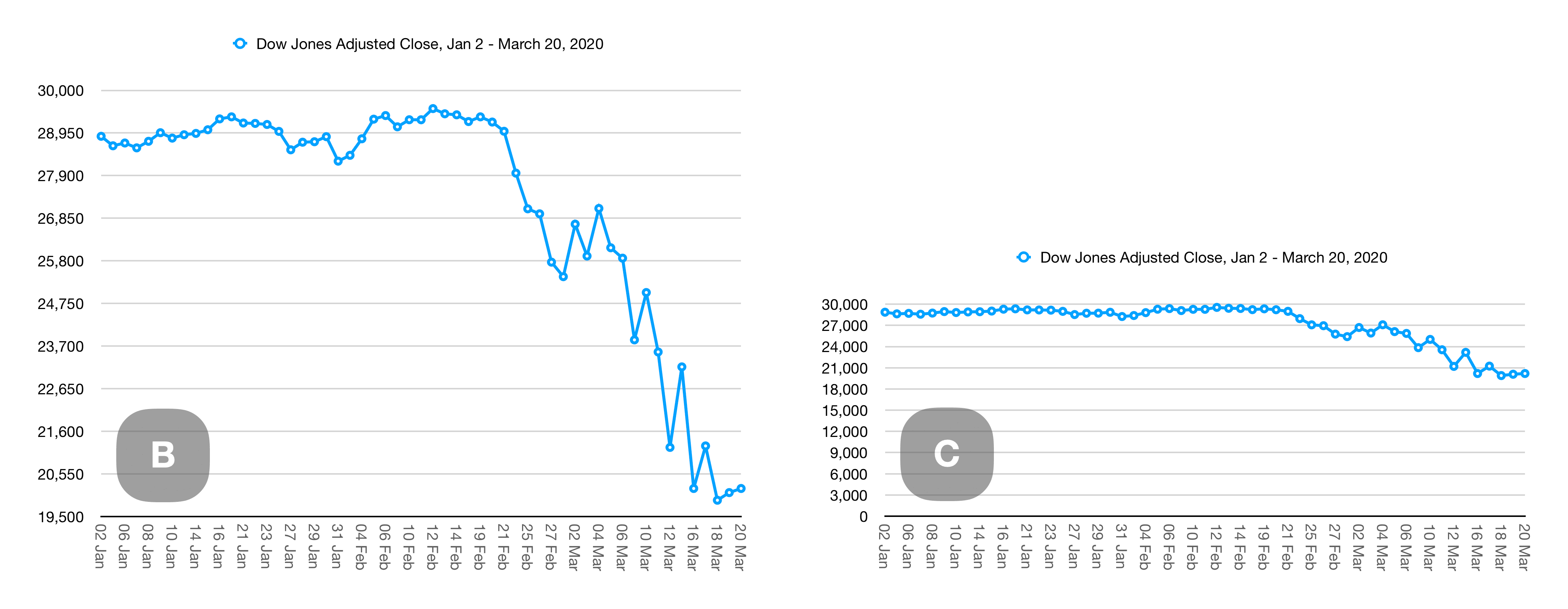
Let’s combine our two methods of distortion. Chart B and chart C still show the same source data. The only differences between the two are the baseline (chart B starts at 19,500 while chart C starts and zero), and the height of chart C is squished to half the height of chart B:
Always look for the baseline.