Yesterday’s Firefox launch garnered a lot of press. I noticed a peculiar pattern emerging on some of the news sites. There seems to be a whole weird underworld of hastily-photoshopped graphics for news sites.
Here is a collection of some images from some Firefox 1.0 launch news articles I found across the website with color commentary. It’s too bad Salon.com hasn’t done a story on Firefox, because their article graphics are like works of art.

|
Enterprise Linux IT (day 1)I call this one “Firefox Christ”. If I’m interpreting it correctly, it depicts the ascension of Firefox back to heaven after having spent three days in hell. |

|
Enterprise Linux IT (day 2)Apparently not content with their apocalyptic graphic from day 1, the Enterprise Linux IT site went tech on day 2. We can assume that the ones and zeros are some kind of “data”. |

|
Linux InsiderOne of several sites that surrounded the logo in a blurry halo. This is somewhat understandable, as it was probably a way to mask the edges of the logo since they probably had to just crop a low-res version from the Mozilla website. That doesn’t excuse the Times New Roman text title here. |

|
News.comI get the “1.0” road sign, but I’m really confused about the little Firefox rolling in the background. Maybe it symbolizes the “roll to 1.0”? |

|
VNUnetI like what they did with the close-cropping, but they went a little crazy with the JPEG compression. |
|
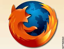
CNNA simple image of the logo seems like something that would be hard to get wrong. CNN.com decided it needed a peach/orange background gradient. Maybe that was a screenshot from somewhere I don’t know about? |

|
BBC NewsThe best of the bunch, but I think that mostly because this is a screenshot of a graphic I made for the Mozilla.org home page. Still, it is simple, straightforward, and doesn’t include any wacky photoshopping. |
There’s also News.com’s teaser graphic,
“Candle in the Way.”
Shocking! Good old Auntie Beeb keeping the side up though…
You are quite biased 😛
Ah well, you are right. Your (cropped up) version is still the best.
I suppose there’s no longer any reason to apologize for font-geekery. I’m pretty sure that’s Minion, not Times New Roman. Look at the snub-nosed E. I’m not saying Minion at that weight isn’t an equally bad choice there, though.
Nice post. By the way, looks like you haven’t completed your last sentence under “CNN”.
I think the BBC’s is the weakest since you get absolutely no bearing on the Firefox brand.
I’ve been using Firefox for a while now, but not until I read this article did I realize that the Firefox logo basically looks like a a fox “humping” the earth. What’s this– meet the new boss, same as old Microsoft? 🙂
Breaking news:
According to the CNN article, there will be no more Firefox releases. Ever. That’s right, ladies and gentlemen: 1.0 is the “final version”.
This is exactly what Microsoft did with Internet Explorer in 2001, is it not? Those hypocritical open source bastards! I’m switching back to IE right away. At least with IE you know what you have…
lars, you got to be kidding.
if CNN said that they are wrong. it should be “final release”.
that is means that it is the final 1.0 you will get, there will be no more 1.0…but yaa there will be 1.1, 1.2…, 2.0, ….., 5.0, …..
so rest assure…
and with FF you know everything…all the way down to source code…if you care.
The CNN link is further up this page, just next to the screenshot.
Lars, now that it really appears you’re not being sarcastic, Firefox 1.0 is absolutely not the ‘Final Release’ in the way you’re implying. This 1.0 release is an important milestone in the development process, but it’s just the point where the product can be described as being past beta. As ‘nomore’ said above, there will certainly be further releases with improvements, bug fixes, and new features. Don’t be fooled by CNN’s confusing reporting.
Actually, I was being sarcastic. However, if you read the article you will see that it’s not something “I’m implying” – it really says that it is the final version. That is the whole point. Not that I would ever trust CNN on a tech article.
There’s a new winner in the Firefox news business. Salon does a beautiful crop of the logo in a news article on FireFox: “Firefox — the flag bearer of free software“

More photoshopping
At least most of the stories are really positive irrespective of their artwork. eWeek’s Story, where this image appeared, is a perfect example.
Despite the perspective problem, (giant icon on the screen, versus floating in front of the monitor) it’s some of the better art on the site, actually. Which brings me to the point. Is it fair to expect good art from techie sites?
I would say it is, but most seem more anxious to emulate the flavor of the month or demonstrate knowledge of some technique than to illuminate.
Unfortunately, the salon article actually has a slightly older version of the logo – one that doesn’t quite match what was used with 1.0
Looking at the other examples again, it appears the only people who get points on that front are BBC News and Enterprise Linux IT.
There’s another article on BBC today about Firefox and this one features yet another nice screenshot from the website. Ben Goodger will be pleased to see his beautiful car on BBC:
CNN.com’s article image is from
http://www.slunecnice.cz/product/Firefox-Wallpaper/
I’m sure the peach gradient would be better replaced if only vector versions of the logo were made available (largecoughingnoises).
Yet another beauty Steven:
Are we going to see an equivalent Thunderbird post now with the release of 1.0? Here’s a few I noticed right away…
from TechTree.com
from News Factor
from Linux Insider
fgh
nmnbmb