We had an election here in Canada yesterday. The Elections Canada website has a page with the results. There’s a little in-line bar chart to help visualize the relative values.
What is generally considered a good practice in CSS (the code used the style and layout pages on the Web) is making 33.1% look bigger than 34.4%:
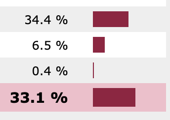
This issue is fairly simple. The width of the bar-charts are defined with the em unit. Both the Conservative 34.4% bar and the 33.1% Liberal bar are to be 3em wide (they’re rounding off for the small comparison).
The trouble comes in the way the winning party row is highlighted. The winning row is set to have a larger font size (120% the regular size). Since the em unit is relative to font size, the winning row chart gets distorted to look 20% larger.
The fix is easy – use rem units (which are relative to the base document font-size rather than the local font-size) rather than em units for the bar charts.
I’ve passed this on to Elections Canada, but wanted to post here because it’s in interesting little issue that could be easily misconstrued. I also wanted you to know how smart I am.
There’s a proportional representation joke in here somewhere…