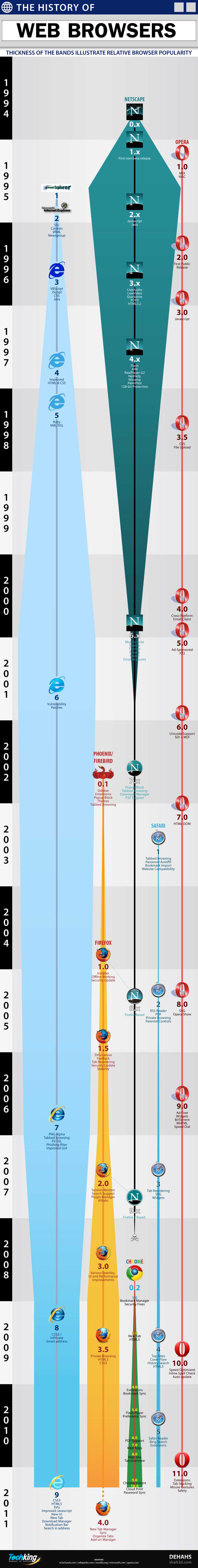
Interesting chart mapping the life, death, and popularity of web browsers over time. I haven’t seen this type of presentation before.
2 thoughts on “”
Comments are closed.
Interesting chart mapping the life, death, and popularity of web browsers over time. I haven’t seen this type of presentation before.
Comments are closed.
Mosaic is missing here!
Something seems off towards the end, there.
The band widths are supposed to represent relative share. For most of the chart, share “transactions” are visible and obvious — IE gobbling Netscape’s share in 1995-2001, then the shift back to Firefox, and the way it accelerates around the 2.0 release… all that makes sense.
But from late-2008 on, when Chrome’s band is widening as it gains traction… where is that share coming from? All of the other bands are static for that period!