Today we have a lesson in how to screw up a good thing. I’ve been a long-time user of instant messaging. It started with ICQ, and though it was mostly a novelty at the time, it was clear that this was a major shift in online communications. I still use ICQ primarily, but sneaking in as a default install with XP, MSN Messenger was slowing winning me over. I would have switched completely, but the lack of an archive of messages was a deal breaker.
![]() This was MSN Messenger 4.x. When Messenger 5.0 became available, I updated. It was a mistake. Here’s why.
This was MSN Messenger 4.x. When Messenger 5.0 became available, I updated. It was a mistake. Here’s why.
- Tabs that are really hard to eliminate.
In 4.x, turning off the annoying tabs (that I presume no-one uses) was easy. Go to the Tools menu, and toggle the Show Tabs option. In 5.0, I didn’t think it was possible until I stumbled across an obscure setting in the Privacy tab (?) called “This is a shared computer so don’t display my tabs“. I’m not using a shared computer, but this did exactly what I wanted. - Popup Advertising!
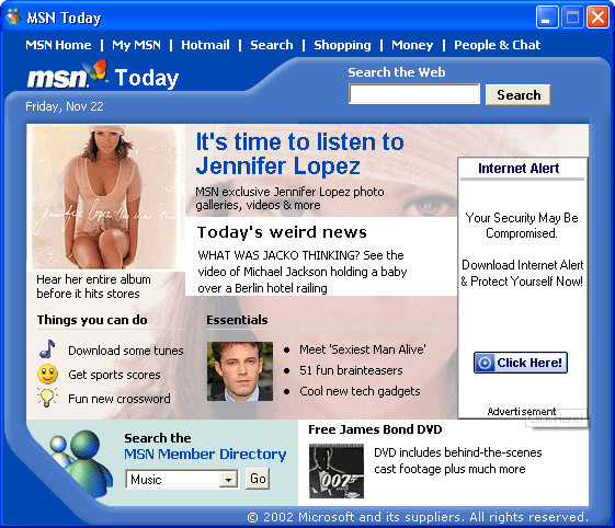
Everyone knows the world is going to hell – old people have been telling us this for centuries. I plan to tell young people this when I get old. However, I didn’t realize how bad it was until Messenger 5.0 gave me pop-up advertising when it loads (screenshot). This is not a trivial annoyance. Consider that for most MSN Messenger users, the program loads at start-up. This means a pop-up ad every time you boot your computer; totally unacceptable. I’ve since learned that you can turn this off by un-checking the “Display MSN Today when Messenger signs in” option; still totally unacceptable. - New sounds.
I’ve always thought the audio in Messenger 4.x was some of the best audio design in any application. The default ‘user-is-online’, ‘message-sent’, and ‘message-received’ sounds were subtle, distinctive, hard-to-miss, and easy-to-ignore. Perfect. The sounds may grow on me, but it feels like the like the new sounds are the audio equivalent of the visual changes between Windows 2000 and Windows XP; from sharp and subtle to soft and a bit garish. Of course, the real test comes in every day use, but for a quick comparison, here are the sounds of both versions (links are WAV files): - Icons – branded to death.
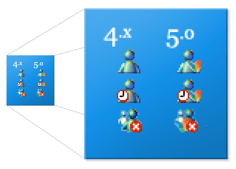
 The icons in Messenger are important, as they are one of the new icons that are always on the screen. The new 5.0 icons include the MSN Butterfly. For the record, I’m not totally anti-butterfly. The full-size MSN Butterfly icon included in system32/shell32.dll in XP is absolutely beautifully rendered. However, the tiny butterfly added to the 16×16 pixel system tray icon is too easily confused with the offline or away status indicators. It is too small to decipher, and just adds clutter.
 - Easy to dismiss items
In 4.x, you could right-click on the alerts (the boxes in the bottom-left corner of the screen that tell you a user has signed-on), and dismiss them quickly. It is an obscure feature, but totally non-intrusive and handy for those who use it. This doesn’t work in 5.0
I’m a confessed upgrade junkie. Sometimes it burns me.
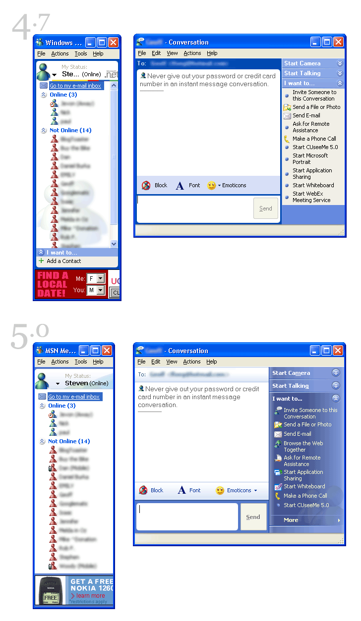
Microsoft’s UI design teams seem to need to implement an entirely different interface scheme for every product line. Take a look at this comparative screenshot of version 4.7 and 5.0 (also note one of the new improvements in v5.0 – the better layout of the My Status area at the top of the Messenger window). Office and XP look different and all of the MSN stuff seems to be happening in a bubble somewhere (a heavily bevelled bubble, I would imagine).
This reminds me of the politics and positioning that takes place between federal, provincial/state, and municipal politics. There is only one tax payer. There is only one user.
 This
This 
