There’s an interesting article, Push Here to Save Energy, in MIT’s Technology Review about the work of Bruce Nordman of the L. Berkeley National Laboratory.
Nordman is on something of a crusade to standardize the mess of office equipment power statuses – on, off, hibernate, sleep, power-saving mode, stand-by – the list goes on. Nordman’s research suggests that an enormous amount of money and energy is being wasted simply because people don’t understand (or bother understanding) the many variations of power-saving options in office equipment.
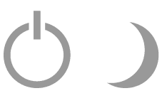
Nordman’s group is proposing a standard of three options: On, Off, and Asleep. They are also pushing for wider adoption of the semi-standard power symbol and the crescent moon shape for Sleep mode.
This is a great idea, however, anyone interested in the practical application of a standard like this should first read of Donald Norman’s attempt to simplify and standardize the Macintosh power button. Sounds simple. Isn’t.
I would suggest (if they haven’t already done so) that Nordman approach the American Institute of Graphic Arts for a truly public and standard symbol. The AIGA has many standard icons publicly available – include the balanced and beautiful Information symbols seen here.