Imagine a website where you could:
- find out the current ski conditions
- find any business in your province
- see all properties up for sale on a map
- contact anyone in your government
- download the provincial budget (and the previous three years of budgets)
- find anything and everything you could possibly want to know about the election including live results
- easily find every single accommodation, campground, festival or event, restaurant, or tour in the province
- find useful and up-to-date weather info including a chart of the temperature over the last 24-hours
- watch the Province House live
- view every single Provincial Statute
- see where everything in your province is on a map
Then imagine that it’s all easy to find and navigate, quick to load, and resists the temptation of self-indulgent multimedia.
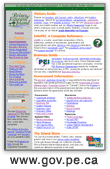
If you are lucky enough to live on Prince Edward Island then you already have a website like this: www.gov.pe.ca. “Website architecture and construction by Reinvented Inc. for the Government of Prince Edward Island, Canada”. I build websites and I fancy myself a fine critic of effective sites. This one is insanely great.
* The question “How Should Government Web Sites Be Designed?” was asked on slashdot. This post was written as a reply on the slashdot thread.