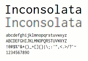
 If you spend a significant amount of time working with any type of scripting, code, or markup, then you’re probably looking at a monospace (fixed-width for each character) font.
The quality of these fonts varies, though the defaults that ship with Mac OS X, Windows XP, and Windows Vista are quite good. The Consolas font included with Vista is particularly good.
Fortunately, there is a quality free/open alternative. Raph Levien has developed a great programming font cleverly called Inconsolata. I have been using it as my primary terminal/coding/text font for several months and find it superior to anything else I’ve used.
Incosonata is freely available under the Open Font License. The OpenType version of Inconsolata will work on all major platforms. There is also a PFA version available.
Font geeks can download the Inconsolata FontForge source file and a PDF sample is available.
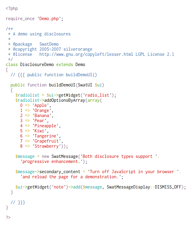
Here’s a quick screenshot of Inconsolata used in a simple PHP file on my desktop.
Love it. Thanks.
On OSX, as the PHP screenshot illustrates, it’s a wonderful font, but it doesn’t play well with XP’s Cleartype:
http://pliv.com/show/loose/inconsolata_code.png
The blur is quite extreme. I’ve never seen a font that ignores hinting this much.
Willem, that PHP screenshot is actually from the terminal (Gnome Terminal) on Fedora 7 Linux.
You’re right about the XP rendering. That is pretty blurry. At least it’s open-source, so it might get better.
Certainly an excellent font but it could stand for a little tweaking: ‘a slashed zero and the position of the horizontal bar on the lower-case f dropped to stop the blurring at 9/10 points’. How handy that someone’s done both things!
http://damieng.com/blog/2006/11/28/inconsolatadg-slashed-zeros
Not too bad, but I still prefer Bistream. I’ve been using it for about a year and a half now and love it.
http://www.gnome.org/fonts/
That’s a nice font, I don’t know how I’d deal without a slashed zero though. I’ve been using the Proggy series of fonts for a couple of years now and they’ve made using something like Courier all but impossible for me now.
http://www.proggyfonts.com/index.php?menu=download
I suppose it’s more of a habit of what I’m used to looking at now more than anything else.
It’s nice, but I still prefer my current font, ProggyClean:
http://www.proggyfonts.com/index.php?menu=download
You may want to take a look. It might not look so nice, but plays much better with small font sizes. It’s very readable at 12pt with lots of info onscreen.
“…thought the defaults…” should read “…though the defaults…”
sorry for the public correction.
I like Monaco for a programming font.
I’ve started working on hinting Inconsolata for TrueType/ClearType. No more blurry pants.
Get it here: http://mark.kiidesign.com/inconsolata.html
fairly good, but I still prefer Bistream but worth trying
I can’t get the OpenType version of the font to import into Hummingbird Exceed. Anyone managed this, or know why?
Have downloaded this font from 2 sources-both refuse to install-50% installation then message font file may be damaged.
Please…… can anyone tell me if there’s a modified version for windows?
This font looks all washed-out on XP….. maybe someone changed it to look better in windows?
Many thanks for the information about the freely available fonts, i read your blog every week and find interesting informations!
Found it !! Inconsolata – Properly Hinted for Windows
This is a ttf file that looks a lot better than the original Inconsolata on my XP machine.
http://pgl.yoyo.org/bits/tech/inconsolata-cleartype-raph-leviens-inconsolota-font-hinted-for-windows/51:2008-09-25/
Uninstall the original one before installing this.
The previously mentioned hinted inconsolata had hinting problems with odd sizes and for bold. A correctly hinted Inconsolata ttf has now been uploaded by Dave Crossland to the Google font repository:
http://code.google.com/p/googlefontdirectory/source/browse/inconsolata/?r=fffda675769720a297f4d239e7065f751bbe655f
The new font works well for me at all sizes and formats with Cleartype under XP.
Thank U, Codeur !!! The version you pointed to works superb on my XP machine.
One point, though — I had to install Mercurial to download the font from Google font repository. Does anyone know of a better way?
Neel, I realised later that there is an easier way to access the Google font repository.
For all fonts, go to http://www.google.com/webfonts. You can examine and download the fonts from there.
To download Inconsolata hinted without installing mercurial, use http://googlefontdirectory.googlecode.com/hg/inconsolata/Inconsolata.ttf .