![]()
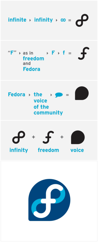
Matt Munoz, a designer at Red Hat, has posted an interested walk-through of the development of a logo/visual-identity concept for Fedora Linux. It’s fascinating to see the process and justification behind a logo idea like this.
This isn’t an official logo yet. It has been proposed and is being discussed by the Fedora community. Everyone, including myself, will have an opinion (and criticism), but when you have great work like this done, you should say “Thanks” and go with it.
Here’s a quick preview of some of the process – you can also see the complete process.
Nice work Matt and the rest of the design team.
I really like it, but it feels a lot like a Macromedia logo. I guess I have been overexposed to Macromedia Brandatisation(tm) over all these years.
It looks like that new Quark/Scottish Arts Council logo too!
http://www.macworld.co.uk/news/index.cfm?NewsID=12611&Page=1&pagePos=2
Call it logo zeitgeist, baby.
A commitment to the future is a promise, and a promise is infinite? Soooo…that’s like saying, “we promise to get to that in the next version,” forever?
First of all, I have to say I’ll really miss that red hat. But you know what? That new logo rocks. Seeing how they came up with it was fascinating. I, for one, will be proud to wear that new logo on my operating system of choice.
Looks suspiciously like the new Toronto logo, which has been the focus of yet another spending scandal. Alas, the blog wars rage on for and against the new brand.
I must say I find the Fedora logo much more appropriate though.
I’m with Jevon on this one… I immediately thought of the Macromedia logo sets when I saw it… and Quark too unfortunately. That said, I actually do like the logo and the thought process behind it.
All people with kids may see is a blue version of the Mr. Blick Jumping Bean game.
I think the blue of the infinity symbol is too close to the white, it makes it hard to pick out the f. Just one man’s opinion though
I like the look but Manana is on the money. That whole “a promise is infinate” is waaay marketing BS. What does that even mean?
I’m still not really down with it. I mean, I’m not awesome with logos myself, but it jsut feels too “busy being simple” to me.
Drop the corner-circle and you’ve got yourself a nice, simple logo
This is a prime example of a logo trying to represent everything and therefore not really looking like anything.
I personally love the new logo. It is a huge leap forward for the Fedora Community. It just rocks. The slide-show was enough to make me see how much work is put into it and that alone is enough to say, my vote is “YES PICK IT”. If anything was holding fedora back is the “no logo” and the lack of documentation… I must say I am loving the direction fedora is going towards. Keep a look out on the wiki page.
While i looove the thoughts and the process behind the new branding and looove the infiniteFreedom thing, i’m not too fond of the logo itself. the infinity symbol is always nice, if used in a good way, however the f ends up looking really ugly in my opinion. The idea of “speak” corner is great, but i think it’s in the wrong corner – for some reason it feels bad. Also the colors f merges into the infinity symbol looks cheap too. And the color variations are really awfull. This is NOT a flame – It’s my sincere opinion. The thoughts are all perfect, but the logo needs work.
Retarded.
I agree with Thomas M Steenholdt’s comment. Obviously there are a couple of pretty good ideas in the whole thing, all combined looks a little weird. A good example is the proposed logo for “Fedora legacy”, where the purple secondary color dominates on the logo. The secondary color should be less obstrusive at least, a light color. This would lead to bad readability of the section string (“legacy”) on light backgrounds, but could be fixed with outlining each character.
Also the “f” shouldn’t merge directly in infinity by all means, maybe it could be raised from it or something, but as of now it looks badly designed, sorry guys.
What’s really good-looking is the new typeface, which is easy to read.
My 2cts,
Tommy.