The crusade to make the world a more beautiful place inches forward. The Mozilla Visual Identity Team is happy to see the preview of a new default theme for Firefox, which will be included in the next release (0.9 – in the next couple of weeks).
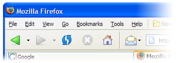
The new theme was designed by Kevin Gerich and Stephen Horlander, the dynamic duo behind Pinstripe, the default Firefox theme on Mac OS X.
The new theme, called Winstripe (“Pinstripe” and “Windows” – get it?), aims to bring more polish and consistency to the Firefox interface. While it is based on the original artwork behind the Mac Pinstripe theme, it has been heavily reworked to blend in nicely with the Windows look and feel.
There will inevitably be a lot of feedback by those who loved the previous theme (called Qute), and might not like the new theme. Constructive feedback is appreciated, but “I hate it” doesn’t count as constructive feedback.
We realize that the new theme doesn’t blend perfectly with the Gnome / Linux interface, and we do hope to make improvements in that regard. That said, we find that Winstripe does work relatively well in Gnome for the time being. All kinds of good work is going on to make Firefox look and feel better in Gnome. Also, the Winstripe theme was rushed in to make it into the 0.9 release, so you will see improvements and refinements over the coming months.
If you aren’t a fan of the new look, give it time. Wait until the new release and try it out for a few days. See how you feel then. If you still don’t like it, you can always install the previous theme.
People tend to get very attached to the look and feel of an application, especially when it is an open-source application. I get the impression from some of the early reaction that people feel like we went into their living room and painted the walls.
I can understand this reaction, but there are a few things to keep in mind:
- At the rate that Firefox is growing, there will be thousands (hundreds of thousands?) of people who use the 0.9 even more, the 1.0 releases as their first introduction to Firefox. They won’t have any attachment or familiarity with any previous default themes.
- We see familiarity as quality. People are used to the previous theme and anything different will take a bit of getting used to. Give it time – reserve judgment until you’ve used it for a week.
- We’re not trying to create great art here – we’re trying to create a clear, simple, elegant, and unobtrusive set of toolbar icons that are easy to understand and don’t get in the way.
Great work Kevin and Stephen.
I hope the application will eventually detect if a user is using either the windows xp teletubbies theme or the windows classic colour scheme and set its own theme accordingly. Also I hope it preserves the ability to match colour scheme changes made in the ‘appearance’ desktop control panel page.
Forward, not backward.
As a user, I can just change the theme. As a person who cares about the firefox product/project, I do care what comes as the default theme. If I wait and try out the new theme (even after waiting for it to be improved) and still don’t like it, can I do anything? Can we as a comunity do anything? I’m skeptical if I’ll like the theme, but I’m worried that nobody (developers/artists) is going to care what we (users) like.
We’re the ones that push it out to our friends. And even though FX is open source, I can’t ship my own custom distrobution with Qute as the default theme *AND* the trademarked artwork. It’s legally not possible.
Getting the default right is what Firefox is all about.
I think that adapting the look-and-feel to become closer from each platform (MacOsX, Windows and, of course, Gnome or KDE) standards is a very good idea, despite it requires a lot of work. Actually, it’s a good way to make a program easy to use, isn’t it ?
I understand that the Windows-specific theme should be the first one, because there is much more firefox-under-windows-user than ff-under-gnome users. Anyway, I hope there will quickly be some gnome-specific alternative (I hope so, due to the mozilla-gnome alliance)
For those who doesn’t like the new theme, Qute will still be downloadable, won’t it ?
Waiting for the continuation of the story…
Do you happen have screenshots of the theme in linux/gnome? I’m concerned that Windows has bright colors with high contrast and gnome tends to be a lot more sober, so I’m not sure how well a theme can look good in both environments (although I must say Qute managed pretty well). IMHO many of the icons have too much color. Any chance of making them less bright and/or reducing the colored area?
Thanks for the hard work.
That’s fantastic for Firefox. I use the Mac version, which is so much better than the current default Windows theme. This one looks much better than the old.
Whenever I installed Firefox on someone’s machine, I instantly installed a better theme for them. I know alot of people are currently screaming “Why?? It’s just fine!” but those guys are code monkeys, not designers.
The principles are admirable – “…aims to bring more polish and consistency to the Firefox interface… to blend in nicely with the Windows look and feel.” – but I think Qute executed this better.
Qute seemed more polished (it’s been around longer and had more revisions).
This theme is consistent with itself, as was Qute, but Qute was also consistent with other Windows applications (such as Windows Explorer), and thus better blended in with the Windows look and feel.
Qute was designed with Luna as the template; Winstripe is a modification of a Mac theme. Admittedly it’s a big modification, but it still looks more suited to Mac than Windows.
No Windows icons have drop-shadows – the icons aren’t supposed to be “standing up” on the toolbar, they’re supposed to appear embedded in the toolbar.
Personally, I also think the “large” size is far too small – lots of unneccesary whitespace around the icons; by contrast, Qute fills the toolbar.
This theme looks like freeware.
I don’t think dropshadow/perspective is an issue we should care about, just look at all those 16 color icons still found in XP. (Does Microsoft change it with SP2? No.)
Winstripe on the other hand is a simple and elegant icon set for Firefox and it does not want to be more than that. Great step forward.
I believe WinStripe in its current incarnation is a step sideways, not forward.
It’s not better or worse, but could be much, much better. As I’ve commented on Gerich’s site, WinStripe is flat. Very flat and bland.
If the idea is to match the icons somewhat with Windows icons, then I’d review the Windows icons and their guidelines again, because WinStripe doesn’t match Windows in any way.
Willem, why would you want to follow the Win guidelines if even Microsoft doesn’t give a damn? Take the new (orange/blue) Office as an example and its icons. The only consinstent thing you’ll find is the use of colors: orange, red, green, blue. This way Winstripe is there.
Sorry guys,, but the Qute theme alone was making my job of convincing people to switch from IE to firefox a lot easier. people loved it, clean, simple but FRIENDLY.
The new theme just throws us back to the usual open source ‘techie aesthetic’ which just doesn’t appeal..
Why the change anyways?
I was so happy to see Qute become the default theme – it made Firefox a true alternative to Internet Explorer. It’s icons were similar to IE but still self-contained. I see that people in our company hate changes to their habits. While nobody complained about the migration from IE to Firefox i think they would definitely complain about Winstripe. Just turning a “P” into a “W” doesn’t make a windows interface.
Qute is a clear, simple, elegant, and unobtrusive set of toolbar icons. Winstripe is not.
When spreading the word about Firefox I’ll now have to tell people that it’s a good browser – “even though that it doesn’t look cheap”. “But there’s a nice theme called Qute which you just have to find and install”. Is this a very user-friendly and uncomplicated way of making people leave IE behind? Will they leave IE behind if it’s not sufficient to download and install Firefox and they’re set to go with a comparable replacement?
This is a sad day.
Incredibly ugly. It’s so “Windows”.
At this time I’ve installed one port of “Pinstripe” theme for Windows and this new design for the upcoming 0.9 has nothing to do with the original Firefox theme for Mac.
Icons are too flat. XP is too ‘Lego’.
Regards.
While in danger of being called a troll, I must say I despise the new theme. Looks like decorations a young kid would want to have in his room, too bright to fit in anywhere but on a mac, and too simplistic to appeal aesthetically to anything but – you guessed it – simplistic designers.
What happened to Qute? Why isn’t it included, too?
I’m not attached to Qute, but I know after trying most of the other themes available, that it was the overall best theme out there, and imho, still is.
And how does a constantly changing application name and now this default theme work in favour of consistency?
I love the new theme – much better than Qute in my opinion. Lighter – cleaner – elegant. I don’t feel the urge to go find another theme anymore. Nice work!
Firefox is clean, fast, simple
Features include tabbed browsing, download manager, popup blocking, resistance to browser hijackers.
Favorite feature is popup blocking.
Firefox has everything you need and anything you don’t need is generally not included.
I love the new skin. Clean, simple. Who wants lots of unnecessary buttons on it anyway?
I have found that those that complain seem to want things more complicated so they can have more work. I like having less to do on the computer. Then I can spend more time with say, my girlfriend or family.
Firefox gets an 11 out of 10 from me. Can’t wait for 0.9 final to come out. I will be dumping internet explorer.
P.S. Microsoft is losing money. The market is saturated. They are really worried over free operating systems like linux and free browsers and software like firefox. The tide is turning. Soon Microsoft will die.
So tell all your friends about Firefox & if you can, swith them to an alternative os. P.S. Don’t use Macs either. In a hush hush, Microsoft bought into them and is helping them with digital rights management, but trying to keep it seperate so people will buy. Who has the authority to lock up things that are and forever will be free? Can you lock up the song of a bird? Can you lock up the freedom to breathe? Can you lock up the freedom to think? Can you lock up free knowledge & music?
Once someone hears a tune, can you reach into their brain and pull it out? If they do hum that song, someone else hears it. Music was always intended to be free. So was knowledge. Suddenly, we are close to losing freedom to almost anything in our society because “We want to protect you from thinking, from sharing, from evil “terrorists” DONT LET THEM TAKE YOUR FREEDOM AWAY. Only you can stop them from taking your freedoms.
I can’t believe you are protesting the clean design of firefox.
It is clean, simple & fast. What more could you want?
Firefox has: tabbed browsing, popup blocking, download manager.
I love firefox. Did I mention it is also free?
“too bright to fit in anywhere but on a mac, and too simplistic to appeal aesthetically to anything but on a mac”
It’s too simplistic and flat (I know, I know, I am obsessed with flatness), even for a mac!! I still hope that 0.8 themes are compatible with 0.9
Programs should fit in to the operating system some way or another, and quite frankly I believe that while the new theme Winstripe has lots of potential, it is still too Mac like to fit into Windows. The theme as stated is a rush job, and it definately needs more work put into it in it’s current state.
However, what stopped Opera from having a default theme that doesn’t look a thing like any Windows app?
Hopefully Winstripe will evolve into a skin worth boasting about.
Oh and to the Havoc, many themes are being (or have already been) repackaged for 0.9. And Qute can now be downloaded from http://www.quadrone.org/graphics/.
Biggest problem: The “Reload current page” button in the new theme looks like a grey lightning bolt on a blue field. What does this have to do with reloading a page?
I welcomed Qute, when it replaced the Orbit theme (which only now seems hideous), and like other themes, but Winstripe sucks, and don’t see any chance of liking it when it’s completed, unless that means starting from scratch.
You should use this one guys:
http://forums.mozillazine.org/viewtopic.php?t=41625
Words cannot express my hate for Winstripe. Qute is beautiful (even though I am using iCandyJr). The average user is not going to switch themes, and locking them in to such an ugly and flat theme as Winstripe (which arguably looks worse than IE) will make them see no reason to switch. This is a terrible move for the foundation.
We’ll, there have been almost no efforts to find a dialoque with Qute theme artist, and now we are pushed with a new “default” theme most (if not all) of FX users find ugly.
I just do not see a point of wasting resources and creativity on a new theme when there is an almost perfect one named Qute. Only a few extra emails would gave you any license you need.
You can have creating a new theme in paralel and have FX users to ask what they think about the pinstripe (linstripe or smth else), but only if there has been left space for Qute – because now it does not look moral and I hate the rude way you have pushed away an independant artist.
Shame on Mozilla Visual Identity Team and their arrogance.
I’m switching to epiphany as a silent protest.
Øivind, I’m not sure you understand the concept of “silent” protest. That said, Epiphany is a fine browser.
I love this theme. It is clean and minimalist.
I am just glad to see that the Mozilla team is still doing what they want and that they feel is right. It will be a sad sad day when they succumb to each and every user’s request.
But to get my two cents in, I find the new theme to be truely inspirational! Truely inspired to look just like all other navigational buttons, that is. When will a browser introduce a truely new theme and have something like mouse gestures as a standard?
New theme is OK, just a few comments after a day’s usage:
– The new tab icon always looks like a print icon at first glance. I never quite think to click on it.
– In Windows, the Extensions and Downloads windows resizer (the triangle made of lines) shows up on the left hand corner. Weirdness.
Well, I’ve been using this new theme for over a week now and I am saddened to have to agree that it is not an attractive new theme. I have found it necessary to pear down the amount of the buttons that I actually display because I just cannot handle looking at them. I only have the forward and back buttons as well as the mail button left. They have been dropping like flies, some of them never did make it to my ‘I guess I can handle that’ level of liking them. I understand that the folks at Mozilla are trying to make things better and I think that overall they are doing a great job. As far as functionality goes I have absolutely no complaints with the Firefox defaults. I think that Firefox is leaps and bounds beyond anything the competition is willing to create. My only complaint is the new theme, I am going to re-theme it for now and cross my fingers, pray, rub my rabbit’s foot, pick a bunch of four leaf clovers, et cetera and hopefully this theme will not be defaulted on the next release. I want you folks to know that I am not just jumping on the bandwagon of hatred, I actually feel bad for having to voice my opinion about this.
There definately does seem to be a struggle here to reach a compromise. The simple fact that the developers are constantly striving to improve Firefox accross all platforms is a testament to how amamazing this project is. However, I would have to agree with many who have posted before me, that there was a much higher degree of consistency between the Qute theme and Windows XP (both with Luna and classic). Qute was a significant improvement upon the IE6 icon set. I was very satisfied with Qute and I would have to agree that it was a significant contributing factor in getting people to make the switch from IE – it made Firefox look far more professional than IE. I don’t think that Winstrip achieves this in Windows or in OS X. I think the previous Pinstripe theme was more attractive and appropriately toned down to fit into aqua (at least Graphite aqua). When I first installed Firefox with Qute on Windows, Gnome, and OS X I thought that it fit each respective OS very decently. I did however feel that Pinstripe was a more appropriate theme for OS X and was pleased when it became the default for that platform. The approach does seem slightly backwards however when Firefox is primarly aimed at Windows (thankfully not only windows though) that the default theme should be a based on something for OS X. Qute was perfect, maybe there should be an Aqua version of Qute. Otherwise maybe we should re-examine how important it is for the theme to be the same in OS X and Windows. Was the IE theme the same in windows and any Mac OS? No, yet it still maintained its identity.
Chris Cook came out last week with his Luna Blue theme for Firefox-0.9 — it looks good, and works like it should. How I wish that Steven Garrity would update his Luna Blue theme for Thunderbird for release 0.7 (and beyond).
We have been speaking/writing/discussing how to enable Micro$oft users to migrate to Linux, and we all agree that it is the Desktop which governs their success (or lack thereof). Well, countless stories abound about users who, because of the aforementioned Luna Blue themes, have been able to make that transition and remain productive *in the workplace*, if not become moreso.
Please, Steven… Luna Blue for Thunderbird-0.7 — we’re begging you.
i really miss pinstripe on the mac side 🙁
it just felt much more at ease and this new toolbar/icon set looks very foreign to me….
I can’t understand these negative responses. The new theme is REALLY nice. It is clean and elegant; the icons have just the right amount of roundness to their edges; the colors are VERY well done, and the theme simply has an overall ‘calm’ look to it.
I am a hardcore minimalist when it comes to my desktop and applications, and I like to conserve space. however, i use the large toolbar icons because a) they’re just very attractive at that size b) the small toolbar does not look good. I edited it slightly, and I think it can look better like this: http://www.shovelbeating.org/~nirvana/fxsmall.jpg (the ‘home’ button is not elongated and ugly, and the spacing is more conservative and compact)
Qute WAS, indeed, a good theme, but not one that should be the default look of a final, polished product. Keep up the good work on firefox’s interface.
With the release of 0.9.1, WinStripe looks signifigantly better. A big thumbs up to Kevin and Stephen!
Where’d the firefox logo go? I no longer see it in the upper right beneath the close-window “X,” and I want to.
I thought that I would just give a bit of an update to my previous comment, so here it is:
The modified theme that is now coming default with Firefox 0.9.1 is fantastic. I absolutely like all of the major buttons. With the previous version of the theme there was just something unappealing about the buttons and I am surprised at how very little change actually was needed to improve them so much. However, I would be very pleased if the new tab button did not look like a piece of bread popping out of a toaster. I am aware that it is not a high-priority button because not as many people use it as some of the others but I personally use it almost as much as the forward and back buttons. I had tried to keep it off my Navigation Toolbar for a while but I got tired of always pressing ‘Ctrl-T’. Please consider working on this button. I wish I had some sort of suggestion or mock-up to give you… but I don’t.