The team at silverorange has been working on a redesign of the mozilla.org website. We’re keeping most of the content as it is (especially historical content, like documentation, etc.). We have a new visual template and redesigned some of the key top-level pages. We call the new style: Cavendish
Please take a look through the site with your favourite web browser and post any issues/bugs on this MozillaZine thread. We’re most concerned about technical issues and bugs (rendering problems, etc.).
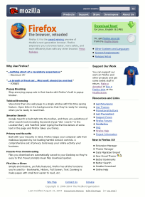
See the website beta now at website-beta.mozilla.org and post feedback on this MozillaZine thread.
This is still a beta, so there are some outstanding issues. Some in particular that we’re aware of (so don’t bother pointing them out):
- The home page has not been updated yet (except for the template, of course)
- Round box corners not appearing in Internet Explorer (this is a known and accepted issue, we’re using :before and :after pseudo-elements, which aren’t supported in IE, but degrade gracefully)
- The main logo/wordmark shows sporadically in IE5
- Some extra margins in left menus in IE5/5.5
- Main site tabs do not indicate current section
- Mozilla Store is not included in the template yet
Aesthetic feedback is welcome, but we reserve the right to respectfully ignore it. We have no illusions of being able to please everyone. Rather, we’re aiming for a clean, simple, and professional overall look and feel.
Very nice! I think the icon graphics in the callouts (Download, get a CD) should be clickable. Besides that, it’s nice and clean, and the visual flow looks good.
Cavendish — clever. Feels very nice and open; great work.
Steven, congrats to you on the team. The site looks fantastic.
Any thoughts on when we’ll see a redesign for Mozilla Update? Um, just wondering.
It’s a great improvement. Shea’s previous effort wasn’t one of his greatest.
The tabs should be sorted out though – the “selected” tab should be more definitely a part (a “tab”) of the page.
Very nice.
“Round box corners not appearing in Internet Explorer (this is a known and accepted issue, we’re using :before and :after pseudo-elements”
There is a solution these issues
http://dean.edwards.name/IE7/
Chris – Dave Shea’s previous effort wasn’t bad to start with, AIUI. Part of the problem was that his effort ended at (or before) the point when the site went live, and then other people made big changes to the content and added a whole bunch of CSS hackery to make their new content lay out how they wanted.
Hopefully this time things will be rather more coordinated, and people won’t be changing all the content around as soon as the site is launched… (having said that, a lot of the content does need updating…)
Visually its a big improvement, but I hope the content and organization is also improved. I don’t really know how to improve it, but a short while back there was an article on how to make it more accesable and improve the presentation of the site. I didn’t agree with many of the things he proposed and his design wasn’t pretty, but it was a step in the right direction. So many products to choose from is confusing to new users, I know the main problem is there are that many products to choose from in the first place.
The left sidebar should not appear first in the HTML. Put that last so text browsers and people with stylesheets turned off can see to the real content right away. You can easily move it back to the right using styles for browsers that support the pretty layout.
Why use such large left and right “margins”? People with large text are able able to see much less on the screen than normal and this takes off a lot more. Its a nice look, but you need to think of useability not only coolness, which it does have.
Very nice design, the blue color brings a cool sensation.
I noticed a margin issue in this page:
http://website-beta.mozilla.org/products/firefox/download.html
The “Now Downloading” text is too close to the menu box on the left.
Anyways, keep up the good work.
Looks good. Much more clean.
However, I do think that on the front page the left column (t-shirts) should be put on the right (just like on the product-pages). The t-shirt pictures are very, very big in comparison to the product logos. You are “selling” internet-tools, not t-shirts, right? 😉
There’s another discussion in the same Marketing forum: http://forums.mozillazine.org/viewtopic.php?t=116174
Andkon’s trying to give some rought shots 🙂
Its great, but please make more of Camino. It makes me sad for it to not have a ‘spotlight’ :o(
More of Camino?? I would say the exact opposite. One of the biggest potential problems with new users coming to the site is the range of choices available.
What is the difference between Mozilla and Mozilla Firefox? So If I am on a Mac I can’t use Firefox right, I have use Camino? What is the app suite? It *does* have a higher version number.
Sometimes too much choice can be bad. And if the target is now endusers, then that has to be taken into consideration. If Camino is not your primary product then it has to be hidden away to a certain extent. Maybe that is not a decision for the visual identity team to make, but someone has to make it. Developers and Mozilla heads can always find Camin. If and when it does become the dominant product for the Mac, it should get top billing, but until then…
I’m sorry … aside from the main menu bar, I like the old one better: it leads the eye much better than this one.
In this design, my first reaction was ‘What am I looking at’? If I didn’t know any better (and a lot of people don’t), I’d think mozilla.org sold T-shirts.
There is no center, nothing that draws the eye immediately to itself, nor anything that directs the eye through the page. It is hard to find out what the page is trying to communicate. Frames around discrete items and conceptually different areas (ie., program descriptions vs. news vs. promotional goods) would help, as would a bit more margin space between elements, and a lightly shaded background for different page elements (ala the little help box on the bottom of the left column). Larger and/or bolder print indicating main sections would really help: large print is the first thing people look at, both on and off the web. Padding/margins or a background would help in this area as well.
Smaller is not better on the web, or even computers in general – the smaller an item is, the longer it will take to click on it. Maybe it’s my setup, but the text was a bit small.
I also think that promotional stuff (currently the narrow left column) is less important than the main product, and should be moved either down, or to the right side of the page. And instructions on help should be near the top of the page, not the bottom, or, as in this case, below the fold (even on a 1280×1024 screen).
Slightly larger icon graphics wouldn’t be a bad thing, and floating them, with no sides clear will remove the dead space to their right. Another alternative would be to have the section title next to the icons, with a colored or img background.
Finally, a bit greater contrast between the tab color of the main menu items and the title bar would be good: they are in an unconventional place to begin with, don’t make it even harder on the user.
I have to disagree with Tim above. The new design is a massive improvement. Talking pure design, it’s got a much smoother, cohesive feel. Whatever happened to Dave Shea’s original idea for the first redesign, it ultimately wound up looking patched together and ugly (Dave is an extremely talented designer, as evidenced by the recent redesign of his personal site, mezzoblue.com, so I can only guess at what the first redesign was SUPPOSED to look like).
Talking information flow, things look great. The menu is much more visible than the old design, but blends away when you’re not looking for it. The extra large program icons are like a road sign guiding the user, and hey, Jon Hick’s work looks awesome at large sizes. My favorite change in the new design is, hands down, the large green DOWNLOAD NOW boxes on the product pages. Even as an experienced user, I felt like I had to fish around to find the download on the old pages. This is a welcome and perfectly executed improvement.
PS — I would LOVE to see this stylesheet applied to update.mozilla.org. 🙂
Thanks for the feedback so far. Please keep in mind, though, that the home page on the beta site is not done – it’s just the contents of the old home page in the new template. The home page will be updated later on, but there’s no need to comment on the contents of the current page.
i think that the fact that these things are free needs to be said. we all know that mozilla/firefox/thunderbird are free, and even are MPL/GPLed, but most people won’t know that. the firefox page only says “free” once and that is in the context of “hassle-free downloading”. the thunderbird page does not mention the word at all, and the mozilla page only says it in a quote.
btw, i forgot to say that in general the new design is stunning. i agree that more thought needs to be given to handling of camino. i think the way it is listed under “other products” is an insult to mike pinkerton. however, i also see the problem of confusing users; i don’t think it should be said that camino uses the native mac os x gui toolkit, but firefox doesn’t.
a minor point that i doubt is easy to fix: the way that you have to click on “download now” rather than any of the green box is confusing. i know that this is hard to deal with. perhaps some dom scripting should be used–obviously this will not work for everyone, but if you can make it better for a few people (ie windows ie users), then this can only be a good thing.
“Main site tabs do not indicate current section”
What I do is a server-side substitution, adding a class=current-page to any link whose href is the current URI. Something like:
s/href=$URI/class=current-page href=$ENV{REQUEST_URI}/g
where $URI = quotemeta $ENV{REQUEST_URI};
then use CSS to style the a.current-page selector. I believe this type of substitution can also be done with client side scripting, in case server-side is not possible.
A great design, Steven! I would particulary say that the product page and the firefox page are stunning. A little propsal: The green “Download now” button is great, but I think it would be more intuitive if it was possible to click on all of the canvas instead of just the download now text.
You should be careful with the JavaScript used for the download. As it is now, it enables malicious people to do cross-site scripting:
http://website-beta.mozilla.org/products/firefox/download.html? http://ftp.mozilla.org/pub/mozilla.org/? “><script>alert(“Hi! Let’s steal some cookies!”)</script><span
Site looks good, though!
Oops, sorry, didn’t know you allowed arbitray HTML in your comments. Seems like a big no-no, but still: apologies for the alert box.
A great improvement. However, in Opera the part “Technology previews” is pushed down and only starts below the left sidebar, leaving a huge gap. This is because of a div with “clear: both” just before that. If that’s removed, the site will look great.
This really does look much better, especially since the same feel is throughout the whole site.
The only thing I could find after having a quick look at it was that the sitemap is still very vague.
@bamm, I believe the best way to do it is to have an id in the body tag and then changing everything with css. This can relieve the server quite a bit if you attract a lot of traffic.
I’ve always wanted Mozilla’s site to use all kinds of code (preferably standard) that works pretty in Moz but degrades in IE. I think that would really boost interest in the browser ’cause it would show it’s strengths right in it’s website. I know it can be done, ’cause I’ve seen it done in several places for the past couple years or so. In fact, I think every browser maker should code their site to their own products strengths (minus proprietary coding?), and then have a screenshot showing how much extra better things can be in their own product.
The new design looks great! Everything seems to flow much better, with proper emphasis on the important parts through the use of contrast, size and location. While my eyes where usually drawn first to the navigation bar in the old site (due to it’s sheer size and contrast), the new look focuses much better on the branding and content.
And on the nitpicky side, I never understood why the old website added a thick, black square-shaped line around the Mozilla logo. It seemed to dominate over the logo itself. The new design is a better solution to the “floating head” problem.
Great job guys =)
>The left sidebar should not appear first in the HTML. Put that last so text browsers and people with stylesheets turned off can see to the real content right away.
Actually what is first, content or navigation, is a nonissue. What _should_ be there right at the top is a “jump to content” or in the opposite case “jump to menu”. It’s just as bad to to have to hear/read the entire content of a page when you want to reach the navigation as the opposite. The “jump to X”-link (hidden in a graphical browser) is the only good solution for all scenarios.
> If I am on a Mac I can’t use Firefox right, I have use Camino?
Last time I sat infront of a MAC I used Firefox, not Camino. I do however feel the current design is a good compromize, concentrating on pushing the 3 main apps but with Camino among the selected few in the “we also got…” section.
The diehard Mac user will find Camino anyway, but eg I that like my browser to generally look and behave the same on a Mac as on my 2 main platforms (Lin & Win) don’t want to be confused into beliving Camino is the only option when I happen to use OSX.
(note: These are just rationalizations for a “gut feeling.”)
Personally, I don’t really like it. Instead of a web page design, you created a web letter-head design!
You use a tab like navigation at the top; however, the box containing those design-parts seems to be set off of the rest of the page. (I’d rather use “design elements” but that word was already co-opted by SGML/XML.) Real tabs don’t look like that – they form part of the edge or frame of a page – and the effect seems out-of-place.
It almost seems as if you started with a standard page, then just “plopped” the navigation and branding elements onto it. Like a letterhead, you see. And since most letterheads are just fluff and have little to do with the content, these parts seem alien to the content. It just doesn’t feel right.
It’s beautiful! I love it!
Nice design, the layout is a definite improvement. Unfortunately i really dont like the colours used. The site looks too dark and bland. You need to introduce some warmer colours in there somewhere. Even taking the blue/purple colour from the lighter blue in the thunderbird logo would improve things. Although the oranges from the firefox logo would be better 🙂
I do however seem to have a layout bug. The “technology previews” section appears right at the bottom of the page underneath the latest news section and to the right on my pc, looks fine on my mac; perhaps its because im using the latest nightly build of firefox?
Oh, and if this design is to extend to the mozilla update site can someone see to adding a search feature? Its really annoying having to scroll through the extensions to find the one i want.
Keep up the good work
Overall, a definite improvement. However, it does look a little crowded. This could be easily avoided by making the sidebar visually separate somehow, such as the colored background the current mozilla site uses for its sidebar.
One of the advantages of the current site is that different things are clearly separated.
The first thing I noticed is that the sidebar is less separate from the main content, and as a result, the entire area below the header becomes a big slab of text, and I don’t know what to read anymore.
In the former design, the sidebar was visually different, and I instantly knew to ignore it, except after I was done with the main content.
It seems as though CSS facilitates layouts such as these, where there’s a ‘white paper sheet’ base, and darker elements are laid on top of it, still separated by white space. Similar to how many other design tools have a natural tendency to put a stamp of some kind on what is produced with them. The ‘letter head’ style mentioned earlier.
Even though this design is not unpretty, I feel the brown design had a more solid feel to it (the pale sea-green menu, however, is very very nice. Maybe apply its style to the index side bar too?).
That looks… hurl! My dead granpa could do better.
BUG with current Seamonkey Mozilla 1.8a4 builds. With FF 0.9.3 the beta website shows good, but so I see it with Seamonkey:
http://www.torsten-richardt.de/bilder/Moz1.8a4-build.png
There is a huge gap between releases and tecjnology previews. Am I the only one who sees this?
> There is a huge gap between releases and tecjnology previews. Am I the only one who sees this?
No, but I do see this at the very top of the page you complain about.
——–
NOTE: This home page on the website beta has not been updated for the new design yet.
——–
> That looks… hurl! My dead granpa could do better.
And since it’s all done with CSS tell you dead grandpa to fire up his texteditor and submit his really greate layout.
I can’t help but notice that on the individual product pages you did away with the giant program icons and instead swapped in window screenshots. I have to say, I think the program icons had a much greater visual punch. I feel that screenshots are best when you can click on them for a full size, no?
It says “Firefox 0.9.3
Firefox is the safer, faster, better web browser with exciting new features such as tabbed browsing and integrated search. Get rid of pop-ups, spyware, viruses and other nuisances. “Firefox: wired. IE: expired….etc”
But underneath the download link for me is for the older Firefox 0.9.1 version:
http://ftp.mozilla.org/pub/mozilla.org/firefox/releases/0.9.1/firefox-0.9.1-i686-linux-gtk2+xft.tar.gz
Using: Mozilla/5.0 (X11; U; Linux i686; en-US; rv:1.7.3) Gecko/20040828 Firefox/0.9.1+
simple and open.
http://website-beta.mozilla.org/products/firefox/system-requirements.html
For this page either list it as “System Recomendations” say rather then Requirements as Firefox can work perfectly fine on Windows 95 as there are a number of posts every so often asking if firefox really works on Win95 or to say it does work fine on Win95 but ask why the page has no mention of Win95.
Might as well change something as Win95 has been listed on the page for Mozilla 1.x for a long time. http://website-beta.mozilla.org/products/mozilla1.x/sysreq.html
HERE HERE PEOPLE… Listen here, because this is a very good ideea and you definatley need to integrate it into the site. Over 90% is IE market right? You want users to convert! good! Than try instaling Yahoo messenger[it has an web based instaler with certificate]<> on your computer and see how easy it can be even for the dumbest user(belive me there a lot of people that are afraid to click next just because to don’t make any harm to their system.. or there are people that just get the “no” in the hands: “i just don’t know how to install a program”[This represents the majority,over 50%].And i would like to add a developer notic the firefox quicklaunch icon automaticly to swap with ie icon so the stupid user click on it. Same for the Desktop. Don’t laugh of my english.. 🙂
PS: and make the same installer on your site that should and will help people to install the aplicaton
Bleh…
you went from Non-installer: ~/releases/0.9.1/firefox-0.9.1-i686-linux-gtk2+xft.tar.gz
To
Installer: ~/releases/0.9.3/firefox-0.9.3-i686-linux-gtk2+xft-installer.tar.gz
I could have swaorn that the old site setup had a choice for both installer and non-installer versions but this makes people think there is only installer versions unless the copy paste and backup to release directory that is if it occurs to them to do that.
The complaint is the same with the Windows version as you should have another link for the .zip version beside it or at least somewhere by.