Open Source software is regularly criticized, often fairly, for lacking in ease-of-use and polish. When a developer wants a new feature – he can add it to the software, and if it gets checked-in by the project owners, it will be there for all to use. The obvious fault with this model is the now well known scourge of “creeping featuritis” – when too many features and options begin to overwhelm and overshadow the core functionality of the software.
The Mozilla browser and suite were a high-profile example of the ills of featuritis. While the software did everything you could possibly want it to, people still seemed to prefer other software packages that did less.
In a well run software project (several of which I fancy myself a part of), any additional feature must be proved valuable before it is incorporated. Even if a patch is already written to add a new feature, there are plenty of reasons not to accept it. More code means more potential bugs and more management. Additional user interface features can detract from other more important features.
Learning to Say “No”
One of the most important acts of a software project manager is to say “no”. No, this patch introduces more code than it should. No, this feature will confuse more people than it will help. No, you’re ugly and stupid (sometimes the manager has a bad day).
The open source software model has dealt with the importance of saying “no” quite well in the realm of code and patches. Projects have a limited set of people with the power to commit code to the project. Anyone can submit a patch, but only the anointed few can accept it. These anointed few are usually determined by right of having founded the project, inherited the project from the founder, or through perceived merit. For more on the issue of project ownership in free software, see Eric Raymond’s Homesteading the Noosphere.
When submitted code isn’t up to snuff, it isn’t accepted (ideally). The practice of saying “no” to patches in open source software is understood and accepted. Now, some projects seem to be learning the value of saying no to ideas and features that will negatively affect the interface and experience of using the software.
Living Examples: Firefox

In discussion about the usability of open source software, the Firefox web browser is sometimes cited as an exception[1]. Out from under the girth of the Mozilla project, this small and simple browser emerged to become one of the more popular open source products and projects. The developers of Firefox leveraged the long and proud history of saying “no” to code patches and applied it to the interface and functionality as well.
The resulting browser provides a better browsing experience than it’s ancestor, Mozilla Navigator, despite having far fewer features and functions. Smart default settings and an overall better understanding of the experience of using the application by the developers helped make it better for everyone.
Living Examples: Gnome and the Spatial Nautilus
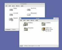
Spatial Nautilus isn’t really much to look at – you really have to use it to understand it. Screenshot from ArsTechnica.
If you think “Gnome and the Spatial Nautilus” sounds like a line from a novel that Douglas Adams and J.R.R. Tolkien might be collaborating on in the afterlife, please bear with me. Gnome is a group of projects that provide a desktop environment on Linux. Nautilus is the name of the file manager in Gnome, like Explorer in Windows and Finder on the Mac.
The “spatial” browsing metaphor a concept for browsing and managing files and directories of which the details are not important for this essay (to learn more about spatial browsing, see John Siracusa’s seminal article, About the Finder…). Suffice to say, the Gnome project has implemented spatial browsing in Nautilus in their latest release, and a lot of people really don’t like it.
Using the spatial browsing metaphor can take some getting used to, and many people who are used to another metaphor (or no solid metaphor at all) are understandably quite resistant to this new model. A fundamental and controversial shift like this is one I would not have expected an open source project to be able to pull off. While a closed corporation has a hierarchy of power, where one person can make a decision for all, consequences be damned, I was skeptical that such a move could happen in the looser structure of the Gnome project.
I was wrong. The developers of Nautilus debated and then declared their bold intent to “go spatial”. There has been much support, and much resistance. However, regardless of whether they were right (which will likely be proven over time), they deserve credit for making such a strong, clear, and decisive move.
Living Examples: Hunting for Preferences in Gaim
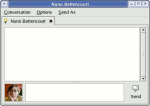
The Gaim messaging client is starting to get simpler with each release with a planned simplification of the preferences.
A third and final example of this pattern of interface elegance in open source software comes from a recent discussion on the development mailing list of the Gaim instant messaging client. Gaim is an open source messaging client that works with a variety of protocols (AIM/ICQ, MSN, Yahoo, Jabber, etc.).
Sean Egan, lead developer on the Gaim project, has posted his intent to dramatically simplify the “Preferences” in the application. He lists many preferences that can simply be replaced by a good default, and others that are just plain irrelevant. Rather than getting bigger and fancier with each release, the project seems to get simpler and more elegant.
Killing the Myth of the “Average User” and the “Power User”
Rather than aspiring to do everything imaginable, we are better off aspiring to do everything we might actually want our software to do in practice. While it may be that I’m attracted to projects that tend towards elegance in interface and design, I suspect that the examples I’ve cited here are not exceptions. Rather, I see them as part of a larger trend in open source software – one where simplicity and elegance in interface design is held in the same respect as elegance in code and engineering has been all along.
A kernel hacker, who we might all consider to be a “power user” may not be a power user when he just wants to burn a CD for his road trip. A database administrator, another typical “power user” may just want to chat with his friends, not perform an orchestra of preferences and settings in a chat application. We are all experts in some area of software and beginners in others (and our experience is constantly changing).
Rather than adding more and more features for the mythical “power user”, or swing to the other end of the spectrum and dumb-down the interface for the mythical “average user”, smart developers are learning that good defaults and elegant interface design makes software better for everyone to use, regardless of their level of experience.
- John Gruber cited Firefox and Camino as exceptional in their usability as open source projects in his critical reply to Eric Raymond’s essay, The Luxury of Ignorance. The reasons for the exceptional nature of Firefox and Camino are further discussed by Matthew Thomas.
Wow. That was a fantastic article, and I think that the final paragraph says it all. That is exactly the way I’ve been trying to develop software, but I never was able to express it so concisely. Thank you.
(I think slashdotting is imminent…)
I think in a lot of cases the Mozilla Seamonkey implementations were incomplete or poorly designed.
And true, it’s better not to have a feature than have it done poorly.
I fear that the simplification mania sweeping the OSD world is well meaning but ill-founded. The lack of user-centered design processes – specifically documenting use cases and usage frequency means there is no reality check for axing an option.
In case you would (despite everything) want to keep lots of options availabe, the key idea – i think – would be redesing of options interface. We are used to hierarchic toolbars where everything has its own place. This is problematic because many options could just as well (for example) be put under ‘file’ or ‘tools’ -bar – so its not very intuitive before you learn where to find everything.
I think it might be better to make options interface in mindmap style where each option would have “link” to options alike. For example when you are in “save” -option you would have links to options: “save as”, “open”, “page settings” and “close window”. In this way options wouldn’t have one “right” place where to find them but you could find them (in semantic web) by following the trace of options alike. What i think would happen in this is that most common options would have lots of connections to them and not so common options far more fewer, so there would be lots of options, but they wouldn’t be bugging you unless you’d be looking for them.
I feel the beauty of the Firefox design is in its open architecture. Features can be added in the form of “extensions” which allow the user to take the solid core product and expand it with whatever additional functionality they desire.
This is a wonderful way to allow your product to be both feature-rich, and lean and mean.
I agree with Frank, there. The nice thing about Firefox is that you don’t have to say ‘no’ to new features, you just call them Extensions and everybody is happy – ‘regular’ users, and the ‘power’ users who probably enjoy downloading a bunch of stuff anyway.
The power user who enjoys downloading a bunch of stuff doesn’t exist. The absurdity of desgining for mythical users is the point of the last section of the article.
During the recent Gaim preference culling mentioned in the article, much feedback took the form of “I don’t use it, but others do”. One of the Gaim developers smartly stated that such comments were worthless and would be ignored.
Steven’s dead on. The only outfit taht can get away with featuritis is Microsoft because it has unlimited resources and distribution power. Others must live within their means. There’s no substitute for simplicity both for end-users and even more so for development and maintain-ability. After 5 years, Mozilla has figured this out with Firefox. Now we just need to get Firefox to 1.0 and make it the core Mozilla offering. That cannot come soon enough.
I’m curious where you snagged that screenshot of Gaim. I’d love to have only the send button (or no buttons!) and the buddy icon in the IM windows, as is shown, but the latest release (0.77) doesn’t seem to have an option (heh) to do this. Was it from CVS?
Thanks for the great replies everyone.
Thomas, the Gaim screenshot is actually a hacked-up mockup I made for the gaim-devel list. However, you can now hide those buttons in the CVS version (and presumably the next release). The buddy icon has also been moved up to the left of the input box, as in the screenshot.
This is a great article, really hits the high points of things I would like open source to take to heart. One of the things I like about GNOME, though I don’t have a Linux computer at present, is that it seems to have taken a more Mac-like simple-to-use, powerful-to-extend philosophy, whereas my experiences with KDE always reminded me of a less-polished version of Windows.
I would hope that the makers of OpenOffice, functionally a great program, but with a UI that is downright hostile at points, would take something from this article as they design the UI for OO.o 2.0. We don’t need more buttons or prettier buttons, we need an interface that maximizes usability, regardless of the proficiency of the person sitting at the keyboard.
> The power user who enjoys downloading a bunch of stuff doesn’t exist.
The suggestion that there are no users who enjoy downloading addons for their software is basically wrong. If you look at the Mozillazine forums, there will always be a few threads where people are discussing which extensions they have installed. So, such people do exist, but they’re a tiny minority of people who appreciate the software itself rather than just regarding it as a tool.
In any case, the extensions system itself has all sorts of problems. There is a tendency to push out features that should exist in the core into extensions. In the case of Firefox, there are no UI guidelines for extensions, so they tend to suffer from too-many options and occasional flat-out bad design. There is the problem of too-many extensions – how many people are likely to search through nearly 200 extensions to find the one that adds the tiny piece of functionality they need? Worse, extensions can conflict and so a user can unwittingly reduce his browser to an inoperable state by installing the ‘wrong’ combination of extensions.
A case in point is the “SessionSaver” extension. This extension allows one to save and restore one’s browser state in a number of ways (manually, automatically when the browser shuts down, only after a crash). Of these functions, I want precisely one (resore state after a crash – although having said that, the other options have been useful). Now, restoring state after a crash should really be a core function (afterall, it increases the user-friendlyness of the product and doesn’t add any complexity). But it’s not so, instead, I have to put up with an extension that adds 3 items to my file menu (one of which isn’t actually an item at all, it’s a text label. In a menu.) and another submenu to my tools menu (which agan has two non-clickable labels). It also has an options dialog which is a model of unfriendly-terseness and has some truly bewildering options (it seems that, at some point someone decided they wanted to be able to restore a state of the browser with lots of different windows into a single window with multiple tabs). Since one is restoring the browser after a crash, one would expect to be asked on startup if one wished to have the session restored. Yet, as far as recall, it doesn’t do that.
So we have an extension that I’m using as a replacement for a single function which should be included in the core and should have a single dialog asking if I want to restore my session but instead has a horrific interface that lacks the single dialog box I expect.
To be fair on the sessionsaver people, it works really well and the interface problems may have been fixed in a more recent version.
As for simplifcation in general, I agree it’s a good idea and indeed I appreciate a simpler UI. But I get the feeling a lot of ‘power users’ feel differently. Witness the number of people who bitch and moan about the ‘simplified’ Gnome 2 interface but love the much more cluttered KDE interface.
As for jgraham’s reply about the troubles with the extensions system, the problem is that no solution will ever be 100 percent perfect. The extensions system is the best solution I have seen as to the problem of feature bloat. As for extensions being difficult to find, there are solutions to that (seperate) problem. While the extensions page looks great, really great, adding a way to sort extensions by popularity or voting would certainly help to make (well-designed or popular) extensions easier to find. Perhaps people could design extension ‘packs’ that would install a group of commonly used or highly rated extensions in one go.
As for the last section of this article, the terms ‘power’ and ‘regular’ user (to my mind) is language used to distinguish between two groups of users – those who want to customize the product and those who want to use the product out of the ‘box’. Extensions allow Mozilla to provide a fast, solid foundation like Firefox without sacrificing the ability to customize and add aditional functionality. If there is a better way to serve the needs of ‘all’ users, call them what you will, I have yet to see it.
To clarify, I believe the extensions system is wonderful. But it is problematic from a UI standpoint because extension developers aren’t held to the same standards as the first-party developers.
One solution might be a HIG document for extensions. Then at least people would have some rules to follow.
These are three nice examples of Open Source projects that have, or are beginning to have, polished user experiences. But there are thousands and thousands of Open Source projects which do not.
User experience work is very hard. That a few projects have reached a point in their maturity to be able to “afford” high-quality user experiences isn’t that surprising. What will be surprising is when it’s the rule, rather than the exception.
That’s a long ways down the road. But this article, and further attention to the value of quality UI, are great steps to be taking down it.
Power and simplicity are not contradictory:
– The barrier to entry should be as low as possible to build users’ confidence
– The users who use the tool the most will find they could improve their productivity by customizing it. At this point a few well-thought out mechanisms are needed to minimize the learning curve. The tool I have written for work has three such mechanisms:
– All non-performance critical code is written in Python, and can be replaced by the user
– A grammar file to specify register formats
– Skeleton files that can invoke Python code
These mechanisms shouldn’t be add-ons, but rather the way the tool itself is written since they need to be well tested and easy to understand for users. If the mechanisms provide easy customization for users, they also do for the maintainers.
There are many programs I’ve given up using because I find they are missing essential features. When I launch a music player, I expect to find all the options I need. Perhaps they’re hidden under and ‘advanced’ button, but they should be there somewhere. If I need to install an ‘extension’ just to use your program, then your UI sucks. There is a common theme to all these programs, they’re all part of the gnome project. Coincidence? I doubt it. Of course, I still use many gtk and gnome programs. I’m just noting that all the programs which I’ve ultimately found inadequate have been gnome projects.
90% of users just sit down and use their programs as-is. They don’t go and tweak the program, they don’t do anything. Changing the background is about the limit of tweaking by most users and many don’t even get that far. It doesn’t matter how bad the defaults are, users don’t change them — I was recently in an office and the screen was still flickering at 60Hz. When queried, the owner said “I don’t dare touch anything”. The lesson I take from this is that good defaults are critical. I notice you came to the same conclusion. If the default install of your app aren’t easy to use, then your app is going to have no end of problems (compare scribus to quark — regardless of features, scribus feels ungainly.)
But my opinion differs markedly as soon as you go beyond the defaults. Since the defaults are good in 90% or more of cases, a user changing them is a power user by definition. That user wants the feature which will make the program better. Here is where the gnome project fails miserably, such users are told quite simply ‘No’. Well, that sucks. The first thing that these 10% of users should be offered is a few simple options — perhaps the ones mentioned above in the ‘Well, I don’t use it but I know x does’ category. The goal is to satisfy as many people as possible with the minimal amount of effort. Most people can be satisfied by the defaults. Most of the rest can be satisfied by a few simple options.
As an aside, claiming extra features decreases stability is wrong. Sure, the naive way of implementing extra features is to build them straight into the code (decreasing stability) but if you’re going to go to the effort of writing an extension mechanism then it is no more work at all to dynamically load any non default preferences as you would an extension.
Extensions are not an acceptable solution because they’re just too complicated to install. Extensions are appropriate when you want to go beyond the core functionality of the program. For instance, an extension to the printing system could add printing to PDF (something that is not core to printing, but many people want). However, as soon as you start putting functionality many people want into ‘extensions’, you ruin the application. Firstly it becomes hard to set the optimal defaults. But more importantly, when the user finds the defaults are inadequate, the barrier for that user to fix their environment is far too high.
The main problem with programs having lots of features is the defaults often suck. This has certainly been a problem for various KDE apps in the past, and will probably continue to be a problem in the future. Conversely, it won’t be such a problem for gnome since programmers know they can’t expect the users to fix it. Lets go back to the mozilla/firefox debate. I see the main problem with mozilla being that its defaults sucked. That meant users had to go through all sorts of hoops to get their browser they wanted. In creating firefox, developers had to get rid of those options, so they were forced to select good defaults — they could no longer use the excuse ‘the user can change it to something they prefer’. Imagine if mozilla defaults was just like firefox until you hit the preferences menu option. Suddenly most of the justifications for using firefox disappear. Speed? Hardly a problem with prelinking, especially if you’re just using the defaults. Reliablity? Not a problem with dynamic loading.
As an attempt to summarise… 90% of users will stick to the defaults, so make them as good as you possibly can. When a user doesn’t want the defaults, chances are it will be a simple tweak which many users want. So put these popular variants in a fairly prominant place. But DO NOT STOP THERE!. Some people want the advanced functionality and that should not be relegated to requiring them to download it from the net. The ‘advanced’ tab is a pretty simple concept, and my only complaint with it is it’s misued too often. Then, and only then, put in your extensions mechanism if you want. The goal is to satisfy as many users as possible at every step. You want to satisfy 90% of users without showing them any options, then most of the rest with just a few simple options, then most of the rest with enough options to avoid the need for extensions.
Sorry for the long post.
Great article, Steven.
Here’s my two cents: It’s not the amount of features (or lack thereof) that matters. It’s more important that they are displayed in a friendly manner. Of course, as stated in the article, some features can be entirely worthless and shouldn’t even be considered if the developers feel that be the case.
It seems that many programmers start with a few options in early stages of the program, listing them with a checkbox or three. Then add a few more checkboxes, and a few more, and a handful more, and eventually you’ve got a mess of nothing but checkboxes cleverly placed to fit in the small amount of real estate given. This is either a result of laziness to refine the UI, or poor planning and implementation. After major changes have been done per dialog, there should come a time when the programmer should sit back and consider options of making it a little more usable. Nobody likes to look at a window and read every little option that’s there when there are a hundred of them. More likely than not the user is just looking to find a certain option and change it as needed.
My point should now be clear. Functionality shouldn’t be affected at all, just the organization of the functions themselves.
At some point, I believe developers should halt development on features and code efficiency and focus on the UI for a minor version number or two. The user interface is just as important on the code it runs on, and should be given stringent usability testing for every large change.
Bug fixes are nice and all, don’t get me wrong, but I won’t get the chance to find the bug if I don’t want to use the program.
Great article. I really like simple software. Less is more.
Maybe it’s an idea to not completely delete the “advanced” options from the code, but only to remove them from the UI. This as long as the code doesn’t get bloated because of all options and only if the options fill a real need. These options can be modified by “power users” via the .config files of the programs.
Then create a general purpose tweaking program “LinTweak”, with which you can edit the hidden options of the software. This I should of course work with plugins so everybody can add tweaking for any program that has tweaking options.
really good article
Perfect. I made a bookmark and this will spare me writing lots of words in the future. 🙂 You explained it really well.
As for extensions, I believe that they are mostly good because they make it easier for maintainers to say “no” without getting flamed by the tweaker crowd. Other than that, I don’t think they are really useful. Maybe for testing new features or for very specific tasks (for example I’d really enjoy a well designed web developer extension for Epiphany, ideally this should be installed by default and activated either from the GUI or a simple gconf key), but in general, applications should be designed as if extensions wouldn’t exist.
as with many other comments, an excellent article; succinct and insightful. regarding extensions, perhaps the following scenario may be a workable middle ground for those who love them and those who find them a blasphemy *g*…
allow extensions, but use the download count or some other metric as an indication of popularity/desire/need; when a given “measurement” has been reached, implement that extension as an integral part of the product. the majority has spoken and the extension list for future releases is reduced by one.
I have seen several articles on the topic of user interfaces recently, and have a few thoughts about it.
1) There are many functions that are common to most projects, such as file operations, help (general and context sensitive), printing, viewing options, etc. A skeleton with the most common features would provide developers with a headstart on their user interface, as well as samples that could be used to add the unique features of that project. It would be helpful to have at least one for each of: Gnome, KDE, lesstif, curses, and XUL.
2) In the same vein, while there is a certain amount of art to creating user interfaces, there are also many well-known practices. A site providing HOWTOs and sample design documenation in a format like wikipedia so that it is a living project and can be easily contributed to by users as well as developers and UI professionals would go a long way to helping projects that already have a lot on their plate just getting the blasted thing to work>:-(!
3) A thought about configuration options is to make them context sensitive. A right click would pop-up a menu where configuration is a menu selection, and the submenu would have the options for all of the active elements.
4) Back in the old days of IBM mainframes, they provided several times the number of options that most users would ever need, many of them for tuning. Of course, since they thought of themselves as a hardware company at the time, the defaults were far from optimal. This meant that customers who didn’t change them would need to upgrade their hardware sooner, and those who did had to take IBM education courses to learn how (yet another example of how Microsoft does not innovate). I have kept in mind how much I hated this, and in my own development, as much as possible, have the program dynamically tune itself. Would this be possible to do with user interfaces? Here are some ideas:
a) Reorder menus to put the most frequently used items near the top.
b) If a user performs many of the same functions in the same order, automatically build a macro and use it when the beginning sequence is entered (like editor macros that perform shortcuts for certain languages, like closing brackets in C loops). Of course, allow the user to modify it immediately to add prompts and provide the option of executing automatically or displaying a small window with a simple hotkey or mouse click to activate it.
c) If there are several ways to navigate to the same point, keep track of how a user typically does it. When the beginning of that path is selected, display the entire path (like Open Office automatically finishes words). Or, if an option that is nested in several levels of menus is used frequently, move it to a higher level menu.
d) Use a threshold of the number of repititions before “learning” takes place and make it configurable, perhaps with a slider bar from slow learning (ie. many repetitions) to fast learning (ie. 2 or 3 repetitions).
(Note: Coming here from LinuxToday which just linked to the page today.)
JJS:
a) Reorder menus to put the most frequently used items near the top.
Please, not this. Think about it: just when you’re learning where something was, it would move somewhere else…
I’m sorry to keep this going, but I’m still stuck trying to figure out why people are objecting to extensions. The way I see it, extensions are there to provide the ability to customize or add advanced functionality to a program in order to suit obscure needs. The question is, why wouldn’t you want to offer the ability to build extensions? Because they’re too hard to install? Because they might not match the look/feel of the program? There is no way to put every possible feature that anyone might ever want into a product like Firefox. Therefore, the designers chose to allow users to add obscure (but perhaps important) functionality through extensions. This way, the available options could somehow be kept to a minimum, and the defaults hopefully optimized to suit the tastes of the majority of users. To my mind, that _is_ the “elegance” in Firefox.
I would like to add to your Living examples the GTK application Firestarter. It is a very simple Wizard and administration program to set up and configure a firewall. I have tried before to set up a firewall on my home Linux system and given up for lack of time and promised myself to learn how to set up the configuration files.
I found Firestarter installed simply from an RPM at the projects website and within minutes of the install I had a working firewall. Everything was intuitive and easy to follow, in short elegant and Impressive.
I’d go one step farther and say that as a power user I expect things to be simpler. As a developer, I have certain expectations of what I will find when I go to perform a particular task. If I am bombarded with fifty options where I expected 4, I may be able to work through it with more aplumb than the average user, but this doesn’t mean that I like it any more than the average user.
I’m going to have to disagree with you about Firestarter, Bill. I’ve never gotten it to work. After I install and run it, I have to click through about 6 pages of dialogs, and then (with the defaults, which it says will give me a default firewall) all it does is shut down my network connection, in both directions. The documentation seems to be mostly of the “list all features” form, not “how do I use it” form, so I can’t figure out how to fix it. There are probably over 100 controls (menuitems, controls on each dialog, lists in tabs, …) to set, so I have no idea where to start troubleshooting it. (If I was a firewall expert I probably could, but that’s just the point, no?)
Compare Mac OS, wherein you open the Networking control panel, click the Firewall tab, and click Start.
Don’t give the Gnome developers credit for making a decision and sticking to it. They decided which of two options was best for ALL users and apply it as the default. The spatial metaphor is hardly innovative. Finder did it. Win95’s “My Computer” view did it (and all subsequent versions still support it). The OS/2 Workplace Shell did it. I find more people using the Explorer view in Windows than the “spatial” view. They dislike the clutter that comes when a new window pops up with each double-click.
Unfortunately, the Gnome developers have forgotten that they come from the “free software” movement, which believes that software should empower, not constrain, users. Their design decision deliberately removes a measure of control the user has over their environment. That is not a laudable thing.
“They decided which of two options was best for ALL users and apply it as the default.” Well, yeah, that’s what developers have to do. If you have 2 options, you have to pick one or the other for the default. 🙂
“Win95’s “My Computer” view did it…” No, it didn’t. Go read Siracusa’s article. Windows does not have, and has never had, spatial file management. They have a “big icons, and open folders in new windows” view, but it is not spatial — so even the most hardcore Mac user is hard-pressed to like it. Hardly a condemnation of spatial.
“Unfortunately, the Gnome developers have forgotten that they come from the “free software” movement, which believes that software should empower, not constrain, users.” Utter bull. The source code is there if you think you can do things better — it’s free software in every sense of the word.
As for keeping things simple, this does not (necessarily) make users less empowered. Put your mom in front of a Mac, and then put her in front of a Linux console, and ask her which she feels more empowered using. Making a free operating system easy enough that my mom can use it is most definitely a laudable goal.