 I’ve been conducting a user interface experiment with myself as the subject. A long-time Windows user and armchair graphical user interface critic, I have spent a week working in Mac OS X. What follows is my review of the experience.
The Scene
My primary computer is an IBM ThinkPad T30 laptop running Windows XP. Most of my time at the computer is spent using a web browser (Phoenix/Firebird and Internet Explorer 6), reader/writing email Outlook 2002, and doing web development work (PHP/XHTML/CSS via HomeSite and graphics via Photoshop/Illustrator).
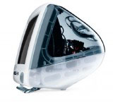
The mac I’ve been using is old graphite iMac we have at work for testing web applications. It has a 15″ CRT, a 400MHz G3 processor, 192 MB of RAM, and is running OS X 10.2.5. Not the latest and greatest hardware – and it showed – but it was sufficient for most work.
I’ve always been familiar with macs, but I’ve never spent enough time with one to actually make a fair judgment on their quality and usability. Using a mac always felt to me like trying to use a computer with boxing gloves on (much respect to Strong Bad). I’ve often wondered if it was simply due to my familiarity with Windows conventions rather than any difference is quality of design This is my third full-workday on the iMac and my experience has been interesting. Here are my observations.
The Boxing-Glove Effect
First, it look me a full day to get beyond the simple differences between Windows and OS such as basic key combinations, window/application switching, and the location of the special keys (Control, Alt, and the whatever-the-hell-you-call-that-thing mac key). For the most part, these differences are innocuous – neither better nor worse on one platform or the other – but a serious hurdle in switching between the two. It doesn’t help that my ThinkPad has an annoyingly non-standard location for the Ctrl key. My hand muscles are more confused than they were during puberty, but as I did then, I’m mastering them.
The hardware is an odd combination of great and crap. The CRT is a great quality, though 15″ & 1024×768 is way too small for me. I tried not to judge too much based on the screen-size, as larger screens are obviously available. An LCD would be nice too – also available (read my initial reaction to the release of the flat-panel iMac).
The slot loading CD drive is a nice touch. Perhaps there are engineering reasons why more manufacturers don’t do this – but it is great in practice. The little speakers are all right for general use, but you won’t want to throw a party with them (I tried, but only one person showed up).
The keyboard and mouse are crap. I know Apple has since replaced the puck-mouse, and bashing it is passé, but holy crap is it bad. The mouse is perfectly round, making it difficult to feel which is the front and back – important piece of special knowledge when using a mouse (as it determines the direction of the cursor). The keyboard has tiny arrow keys and tiny home/pg-up/pg-dn keys. Luckily you can easily replace a keyboard and mouse. Otherwise these unfortunate components would be a deal-breaker.
One major problem with the iMac: it made me look like a dork. Those who know me understand that I am one who can rely solely on my physical appearance to get through life. Having a cute-looking gum-drop computer on my desk caused my co-workers to laugh every time they enter my office/cubby-hole. Don’t underestimate this – the dork appearance factor is probably killing sales of the Segway. Granted, I would look like a total bad-ass with a 17″ titanium Powerbook or a new 17″ flat-panel iMac.
The Software
The software proved more interesting (and is more up-to-date) than the hardware, I’ve criticized OS X for being over-designed. I stand by that criticism, but it was not an impediment to using the computer. In fact, I found that the GUI had a more solid overall feel than Windows XP (which is quite rough around the edges). Everything is smoothly anti-aliased the visual elements (windows, widgets, menus, etc.) gave an impression of depth and integrity.
 I came across a few particularly nice touches in OS X. When working on a document that has been changed since last saved, the window-close control (the little red orb), has a dot in the center. This indicates that if you click the close button, you will be prompted to save or discard your changes. This is a smart and unobtrusive feature that proved very useful (I happened to be working with a lot of HTML files this week).
Closing an unsaved document brings up another nice feature; Rather than the floating dialog boxes of Windows and previous versions of MacOS, dialog windows (a.k.a. “sheets” in applespeak) are attached to the title bar of their parent window. The subtle animation of the sheet sliding in from the title bar of the parent window helps reinforce the association between the dialog and the window. Nice simple improvement.
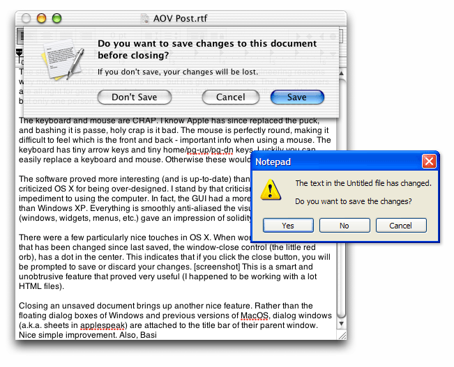
A simple unsaved document warning dialog also highlights something MacOS has always done better than windows: wording of dialogs and controls. Take these two examples of a save-warning in Notepad on Windows XP and TextEdit on OS X. Windows asks me “Do you want to save the changes?” and presents three buttons: “Yes”, “No”, and “Cancel”. OS X asks a similar question “Do you want to save changes to this document before closing?”, but the three buttons presented has a powerful differences: “Don’t Save”, “Cancel”, and “Save”. See screenshots of the OS X and Windows XP save dialogs.
While some dialogs were well worded, I did find inconsitencies. For example, the Empty Trash confirmation dialog has “Yes” and “No” options rather than the better alternative of “Cancel” and “Empty trash”
The OS X scheme forces me to click on the action I want to perform. If I want to save, I click “Save”. If I don’t want to save, I click “Don’t Save”. On Windows XP, I have to figure out (as simple as it seems), what “Yes” and “No” mean. This forces the user to understand the question before clicking (if it said “Discard changes”, then clicking “Yes” would delete your work). Also, the “Don’t Save” button, the most dangerous option, is located farthest away from the “Save” button to reduce the possibility of accidentally clicking on it.
The Dock
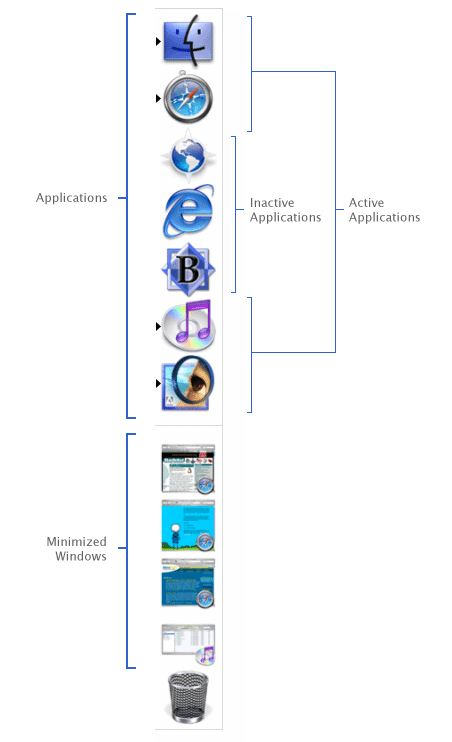 The infamous OS X dock confused me for quite a while until I understood that it can contain three distinct types of objects: Shortcuts to applications that are not currently running, icons of all applications currently running, and icons for any minimized windows (oh, and a trash can). See a diagram of the three dock-item types. At first, the inclusion of both application shortcuts and applications that are currently running in the dock seems like an odd design choice. However, I grew to appreciate the diminished distinction between applications that are actively running and those that are not running (the only visual difference between the two is a small black arrow with the icon – see the screenshot to the right). However, I did find this made it easy to unintentionally leave a trail of opened applications with no documents open after a while.
The thumbnails of minimized windows in the dock proved surprisingly useful if kept sufficiently large (though I’m not sure they are worth the screen real estate and I expect most power-users have their dock set to be quite small). However, the general window management proved awkward and frustrating for an experienced Windows user. Windows provides a tile in the task-bar for all open windows. OS X only shows minimized windows on the dock. This led me to the following frustrating scenario several times: I have several windows from several applications open. I open a new window that is larger than all the other windows, completely hiding all other windows. I have now have no way to get to the other applications without first moving or minimizing my current window. Pain in the ass. I can imagine this being a significant long term annoyance with OS X. Update: Several readers have pointed out that you can Command+click (or right click, or click and hold) on an active application icon to get a menu of the current windows. So noted.
The Finder
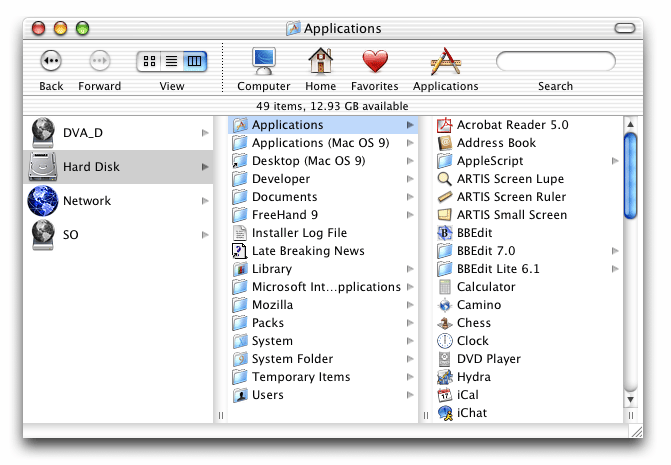
The Finder was another area of the Mac that seemed to be polarized – some great things and some real crap. Plenty of smarter people than myself have written about the OS X Finder. The three-pane view, a relic from the NextStep OS, is fantastic. Part of the work I’ve done on the mac this week involved editing a large number of HTML files buried in a deep hierarchy of folders (on a Windows NT 4.0 machine, no less). The three-pane column view was much better than the Windows explorer-tree (which is quite good).
The icon view in the finder also had a nice feature that Windows could learn from.  The icon view shows additional information about objects when there is room (eg. image dimensions, or the number of items in a folder). Nice, but I’d like to see it taken further: add a “zoom” control to the finder icon view, the closer you zoom in, the more detail you can display about objects (see Eazel’s Nautilis).
Working with both Linux and Windows (98, 2000, NT, and XP) machines on the network proved surprisingly smooth and seamless – this is a massive improvement from my experience with previous versions of MacOS.
The “spring-loaded folders” feature is something I will miss in Windows. Pickup an icon and drag it over a folder, if you keep holding down the mouse button, the folder will open, you can then hover over child folder, which will open. You can repeat this process indefinitely, making it easy to navigate deep into a folder hierarchy. Then, when you finally drop the icon, it is deposited in its final location and all the windows you opened close. It works well.
Elsewhere in the System
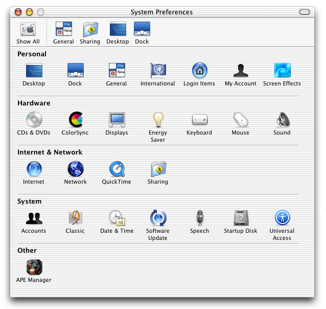
The System Preferences was generally well organized, though I was completely confounded by the bar along the top of the System Preferences window. It contains duplicates of icons in the System preferences window. It is customizable, and I suppose it is intended as a place to put frequently-used items. Duplicating icons in this already crowded window seems to be an odd choice. This is particularly puzzling since other applications use a similar-looking icon row at the top of a preference window in the same way tabs are traditionally used. I welcome any insight into this design decision.
 The Safari browser (I was running Beta 2) is shaping up nicely. I’m not sure about actual rendering speed, but it felt faster than IE5.5 or Camino (which is also a very nice application). I even got used to the brush-metal appearance of the Safari window (something I started off hating). I did find that there was insufficient feedback when a link was clicked. If a server took a few seconds to respond, the only indication that a link had been clicked is the blue bar in the location box (and it remains motionless while waiting for the server to reply). As a result, I found myself clicking links repeatedly before realizing that they were already loading from the first click.
Another feature I’ll miss in Windows is the highlighting of active form fields. The active form field is highlighted with an unobtrusive but strong blue halo. I was mystified that using the Tab key (or Shift+Tab) to move through form elements only selected text input boxes, skipping radio buttons, pull-down menus, and check-boxes. Can anyone offer an explanation for this? You also can’t tab through buttons in a dialog box (“Save”, “Don’t Save”, and “Cancel” for example), meaning mouse is required for something that can be easily (and quickly) done with the keyboard in other windowing systems. Is it possible to operate a mac without a mouse?
 Another annoyance: while icons have nice visual transparency, they also have tactile transparency. This basically means that if an icon has a hole in it, and you click in the hole, you haven’t clicked on the icon. What!? The Internet Explorer icon is a good example: the gaps in the “e” (not to mention all the white-space around in icon) are mouse-click dead zones (the orange-pattern highlighted area in the image to the right is not-clickable). The dock gets around this by making the entire icon area clickable – the finder should do the same.
On the even more nerdly front
I’m not an expert in Unix or Linux, but a friend who is tells me that the integration of the GUI with the command-line-type functionality (super-user permissions in GUI dialogs, etc.) is better than RedHat or anyone else has been able to do. For more on the Unix aspect of OS X, see this 1-hour presentation by Apple’s VP of Software Technology and alumni of the friend-linux-GUI Eazel project, Bud Tribble. The presentation is an interesting look beyond the marketing gloss at Apple. Tribble seems as wary of hard-core mac fandom as I am. He also talks about how Apple listens to its customers, and then often chooses to say no to feature requests – a smart move, if done properly (this topic is discussed at CEOBlues.com).
So what does all of this mean?
I’m not going to run out and buy a mac tomorrow (sorry Dave). However, I am more impressed with the operating system and interface than I expected to be. Previous experiences with the mac never lasted long enough to get past the simple brain-cruft of familiarity with Windows. I’ve caught a glimpse of what it is that seems to make mac fans just that, “fans”.
By the way, here are a few corny posts titles I rejected for this post:
- The OS X-Files
- An outsiders’ tales from the Apple orchard
- A Taste of the Forbidden Fruit
I found, over a year or so of fiddling (note: a year in mac-time is enough for apple care to double in price, even though you think you have a year to recover from your first purchase before buying insurance) with an iBook, a few solutions to your problems:
First: You can Apple+Tab through windows the way you would in Windows. I like the action on Jaguar’s Apple+Tab more than 10.1.x, it bounces between applications. Although I’ve argued this with people, I’m not sure what the real behavior is, I think it bounces back the way Windows does, and the other just iterates through the applications, needing a Shift-Apple-Tab to go back.
Second: A big geek thing about Jaguar was spring-loaded folders. There you go.
And I’m pretty damn sure there is a shortcut for dialogs. It just escapes me right now. Something like Apple-O or Enter, or something.
I own both a new hp windows system and a six month old Mac, the fact that the windows system is new aside. I much prefer windows for every day use; but when it comes to using Photoshop/illustrator and the like, I much prefer to use the Mac.
Why criticise hardware that’s long gone? (keyboard, mouse, iMac shape)
Windows has taskbar for all open windows: I had trouble switching to other open windows.
Command (the proper name of the “Apple Key,” abbreviated “Cmd”) + ~ switches between open windows within any app, across the system. Also many programs have a built in “window” menu for keeping track of open windows. Many of those assign keyboard shortcuts to get to the window you want instantly. One example assigns Cmd+1 to the first opened window, Cmd+2 for the second… Still could use some polishing.
System prefs window:
Customizable top bar doesn’t bother me. it uses otherwise wasted space next to the “show all” button. Plus, if you don’t like it, press the “tic tac” widget on the right of the title bar to toggle it on/off. Use the “panes” menu to navigate to other panes when the “show all” is hidden.
Tab navigation in web forms:
Programmers can allow tabbing to select other elements of the page. See the preferences within Internet Explorer for an example. Otherwise, use the “feedback” link in Safari!
dialog box use
In “save” dialog boxes, use “Cmd+” the first letter of the choice you want, for example “Cmd+D” to select “Don’t Save” This issue could still use work. Also, enable “Full keyboard Access” (Keyboard System Preference) within to allow tabbing to select options in dialog boxes. Keyboard-only navigation in Mac OS X is still not yet perfect. It seems Apple desperately does not want to copy Windows’ pretty decent system for this.
“The OS X Files” is already taken by Bob LeVitus, a noted Mac author.
Here’s hoping next time you try out the Mac in the professional environment, that you get to try a Pro machine that isn’t two years old and designed well before its OS. Says a lot for older, bottom of the line Apples, though.
i grew up on the mac (an old centrus 650 25 mhz). that said, at the age of 14 the family got the first pc. SInce then I’ve built 4, and have become somewhat of a web (wanna be design) junkie. I’ve dabbled with linux a few times… mainly after the look of KDE 3 and 3.1…. enter mac OS X. I really like the look, but I havnt ever gotten to use the OS for more than a few minutes at a time.
thanks for the details.. I have been lusting for a mac recently, but im not sure that when i get the money i’ll be able to spend it on the computer. i have a great pc right now with all the latest software… i wish i could find somthing to justify buying the damn thing. maybe if i get into art school i’ll be required to have one.
anyway, thanks, its a good read.. i love the analysis. I also really liked your windows xp article. keep it up.
Interesting article!
I’ve been a Windows user since the early release of 95. I always upgraded to the newest version (switching quickly over ME) and now run WinXP. I know PC’s and now how to fix them when they don’t do quite what I want them to do. I know how to fix other people’s PCs. I like using Windows.
Then I get a job at a local newspaper and they only used MACs – besides the couple PCs that managers would use because they most likely didn’t want to make the switch. For 2 years I was forced to learn the ins and outs of my 15″ green iMac gumdrop. I was using OS9 because some of the software we needed to use wouldn’t work on OSX yet. In fact – I still use OS9.
About a year-an-a-half into the job I got a freelance project and worked out a deal to make this company a small website in exchange for a new MAC. The deal was made and I got to bring my first MAC home to 3 other PCs.
At first it was a fight to see which one really took more of my attention. At first it was my MAC because it was new and I wanted to master it. Then it was my PCs because I could get things done faster. Months went by with this changing of hangs until I stopped pulling my PC keyboard in front of me and continued to use that MAC’s.
To be honest – I love them both and have to use them for testing purposes. However – when it comes right down to it, I love my MAC. Call it a crush but I think it’s for real.
I agree with most of what you had to say but having a better keyboard and bigger screen definitely enhances the user experience.
—————————————-
To answer your System Preference bar question:
—————————————-
Yea – it is for frequently-used items. It doesn’t make much sense to have those there until you actually go into customize a setting. For example: Say you go to the System Preference panel and choose to change the desktop image. Instead of having to jump back (by clicking the top left SHOW ALL icon) you can quickly jump to your next commonly used preference area.
When you look at it like this it really ends up saving to a bit of time.
Alright – I’ve written enough today but great write-up Steve 🙂
RE: bc and System prefs window:
Turning it off or navigating without it is not the point. The point is that the initial reaction of some users is confusion. If enough people are initially confused by this feature I’d say it is bad design even if it can be turned off.
I agree, it’s a tad confusing, I had removed it without even thinking (wide button in upper right corner of the window). It’s hard to see what the justification would be for the current implementation.
You’ve obviously forgotten the (in)famous “an error of type -11 has occurred”…
“My hand muscles are more confused than they were during puberty, but as I did then, I’m mastering them.”
Most disturbing line on AOV ever!
“I have now have no way to get to the other applications without first moving or minimizing my current window.”
Also worth noting is the amount of either free or cheap little utilities that make OS X better to deal with. In this case, WindowShade X, by Unsanity, brings back the OS 9 tradition of shading windows upon double-click to the bar. This helps immensely.
Also definitely needed is LiteSwitch X, which makes Command-Tabbing through running applications so fantastic it hurts. Especially great is the ability to mark any and all for quit, and then releasing the command-tab keys, quitting all marked apps instantly.
another comment…
about the save dialog, looking at this has made more a little more observant of the dialog boxes on both my winxp and rehat machines. It seems gnome has caught on to the “save”, “dont save” idea. is this new (i am a new commer to linux–running redhat 9).. or has windows just been too slow (or arogant perhaps?) to recognize this (dialog box wording) as a good idea? comments?
~bc: I did keep in mind that I was using old hardware. I imagine the experience would be much better on a newer machine (especially with the improved mouse and keyboard and larger screen). That said, I don’t feel that the hardware actually limited my experience with the operating system very much. Also, see Nathan’s reply regarding the system prefs window. Thanks Nate.
Charlie: I’m sorry to disturb, but I’m all about de-stigmatizing masturbation – the human wang is a beautiful thang!
Garrett: I’ll check out those after-market add-ons (WindowShade & LiteSwitch) – however, for the purposes of my “experiment”, I wanted to stick with the core OS.
ryan: I think Mac OS has had these well-worded action-oriented button-labels in dialog boxes for a long time (am I right?).
Tim Bray has some good comments on keyboard navigation in OS X.
Thanks for the great comments, everyone.
Suddenly I’m glad I’m using ObjectDock on Windows instead. I can’t believe there isn’t an option to show all windows, and not just minimized ones. Doesn’t this make it completely useless unless you minimize every window you’re not using in the foreground?
This is odd. Maybe it’s, like keyboard navigation, just an instance of Apple not wanting to imitate Windows’s taskbar?
Anyway, I still want a Powerbook for next Xmas.
Now Steven, what you do in the privacy of your nerd shack…”tickling the silver oranges” I hear you’ve named it…is your business. But as to whether it’s appropriate for the general public…I don’t know..
I just switched to an eMac from a Toshiba laptop with ME because I was ready to start on a new project with a new graphics program and tablet, but also because I have a quite large portfolio – over 200 pages that I don’t want to lose to disk corruption or a virus or a hacker. I find the Mac very fun to use. It is very fast and productive. I have a GB of RAM and I can load old Mac programs without slowing down at all. I had 384 MB RAM with Windows ME, but it didn’t handle memory very well. Once I had to programs up – one taking 64 MB RAM and the other 32, Windows would say it was out of memory. Never had any problems with the Mac’s memory management.
If you lost a window and you want to find it click on the application icon in the dock and then select window from the top menu and you can then select the window you want. I did find it hard to navigate on older Macs but not on OS X. The graphics are incredible compared to anything I have seen before on a computer. I am actually playing games on the Mac – they are fun on the Mac whereas they were a real pain on the PC.
That was an excellent, well-balanced article. I’m a Mac freak myself, but using both Mac and Windows extensively, I can say that your observations are very accurate.
Cheers,
Aaron.
TABBING TO MORE THAN TEXT BOXES:
Go to System Preferences…
Go to the Keyboard section…
Go to the Full Keyboard Access tab…
…Change the radio button from “Text boxes and lists only” to “Any control”
-Nathan
One more comment on window switching within an application… in addition to the other poster’s comment about Cmd-~ switching between open windows in an app, you can also do so from the Dock… just right-click (or Ctrl-Click, if you haven’t ditched the lame one-button mouse yet) on an application’s dock icon, and the context menu will include all open windows for that app.
I know this works on many apps, but I’m not positive it works for everything. Works on the browsers & apps I frequently use, though.
Switching between open windows in Mac OS X is actually very easy, if you know how. Control-click (or right-click if you have a multibutton mouse) on the icon for the application in the Dock. This brings out three options in most cases: a list of open windows enabling you to go to the exact window you want, A possibility to include or remove the application from the dock when not active, and the ability to quit the Application without bringing it to the foreground unless documents need to be saved. Also you can control-alt-click an icon in the dock and be able to force-quit a crashed application.
I am a long time Mac user. I did my video editing using FCP and burn DVDs using DVD Studio Pro. All I have to say is that there is no match for that in the PC world.
The place where I work uses both Windows and Macs. Sure. PCs cost a bit less. But there is no complete solution for Video and Audio. Configuration is a lot of work. And if you have multiple packages running, you have to try your luck. You cannot install different packages on a single PC.
” I did find that there was insufficient feedback when a link was clicked. If a server took a few seconds to respond, the only indication that a link had been clicked is the blue bar in the location box (and it remains motionless while waiting for the server to reply). As a result, I found myself clicking links repeatedly before realizing that they were already loading from the first click.”
Just in case you plan to continue using OS X at all, here’s a tip. In safari go View->Status Bar (or command-) and this should give you the same amount of feedback you are used to. It’s still beyond me why apple chose to leave the status bar hidden by default – many people have complained about it.
Good review btw. Very refreshing to find an unbiased look at os x from a windows user.
L.
Re: open windows not appearing in the dock. The primary reason for this is that the Mac is application-centric while Windows is window-centric. For example, within Windows, closing the last open window of an application causes the application to quite; Mac OS does NOT assume u want to quite the application, so leaves the application running, ready to open new windows when called upon.
With respect to the Dock, this is why Applications are shown but open windows are not. The confusing part for Windows users is that the Dock can also hold almost any other kind object, such as folders, non-running applications, minimized pages, etc. Specific open windows are accessed, as others have pointed out, by control-clicking on an application and choosing the desired window from the popup list. This functionality drastically reduces dock clutter, making the Dock more efficient. (How does the Task Bar look when you have 20 html pages open for editing?)
If one is a new computer user, is familiar with the Mac design philosophy, or is not un-learning Windows, this functionality makes perfect sense. Its one of those basic issues that always causes problems for those of us that are “bilingual”.
Additional option for switching to a “buried” application window. Select the icon in the dock and hold it. A menu pops up which almost certainly lists all the open windows for that app.
What was that, about 4 different ways to get to a hidden window?
(How does the Task Bar look when you have 20 html pages open for editing?)
Well, it combines them all into one thing. It’s kinda annoying actually, but no real clutter.
I’m sorry you didn’t like the shape of the Graphite iMac. Our family likes it so much we just bought a Graphite iMac for the kids at their request to replace the Bondi Blue one we gave the grandparents. It is an interesting shape. If you look at it for a while you see a lot of thought went into it.
It’s interesting that you mention the “boxing gloves effect”. I use both Macs and PCs and for me I think I’m wearing a Strait Jacket whenever I have to use windows. It just seems that windows only wants to let you do things certain ways whereas the Mac tends to get out of the way and let me work.
Thanks for an interesting review.
I use a PC with Win 2000 at work, but I Own a Mac. There just has to be something said about the Windows boredom factor. I use my PC at work because I have to. I use my Mac at home because I love to. It’s just that simple.
Also, you didn’t mention that Apple now has a utility called X11 that lets you run unix/linux software on the Mac. Lots of neat open source stuff out there. Very geeky, but can be cool. Try OpenOfice.org for a free replacement for the way overpriced MS Office. Very nice.
Also, there is one more type of item you can put in the Doc… folders aliases. I put an alias of my applications folder and an alias of my hard drive in the Doc. With one click I can start any application on the machine. Also with one click I can branch to any file anywhere in the hard drive. Try that in Windows… NOT.
In all that, I still haven’t found anything that I can do in Windows that I can’t do on the Mac. (Not even counting Virtual PC).
One comment on the hocky puck mouse. I agree, it is too small for adults, but I noticed that it fit childrens’ hands perfectly.
“Also, there is one more type of item you can put in the Doc… folders aliases. I put an alias of my applications folder and an alias of my hard drive in the Doc. With one click I can start any application on the machine. Also with one click I can branch to any file anywhere in the hard drive. Try that in Windows… NOT.”
I dont really understand what you mean, but I think that’s what the QuickLaunch in Windows is for…
I must say, it would be excellent if Windows had that spring-loaded folder thing. I’ve used Macs quite often, and that’s one thing I would really love to have in Windows. As for anything you can do in Windows that you can’t in Mac… There sure are a lot of programs and games that don’t run in Mac. I think the goal of a really good OS would be to stay out of the user’s experience as much as possible. Most people don’t really use a computer to use the operating system, they use it to use the programs they need. It’s my opinion that it would be best if the OS just stayed out of the way most of the time while allowing you to do whatever it is you want to do.
“Also, you didn’t mention that Apple now has a utility called X11 that lets you run unix/linux software on the Mac.”
Well that’s the understatement of the year. X11 actually is a large package that has been developed over two decades. It is the basis for graphical interfaces on Unixes and Linux. The version Apple is using is XFree86, an open source implementation of X that is also used on Linux. For a full history see http://www.linux-mag.com/2001-12/xfree86_01.html
Welcome to the wide world of open source software. Other open source packages Apple has already provided you in OS X are Apache (webserver), OpenSSH (remote login), Samba (windows networking support), and GCC (compiler). Not to mention that the kernel iteself is based on FreeBSD.
I think the legacy of OS X will be that it was the software that united the Mac and Unix/Linux communities.
If you want to bring all of an application’s windows to the front, click on its Dock icon.
If you want to bring an app to the front while hiding the app you were in, Option-click the destination app’s dock icon.
If you want to bring an app to the front while hiding EVERY other app, Cmd-Option-click the destination app’s dock icon.
There are a bunch of other tricks like this for power users. Apple likes to make the interface as simple as possible for users who just point-and-click, while hiding a lot of power for exploration for power-users. They often get the best of both worlds that way – you don’t have to LOOK at a confusing, crowded interface, but you can access all kinds of extra features as you learn more.
Steve: couple of tips about the dock, a running application with open windows will have all of it’s windows listed if you click & hold down on the dock icon (or to get the list up faster, right click on a multi-button mouse, or control+click with a single button mouse)
The right side of the dock can also hold Folder & document short cuts (I tend to put the Applications folder, my home user folder, and my documents folder in the dock) these go in the same side that minimized windows go (beside the trash, make sure to not drop folders in the trash 😉 )
folders that are in the dock will display a list of everything that’s in them when you click and hold down (right-click/control-click)
(for me, the Applications folder in the dock works like the start button in windows, a quick & easy way to access all of my programs, allows me to keep a much smaller number of icons permamently in the dock)
someone else mentioned this, but I had to comment on it as well, it is a great feature.
“Also, there is one more type of item you can put in the Doc… folders aliases. I put an alias of my applications folder and an alias of my hard drive in the Doc. With one click I can start any application on the machine. Also with one click I can branch to any file anywhere in the hard drive. Try that in Windows… NOT.”
*cough*
You can put any toolbar you want on the Windows Taskbar, including folders with application shortcuts in them, or the entire contents of the hard drive.
For real fun, drag my computer or a folder over to the edge of the screen in Windows XP, you suddenly have a side-bar with all your folders/drives/whatever was in there. It auto-hides, and you can have multiple folders over there.
Don’t forget the quick-launch bar, I love it, use it all the time.
Well-written article, I tend to agree with you on the gripes about the OS and such, and most of your points are well-reasoned. I love my PC, and don’t plan on switching, and using a Mac at work hasn’t changed that opinion, but I can see why some people like it.
I think Mesh sumed it up nicely, an OS should be seen, but not heard 😉 (well, to a point anyway). It should be there to help you “operate” your computer more than anything else… That said, both XP and Mac OS X seem to be trying to be more…
I honestly think your preference for OS is like your preference for anything. I was born in Australia, so to me, this is the best country in the world. I dare so 200 million Americans wouldn’t agree, let alone most of Europe, Africa and Asia etc… If you are used to using XP, that will always bias you against other OS’s, and vice versa.
I also think Mac OS X is helping XP (Longhorn) become a better OS, and vice versa.
You can switch to any open window by clicking the icon of the program that the window belongs to, hold down the mouse button, and a contextual menu will pop up and at the top of the menu will be a list of all open windows belonging to that program.
Open Windows:
I just did a quick check on my Mac and I have 14 windows open in Safari, 2 in Camino, 1 in iCal, 7 in TextEdit, 14 in GraphicConverter, 23 in Photoshop, 4 in Terminal, 6 in AppleWorks, and 3 in Preview.
That makes 74 open windows on my computer. Frankly, the windows-method of task bar buttons for every open window proves extremely useless to me, whereas the organization of window by application through right-click (control-click for those of you who have the 1-button mouse) is very useful. As a Mac user I’m also still in the mindset of application-centric, which possibly isn’t the best mindset to be in, but I know clicking on an application in the dock brings all of its windows to the front, at which point command-` will cycle through them (or the Windows menu).
One of the main things I’ve noticed between the way Mac users work and the way Windows users work is that Windows users seem to want everything maximized. It’s sort of like you want one thing open at a time, and you use it to its fullest. Mac users tend to have many things open, with windows at all different sizes around the screen (we’re multitaskers!). That doesn’t maximize your screen real estate as well, but it really allows you to take advantage of features like drag-and-drop which, although it exists and works on a PC, is hardly useful when your window is the size of the screen. I just drag links to a folder on my desktop regularly.
So a lot of it is comfort. I think Mac OS X is a lot more familiar to Windows users than Mac OS 9 (or previous) ever was, and with the upcoming release of Panther this year, I think we’ll see some really interesting new interface ideas that push us even more. Here’s to hoping. 🙂
Thanks for a great objective article, Steve. I hope you don’t get Mac users bashing the article.. (sometimes I worry the Mac community is a bit too reactionary…)
Although I’m primarily a OS X user, I do use windows XP (NT,98,etc, etc) for testing, playing games, and misc. These days though it has less to do with which OS is better then it does with my opinion of Microsoft as a company.
(I always try to use the right tool for the right job first, btw.)
MSFT’s greedy licensing schemes, heavy-handed treatment of developers, and incompatible “standards” implementation have left me cold. I have no illusions that Apple is incapable of these things, but as long as MCSFT continues to throw its weight around, and especially if Apple continues to support many of the open source projects I would ordinarily use Linux or Solaris for, then I don’t see myself giving up my Ti-book.
I think you are really missing the boat by not including mentions of all the great apps that you get with X (and the Windows counterparts are pretty lame)… Such as iTunes, iMovie, iDVD, iCal, iChat and so on.
Wow! This was a great, even-handed article. Further, the politeness and fairness of the responses from your readers speaks highly for your site. While I snickered at the comment about your hands, I was a little put off by the somewhat conceited comment about your looks. If you are going to point such things out, you should at least post pictures.
Someone mentioned 3rd party apps.
Here’s the ones I can’t live without to be supra efficient:
Dragthing X : Have pop up windows that open and close on any part of the screen containing anything you like, including all running apps, drives, servers, links etc. Re: The System Preferences pane: I recreated this as a pop up in dragthing and can now access any of the preferences in a trice.
DockFun: Lets you put the dock anywhere. I have a tiny version in the bottom right of the screen showing all apps that are running, and I have Dragthing show a list of all apps that I WANT to see running in a bigger view. Also lets you have multiple docks which you can switch between to hold different apps.
FruitMenu: Lets you have completely customisable contextual menus (ones that drop down from the mouse position on right click). I have my home folder and all drives on that list, as well as Entourage and Safari. Can’t get much quicker than that for access.
Launchbar: This is an unbelievable thing, especially when you are dealing with lots of files on your system. Launchbar hides in the background. You press a hot key (mine is control escape) and then you either type the initials or the first few letters of the thing you are looking for. You press return…if its an app, it launches, if its a folder it opens, if its a file it can show you where it is. It’s instant. Has to be seen to be believed.
Pathfinder: This is an app that can take the place of the finder. Has cool features like MOVE which actually copies and then deletes bunches of files to other drives in one go, shows more details about files and folders, and is generally better in many ways. The other cool thing is that because it’s an application, you can hide it and when ytou bring it back it is in the same state with all the windows/last search/whatever where you left it. Cool.
Applescript: How come no one mentioned Applescript? I love it.
Show Desktop: A small app that hides all apps with one clock on its menu bar icon.
Some other things to note about OS X and newer computers is it really doesn’t care how many apps you leave open. I know that from years of ‘tidyness’ due to computers not being what they are now, we’ve all become ‘quit’ freaks. But OS X’s multitasking takes care of all that in the background. I now always leave Entourage, Safari and Sytem Preferences open.
Last but not least, I like being able to go to System Prefs/Sharing and set the built in firewall.
I am not a fan of the dock, but that doesn’t seem to matter. The one thing I miss from 9 is pop up windows, but James who wrote Dragthing assures me he’s putting it in his next update.
Hope this helped some people who are wondering how to get the most out of their mac.
FYI I’m on my mac 12 hours a day doing music and I’m dealing with massive quantities of files. OS X isn’t up for it alone, you need these apps to help you!
“That makes 74 open windows on my computer. Frankly, the windows-method of task bar buttons for every open window proves extremely useless to me, whereas the organization of window by application through right-click (control-click for those of you who have the 1-button mouse) is very useful.”
Not true, Windows handles such an amount of open windows very nicely, grouping them per application, so you just have to normal (left) click on the button and choose the window you want. This is undoubtly more intuitive than the mac way! And you always keep an overview of the open applications, without having to go to a menu or whatever. I don’t like the idea at all that macs leave applications open even you’re not working with a document in them! That’s such a waste of resources…
I think your boxing gloves phenomenon is definitely the result of your familiarity w/Windows, and has nothing to do w/Macs in general. In fact, X’s keyboard shortcuts are far more thorough and easy to remember (and type!) than Windows. Just check out the keyboard shortcuts comparison at http://www.xvsxp.com/keyboard/
Also, as a web developer I find X’s screen shot capabilities far more useful than XP’s.
I appreciated your points about the tactile transparency of X’s icons. I agree that the Finder should behave like the Dock w/regards to icons. I also agree that navigating dialogs and form elements in X isn’t as good as XP’s. And thank god they ditched the round mouse! Thanks for the article!
All in all an excellent review with fair points on the OS X interface. In a couple of places things you complain about are easily changed- most of those already meantioned above.
1) You can enable tabbing for other controls elements using System Preferences, check the full keyboard access tab of the keyboard preference pane.
2) Command tab will highlight the next running app in the Dock if you hold down command and press tab multiple times it will cycle through multiple apps. In Mac OS 10.2.x the first command tab in a series will highlight the last active application and then cycle from that point forward (This is great when you are working with two apps).
3) In system preferences (or any window that has a standard toolbar) you can click the button on the far right of the title-bar to hide the toolbar.
Note that most dialog boxes in Mac OS (9 or X) can be controlled using the Command key and the first letter of the button you’re aiming at. Don’t Save, for example, can be triggered with Command-D. The escape key will usually be linked to the Cancel button, and either your return or enter key will hit the default (blue) button in a dialog box.
You can also turn on Full Keyboard Access in the Keyboard System Preference and play with Universal Access settings to gain even more control of your Mac OS X computer with a keyboard.
re : “Control, Alt, and the whatever-the-hell-you-call-that-thing mac key” … it’s Control, Option (Alt) and Command (Apple) keys . susan kare (who designed the icons for the original mac as well as win 3.x) says that she found that symbol in a book of scandinavian road signs , and it apparently is used to indicate and interesting place
re : mouse . the idea according to them was to design a mouse that would fit confortably in the small hands of a child . that is actually probably what they were trying to do , but i don’t think anyone outside of cupertino bought it .
re : “I open a new window that is larger than all the other windows, completely hiding all other windows. I have now have no way to get to the other applications without first moving or minimizing my current window” – every application has a Window menu . and guess what ? it lists every document window in that application (including the finder) .
re safari : “I did find that there was insufficient feedback when a link was clicked.” – go to the View menu > Status Bar .
re : “I was mystified that using the Tab key (or Shift+Tab) to move through form elements only selected text input boxes, skipping radio buttons, pull-down menus, and check-boxes.” – sigh … yes , camino and IE are better that way .
re : “Is it possible to operate a mac without a mouse?” – they’re working on it . go to System Preferences > Keyboard > Full Keyboard Access .
hope you get a chance to spend some more time with the system . it will grow on you …
cheers
Nice article! A few quick (maybe) comments:
“[The Dock] can contain three distinct types of objects: Shortcuts to applications that are not currently running, icons of all applications currently running, and icons for any minimized windows.”
Actually, the Dock can contain just about anything you want to put in it. Drag your hard drives, network drives, favorite applications, folders, files,..etc to the Dock for instant and easy access. If you drag a folder, you can Click+Hold to drill down to the folder. You can even drag items to folders in the Dock to move or copy items into that folder without ever opening the folder or navigating to it.
“The three-pane view, a relic from the NextStep OS, is fantastic.”
The Column View is not limited to three panes. You can resize the window to display as many columns as you can fit on your screen. You can also resize the columns to fit even more by dragging the little vertical equals widget at the bottom of each scroll bar track. Option+click the same widget to resize a particular column (like the Preview column).
“I was completely confounded by the bar along the top of the System Preferences window. It contains duplicates of icons in the System preferences window.”
Being able to add those System Preferences that you use regularly means that you don’t have to scan through the entire list for those you frequently use. Additionally, you can quickly switch advance or move back through the few that you do without going back to the main list. This Preference Panel model is used by most developers now. See OmniWeb’s fantastic Preference Window for a well-designed and organized set of preferences.
“Another annoyance: while icons have nice visual transparency, they also have tactile transparency. This basically means that if an icon has a hole in it, and you click in the hole, you haven’t clicked on the icon.”
The masking are is defined by the developer, not the OS. If Internet Explorer’s icon has holes in it, that’s the fault of Microsoft.
“OS X only shows minimized windows on the dock. This led me to the following frustrating scenario several times: I have several windows from several applications open. I open a new window that is larger than all the other windows, completely hiding all other windows. I have now have no way to get to the other applications without first moving or minimizing my current window.”
Others brought this up, but I thought I’d chime in with additional observations. There is a new (to Mac OS) windowing model in OS X; it uses interleaved windows, as opposed to application layers. Basically meaning that windows from different applications can mix together one on top of the other. Previous to OS X, the Mac OS windowing model meant that switching to a different application meant _all_ of that applications moving to the front (with the frontmost being active), even by clicking a window in the background. In OS X, to bring all the windows forward, you click on the Dock icon. To bring just one window forward, you click on that window, leaving all the other windows for that an other applications in the same layer they were in before the click. Command+clicking a window allows you to interact with a background window without making the window and the application active. A simple Click+Hold (or Right-click, or Ctrl+Click) on any application icon in the Dock brings up a list of all windows for that application. Additionally, you can operate some application just from their Dock icon — see iTunes or Mail, for instance. But wait, there’s more. 😉
Cmd+Tab allows application switching. Cmd+~ allows window switching. So, click Cmd+Tab to switch to your required application, then just switch from TAB to ~ to run through your windows. Also, try CMD+Tabbing through your applications. When you get to an application you want to quit, switch from TAb to ‘Q’. Or to hide it, switch to CMD+H.
You also get: If you turn on Full Keyboard Access in the Keyboard Pane of System Preferences, you can navigate the Menu Bar, Window Toolbars, Windows, Utility Panels, and the Dock(!) with the Keyboard. Basically meaning never having to touch the mouse if you don’t want to. You can quickly put focus on the Dock by clicking a key combination (I use “letter keys” so I click Control+D). Then you can move from icon to icon with the arrow keys. Then using the up and down arrow keys on an icon you can access it’s Dock Menu. Clicking the Space Bar makes your selection. Also, be sure to choose the “Any Control” option at the bottom of the Full Keyboard Access Pane to use TAB, ESC, and all that in Sheets, Modal Panels, and the like.
“I grew to appreciate the diminished distinction between applications that are actively running and those that are not running (the only visual difference between the two is a small black arrow with the icon – see the screenshot to the right). However, I did find this made it easy to unintentionally leave a trail of opened applications with no documents open after a while.”
This is really not a problem. I never quit any of my applications (unless I’m shutting the system down, which is rare). If you go to the Process Viewer in your Utilities folder, you can see that application left running with no open windows use very little to no CPU cycles. As times passes, the applications also give up any items they may have left in RAM. You can also see this by running “top” in the Terminal application. “Top” gives you a detailed listing of all you memory usage, from “Wired,” “Active,” “Inactive,” “Virtual,”…etc. Unless you absolutely need to take an interest in your memory usage for high-load tasks, then leaving applications has very little to zero effect on performance.
—
Additional features I think you should check out are:
1. Customizable Toolbars: You can choose Customize Toolbar from each applications Menu Bar to create your own Toolbars. This is an incredibly handy feature in the Finder. You can also drag any application, folder, or File to a Finder toolbar for quick access. For example: If I download an application that mounts as a Disk Image, I simply drag the application’s icon to the Application Folder icon I have in my Finder toolbar to install it. It takes a second, and you’re done. The same can be said of any item. If I download some jpegs ;), I simply drag the jpegs from my Download folder to my JPEG’s folder icon in the Finder toolbar to move or copy them in one simple step. Additionally, clicking on the same icons in the toolbar takes you to those folders instantly.
2. Services: This is one of the most under-mentioned yet most powerful features OS X has. Any application written in Cocoa (form OPENSTEP, as opposed to Carbon from Mac OS 9 and below) can offer other applications “services.” These Services are found in each application’s Application Menu (the one next to the Apple in the Menu Bar). These can also be accessed through a contextual menu (Click+Hold, Ctrl+Click, Right-Click). Highlight a bit of text and see what _other_ applications are offering your current app. Highlight a word and you can have OmniDictionary look the word up at Dictionary.com with just a Cmd+=. Or you can highlight a passage and send it to someone with Mail, summarize it with the built-in Summary resource. Or, the system can read it back to you. It’s actually pretty cool.
3. InkWell: Apple’s groundbreaking Handwriting Recognition Technology that it has been perfecting since it’s introduction in 1993. You nee dot have a Wacom Tablet to try this tool out (or even to see the System Preference Pane). I use it everyday for tasks, and the recognition keeps getting better and better.
4. Speech Recognition: Little used, and in much need of an upgrade, but you can command you computer for a large number of tasks with just your voice. You iMac has a built-in microphone, so just turn Speech Recognition on in the System Preferences. Then, say, “Computer, tell me a joke.” It just might make you laugh.
Well, I certainly went on and on, but I thought I’d answer as many questions as I could and give you a few tips to make your Mac use a little easier. Thanks again for a well-rounded and objective article.
Mac to me has a major advantage in its word processing. Writing technical/scientific document with a lot of micro-something (mu-) or degrees as in temperature, you can simply press option-m and option-k, etc. Have not found out how this can be done without going through menu bar in the Windows.
If you install Launchbar on your OS X system, you will never want to use Windows again. It’s an absolutely must-have utility for X. To launch an application, you simply type Command-space (configurable) and begin typing the name of the application you want to launch (or the person to whom you want to send email!) and when it appears in a drop-down menu, you hit Enter, and the app launches (or your email program opens with a new pre-addressed email). You really have to see it to believe it and appreciate it. Go to Versiontracker and grab it.
To answer two questions the author posed:
The bar at the top of System Preferences probably has its roots in the NeXTstep operating system. NeXTstep had the concept of a “shelf,” a place where icons could be put similar to the dock. For example, to move a file from one location to another, you could drag it to the shelf, then navigate to where you wanted to put it and take it off the shelf. I suspect that System Preferences’ toolbar is intended to be a shelf of sorts.
It’s also sort of a “bookmarks” feature. You can drag the prefs you use most often there, and avoid having to “show all” to go from one to the other.
Of course, if it is too annoying, one can always click the toolbar-hiding widget, at the right of the window’s title bar, to get it out of the way.
As for not highlighting buttons, keep in mind that when Windows was introduced, mice were unusual. Microsoft could not count on Windows users having access to a mouse, so everything had to be controllable through the keyboard — whether it made sense to do it that way, or not. That’s stuck around as a legacy feature.
Macs have always come with mice. Since Apple can thus reasonably assume that every Mac user will have a mouse, they chose to design the OS accordingly. Instead of tabbing again and again to select a button, you click it. Of course, Mac OS X supports Windows-style keyboard activation, but you have to turn it on. Why? Apple considers that most people won’t want to use the feature, and therefore it’s less confusing for it to be off by default.
While you’re mentioning things that you’ll miss on Windows, may I point out a feature you might not have noticed? The Mac has the handy “Option” key, which takes the place of the Alt key on a Windows keyboard. The Option key’s primary purpose is to let you enter special characters.
For instance, consider the em dash. It’s the typographical character used for a dash that seperates ideas in a sentence — represented in typewriter or online text as two hyphens with whitespace. On Windows, you have to hold down the Alt key and type 0151 on the numeric keypad to produce the em dash. On the Mac, you hold down the Option and Shift keys and type a hyphen. (Without Shift, you get the shorter en dash, which is Alt+0150 on Windows.) Want a cent sign? Option-4… easy to remember because 4 is also the $ key. Bullet? Option-8, and gee, a bullet is kind of like an asterisk. So is the “degrees” symbol, which is Option-Shift-8.
The Option key makes it a lot easier to do typesetting on a Mac… or even just make documents look professional, by using the right characters.
Finally, a bit of advice to Windows users switching to Mac. When you can’t seem to do something, try doing the most obvious thing. That sounds condescending… but I’ve found that Windows users have gotten used to things being non-obvious. They search for a complex way to do things… a command buried in a menu, an arcane key combination. Sometimes, they do consider “hey, in three other programs, if I option-click on something like this, it does the thing I want,” but too often such an idea is rejected as “too easy.”
Apple has always stressed intuitive design and consistency to programmers. Don’t be afraid to try doing something obvious. If you can say “It’d be nice if I could just…” it’s worth giving it a shot. It’s probably already in there. (Case in point: If you have Safari beta 2’s Tabbed Browsing turned on, you can command-click a link to open it in a new tab. You can also press command-Return in the location or Google fields to open a new location or a Google search in a new tab. You can even use the middle mouse button [scroll wheel] to click on a link and have it open in a new tab.)
Your analysis is absurd! Why are you using such an old iMac? Try it on a current Mac, moron! You windoze drones are all alike!
Very interesting read. Always good to hear constructive criticism from those on other platforms, so thanks. A couple of short replies:
“I was mystified that using the Tab key (or Shift+Tab) to move through form elements only selected text input boxes, skipping radio buttons, pull-down menus, and check-boxes. Can anyone offer an explanation for this?”
This is a Safari-specific issue that I’m sure they’ll update before it comes out of beta. OmniWeb, for example, does the best job I’ve seen of tabbing and filling out web forms and does all you mention and more (including expanding text windows like this one into bigger editing sheets).
“Is it possible to operate a mac without a mouse?”
You can certainly configure OS X to do most things without a mouse (there are exceptions depending on the program), including full keyboard access to all menu items, toolbars, the dock, windows, etc. When I’m so inclined, I go for hours without touching a mouse. That being said, there are often times when the keyboard is the long way, and a good program is designed to optimize the balance. Also, OS X has some great drag-n-drop features I can’t find elsewhere (especially integrating the Terminal with GUI apps).
About tabbing between buttons in the diologe. This would be a carry-over from mac OS 9. Traditionally in the Mac OS, enter or return would be for the highlighted option, and for a “don’t save” you would do an Apple+D and for a Cancel is an Apple+Period
All in what your used to, I personally can’t stand windows tabbing between buttons. As for running a mac without a mouse, that has been nigh to impossible ever since they were introduced in 1984. Almost impossible now, it was impossible back then because the arrow key’s weren’t on the orginal mac keyboard.
Overall I think you have a very objective ariticle written here. Good reading.
Kinda nice isn’t it when you have to go looking for mistakes in an OS compared to running into them constantly.
Think about that.
Couldn’t you find an older Mac to test the OS out on? One with a squared one button mouse and a B&W CRT screen?
Clearly this would have been a better user experience if your hardware matched the OS. OSX 10.2 takes advantage of the Mac’s on board video card allowing the CPU to do the labor intensive calculations while the graphics rendering is handled by the vid ram. The machine you used is outfitted with 16mbs of video ram, half of what is recommended for this feature. I do agree there is some overdesign at work in the way files are managed, but once you have settled on a way of doing things it all comes out in the wash. I do use windows at work and to be frank, the whole XP setup is limited and clunky reminding me of Mac’s OS 7 from about 8 years ago. The only appealing feature my Dell seems to have at this point is an edge in processor speed. I notice this in some of my high end graphics projects. It runs apps (for the most part) the same as my mac does. Pound-for-Pound, the Mac just gives me a better integrated computing experience. And if you’re spending nearly as much time as I have to spend in front of one of these things that is what counts. Did I mention crashes? I’ve had OSX booted on my ibook for better than 14 weeks – no crashes. The almost daily reboot on my Dell is a pain. I’m glad you liked Jaguar just the same, perhaps it will entice others to try it out.
If you install Launchbar on your OS X system, you will never want to use Windows again. It’s an absolutely must-have utility for X. To launch an application, you simply type Command-space (configurable) and begin typing the name of the application you want to launch (or the person to whom you want to send email!) and when it appears in a drop-down menu, you hit Enter, and the app launches (or your email program opens with a new pre-addressed email). You really have to see it to believe it and appreciate it. Go to Versiontracker and grab it.
Hi Steve,
Nice little article–except I get to experience reverse boxing glove effect every time I use Windows (about once every two weeks)!
A usable Dock isn’t that hard. Get the free TinkerTool or Cocktail from VersionTracker. Now squish the thing in the bottom right corner (tell it to use the “End” position). If you’re an old-skool mac user, this has the added benefit of returning the Trash to the bottom right corner of your screen. Also, make it very small (much as you hypothesized Steve, this is exactly how I use it). Finally, I also recommend buying a really good app launcher like MaxMenus. But if you want to go the low-end route, you can just drop your Applications folder on the Dock to make a cheapo launcher…
As for the minimize windows effect, this is one of the most useless things I’ve ever seen. It’s only useful if you want to save that window for use an hour later, but not see it until then. Usually, you just want to see what’s under it and be able to quickly access the window again. To fix this, buy Unsanity’s WindowShade for $10, which makes windows collapse when double-clicked in the title bar.
And finally, as mentioned by others, OS X usually uses the first letter of the dialog item plus return for the default button and command-period for cancel. Tab is reserved for getting you between panes and type-able fields. Apple has never really cottoned to the idea of tabbing across every item–only the ones you can type in for some reason.
If you do much PHP/MySQL web scripting the fun can really begin. I love it because I can actually edit live on my Mac, thoroughly testing and jumping back and forth between jEdit, GoLive and phpMyAdmin and when I have it working right, I just upload it to the Red Hat server in a fully debugged state.
Hope you get a chance to use one with a bigger monitor next time!
I agree definitely a well-written article. I’m a Windows user through and through and find OSX to be far less annoying than other MacOS’s. For example, thanks to OS X I can now find out if a Mac has an IP address without having to reboot it three times and change all the user-level options in the TCP/IP dialog box in between each reboot. I’d appreciate it if they’d bother putting a link light on their ethernet port, however…
I still find window management to be much easier in Windows, especially with Windows XP. Applications are all in the start button, and the stuff I’m doing is all on the taskbar. If I’ve got 20 html documents open, all the html documents collapse into a group that gives me nice control over the windows individually and as a group.
I can type my way in and out of any problem, and it’s easy to minimize and maximize windows with easy key combos. Alas.
Macs are still dandy though. I find it strange that they deliver such a nice “integrated” experience and a well-rounded GUI yet half the macheads on the response chain are suggesting little programs you can buy to smooth out annoyances with the way Apple chose to do things… I can hit windows-r and type in the name of the program I want to run (assuming I know the name of the executable, a caveat to be sure), folder I want to open, web url I want to go to, “mailto:” + email address I want to send to… um, for free.
😉
Command ` (that’s the reverse apostrophe under tilde) will toggle windows in a number of OS X apps under Jaguar. Nice touch.
And, like you did, I used a G3 laptop everyday. Let’s say I live in Mac OS Zen (take it slowly, Grasshopper!). I made the mistake of using a 400MHz G4 desktop with a bucket load of RAM for a week and WHAT a difference. OS X really makes sense on G4s with lots of RAM. That cpu sucking glitz becomes a nice smooth ride that adds to the user experience.
Spring loaded folders!!
Big deal, whilst the Mac way is nice, (i have a G4 to play on), windows has been offering a similar thing in windows explorer for years.
Just open explorer and then drag anything from the right hand pane to the left hand tree view and hold the mouse over any folder that needs to be opened or expanded and it will be, you can even scroll up and down in the pane, granted opening the folders is a little slow each time but the functionality is there.
And if you right click and drag you will get a menu of choices (copy/move/cancel) and you wont lose focus on the original folder!
Great article.
As to the “leaving unused apps open” issue, it’s not really an issue in OS X. It was an issue in OS 9 and previous, but not anymore, for the most part. There are still a few memory leaks here and there, but if an app has no open widows and is not performing a task, it doesn’t take up any resources to speak of.
I understand the confusion, as this is not the way many previous OS’s have worked. In fact, OS 9 doesn’t work this way, and many upgrading Mac users still haven’t discovered this and go about their old ways of closing unused apps “to free up RAM” that’s already freed up.
I’ve heard of several OS X users who basically keep all of their semi-often used apps open ALL THE TIME, and many don’t even restart but every week or so…so how can it be a waste of resources? If it was these people couldn’t do that.
As this concept (and people’s awareness of it) matures, the dock’s intermingled placement of open and unopened apps will not seem as much of an oddity. You place your icons in the order you want them, so they are ALWAYS there, instead of having to look TO SEE IF your app is open. As I become more used to this, the more I’m starting to love that I can ALWAYS go to the same place to deal with a particular app.
Also, I’m not sure exactly how Windows works, but previous to OS X, opening and closing apps constantly was not good RAM management, which is always why I have hated that Windows quit the program when I closed a window, and then had to relaunch (and wait) for the app to open over and over.
Steve, if you’re wondering where some of the extra random people came from, this post was linked to on MacNN. Perhaps that’s where all the massively repetitive comments came from. Many Mac users are a)very helpful, or, b)quick to defend their religion of choice (or both). Either way, helpful or defensive, how many times do we need to tell someone Cmd+Tab changes programs?! Cranky! Can we not read previous comments? Anyhow, there is some good stuff up there (like unsanity products, and LaunchBar is downright ESP for the Mac) but this was just a simple comparison of the basic OSs. Of course, great free/shareware is a big plus for the Mac. Also, typing with anything beyond the characters you see on the keyboard is a joy on the Mac. No more “Alt+ 126473” to get a simple cent sign or bullet point. Option+4 or Option+8! Love the comment about how amazing it is to navigate an OS by keyboard! I guess he/she has never seen Windows before. Good write up Steven, look forward to a follow up, perhaps?
OS X is Unix and Windows XP is not. That says it all for me. I can do things from the command line or from within vi that neither OS X GUI nor Windows XP can manage without dozens of mouse clicks or dialog boxes.
Plus I think XP’s GUI is lame. Maybe its the sheer ubiquity of Windows, but I don’t see it as exciting, entertaining, nor particularly helpful. OS X at least looks good, like someone actually spent some artistic energy on it. My one gripe about the mac interface is the single menu bar. I prefer the menu bar to move with the window, but I guess the single bar is a holdover from when Mac’s had 9″ screens. It does save space.
I have four computers at home: 1 XP game box, 2 Linux PCs, and an Apple powerbook. The mac is the slowest of the bunch, and ironically the one I use the most. Guess that says it all.
Nice balanced review with the expected minor confusion that goes with learning a new OS.
My system is the same as yours (1999, 400Mhz, Graphite iMac) with a bit more RAM (768 MB), a two-button/scroll wheel mouse and full size keyboard. I’ve found it to be fast enough for my daily tasks. In fact, it runs OS X better than XP runs on a PC of similar vintage.
If you spend a few weeks with OS X, I’m sure you will be able to switch back and forth between platforms easily as many of us Mac users do. Plus, you’ll find that being a niche platform has some advantages like virtually no viruses, spyware or ad laden applications.
One little extra:
In OSX, you can switch between windows of an active application by clicking command-` (That’s an accent, the key immediately above the tab key.)
This fantastic function lets you differentiate between switching between applications (command-tab) and within an application, which should address you concern about losing windows when you open a new one.
dotnetjunkie said:
“I don’t like the idea at all that macs leave applications open even you’re not working with a document in them! That’s such a waste of resources…”
Only for a crash-prone Wintel system…(Now just wait, I’ll get dozens of responses from WinXP folks claiming they haven’t rebooted in *n* years. Oh well.)
Great comments, all around. I’ve been a long-time (and satisfied) Windows user and have recently made the ‘switch;’ previous Mac OS versions I could never get excited about. I’m glad so many responded with ‘power use’ tips for OS X.
I have a question and 2 comments:
1. When a cursor is somewhere in the middle of a line of text, pressing ‘home’ or ‘end’ doesn’t cause the cursor to move to the respective end of the line, a Windows functionality I sorely miss in Mac OS. Anybody know if there’s a way?
2. One thing I don’t like is when I click on, say, the Apple, select ‘Dock Preferences,’ and change something, it closes the drop-down menu immediately, even if I want to make multiple changes, which is a hassle.
3. One thing nobody mentioned is when a change is made, say in SysPref, the change happens automatically (and immediately), without the need for a Windows ‘Apply’ button. Very nice touch.
One more thing:
I’ve configured my XP system at home to work like a Mac as closely as a I can: Taskbar on the top of the screen, Start Menu where the Apple is, trash can is bottom right. Also, XP has a response to Mac’s app-centric GUI: it involves the tray icons, which contain programs that are continuously running.
I use Mozilla at home, which can be set to run in the tray, even without open windows. When I want a new window–browser, mail, whatever–I simply right click and select. Extremely useful; almost totally indispensable. (Though Moz tends to freeze XP every few days or so and sometimes requires rebooting…)
For the folders to open on hover as you have described, you can use SpringFolders from http://www.stardock.com, it works well. Dunno if you can get it by itself, anyway with ObjectDesktop you can get most if not lal of the features you have in a Mac.
Well I think I am the odd-ball here when it comes to the dialog on the save document window. For me, less text is better and takes less time to form an answer. I read the question and as it is formed as a yes or no question it follows that those answers are better suited.
The IE icon problem seems to be more a problem of icon design than an OS-Problem. QuickTime Player ‘s icon has transparent areas, too, and they are clickable. I don’t know much about icon design, but I figure there are two types pf transparency in OS X: One that’s not clickable (should be used for anything around the icon) and one that is clickable (should be used for “holes” in the icon.)
So this seems to be the fault of the (otherwise very good) Mac Business Unit at Microsoft.
“Working with both Linux and Windows (98, 2000, NT, and XP) machines on the network proved surprisingly smooth and seamless – this is a massive improvement from my experience with previous versions of MacOS.”
hm.. isnt it the other way round? isnt windows incompatible to all other platforms? the mac could always read iso-cds. windows doesnt read anything but iso, ntfs and fat.
The thumbnails of minimized windows in the dock proved surprisingly useful if kept sufficiently large (though I?m not sure they are worth the screen real estate and I expect most power-users have their dock set to be quite small). However, the general window management proved awkward and frustrating for an experienced Windows user. Windows provides a tile in the task-bar for all open windows. OS X only shows minimized windows on the dock. This led me to the following frustrating scenario several times: I have several windows from several applications open. I open a new window that is larger than all the other windows, completely hiding all other windows. I have now have no way to get to the other applications without first moving or minimizing my current window. Pain in the ass. I can imagine this being a significant long term annoyance with OS X. Update: Several readers have pointed out that you can Command+click (or right click, or click and hold) on an active application icon to get a menu of the current windows. So noted.
Also, the ‘Window’ menu on the ‘Menu Bar’ is traditionally the way you select windows within the same application.
Nathan H. was wondering why home and end don’t work in text fields on MacOS X…
There are equivalents. Ctrl-a and ctrl-e.
The happy news for some Unix users is that Emacs key bindings (at least motion and ctrl-k) work just about everywhere in MacOS X. (As a vi user, I’m not that thrilled, but vi keybindings in GUIs is so far unheard of)
In any case, using MacOS X from the command line, it is obvious that many of the developers are from a primarily Unix background.
My initial reaction is that this review seems awfully biased.
Running jaguar on a 400mhz g3 imac is like running xp on a pentium 3 700 with a 16mb video card. It runs it ok but only barely. You cant compare it with the experience of your thinkpad. Try a powerbook g4 and go crying home to momma 🙂
I personally use a p4 acer 1.7ghz desktop at work with xp and a g4 fp imac at home. I MUCH prefer using the imac. OSX is a far superior OS to xp in my opinion, after having used both from a power user, server and admin perspective.
Having said that you cant argue with anyone’s opinion, but any criticisms listed here seemed rather superficial to me. I can assure you that the experience of going back to windows for a mac user for a mere week after many years of mac use is far worse than what you just had to go through 🙂
I’d love to see a comparison of a ‘properly’ set up RH, Mdk, Suse, or Deb Linux box vs Mac… I quit using M$’s garbage over two years ago and have *never* regretted the change.
Concerning the “three-pane view,” that’s only the default width for the columnar Finder view. By clicking and dragging on the window sizing area at the lower right corner of a Finder window, you can have as many columns as fit on your screen (and as deep as your folder hierarchy goes). Eight columns fit nicely across my 20-inch LCD display, for example, but if that’s not enough, there’s a horizontal scroll bar along the bottom.
Usually programs support pressing ‘d’ for ‘don’t save’, return for ‘save’ and command + ‘.’ or ‘esc’ for cancel.
Re: Nathan H. was wondering why home and end don’t work in text fields on MacOS X…
Alternatively, you can use CMD-rightArrow and CMD-leftArrow to do this.
CMD-up and CMD-down will move to the beginning and the end of the document.
Option-right and Option-left will move to the end of the current word (or the word after that) or to the beginning of the word, respectively.
All these shortcuts can obviously be used while holding the Shift key to make selections.
Cheers!
ML
That (the whatever-the-hell-you-call-that-thing mac key) is called the Command key.
Think of it like this: to open a file, Command-O; to save Command-S; to save AS, Command-Shift-S; and so on.
For the longest time, the Ctrl key was unused on the Macintosh except by some rare applications, or the use of a Macro editor such as QuickKeys.
You can sorta think of the Option key as “Alt” but it’s not *quite* the same. It certainly doesn’t function the same way on Windows/Linux. I’m used to (after some 15+ years of Mac’ing) thinking of it as a Command-key modifier. 🙂
HTH!
Cheers,
Oh, one other thing. I still don’t grok the difficulty with the round mouse. All one need do is drape your fingertips over the mouse so that your middle and ring finger center the ‘tail’ of the mouse cord. Underneath your fingers at that point, is the button.
No more confusion over which end is up.
Later versions of the Puck featured an indent on the button to make ‘feeling’ it easier for those people who can’t figure out the mouse cord thing. I always thought it would be a nifty idea to take off the mouse’s side-panels and take them into any high-school wood/plastics shop, melt them slightly, and put indents in them so that the ‘sides’ of the mouse were easily found, and then put them back on.
The newer optical mouse is MUCH better though. And as you mention, adding another third-party USB mouse is easy enough. The MS Intellimouse makes a good and inexpensive choice. (The one decent thing Microsoft has released in years, and the only piece of the Microsoft pie I’ve ever owned in 15 years 🙂
Good article, with many helpful comments from most sides.
ReeD wrote “One of the main things I’ve noticed between the way Mac users work and the way Windows users work is that Windows users seem to want everything maximized. It’s sort of like you want one thing open at a time, and you use it to its fullest. Mac users tend to have many things open, with windows at all different sizes around the screen (we’re multitaskers!).”
I think some of that comes from the fact that Macs have only one menubar–on a Windows machine you have to decide which File menu you want and aim for it, made worse by the fact that menus in background windows are active. On a Mac the File Menu is always in the same place.
If you really liked the “three-pane view” of the Mac finder, you can have it under Windows via the shareware product “WinBrowser.”
http://www.winbrowser.com
I’ve used WinBrowser for years (being a Nextstep user in a former life), & love the ability to collect files on it’s “shelf” as well as the intuitive way you can view files in your system in general.
Cheers,
Rich
Next time it would be better for the readers if you used a modern Mac, not an old iMac. Using an old iMac hamstrings your experience, despite your acknowledgements.
“How does the Task Bar look when you have 20 html pages open for editing?”
I see only the Homesite application, as it controls its own open documents with a tabbed IDE interface. The lack of a good IDE-like HTML editor on the Mac is one of the things keeping me from switching. Mac screen clutter with all these damn little floating windows is really annoying, even with dual-displays running 1280×1024. Which brings me to …
My second criticism with the Mac and multiple displays is the Finder menu. I use a limited set of keyboard shortcuts. For most menu commands I am content to use the mouse and the pull-down menus. However with dual-displays, it is a long journey from the second-display back to the top of the primary display. I remember the original Finder argument of having the menus in one place so your hand and mouse are always travelling to one place on the screen. This argument mostly works with one display, but it starts to fail with two displays, and I suspect gets worse with each subsequent display. One thing that may help the Mac community get over this is that it is not a Microsoft Windows exclusive to have menubars attached to each window. On X Windows where virtual desktops have been the norm for years, it was obvious that when switching between four (or more) different displays, menubars should be with the windows. I know this is a sore topic for most Mac users, but I would welcome a system preference to enable *individuals* to change the Finder menubar behavior.
People who use MACs are the same people who said that BETA was better than VHS 15 years ago. Need I say more?
Except that I don’t think beta was around for 19 years! 😉
Thanks for a fair and well written review!
A few people seem to damn the writer for not using the latest hardware, but hey, does that change the OS behavior (except making it faster, duh)? Think not.
I’m amazed you went three days with the round mouse! I remember getting one with the original iMac. Gotta be right up there for worst human-interface design of all time. You really weren’t using the Mac if you were fighting that gadget the whole time. Seriously – try it with a decent mouse. The Apple Pro Mouse that succeeded the dreaded “puck” is incredibly good. I’m an avowed trackball man, but somehow my home system still has the Pro Mouse sitting here after almost 2 years. Of course, it only has 1 “button” which may induce too much psychological trauma for a longtime Win user 🙂
Can you use a Mac completely without a mouse? Hmmmm… Dunno. Why would you want to? Oh yeah, you had the round mouse!! 🙂
My guess is your co-workers might also laugh at the new iMac – it’s just too pretty. The powerbook will definitely draw a crowd. Better yet the large Cinema Display (or 2!) if you want to blow them away.
Even though you’re trying to be objective you sound like a power user so you should really give the power-user systems a try.
Window management is something I don’t have a lot of problems with. I use an iBook, so my hands are constantly at both the mouse and the keyboard … with that setup, I use Cmd-H a lot. In almost every application (except Radio Userland and Adobe Photoshop Elements, so far; they appear to override the OS’ default), that will hide the current application and every window owned by that app.
It’s very handy. The app’s icon is still in the Dock, so you can always get back to it.
I keep wanting to use Cmd-~ more to switch between open windows in the current app, but always forget about it. Sigh.
An interesting and well-balanced article. And unlike some of my fellow Macophiles, I find your successful use of the latest OS on an obsolete Mac to be a demonstration of the attention to detail that sets Apple apart from MS. I’m also gratified that (with the notably obnoxious exception of the dubiously named “Dixon Yermouth”) the resulting dialogue has been intelligent and courteous.
Mr. “Windows Users”: People who use Macs are not the same people who said Beta was better than VHS. I am a Mac user, but I never used Beta, only VHS…
FYI – Beta, however, IS better than VHS, always has been, always will be. Just because it was not widely adopted does not mean it’s bad or that it failed. In fact, Beta is still happily alive. Almost all PROFESSIONAL video is recorded on Beta. Go to a TV studio, what will you find? Beta. Just because the unwashed masses don’t appreciate quality, doesn’t mean there’s no market for it.
Mac/Beta comparisons fail though, because it’s not the same scenario. Data can be exchanged between Macs and PC’s just like it can between Unix/Linux/Windows/OS2/etc. There is compatibility… In fact, now with MacOS X being based on open standards, there is more compatibility with industry standards on the Mac than there is with Windows! Windows is now the only proprietary OS on the market. 🙂
I came across a link to your post from an Apple-related site and was curious how the other half lives. (Actually, I know how you all live because I’m surrounded by Windows users everywhere I turn.)
Almost 90 replies in two days tells you how passionate we Mac fans are. I didn’t bother reading them all and won’t bother telling how you could have done this or that.
Thanks for the honest attempt at an unbiased look. Hope you try again with better hardware. You may switch yet…
“1. When a cursor is somewhere in the middle of a line of text, pressing ‘home’ or ‘end’ doesn’t cause the cursor to move to the respective end of the line, a Windows functionality I sorely miss in Mac OS. Anybody know if there’s a way?”
option/-> jumps one word
option/up-arrow,down-arrow jumps one *sentence* (not line)
Add shift key to the mix, and you select as you move
I also enjoyed the article, and was amused that Steve found stuff I have never noticed, even though I’ve been on OS X since the ‘beta’ days. Goes to show what familiarity will hide.
The dock never bothered me; in fact, I have it hidden and use it maybe once or twice a day. I like my fingers on the keyboard, and feel a pang of annoyance when forced to use the mouse. Intuitive keyboard shortcuts, tabbed window apps, and LaunchBar keep my fingers slim, and my mousepad clean :-).
It’s a bit of irony, but one of my major dislikes of Windows apps is the umpteen mouse clicks needed. Web apps are even worse.
Cheers, Eric
“That (the whatever-the-hell-you-call-that-thing mac key).”
…well, it’s called the Command key. It’s been around since before Windows even existed. It was a smart idea:
Let’s say you are using a Unix terminal session (telnet program) and want to type “Ctrl-C”… that sends the ‘break’ command. But what if you want to copy and paste text in a terminal session? Too bad if you’re using Windows (although there are workarounds).
The ctrl key functionality was determined long ago by the Unix world. Microsoft’s re-use of the ctrl key for their own purposes just screws everything up.
Now, if you’re using a Mac… no problem, because the ctrl key functions like it should, and the Command key lets you do your cut, copy, past, save, etc… functions of the OS. And that my friends is “Thinking Different” 🙂
I like the new Mac OS X GUI. It’s simple, concise, and intuitive. Makes more sense to me than Windoze. The overall interface is far more pleasing to the eye, and looks dramatically different (in this case, the difference = superior) from other OSes. Networking in Mac OS X is much easier to deal with – easier to set up multiple connections, the “networking” interface provided by XP is a bit illogical, this was prevalent in previous versions of Windows, however. OS X handles multitasking more efficiently than does Windows – even when opening enough Apps to use up all of the free RAM, OS X runs quickly. When opening too many apps within Windows XP, things slow down and become unusable, even if you have a lot of RAM.
The only drawback to the Mac OS X interface is its general SLOWNESS. It’s still unacceptably slow – when opening windows for the first time (especially those that contain many icons/folders), loading time is increased substantially. The faster 1Ghz + Macs don’t seem much snappier than the slower G3-era Macs, so it still does seem that the Mac OS X interface is ahead (aka too demanding) of Apple’s hardware. If Apple can give their hardware more of a technological boost, enough to blow by the current PC hardware, they’d be in excellent shape.
– Haywood, ’03
I use a Mac at home and a PC at work. There are a great deal of similarities and some big differences. I use an emac 700 (a G4 with 320 megs of ram) running OS 10.2.5 at home and a Pentium III running Windows NT at work. If you were to take two inexperienced people and put one on a Mac and one on a PC, the Mac user would take much less time to learn his computer than the PC user. With the Mac, virtually all software uses the same controls, which makes the learning process much quicker. Plus, the system software comes complete with everything to easily get on the internet, create an email account and be surfing in no time. iTunes, iMovie, iPhoto, iSync, etc. are all included.
> People who use MACs are the same people who said that BETA was better than VHS 15 years ago. Need I say more?
1. It’s “Mac”, not “MAC”. “MAC” is “Media Access Control”, which usually means one of the hardware layers on Ethernet.
2. You are right. So were the People saying Beta were better than VHS. 🙂
In the last few years, I introduced quite a number of colleagues, friends and relatives to the Mac. Some of them made the switch, and none ever said he regretted trashing Windows (and some of them Office as well) for the Apple OS.
In fact, some of them even told me that they actually stopped understanding the MS way of user interface (an experience I share, but I am certainly not representative after 23 years of computer experience without any serious exposure to Windows).
Thanks for a fair and balanced look at the Mac through Windows eyes. I want to apologize for the MacMacs out there who cannot see your review for what it is and habitually strike out when they read something they don’t like. For those who criticized the selection of an old iMac: notice that there were no complaints in the least about its performance, and aside from the noted acceptance that the experience would have been better on a newer Mac with a bigger screen, the other experiences would have been mostly the same.
That said, I was disappointed to see the most recent posts begin to resemble a flame war. My experience developing software for BOTH platforms since 1984 has been that most people look at all OSs throught the eyes of their main OS–kind of like second and tertiary languages. The Mac OS went from silly to emulated, to inferior in the eyes of ignorant masses. Some of us accept that the associated cultures can affect our views.
I think it’s marvelous that improvements are made in Windows and Mac OS regularly enough to cause the differences (on the surface) to be esoteric. While I still think everything is just a little bit more sensible and polished on the Mac, Windows has clearly come a long way to copy the most useful features, and in some cases, even add better ones. I do, however, think it’s only a matter of time before the tired old DOS architecture collapses, so they’d be advised to start from scratch eventually, as Apple nearly has.
Oh, yeah, it *is* irritating to see the same comment made a half-dozen times. It’s too bad people can’t be forced to read all the posts and type an embedded password before posting 🙂
Especially seeing as I bothered typing in a long list of useful apps.
You said…”Can anyone offer an explanation for this? You also can?t tab through buttons in a dialog box (?Save?, ?Don?t Save?, and ?Cancel? for example), meaning mouse is required for something that can be easily (and quickly) done with the keyboard in other windowing systems. Is it possible to operate a mac without a mouse?”
In most applications when this comes up you can use the following keyboard combinations…
Apple-D =Don’t Save
Apple-S =Save
Apple-C =Cancel
A
Very good article!
As many users have pointed out there are ways around many of the shortcomings you found, such as keyboard shortcuts like ENTER to press the “default” button in dialogs, SPACE BAR to press the highlighted (blue ring) button in dialogs, COMMAND-TAB to switch between running applications, COMMAND-TILDE to switch between open windows, and ESC (or COMMAND-PERIOD) to invoke the cancel button. (And, yes, the “apple key” is known by long-time Mac folks as the COMMAND key.)
One appreciable feature of Mac OS X is that the command-key shortcuts are almost universally consistent between different applications. COMMAND-W always closes the active window (or tab in Safari). And these command-keys almost always mean the same thing too: A, C, F, G, H, I, M, N, O, P, Q, S, V, W, X, and Z. Whew! Would have been quicker to list the inconsistent ones….
Safari doesn’t honor the “Full Keyboard Access” setting “For windows and dialogs highlight: Any control,” but perhaps future versions will. I wouldn’t mind that at all.
As a web developer I was especially excited when Mac OS X came out. Because it runs Apache and its many mods, like mod-perl and mod-PHP I can do all my web-development and keep my dev sites right on my desktop computer. Setting up local domains is pretty easy with NetInfo Manager, and Apache VirtualHost configuration is as easy as it ever was. I found it best to keep my sites in the ~/Sites folder, and then use symbolic links to point my sites to my local CVS repositories. And because it’s Unix under the hood I’ve learned an enormous amount of useful stuff that every web devloper should know, such as how to set up and administer various services.
Frankly, I think if you got yourself a nice fast dual-processor Mac and a 20″ flat panel display you’d be in Hog Heaven. For the mix of web-development, graphic design, game development (SDL!) and just plain beauty I haven’t found any OS I like better than Jaguar (except maybe Panther – we’ll see!)
I think it’s amazing that after almost 20 years of personal computing this is still one of the most feverish and highly contested debates.
I’m a Mac fan who has had to work with Windows. I still find Windows clunky, but maybe its the hardware — who knows. Be that as it may, I think your observations about Macs were correct (and your previous comments about users are spot-on; and I say that a starving piss-poor artist myself). However, what I don’t get is the disdain from Windows users. Your critique has the tone sometimes of sounding like a person describing how they had to contend with using someone else’s bathroom for the first time: “Then there were the faucets. I don’t know who designed it this way, but instead of the usual two there was only one! I couldn’t get *any* hand-washing done! OK for some, I guess.”
Anyway, I appreciate your honesty. Right on!
I’m 70 years old, and as teaching an old dog to do new tricks is hard I’m glad to have recently been able to learn intuitively on a Mac. My grandson is about to switch.
I’m glad you wrote the article because the comments have opened a lot of doors.
re nathan: “the kernel iteself is based on FreeBSD.”
You got that upside down.
OSX uses BSD *without* the BSD kernel. Instead it uses the Mach kernel.
what a great review. I have an old p3 100 that I’m going to load Windows XP on and compare it to my dual G4 1.4 with 22inch flat panel. Ill bet the XP is so slow the test will be over in a matter of minutes but Ill be able to experience XP at its best…lek
Below is a link to a full list of OS X keybord shortcuts – a must for power users.
Do you know of where I can get an equivelent list for Windows 2000/XP shortcuts?
<http://docs.info.apple.com/article.html?artnum=75459&SaveKCWindowURL=http%3A%2F%2Fkbase.info.apple.com%2Fcgi-bin%2FWebObjects%2Fkbase.woa%2Fwa%2FSaveKCToHomePage&searchMode=Assisted&kbhost=kbase.info.apple.com&showButton=false&randomValue=100&showSurvey=false&sessionID=anonymous|169001649>
Oops! for some reason the link for the keyboard shortcuts didn’t post. I will try again but just in case it doesn’t post again here is how to find it;
1) go to http://www.info.apple.com.
2) click on the sub-list of links called *Knowledge base*.
3) under the subject *Mac OS System Software* click on the *Mac OS X* link.
4) do a search for the words *keyboard shortcuts* and it should be about the 4th search result.
Alternatively you can just do a search at the main support page for the number *75459* which is the document/article number.
[LINK]
Now Steven, what you do in the privacy of your nerd shack…”tickling the silver oranges” I hear you’ve named it…is your business. But as to whether it’s appropriate for the general public…I don’t know..
You’re a prude, surfing the WEB? Does a priest walk into a strip club to complain that the stripper pole isn’t cleaned with Holy Water every night?
PS. This from a guy who calls himself Charlie Fudge..
Didn’t see this noted anywhere so thought i’d throw in my $0.02 worth on keyboard access… By default control F1 turns full kb access on/off and ctrl F7 allows access to any dialog control (tab key)…also try ctrl F4 to switch among any/all open windows (regardless of parent app)…
Overall an excellent and very reasonably unbiased article. Always interested to read views from “the other side”.
The Mac used in the review came out in the fall of 1999. That makes it about 3.5 years old. What does a 3.5 year old windows machine do when loaded with Windows XP? I use the same Mac (with more memory) at home, and while the experience is not real bad, it is different (even better) on a current system. The time spent writing the article seems rather significant. I wonder if it might not have been a good idea to take some of that time to find a more modern Mac.
As for HTML tools; Have you looked at BBedit?
For all those asking about a older windows box running XP, my main computer runs XP on a Pentium III 450, and it runs fine. 2000 ran a bit quicker, but both ran faster than the 9x, and ME versions.
Mind you, I have a healthy amount of RAM (over 512MB), which makes a huge difference in windows. Way more than processor speed (to a point).
As for stability, its still crashes occasionally, but only by badly written software (a shareware utility and older game does it more than anything else).
This is not meant as a comparision to OS X at all – just wanted to point out, running XP on an equivelent PC to the old iMac is doable.
They say that the only thing it takes for evil to triumph is for good men to do nothing. I don’t know how good I am, but I’ll at least try….
First of all, great article, Steven. I’ve been a Mac user for about fifteen years now, and while it keeps getting better, I agree that there’s still more to improve.
On a completely different note, though, there’s been some talk about “destigmatizing masturbation.” Isn’t that kind of like trying to destigmatize cocaine? I speak from experience when I say that it’s a horrible addiction, and it can take years to get over it. It makes you a slave to your own body and, when it’s finally time for the real thing (i.e. sex), it totally degrades the experience.
Trust me on this one: I know some people say it’s good for you, and maybe on some level it is; but just like cocaine, the detriments far outweigh the benefits. If you’ve started, stop now (while you still can). If you haven’t, please keep it that way. You’ll be MUCH better off.
Sorry somewhat off topic, but some things have to be said. 🙂
Wow.
I was led to your post in a MacFixit link and must say it was a lucky link. Your article is really one of the most even-handed I’ve encountered in 3 yrs as a Mac user. Further, I’ve yet to upgrade to OS X, so your article, plus the helpful info posted by responders, gives me a better look at what’s ahead.
My next computer WILL be a Mac, but two things have slowed me; (1) The change-over from OS 9.2 to OS X will require some time to learn and (2) the cost of the really good Macs is quite a chunk for people on limited or fixed income.
I have an iMac DV (400 Mhz, 512 Mb RAM) and am VERY comfortable with the speed, capabilities and the interface. It cost “only” $1200, but a new flat panel iMac may cost me up to $2000. I went from OS 7.5 to OS 9.x
without any trouble at all. But going to OS X is going to be notably harder.
Something I’ve seen many times that’s not mentioned in your article or in the subsequent responses (it may not apply to OS X, which would be too bad)–
I’ve installed a lot of 3rd party software over the past 2-1/2 years, the instructions usually printed for both Windows (asst. versions) and Mac OS 8 or above. Comparing the number of steps– I’ve done a number of counts —
the steps for Windows install are usually from 2 to 6 more than for the Mac OS.
I haven’t seen the instructions for Windows OS upgrades, but going from Mac OS 9.04 (in 3 steps) to 9.2.2 was a snap, with only ONE critical “must do” that was also a snap. (ie, Firmware update).
80% of the apps I’ve installed ran perfectly right from the start. The other 20% needed memory allocation tweaks. (Now I understand that OS X takes care of the memory allocation. Great!).
While this is a “small advantage” I do think it speaks very well for Apple’s software engineering. Frankly, without flaming, the stories I’ve heard from Windows users regarding app installation and the never-ending series of “patches” and OS version upgrades sounds like horror stories in terms of both inconvenience and cost. (Example: a good friend just trashed his mother’s Windows machine and bought her a Mac because he was tired of the weekly visits just to keep the Wintel running.)
Add to these points the fact that MicroS is now a convicted corporate criminal, and you may agree that dealing with a company that makes you buy a new engine every year or so while illegally suppressing competition is not a good ethical choice, either. (Apple, btw, made the Business Ethics Top 100 list last year.)
Finally, the ONE criticism of Macs that always seems to crop up is the “fact” that there aren’t as many computer games availabe for it / them. Well, if playing games is really that big a deal, OK, but to those who want /need to just get some valuable work done — it’s a moot point indeed. The question becomes, Just how much more entertainment do we NEED? I think computer games ARE fun, but that never influences my computer buying decisions.
Again, congrats on the fine article and to those posting who were polite and sensical.
I too was suprised and annoyed at the behavior of the Microsoft Internet Explorer icon on a Mac. This behavior is consistent whether you use IE5x in OS9 or OSX. However, I disagree with you when you say this “is a good example [of icon behavior].
It is a crappy example. As a user of pretty much the same OS’s as you (DOS, Windows 3x and up, Linux, MacOS), I can assure you that of the hundreds of applicaton icons I’m familar with in Mac OS (System6 to OSX) Microsoft’s IE is the only one that actually doesn’t properly mask the icon. (It’s easy to do it right with any icon editor, which MS’s engineers would have had to do, and in fact you can alter the behavior yourself with a few moment’s effort. Of course, it begs the question as to why you should have to in the first place. Other examples of MS Application icons for MacOS don’t have this quirky icon mask).
For reference:
” … Another annoyance: while icons have nice visual transparency, they also have tactile transparency. This basically means that if an icon has a hole in it, and you click in the hole, you haven?t clicked on the icon. What!? The Internet Explorer icon is a good example: the gaps in the ?e? (not to mention all the white-space around in icon) are mouse-click dead zones (the orange-pattern highlighted area in the image to the right is not-clickable). The dock gets around this by making the entire icon area clickable – the finder should do the same. …”
Happy Saint George’s Day
“While some dialogs were well worded, I did find inconsitencies. For example, the Empty Trash confirmation dialog has ?Yes? and ?No? options rather than the better alternative of ?Cancel? and ?Empty trash?
Actually, in OS X, you never have Yes/no dialog boxes; if anything you have Cancel/OK ones (don’t ask me why there’s this little bit of incosistency, it’s always had this even in System 7 and earlier).
“Another feature I?ll miss in Windows is the highlighting of active form fields. The active form field is highlighted with an unobtrusive but strong blue halo. I was mystified that using the Tab key (or Shift+Tab) to move through form elements only selected text input boxes, skipping radio buttons, pull-down menus, and check-boxes. Can anyone offer an explanation for this? You also can?t tab through buttons in a dialog box (?Save?, ?Don?t Save?, and ?Cancel? for example), meaning mouse is required for something that can be easily (and quickly) done with the keyboard in other windowing systems. Is it possible to operate a mac without a mouse?”
Ah, you can! It’s called Full Keyboard access, and it can be turned on in the Keyboard Preferences window in System Preferences. Yoiu can choose to activate it for text boxes (likew what you had) or for all items (tabs, buttons, etc…)
“Another annoyance: while icons have nice visual transparency, they also have tactile transparency. This basically means that if an icon has a hole in it, and you click in the hole, you haven?t clicked on the icon. What!? The Internet Explorer icon is a good example: the gaps in the ?e? (not to mention all the white-space around in icon) are mouse-click dead zones (the orange-pattern highlighted area in the image to the right is not-clickable). The dock gets around this by making the entire icon area clickable – the finder should do the same.”
This is probably due to poor masking by IE developers more than anything. With other icons (like QuickTime among others), I can click empty space in the icon and it will select the icon.
I’m sure my one week experience with Windows, as an OS X / * Unix user, would be far more painful.
Try tabbing in the Internet explorer save as dialog(should be a sheet), doesn’t work. It will work in some sheets/dialgs but hitting the enter button doesn’t click the button.
1. “Remembering dozens of keyboard short-cuts is a waste of brain capacity that could be used for more creative tasks. There’s a couple of dozens of keys on my “extended” keyboard I’ve never even touched…”
The real tragedy is that a handful of keyboard shortcuts is taxing to your brain capacity 😉
I can see where you’re coming from, having started off as an exclusive mouse user; once you’ve got the knack of using shortcuts down you never go back. Indeed could not, unless you wanted to quadruple the amount of time it takes to do anything. I assert that coordinating the hand-eye motion to get the cursor on the proper screen location is a heavier mental burden…
2. Regarding XP shortcuts, I went hunting for them once and was surprised to learn that MS has nearly duplicated this efficient Mac functionality: there are dozens. To find them:
– Open ‘Start’ Menu
– Click ‘Help and Support’
– Simply run a search on ‘Keyboard shortcuts overview,’ and you’ll find everything you need. (There’s no consolidated document, but you can print from the Help dialog.)
One thing I think a lot of XP users don’t realize is that the menu key (the one that opens the Start Menu) functions almost exactly like the Mac Command key. For example:
– Menu + Break (under ‘Pause’ next to scroll lock): opens System Properties
– Menu + M: minimizes all windows
– Menu + E: opens My Computer
– Menu + F: search for a file or folder, etc.
Note also that you can assign your own shortcut keys for a given program in XP:
– Right click a program’s icon
– With the cursor in the Shortcut key dialog field, select the keyboard key you want to use. (Always in combination with CTRL+ALT – that’s the default. You cannot use ESC, ENTER, TAB, SPACEBAR, PRINT SCREEN, SHIFT, or BACKSPACE keys.)
So for me, it’s CTRL+ALT+M for Mozilla, CTRL+ALT+P for Photoshop, etc.
HTH,
Nathan H.
Austin, TX
Here’s another corny title for you. It’s what popped into my head when I read the first paragraph…
Macs of Volition.
I’m impressed. I’ve been driving a Mac (and another dozen OSes) since the mid-80s and I actually learned a few things from the article and its responses.
At least one person mentioned it, but I’ll recap the the most important thing about tabbing thru GUI elements on a Mac: once you’ve tabbed there, use the SPACE BAR to select a button, toggle a check box, etc. Return/enter is reserved for the default (throbbing) widget in Mac OS.
I’ll finish with my personal anagram pet peeve. A PC is any personal computer and an OS is any operating system. It’s Windows and Mac OS when you’re talking about the subject of this article.
Enjoyed the article, felt you had some good, but sometimes biased observations, also missunderstandings that would be worked out if you had more time with a Mac OS.
Would be interesting if someone without any computing experience was put in front of both OS’s and after a period of time evaluated both there merits.
A lot of repetiitive posts have been put up, so don’t want to repeat anything, but as to the point about not being able to tile windows, you can, only works in the finder as far as I know, but if you hold the Option key down when you go to the Window menu, the line Bring all to front changes to Arrange in front, this has the desired affect. To be honest never felt the need to use it, and when I did for the sake of this article was annoyed because it moved my windows from there usual place I have them, so probably will not use again!!
One last thing, I must admit I also loved my Puck mouse which I used at work for a couple of years, can’t understand why anyone would have a problem with it’s direction, found it to be one of the fastest mouses I’ve ever used, because the size of ball inside.
Would be interesting to see how the article would look now with all the extra info you have from posters!!
Great article and good comments (nearly no trolls).
One final question about keyboard shortcuts:
Is it possible to get a context menu (normally with rightclick) with the keyboard (like in Windows with the application key which is between the right windows and right Ctrl. Key?
i have nothing but bad memories from my mac days. i droppped 4 grand on a power mac system back in the day. sadly, the powerpc format was still new and ther wasn’t much software optimized for it yet. that changed within 2 years – but that was ample time for a 66mhz computer to go from top of the line to… paperweight. apples just have never been consistantly backward compatible. it’s always been a gamble. but on a pc? one thing i have NEVER encountered after installing literally hundreds of thousands of programs on my windows machines over the past decade is an alleged windows program that wasn’t compatible with my computer (i can almost always run 9x/nt/xp or 3 on either 9x nt or xp – or even on the longhorn beta with a minor bit of tweaking). never mind the old problems with extension panels etc, sometimes i’d use mac programs that actually required *older* versions of the os – think about that – “i’m sorry – you’re using os8 and this app only works with os6” perty dum. and now, i feel sorry for my friends who use macs because apple has gone and done the same damn thing again – making all those os9 apps obselete – cue capt kirk saying “erased from existence”. if the only program you ever use is is photoshop then fine, you’ll get by (mind you there’s actually more adobe plugins for win machines but whatever) but if you like variety then you’re just screwed since os x doesn’t really have any programs written for it (yah it doesn’t – check the numbers. who knows how many millions of apps there are by now for window$? a million probably. feel free to prove me wrong) whatever it is just disrespectful to the customer to obselete their system so completely – not to mention they’ve stopped bundling os9 haven’t they. why that’s just like steve jobbs is kicking you in the gnads. nothing short of magic pixie dust could compell me to suffer a mac now. no thank you. i’ll spend 2/3 as much for a computer that’s 2x as fast. then i’ll use kazaa (ha ha) and go hog wild downloading millions of bizarre and obscure apps that don’t exist on the mac platform. and then just for the heck of it i’ll download some crazy old dos program from 1984 and run it on XP. why? just because i can. i’m kidding a little. i don’t hate the mac so much. it truly is beautiful to behold the nice pictures – even the longhorn beta is still butt ugly (what’s with the clock? puke). but cmon – it just isn’t worth it for me to suffer on a slow-as-molasses (at least according to the adobe – they’re buggers too of ocurse) expensive computer – isolated from the rest of the world (ie the 97% that arent being willingly bumrushed by jobbs. yah. most of the 97% are getting it from gates but at least we know it and dual boot Debian or Mandrake – which reminds me – anyone taken a look at KDE recently? Gosh – it is awful pretty to look at now. By the time there’s a decent selection of mac osx apps out there – we’ll all be using linux anyways.
the thing about mac advocates is that none of them have ever been comfortable with any os aside from mac so – they can’t really measure the downsides. can anyone in the pc world imagine intel pulling the crap that apple has with their pathetic motorolla chips of weakness? and i am really not elitist – i think it is a shame that windows is so kludgy, i do. but i also want my folks to be able to call up webpages without formatting and js glitches, and to be able to find mp3s of the songs they liked when they were little with kazaa or soulseek. and i don’t want steve jobbs lying to them and mugging them either.
phew. rant over now 🙂
Ach. Just reread my post. It sounds so snotty. I’m really not like that. I’m just exhasperated by my apple friends parroting the apple machine’s propaganda (they’ve told me for two years that Motorolla chips are better than Intel – I don’t even bother arguing – how would I without sounding like an asshole). And in the meantime, watching them go through hell trying to find avi codecs so they can just watch a film – or finding their business documents mangled when they email them to someone, or asking me to look for files for them on Soulseek. The thing is, Apple is a nasty proprietary lying thieving company – and the iPod is just an overpriced walkman with a dinky harddrive and a large formfactor… I remember reading the Mac rags back in my Mac days and I remember actually believing that crap too. I just don’t believe that anyone who is truly an advocate of any one system can have much experience in the tech world (same goes for linux fans – i use linux but the OS is hardly as stable as you hear, and the amount of upkeep is often way more effort than the result. goes witthout sayng for windows of course since you don’t find many who *love* it)
Heh I can agree on the Ipod. Overpriced as it was, I was all gung-ho on buying one, just for the cool factor, basically. Then I find out that the IRREPLACABLE inernal li-ion battery will puke out in 2 years. Ipod becomes a basketball, garbage can becomes the basketball net.
How sad is that? You use the $800 dollar thing for TWO years, and then you throw it out. First it astounded me, then it pissed me off like nothing before. I dunno, the experience seems analogous to just about every piece of Mac hardware out now.
So many responses I only read 2/3rd of them, so I apologize if someone pointed this out already; OS X is still an infant, in my opinion, and will continue to be for quite some time. I use a G4 on a daily basis for work and have decided to remain in OS9 for the time being. While it’s not as eye-candish, is has many features OS X still lacks. I have great hope that by 2004 most of this will be rectified. Until then, I excuse most of X’s shortcommings because they had to build it from scratch.
I stumbled by this page by pure accident, googling for a solution to a problem with scandinavian characters. Searching the page I found the little story about the Mac Command key being derived from a scandinavian roadsign.
In the line of useless trivia I can confirm that the story is true. I’m from Norway and we use that sign to mark places of interest, like vista points, old buildings etc. It’s basically shorthand for the brown signs used in the USA marking the same types of places. I can’t remember if there was a fixed text used on those or not.
Oh, by the way, the norwegian naming of the symbol is “severdighet”, which loosely translates to “worth seeing”. But somehow I don’t think that’s going to be a real popular name for the key. 🙂
Well, this is the second time i have written this, and this time the focus has changed. I was annoyed, to say the least at having to read the same reply in post after post. If you are not going to read the whole thing, you should be a bit more… reticent.
All in all a well thought out article. It would be interesting to hear your feelings about X.iii. It addresses many of your complaints, even though there are work arounds in X.ii already.
I can not say the same about some of the replies. I am certainly an avid mac fan, but sometimes the mac fanatics are a bit embarrassing in their ignorant fervour. Witness all the complaints about old hardware. Using an 400mHz iMac in no way affects interface issues, so anyone who brings it up is being a knee-jerk reactionary, not making a reasoned comment. And comments like those of the self-referencing Dixon Y. paint all mac-users alike, which we are not.
That being said, I do have a few comments, mostly in reply to others.
One person above suggested using ctrl-f4 for moving between windows. DO NOT FOLLOW THIS ADVICE!!!!! The reason I am retyping this is becuase ctrl-f4 does NOT page through windows, but one thing it DOES do is close your current tab in mozilla, losing any form data you may have typed in. Also ctrl-a and ctrl-e do not do this, either. Stick to the aforementioned (and long standard) cmd-arrow keys (which actually is more intuitive if you are starting from a blank slate than “home” How is the beginning of a line “home?”) That being said, if Apple included the key on the keyboard, the very least they could do is provide a standard implementation of it. Ah, there are always macros.
Now back to trying to remember what I wrote the first time around. The first thing was to provide a number of other solutions to the “top window getting in the way” problem. In addition to the already offered solutions, there are a number of other techniques, including selecting “hide” from the application menu. To reshow the window, just top the app. This does not minimize the window to the dock. Yes, you may have to take a trip to the dock to redisplay it, but you may also have to go to the task bar in the windows alternative, so it all equals out. Also, selecting the icon in the dock tops all its windows, as does selecting the app from the “recent items|applications” menu under the apple menu, thus lowering the offending window to the back.
Now, as is my nature, I can not let certain misinformed comments slide without a retort, so here we go….
Windows Users (multiple personality disorder? Eve, is that you?) wrote:
People who use MACs are the same people who said that BETA was better than VHS 15 years ago. Need I say more?
Well, yes, actually, yo do need to. While the above correlation is certanly NOT true, anyone who know ANYTHING abut video knows that Beta IS better than VHS. Only a hard-core Machiavellian capitalist (even Adam Smith was not one of those) who accepts by blind faith that the market always selects the suprerior product, regardless of what the evidence suggests, would think otherwise. IN EVERY possible way, from form factor, to tape transport mechanism, to video and audio quality, Beta far exceeds VHS, even the short-lived SuperVHS.
This helps explain the lack of reply link.
As for the post of the pseudonymous “name”. I find it hard to understand how you could make these comments with even an attempt at an air of authority. Not a single supposedly factual comment in this post was correct. To whit:
“the powerpc format was still new and ther [sic] wasn’t much software optimized for it yet. that changed within 2 years – but that was ample time for a 66mhz computer to go from top of the line to… paperweight [yet with a still surprisingly high resale value!]. apples just have never been consistantly backward compatible. it’s always been a gamble.”
PPC-native software was in qualtity within a few months of its introduction. And since the PPC had hardware emulation of the previous motorola processor family, the subsequent OSes that ran on the PPC family ran legacy software just fine, with the exception of a few games and poorly written applications. This is no differnt in the Wintel world. Contrary to later assertions, I can give a LONG list of old windows programs that do not run on newer version of windows, again, mostly games and poorly written apps. Which brings me to:
after installing literally hundreds of thousands of programs on my windows machines over the past decade is an alleged windows program that wasn’t compatible with my computer[sic]
I’ll just say it flat out. Bull. If you had not had the audacity to preface this obvious crock with the word “literally,” this obvious exaggeration might have gone unchallenged, but a bit of simple math shows this assertion to be absurd. Considering the poor state of windows install wizards until recently, if you had installed that many applications, you would have spent the majority of your computer time installing applications, with little to no time spent using them. Even using a grossly conservative estimate of only 5 minutes in an install wizard, you would have spent several years of your life installing programs. If you take into account the time needed by a number of installations to restart, you would have spent literally DECADES waiting for your files to install. You have a great deal of audacity to call Apple liars. Do the math.
You also highlight your ignorance by making claims that switching to OSX relegates your legacy applications to obsolesence. You are again grossly misinformed. Almost every legacy Mac app runs fine in OSX under classic, and those that don’t, run fine, FTMT, if you boot into 9.x. One’s code investment is safe.
As for OSX not having a software base, you suggest that one “check the numbers.” I suggest you do the same. In less than two minutes, a bit of research showed that there are over 6000 OSX native apps, tens of thousands more legacy apps than run under classic, and, with the aforementiond release of X11, literally (I’m gonna love repeating that) hundreds of thousands of unix progrmas that can be easilty ported to the MACH kernal (written right down the street from my house.) This of course does not even take into account the virtually ENTIRE windows’ code base, accessible through VPC. Even looking at it superficially, the amount of code useable on the mac is almost an order of magnitude greater than that available for windows. Period.
and:
i’ll spend 2/3 as much for a computer that’s 2x as fast.
Again. BULL. Macs have ALWAYS been cost competative. If you were to pick ANY mac, and then attempt to outfit a WPC to the equivalent specs, the wintel box would be priced almost identically, often higher. And your comments on speed suggest you know little about the tradeoffs of RISC vs. CISC, pipeline threading, efficient use of processor cycling, etc.. There is little doubt that megaHertz for megaHertz, the PPC outperforms the Intel chips. Which is why IBM uses them in their top-of-the-line mainframes, and not the pentium, not the itanium, the PPC.
slow-as-molasses (at least according to the adobe….)
Um, have you talked to adobe lately?
And then there is this little gem:
…isolated from the rest of the world (ie the 97% that arent being willingly bumrushed by jobbs. yah. most of the 97% are getting it from gates but at least we know it and dual boot Debian or Mandrake.
Isolated how? I can access windows networks, use windows files, run windows software. What on earth are you talking about? And your assertion that 97% of the computer world dual boots into Linux is absurd, nye farcical.
and:
By the time there’s a decent selection of mac osx apps out there – we’ll all be using linux anyways.
Dream on. Even with the work of Sam Walton, Linux will never, yes, NEVER, be a major desktop OS, without a major overhaul of its installation, its UI, its software base, and its driver base. The idea that this will happen any time soon, if at all, for a significant amount of legacy hardware is… fanciful.
Get real!
And then there is this thinly-veiled ad hominem:
the thing about mac advocates is that none of them have ever been comfortable with any OS aside from mac so – they can’t really measure the downsides.
Um, having used various OSes over the last 25 years, I can categorically say that you have no idea what you are talking about. I have used OSes I bet you have not even heard of. I have probably used more OSes than you have owned computers, and I am certainly a mac advocate. I have used Tops-10 Tops-20, Dec-10, OS9 (no, not the apple OS, the multitaking OS popularized by the RadioShack CoCo) Amiga OS, all versions of the mac OS, all major versions of windows, including windows 1.0, TOS (Atari ST!) Linux, freeBSD, NextStep, DOS, DR DOS, Sinclair OS, CPM, Solaris, UNIX sysV, Helios (Atari Transputer Workstation) BeOS, TIOS, ADAM OS (Coleco), and Acorn, just to nsme a FEW. I have played around with GUIs since their inception, starting with the Xerox Alto cluster here at CMU, back in the late 70s. While I was certainly not expert in all of these, I can easily characterize myself as “comfortable” in many of them. And yet, still a mac fan. Go figure.
and then:
but I also want my folks to be able to call up webpages without formatting and js glitches, and to be able to find mp3s of the songs they liked when they were little with kazaa or soulseek.
Um, what deos this have to do with the OS? This is the fault of non-compliant implementation by microsoft, not Apple. You are misinformed. As for Kazaa, why is it that you feel the need to foist that piece of crap on anyone, mac user or not? There are few pieces of code that have caused people for whom I do diagnostic repairs more grief than kazaa. It is a total piece of garbage. But that is irrelevent, as there are certainly many other P2P clients, and I can download mp3s just as easily with a mac as with a WPC, more so, actually, although only people who don’t appreciate sound quality would really care to, since mp3s suck.
As for AVI codecs, why bother? If you knew what you were talking about, instead of watching your so-called friends have trouble with AVI codecs (many of which don’t work with most windows installations either, BTW) you would have them run the .AVI through a filter like DivxDoctorII and convert them into .mov files that display jusy fine in QuickTime. Again, you wear your ignorance on your sleeve.
As for the comments of ‘Mesh,” you are obviously also … disingenuous. No iPod EVER has cost $800 or even close, so your assertion that you threw an $800 iPod into the trash is a clear fabrication.
As far as your assertion that the same applies for mac hardware, I would be interested in hearing your explanation for why mac hardware retains 80% of its resale value after 12 months, whereas Wintel PCs lose 60%-70% of theirs in the same time frame.
OK, Mac lover’s tirade over.
Mark Choi: A very good, if scathing, post Mark. I do have a couple of points to mention, though…
“And your comments on speed suggest you know little about the tradeoffs of RISC vs. CISC, pipeline threading, efficient use of processor cycling, etc.”
I’d agree that the aforementioned comments are incorrect, but most of the points you highlight are becoming irrelevant (sp?) on “modern” processors – none of the Intel/AMD/PowerPC processors for nearly the last 10 years have been truly RISC or CISC – they are all tending towards some hybrid, typically a RISC core with a CISC external framework. As for efficient use of processor cycles, this is more of a byproduct of other technologies than a technology in itself. More notable is the number of operations per clock that the respective processors can perform. Unless my memory is severly mistaken, Intel’s Pentium-M range of processors actually trumps both the PPC and AMD processors, with somewhere in the region of 28 operations per clock cycle, compared to 18 and 12 (Athlon XP). I must concurr, however, that the PPC processors have much better pipelining than any of the AMD/Intel processors.
If, however, we’re going to compare the merits of an OS based on the processors it can utilise, it’s only fair that we also talk about WinXP/2K/2K3’s support for the Alpha range of processors…
Also, the system’s speed is very much dependant on the task at hand – you won’t find any of the latest pro rendering cards on any Mac, so you’re tied to PCs for tasks that require them…
“Um, having used various OSes over the last 25 years, I can categorically say that you have no idea what you are talking about.”
I thought that they’d already made that quite clear… As an aside, I’ve used everything in your list save “Tops-10 Tops-20, Dec-10 [and] OS9”. At the end of it all, I’m primarily a Windows user, but I very much like Macs and can respect their style and design.
“[…]convert them into .mov files that display jusy fine in QuickTime”
But QuickTime for Windows is possibly one of the worst apps on Windows that has ever been released. The Mac version is great, but Windows QuickTime is buggy and unstable with a lot of things… Also, I’d personally rather use WMP9 because it lets me access all my media through it’s library seamlessly. But then, my friends and I don’t have problems with codecs – we just use 3ivx instead, which happily decodes any and all MPEG-4 streams you can throw at it 😉
“As far as your assertion that the same applies for mac hardware, I would be interested in hearing your explanation for why mac hardware retains 80% of its resale value after 12 months, whereas Wintel PCs lose 60%-70% of theirs in the same time frame.”
The reason for this is because Mac hardware is very much a closed market, with only one input for its main pieces of hardware. To further this, Mac hardware has always been and will always be seen as design icons, which keeps the price high in the long run.
“IBM” PCs, on the other hand (saying Wintel is a quick way of making enemies, by the way – lots of “IBM” PCs are neither Windows nor Intel, but still face the same depreciation), depreciate quickly because, on the whole, they are plain, beige boxes (or not-so-plain boxes which are still invariably ugly).
“The “spring-loaded folders” feature is something I will miss in Windows. Pickup an icon and drag it over a folder, if you keep holding down the mouse button, the folder will open, you can then hover over child folder, which will open.”
You have the same behaviour in windows xp explorer. Drag a file or files over a closed set of folders, hold, and the set will open, and so on. Very useful.
I like the MAC. However, back in the real world, 95+% of us choose (and it is a choice) Windows. I don’t think you can exclude personal computers from our competitive market behaviors. If the MACs are as far-and-away better than the PCs (as many would have you believe); it seems to me that our buying decisions would reflect that. Apple corporation has made definite and planned decisions relative to marketing and reputation.
I was considering buying one because of the new pretty interface and i was curious about what the big deal was. However, at the one place that sold them (in a city of about 1 million people), i was not impressed beyond the eye candy. I was testing the newest iMacs and the mouse was the absolute worst (no right click! The guy told me that I needed to play twister with the keyboard for that functionality!). The fast RISC processor that was supposed to outrun the pentiums may have been too busy serving-up “candy store” graphics instead of getting my task done. I even found one of them in character-based mode with some error message at the bottom of the screen as a result of a failed boot. In summary, i was not impressed with speed or stability and the pricing was laughable. On the positive side, that was a very pretty interface (although i was not a fan of the expanding/contracting doc icons – kind of goofy and it got old real quick).
I guess the point i’m trying to make is that it doesn’t really matter who is better or worse, that is subjective and based on personal experience. Obviously, i am a windows user with a curiousity about the MACs. I don’t defend or slam Microsoft or Apple based on my passion for one or the other; it just a tool to me. Market share is, probably, the only true measure of quality and usefulness (unless 95% of us are disillusioned…LOL).
Hi Steve…just found your article and enjoyed it and the comments…I have been a Mac user since the mid 80’s and will use them and prefer them as long as they make them, However I must say with all of the superior features that Macs have to offer the simple fact of not having to worry about viruses is worth every cent of the hardware right there….additionally windows PC will always be inferior to Mac as long as it relies on DOS to function…correct me if I am wrong but this is the albatross around Microsofts neck is it not?! I like the smiling face when and the Mac drone when I start my computer not that ugly dos loading , computer techno babble crap at the one must endure with pc’s,,,and the last note is one only needs to get a gander at the head hanchos wives…and it speaks volumes…basically Job’s is getting laid and Melinda is getting paid…lol.
This is in response to Manny…Market share?! How many people drive a Jaquar or a Hum-Vee? Not many. The market share is far low for these vehicles than say a Ford so does that mean Ford is better of more liked by the public? No it means a) most people cant afford these vehicles b) there are more Ford dealers around so people will tend to have access to these vehicles for viewing and test driving C) the gorilla marketing tactics of MS is part and parcel of what landed them in court D) People will apply the sour grapes tactic to justify and pacify there inability to purchase a Mac as no one wants to feel that what they have is inferior(even if it is) Macs rule…and no, I cant afford a HumVee but do I want one heck yeah! Is it better than the piece of crap I drive as it is all I can afford,,,heck yeah! Do I question why someone would pass up owning a piece of crap car like most everyone else when I see a HumVee or Jag owner…not…HumVee owners use Macs more…hmmmm what does that say?
Misspellings and all I think I have made my point, lol,
I have been running computer labs in High Schools for around 20 years and have had both macintoshes and PCs
from pro-dos and ms-dos to xp and osx. I started out as an apple guy but over the years I have become a staunch PC user. Mac has always had compatibility issues. I am not simply talking about software compatibility but in everything macs do. I had, for example, three broken power macs of the same model and decided to try to make at least 1 working machine out of them. Inside, none of these three machines was compatibile with any of the others. On the PC side however, when my lab was broken into and I had all my brand new PCs stolen, I simply found computer parts all over the school, pieced them together and ended up with 20 working machines, even though there must have been at least 6 different manufacturers among them.
Then there is price. I can get a great PC for under $500, so that for the price of 8 or 9 macs I can get 35 pcs. This is P4s and g5s.
Productivity on the two machines is fairly comparable, though I find I can do more complex things on the PC than on the macs. DVD authoring for example is simply better, easier, and in the case of menu items even possible (you just can’t do some things on a mac—-yes I know macromedia just came out with a program that WILL allow the mac to do much of this, but that is only one program, and it still isn’t all of the things that the PC programs do.)
Finally there is the lying. Mac is the first computer to have airporting, firewire…. simply renaming things that have been on the pc’s before Apple heard of them is not the same as inventing them, (wireless network card and fireline card were out several years before Apple renamed them.) Fastest desktop in the world, etc. you get the drift. Mac is almost the betamax of the computer world, except the betamax was better than the vhs.
I think I was misunderstood in my last submittal, by at least one person. The price range for the PCs and MACs that I was considering were comparable (about $2000 USD). What I meant by “laughable” was price versus performance/features; which, for me, was laughable on the “Apple” side. Kathrynne, your argument would have been valid if I were comparing a $5000 MAC to a $2000 PC.
Apple forces you to buy their hardware and software, but Microsoft is using ‘gorilla’ marketing tactics? Apple, simply, made some bad decisions early on and Microsoft made the right ones, it is that simple. The people that should be pissed off are the guys that are the true innovators of the GUI…Xerox Corporation.
By the way, DOS is no longer a part of Windows, it is emulated and managed just like other applications, the albatross was put away a long time ago.
Outside of this context, I rarely think about this stuff. However, I believe that the die-hard MAC/PC flag wavers need to get a life. It is just a tool guys!
I forgot about the virus issue…why would someone write a virus that would propogate and affect a whopping 3% of the computers out there? All Operating systems (yes, even the most perfect MAC) are vulnerable to attacks. That is why they sell Norton antivirus for the MAC.
I am an oldtime Unix user and now carry a heavy Windows laptop on my consulting gigs – I’ve been contemplating buying one of the new small form factor laptops and am investigating the 12″ Mac Powerbook as an alternative. I enjoyed the information in the article and the many (sometimes heated) responses.
Much food for thought.
Thanks!
—dave—
Manny, No trolls allowed
I’m continually amazed at how people can imagine Macs cost less than PCs. My current eMachine computer, which works flawlessly, was about $600. It’s Mac equivalent in processing speed, RAM, hard drive space, etc. is $3000. How is that cheaper, even if I buy a lot of expensive applications for my eMachines computer?
Two things… Mac is not an acronym, thus it is not MAC. Mac is short for Macintosh, just as phone is short for telephone. You don’t type PHONE, do you? I see this as much from non-Apple users as I do from Apple users. I just find it annoying. Next, in reference to price, the guy “A” right above is bragging about his eMachine costing $600 vs a $3000 Mac. $3000 is going to buy you a near top of the line Mac, while you can get an eMac for around $650. Obviously anyone buying an eMachine is not worried about top of the line, rather they are scraping the bottom of the barrel of even the PC market. I think it is safe to say that the eMac is twice the machine of nearly any eMachine. Plus, no spyware-adware-viruses to worry about.
Geez…the arguments haven’t changed. I’ve been fumbling about since cpm, in all three camps (Mac/the Gates Virus—OOPS!/Unix-Solaris-Linux) for the last 20plus years and we’re still burning heretics at the stake and lambasting unbelievers enough to make Saudi Arabia look liberal!
There is a problem with the clique of self-appointed ubertekkie Jedi who have to extol the superiority of the bleeding edge G5s, as if to imply that everything else belongs in the Smithsonian/Goodwill. I remember spending $1800 for a Kaypro 2, $3000 for an early laptop or disk swapping early Mac. I remember cryptic cpm/dos errors, Mac bombs, panics, and ‘lost’ dlls’ Every OS has improved, and Red Hat actually makes linux reasonably easy to install. (and probably irritating the hard core geek brothers who think we need to chug the everclear before the frat rush skill test)
Yeah, I’m banging this away on a Beige G3 MT that cost me $10 at auction, and looking at a 19″ monitor I got for about the same, running Jaguar quite serviceably with 3/4 gig of ram which also wasn’t expensive. Hell, the software cost more, but it ports well. It has its’ limits, but the damn thing works. For less than a decent dinner tab. My ‘new’ iMac DV SE 400 is somewhere in UPS land, and @ less than a tenth of what it cost new less than five years ago, I’ll have another, faster, serviceable box that, other than memory which can be transplanted, won’t be a temptation to crack the case to dick with and drain the piggy bank for. Even if I could spring for a dual processor G5, I never got the tolerance for a diet of ramen noodles…or an exec job with Halliburton. At some point, we lose the need to spend time flexing our biceps in the bathroom mirror and get on with life with what we have.
OK, I can deal with ‘old’. Just remember that age and treachery beats youth and skill.
It’s a tool or it’s a toy; an instrument or an indulgence. Just pick one.
FWIW, after decades of
Others pointed out the IE icon problem is the developer’s fault, but apparently nobody gave a detailed explanation, so here it is.
Visual appearance and clickable shape of icons are and have always been two different things on macs: current icons have a 24-bit image layer, an 8-bit alpha layer (transparency) and a 1-bit mask (clickable shape).
So there’s absolutely no reason why a transparent area within the icon’s shape shouldn’t be clickable, which would be a very stupid thing: icon designers are supposed to know what they are doing (that’s what they’re paid for, it’s ridiculous to release “professional” products any slightly advanced USER could fix in under 20 seconds — I had to on several occasions).
Of course people do stupid things all the time and such icons exist, but in my experience they all come from either Microsoft or Windows applications ported to Mac OS (such as MapInfo, a GIS program). You can expect PC developers to not know crap about icons and not understand the use of hiring competent designers, but fortunately very few Windows ports (if any) had even the slightest success on the mac market (Mac ports to Windows on the other hand are all over the place). Windows developers usually blame the mac market share for their failure and their lack of interest in the platform, while the truth is users accustomed to proper mac apps found theirs to look and work like crap.
I hate GUI’s completely. So much so that I dual boot my laptop between windows and Mandrake Linux, and when Linux boots it does nto load the GUI by default.
Windows has taskbar for all open windows: I had trouble switching to other open windows.
In this case I can recomend you to use Exposé. When I am working I use this function about six times i one minute.
You can eliminate the toolbar (“contains duplicates of icons”) in the System Preferences window. Click on the “View” menu and select “Hide toolbar” at the bottom of the list.
There are two other types of items that can be added to the Dock. A shortcut to a document or a shortcut to a System Preference pane (from /System/Library/PreferencePanes) can be added to the “trash” side of the Dock.
When you say you miss the highlighting of form fields “from Windows”, don’t you mean “from Internet Explorer”?