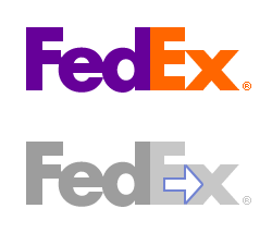
I’m sure that most of those of you that will care will already have noticed this, but for the few, like me, who hadn’t: the FedEx logo contains an arrow in the negative space created by the E and the x. Beautiful.
I guess that’s why I’ve always thought that FedEx was a progressive and forward-thinking company and didn’t know why.
Woah… I have been shipping and receiving stuff with Fedex for years and never noticed that… Very cool. Got any more?
Steven, it’s even better than that. I worked for FedEx for 5 years including a few years in the Middle East (Dubai). I was there when they were rolling out the new brand (including the logo you talk about). At the time they came up with an Arabic version of the logo that also managed to incorporate the arrow between the purple and orange sections of the logo. So, it’s obviously a key component of the visual branding.
I took a look at some of the Arab sub-sites of fedex.com and couldn’t find it. It may be the victim of translation problems. When I was there my boss, an Egyptian, said that the way the logo was written in Arabic it would be pronounced “FeedEx.”
[LINK]
Link formatted by moderator
Andrew: I had the same reaction – I was quite familiar with the logo and had never noticed it. As for other similar examples, I don’t know of anything quite like that, but I have always thought the ThinkPad logo was very cool. The red dot on the ‘i’ evokes the distincive red track-point pointing device in the ThinkPad keyboards. Anyone else?
The Hartford Whalers logo has an “H” in the negative space between the “W” and the tail. It took me forever to figure that one out.
I had never noticed the H/W in the Whalers logo either. Cool.
Credit for finding this one goes to my friend and co-worker, Daniel B.: The Big Ten college sports conference added and 11th team, but was widely known as “the Big Ten”. A clever logo design came to the rescue.
Awesome. Silver Orange should come up with a logo with some kind of hidden aspect..
I’ll never be able to look at the FedEx logo the same way again… but I have always been a big fan of the Whalers logo for that very reason.
ever notice the cock on forget magazine’s logo?
Windom, ever notice the same in the dickmen logo?
[LINK]
link formatted by moderator
Slightly more troubling is the hidden butter knife in the “e”.
I know someone that works at the company that came up with the logo. It is definitely intentional.
Have you noticed that the EMS trucks on the rear doors read “ELVIS”
In Argentina Fedex promotions says “if you want to export follow the arrow” so they do not hide they intentions in the logo. At least not in my country.
The french TGV (Train à Grande Vitesse) has its own logo. This train is supposed to roll at very high speed (about 300km/h). But, if you turn it logo upside down, it appears to be… a snail
yeah i did that once. i had a great time. I’ll EMS you kboutwell for being so stupid.
LOL!
Dave….I’m working here in Dubai and am presently doing my MBA as well. Funny thing is I’m doing a brand exercise on FedEx and came across the details of the arrow in the logo. Anyway, you can view the Arabic logo at http://www.fedex.com/ae_arabic/
The Arrow in this logo is so obvious it takes away some of the fun though!
WHO GIVES A CRAP ! ..What is this ? Dweeb central , small things amuse small minds I suppose. “sarcasm is cowardly” Really , well sometimes situations warrant a high dose Of sarcasm just like this . You are the people that worry the “every day NORMAL” members of the population. The people who go home and get a shot-gun and return to the take away bar and blow someones head of because “your burger was over done” .Oh by the way , something you’ll probably find Highly interesting , ” an ant can live for up to 1 week under water” .. GET A LIFE
Never noticed that before……It’s true, you don’t look at it the same again.
Tomorrow I’ll ask the the FedEx delivery guy if he knows about it.
Mr. Sarcasm, the fedex label has an arrow in it which seems to have missed the conscious perceptions of a whole lot of people and had the effect of altering their subliminal thought processes.
Surely this is thought provoking?
In regards to who is more likely to commit murder because their burger is over done, would it more likely be:
A; one who ponders and marvels at the wonders of the world around him/her?
or
B; One who is intolerant to the actions/ideas – no matter how harmless- of others?
I don’t know whose been pulling your chain, but an ant can’t live underwater for a week – or a day – or even a couple of minutes. (I discovered this tragic fact accidentally)
And here’s a point to consider. If sarcasm is the lowest form of wit does that mean it’s even lower that a half wit or is it a step above?
I’ve never been that good at fractions.
Have a nice day.
John Stilgoe descibed this “discovery” on a 60 Minutes segment that I watched on an American Airlines flight from Brazil to Miami in June 2004. (well the segment was only 20 mins or so). Stilgoe was a favorite professor of mine and I highly recommend his unusual books.
Maybe if you can read Arabic, the Arab Fed EX arrow is not obvious. And if an Arab who doesn’t know English read the English logo, it would be totally obvious. Ya know what I mean?
But I guess you can read Arabic huh?
~MR SARCASM~: While you may not find interest in this, it’s people is certain fields, such as marketing and design, that do. Now this might be a big concept for you to wrap your mind around, but it’s true! Imagine that, a field of work and interest not congruent to your own! It’s insane!
There is an interview with the creator of the FedEx logo, Lindon Leader, over at The Sneeze. Strangely, he also designed the Ryder logo, which I’ve never understood. Maybe I’m missing something?