Behold a visual history of Hard Drive icons in the parallel worlds of Windows and Mac. Notice how they get more and more realistic without becoming more meaningful. Personally I prefer the balance between abstraction and a tactile feel found in the Win9x/W2k and MacOS 9 versions.
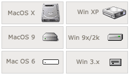
The old Mac (v6 and before, I think) icon is pretty impressive and to someone who hasn’t opened up their computer, just as meaningful as any of the other icons.
Photorealism is the dumbest idea of all. So that’s what a hard drive looks like.
UPDATE:
Here’s the equivalent chart of folder icons. Very similar parallels, problems, and progression to the hard drive icons.
Susan Kare(graphic designer) and Bill Adkinson(computer programmer) designed the Macintosh icons way back in 1984. The idea being that simplified images will result in immediate recognition and thus insure the ‘user friendly’ interface. These were simple images, but totally did the job. They were universal as well and translated in all languages excellently. I have to agree with you Steve, I hate the ‘photo realistic’ look. It somehow cheapens everything. I’m still trying to ‘accept’ OS X, but for now it’s just bells and whistles visually. I think the addage,’If it ain’t broke…” comes to mind.
And baby makes three. I have to agree with steve and sandy about the look of the new hard drive icon. but that’s not the worst thing about it. in previous mac os versions customizing the harddrive icon (or whatever icon) was such a simple matter. now there are more hoops and hence a less mac-like experience.
that said, i still stand by my spider-sense that the new os is a big step forward… even if it moves a little to the right.
What’s this?! The Maccies agree with Steven!?
Sandy, Suzan Kare is amazing. For those that aren’t familiar with her, check out her portfolio.
I thought the parallel development between the Mac and Windows was interesting too (yeah, yeah, I know, microsoft steals).
Yeah, that’s a bizarre process, Dave, but hopefully an update will make things like the way of old. I don’t like these literal icon images either, but I do think they’re otherwise gorgeous in OS X. There’s a sense of depth in OS X, which makes things feel more organic.
Cool little feature, Steve. Now where’s the hard drive icon for the Xerox PARC OS that “inpspired” the MacOS?
Dave: is there any OS X interest at the store?
“Inpspired” is a little-used term meaning “was stolen by”…
I’m gonna go for the posting hat trick here…
Steve, we all know you’re a Maccie wannabe…
Kirby, I’ll gladly admire the beauty of MacOS from the safety of Win2k.
If you’re craving more OS shots, check out the Graphical User Interface Gallery.
Those of you running OSX may find the NeXT screenshots of particular interest.
Let the flame war begin:
The Register: Windows XP hits where Apple’s Aqua misses?
As cool as the OS X interface looks – it seems to me its all eye candy. The dock has serious usability problems. That being said it looks beutiful.
WinXP, is jarring at first, and has a lot of eye candy as well, but for the ordinary user, has been greatly simplified – and i think in a very good way. The new start menu is great, i rarely have to even naviage through it anymore, my favourite programs actually bubble up, and it works well.
It might only be an incremental improvment on older versions, but josh darn it, every windows release learns from the last – and gets so much better. Something apple seems to have trouble doing (no multitasking till X, no memory management, etc)
All that said, i’d love to have an OS with built in pdf, and opengl rendering engines – but hey, what use are they really – beyond geek cool?
OS X has the ability to become a great OS – i just think it needs a couple of generations of development to get there.
I disagree with your folder argument, Steve. I mean, they’re all folders — where’s the confusion? The problem with the hard drive icon is that it doesn’t look like anything to many users.
Isaac, built-in PDF rendering has the potential to greatly simplify print production. OpenGL I don’t know shit about. It makes Quake pretty, I guess.
Isaac, the ‘dock’ on OS X is something I really have to get used to. I really hate it. (at this point) It’s funny. Mac tries so hard to be a ‘real computer’ all these years, than turns around with something as goofy looking as the OS X desktop. And yes, Steve, sometimes Maccies will agree with you….sometimes.
Kirby, you’re right, the folders are all obvious. Still, the parallel pattern of development and the increase in complexity without an increase in meaning is interesting (although, they are all quite pretty).
Found this egg in both Mac OS X server and Regular Mac OS X
On the login panel, press Control-Option-Del.
An alert panel will pop up with “This is not DOS”.
Fucking apple.
Actually I just tried it on a OS X regular and that didn’t work. But I confirmed that it worked on OS X server.
Apple still sucks
Hey Kirby….speaking of new looks…
at the shop i’m finding mostly blank stares when i bring up osX. second in line is the look of panic and fear from os 9 and waaaaaay earlier users. they don’t want or feel the need to change. finally there are the hardcore cats that were running the beta version all winter and are keen as hell. these aren’t people who run application for entertainment they mess with their computer for entertainment.
i think the cutesy stuff on the “front line” of the interface is there for the civilians. i mention pre-emptive multitasking, protected memory, unix core…nothing. i do the genii-effect , the magnifiey dock icons and it’s Aaaaaaaaah! i dunno.
i’m spending a lot of time thinking about the people whose job it is to work on/dream up interface stuff and thinkin’ what a cool /tough job that would be.
if anyone ask you what the NEXT interface should be what would you say….Steve G?
Good call dave, ask a critic for an alternative. Contructive criticism, eh? All right, I admit, I don’t know.
There are some nice (subtle) interface improvements I’ve seen in Windows 2000 (and extended in XP).
Also, check out the The Anti-Mac Interface by Don Gentner and Jakob Nielsen.
Well for me I believe that Mac has taken a drastic step toward making their operating system better. If only Microsoft would bo so bold as to accept that UNIX/Linux is and always will be the best operating system out there. Where Windows XP gives you a user friendly OS it fails to give you the power that you once had to change things and configure things to your own liking. OSX has moved us to the point where we can either give the OS the control or we can open up a shell and take full control of everything. XP cannot and will not do thing and Microsoft is taking steps with NGCSB to take control of everything.
I’ve found an extension of this idea on an otherwise nice GUI gallery page (although it lacks Mac OS 9 and X icons). A bigger chart of various GUI icons can also be found there.
im looking for that hard drive icon > maxos x < just the plain icon with nothing written on it if some1 knows where i could download it plz let me know or if you have it could u email me at highintheboat@hotmail.com as i been trying to find it but just can’t seem 2 find it anywhere on the net. i had it, at 1 time but my hd took a dump on me & i lost it & i thought it was kinda neat icon sry im running xp pro & i still like this icon lol on my desktop.
Steven, check out this incredibly detailed collection of interface evolution across various parts of many GUI operating systems. Incredible.