About two years ago, I wrote about how Wired Magazine was so heavy with advertising. I thought I would update the stats and compare the November 2000 issue with the current, October 2002 issue.
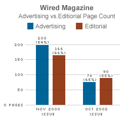
| Nov 2000 | Oct 2002 | |||
| Advertising: | 200 (54%) | 76 (45%) | ||
| Editorial: | 166 (46%) | 90 (55%) | ||
| Total Pages: | 366 | 166 |
The more interesting result of the comparison is not the ratio of ads to editorial content (which changed only slightly in favour of editorial in the 2002 issue), but rather the total number of pages. The October 2002 issue is less than half the size of the November 2000 issue.
At the time I thought I was making some clever observation about the commercial nature of the publication. However, while revisiting the stats, it occurred to me that the ratio of advertising to editorial content doesn’t really have any bearing on the quality of the content. You could have 20 pages of great editorial content bundled in with 500 pages of ads, and it would make the editorial content any less valuable (would it?).
“You could have 20 pages of great editorial content bundled in with 500 pages of ads, and it would make the editorial content any less valuable (would it?).”
I think one can put a premium on 20 pages of content with, say, two pages of ads v/s having to wade through 500 pages of ads to reap the same amount of content.
And besides, that 520 page monster would never fit on the back of my toliet.
Speaking of Edward Tufte, for my money the HTML table does a much better job comparing the two magazines than the bar graph. The table is entirely numerically-based, it’s much easier to compare the page count differences (especially in total pages), and it uses the least amount of ink (or pixels). What’s not to love?
i kinda like the ads in tech mags…they’re usually pretty snazzy and well done. plus, since i was about 4 or 5 yrs old, i’ve possessed the ability to turn pages (so i can read articles after the ads) 🙂
although at 4 or 5, i think all i was reading was dr seuss, which as far as i know didn’t have ads…
I might disagree with you on the HTML table issue Steve. My first impression when I saw the diagram was ‘whoa, the real thing to pay attention to is how many fewer pages there are!’ because of the obvious visual size difference. With the numbers it’s not quite as obvious. Besides, look how beautiful 3.5k can be.
Another thing to bear in mind is that issues from Nov/Dec will have a higher add count due to the xmas factor.
My favorite issue is the April 2000 with Mr. Joy’s review of the implications of nanotechnology, high computing power and biotech “Why the Future Does Not Need Us”. The juxtaposition of that article, the boom era ads and the impending bust is a great comparison to the current issues for both the volume and substance of content.
Steve – Great job on this. It all depends? According to Ogilvy (created the term “the brand”) Advertising guru, studies show people ignore improperly designed ads because they know they are ads. If the ads are “editorial” in style (look like an article) people will tend to read it.
He has case studies to prove this too. So most people will ignore the ads for the most part and read the true editorial material.
Wired did a great job of convincing so many to take out ads. The real thing is how many are just throwing away money on bad ads?
How about a graph on return advertisers vs. new?
Thanks
Cliff ;>