CNN/Netscape Synergies

I’ve long found CNN.com to be at least as funny as The Onion. The robots that control their homepage “top stories” have a knack for ironic juxtaposition, amusing corrections, and being just plain wacky.

All along, though, there was been an odd little blob of pixels floating in the top right-hand corner of the CNN.com homepage that has remained throughout their various design changes. The Netscape logo/wordmark lives up there, taking up what expect would be some of the most valuable “real-estate” on the web.

CNN.com composite image

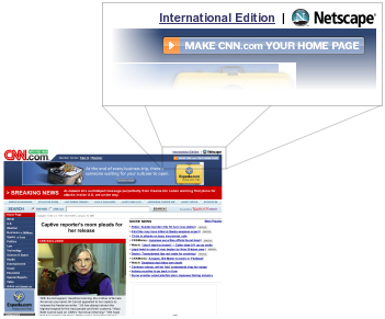
Netscape lives on as a “brand” at AOL, but seems to have been diluted from having been one of the most powerful company/product names in the history of technology to being a second-rate dial-up provider and 1999-style web-portal. Today, for example, the Netscape.com homepage includes such scintillating stories as “10 Things Credit Card Companies Don’t Tell You”, “The World’s Top Topless Beaches”, and my favourite, “Sexy Pix: 10 Best Rear Views”. Of course, the “news” on Netscape.com is supplied by CNN. It’s synergastic.

What misguided cross-pollinating-eyeball-stickyfication-content deal led to this prominent positioning of the Netscape logo on CNN.com? I can only imagine that some starry-eyed marketing folk signed a 28-year agreement back in 2001 and thought it was the deal of the century.


Announcing the Tango Project: Making Open-Source Software Beautiful

Example Tango Icon

Today at the Gnome Summit in Boston in the MIT Stata Centre, Jakub Steiner of Novell and I announced the Tango Project. We’ve been working on it for a few months now, just getting the basics figured out before we started bragging.

The Tango Project is a collaborative effort of a variety of free/open-source software designers and artists to work towards unifying the visual style of the free (mostly Linux) desktop.

To start, we have:

  1. Base Icon Library – Most of the work here has been done by Jakub Steiner. It’s a beautiful icon set that aims to be relatively at-home on Windows, Mac OS X, and define a strong base style for the Linux desktop.
  2. Style Guide – A work in progress, the Tango style guide works to create a color scheme and other key visual guidelines for creating Tango-style icons.
  3. Standard Icon Naming SpecificationRodney Dawes has done much of the work to get a common icon naming specification to make it possible to create an icon theme that can work on a variety of different platforms (Gnome, KDE, etc.). There are utilities to map the new Tango icons to the existing icon names on current Gnome and KDE systems.

It’s been fun to participate on the Tango project. I hope others join us and help make the free desktop (more) beautiful.


Fedora Logo Development Process

Fedora Logo process

Matt Munoz, a designer at Red Hat, has posted an interested walk-through of the development of a logo/visual-identity concept for Fedora Linux. It’s fascinating to see the process and justification behind a logo idea like this.

This isn’t an official logo yet. It has been proposed and is being discussed by the Fedora community. Everyone, including myself, will have an opinion (and criticism), but when you have great work like this done, you should say “Thanks” and go with it.

Here’s a quick preview of some of the process – you can also see the complete process.

Nice work Matt and the rest of the design team.


Using MediaWiki to Build a “normal” Website

Despite the misleading title, this is not a tutorial on how to use MediaWiki to build a website. Rather, it is an observation that MediaWiki can be used to build sites that look and feel like tradition (non-Wiki) websites.

What the heck is a “wiki”?

First, some background. A wiki is a special kind of website that anyone can edit. Pages on a wiki-powered website have an “edit” button, and anyone can make a change. MediaWiki is one of many software systems that can be used to power wiki sites. MediaWiki is most well known as the software behind the Wikipdia.

When I first started playing with MediaWiki to do some visual customization for the Mozilla wiki, I felt a little bit like I was wandering lost through a jungle of PHP, HTML, and CSS. However, after stripping out a lot of the features I didn’t want or need, I started to get the hang of visually customizing the MediaWiki interface.

I’ve since done some minor skin/theme design for our silverorange wiki, and the WikiPEI site, though I hope to improve both in the coming months.

What I’ve found most interesting about MediaWiki is that people are starting to use it to build “normal” non-wiki websites. Pages can be locked-down, so only certain users have editing privledges. This essentially merges the administration tools of the website into the front-end of the site. This merger has the advantage of making administration easier and more direct. However, it can also make the experience of browsing the site (as a non-editor) and bit less enjoyable (hence the attitude that “wikis are ugly and weird”).

While I’m not about to advocate MediaWiki as the ideal content management system for all websites, it is an interesting use of the technology. Some of the design folks in the Linux group at Novell have been pumping out some pretty slick looking websites based on MediaWiki. Here are some examples of their work:

Examples of MediaWiki-powered “Normal” Websites

Hula website screenshot
Hula Project
Hula is a free/open-source calendar/mail server. The Hula Project website was the first site I found that had a traditional stable website feel to it, but was built on MediaWiki. The header is bold and attractive, and the primary navigation is dead-simple.

Mono website screenshot
The Mono Project
Recently redesigned, the Mono site has a light, fun, cartoon-y feel to it. If it weren’t for the “edit” links sprinkled throuout, you’d never know it was a wiki.

Bealge website screenshot
Beagle Project
Beagle is a desktop search tool for Linux. The Beagle website follows the model of the Hula site, with a bold header, and simple navigation.

Are there other good examples of sites powered by MediaWiki (or other wikis) that look and feel like beautiful websites, rather that weird plain old wikis?


Thoughts on Tabs and Windows

Tab screenshot

If you had asked me, before Firefox came along, if tabs were a good idea for a web-browser, I would have said no, absolutely not. The old Mozilla Browser had them, and Opera had them. Both were clunky and intrusive.

The real reason I would have thought it was a bad idea, though, is that tabs introduce a whole new metaphor to desktop document management. We already have windows – adding tabs inside windows just messes everything up. You can’t use existing operating system window management techniques to switch between tabs, such as Alt+Tab or the window-list taskbar. Why should some documents be in tabs and in a window, while others are each in their own window. It would be anarchy!

Yes, all of the above criticisms of tabs are true, but it doesn’t matter. Regardless of broken and mixed metaphors, after about two years of using Firefox (and the betas that led up to it), I use tabbed-browsing extensively.

Having used them for a while now, I have some thoughts one why tabs do work well for web browsing:

  • You don’t have to use tabs. You can use the browser without even knowing that tabbed-browsing is possible. Just go about your pre-tab browsing business and you’ll not be bothered. No one is forced to learn a new metaphor.
  • Tabs Work well maximized. A lot of my friends and family, especially those with relatively low screen resolutions (800×600 or 1024×768), always run all windows maximized. When running only maximized windows, tabs work almost exactly like new windows.
  • Windowing applications and documents is not always a great system. This article about the file-system browser in Gnome quotes a 1995 study by Microsoft that concluded that “[a]ll but the most advanced users did not understand how to manage overlapping windows efficiently.”
  • Tabs allow grouping of pages, like multiple workspaces in Linux/Unix systems. You can have a set of weblogs open in one window, and a set of work-related pages open in another. This isn’t a killer feature, but I’ve noticed myself doing this.
  • Tabs don’t need to be “managed”. Windows often need to be resized, moved, and rearranged in order to make the best use of their contents and of the rest of your desktop. This isn’t so with tabs. You can’t do any of those things to tabs. I suspect this is one of the reasons people often run all windows maximized – this also eliminates the need to ever move or resize windows.

One of the big disadvantages of tabs compared to windows is that you can never see the contents of two tabs simultaneously. With windows, you can arrange two windows side-by-side, or only partially overlapping. While this is useful in some cases (visual comparing two documents, typing in one windows while using another for reference, etc.), it is not often needed when browsing the web. You just don’t often need to see two web pages side-by-side, and in the few cases where you do, you still can (using windows).

It’s a good thing I wasn’t in charge of the user interface design for Firefox, because I was completely wrong. This is a good reminder that you cannot rely solely on your own intuition when designing software that people interact with.


Windows 95, a study in good design?

Windows 95 Start Menu

We don’t often think of Windows 95 as a shining example of user interface design and usability. It was slow on the hardware of the day, it crashed often, and many of its claimed “innovations” were copied from Apple and others.

All of that said, Windows 95 was a big leap for visual user-interfaces at the time. Even if it didn’t break new ground in design, it was significant if only because it brought many of the visual user-interface design innovations of the previous decade to a massive audience.

I was a huge geek/dork, still in high-school, at the time of Microsoft’s development Windows 95. I was one of thousands who paid $49.95 to order a special preview of Windows 95, which was still code-named “Chicago” at the time. Yes, that’s right, I paid for a beta. I can still remember, it came on 37 floppy disks (seriously).

Both Microsoft and their Windows product-line are often considered lumbering behemoths, often with justification. It is surprising to learn that the design process at Microsoft that led to such interface staples as the Start Menu and the window-list task-bar grew out of a small team (approximately twelve people, with another twelve programmers for implementing designs).

The Windows 95 user interface design team used an iterative design process where they would come up with an idea, build a quick/rough implementation, and try it out on users. Then, based on how people fared using the design, they would try again. Rinse, lather, repeat.

This process proved that basic design intuition is often wrong:

“Our first design idea for making window management easier was not very ambitious, but we weren’t sure how much work was needed to solve the problem. The first design was to change the look of minimized windows from icons to “plates”. (See Figure 6.) We hoped that the problem would be solved by giving minimized windows a distinctive look and by making them larger. We were wrong!”

All of this comes from a case study on the interface design of Windows 95. The phrase “We were wrong!” shows up several times in the document. The case study is a fascinating look into what went on, for better or for worse, to be one of the most widespread user interfaces in the history of computing.

Thanks to David Feldman for his article on file browsing in Linux that pointed out this Microsoft case study.


Roadster: Mapping on Linux

I spent last week in New England visiting some clients, friends, and geeks. The geeks part was at the Linux World Expo and Fedora Users & Developers Conference. I’ve posted some photos from the trip.

The Linux World Expo was comprised mostly of creepy salesmen at booths with microphones giving out penguin toys made by children in Malaysia (I presume). It was definitely aimed at corporate middle-management types. There was much talk of “deploying comprehensive integrated solutions on a L.A.M.P. stack. All about the stacks. It was worth visiting for a few hours if only to witness the sheer spectacle of it all.

I then visited the Fedora Users & Developers Conference (cleverly named FUDcon) at Photonics Center at Boston University. There were some interesting talks and some more interesting people. The contrast from FUDcon to the Linux World Expo was quite striking (salesmen talking loudly into cellphones vs. geeks, doing stuff). Video of the FUDcon talks will be posted on the FUDcon website soon.

Screenshot of Roadster
Screenshot of Roadster mapping Boston. See the full-size version.

The trip was also an opportunity to meet up with Ian McIntosh, who I had met at the fall Boston Gnome Summit. He is working on a project that I am very excited about. Roadster is a street mapping application for Gnome/Linux much like Microsoft’s Streets & Trips.

Ian is just getting going on the project, but it is already quite promising and has some key potential contributors interested. Carl Worth, maintainer of Cairo, the graphics package that Roadster uses to render map, was quite enthusiastic about the project and eager to help improve the rendering speeds (it’s pretty slow right now). Eric Raymond, who maintains the GPSD package for GPS tracking devices on Linux was also interested. My own friend and co-worker, Nathan Fredrickson is also helping out.

It was fascinating to see a young project spark enthusiasm and participation from people like that. Several people told me that Microsoft Streets & Trips was the only reason they still keep a Windows partition on their laptops and would love and alternative.

Roadster is still a young project, but there is a Roadster website, a development wiki, and a roadster-devel mailing list if you are interested in helping out.


Consistency in Save Confirmation Dialogs in Gnome

For slice of readership to whom this type of thing is relevant, I have compiled an overview of of the inconsistencies in file-save confirmation dialogs in Gnome. There is also a page with screenshots of the dialogs in question. I’ve posted the overview to the Gnome desktop development mailing list for discussion.

If you don’t know or care about (or any combination therein) what I’m talking about, I thank you for your patience.


Cleaning Your Bedroom and Improving the World

When I was growing up, my bedroom was always a mess. Every week or two, my parents would get me to clean my room. I wasn’t interested in cleaning my room, but I had to get it to at least pass a quick visual inspection my mom or dad.

To make sure I passed the informal inspection with minimal amount of work necessary, I would stand at the door of my room, where my parents would stand, and look in. I would scan the room and make note of the first thing I noticed that was out of place – pants on the floor, the unmade bed, or whatever was the most visually obviously out of place. Once this was taken care of, I would go back to the door, have another look, and pick the next thing I noticed. I would repeat this simple process until things were looking good enough.

This process has stayed with me ever since and often proves to be useful way to decide what to work on first. Over the past year, I’ve tried to apply this bedroom cleaning prioritization technique to help improve, in a small way, the open source desktop computing experience.

Last fall, I looked at my desktop computing environment and took note of the first thing that didn’t feel right. At the time, it was the ugly old Firefox icon (then called Phoenix). That helped, in small part, get the process started that culminated in the redesign of the visual redesign of all things Firefox and Thunderbird.

More recently, now having a beautiful web browser, I returned to my bedroom cleaning technique and took another look at the desktop and see what bothered me next. This time, it wasn’t visual. Rather, it was the sounds used in the Gaim instant messager application that were the most prominent rough edge.

I set out a few months ago to improve these sounds. Like with the Firefox visual work, I didn’t have all of the skill needed to do the work myself, so I looked to others for help. This time it was Brad Turcotte, a musician (aka Brad Sucks), that came to my aid. He and I bounced sounds that he created back and forth for a while until we had something that sounded right.

These new sounds have now been accepted by the Gaim developers and will be included in a future release.

Now, I’ll have to head back to my bedroom door and take a look around to see what rough edge I notice next.


Emblems in Gnome

This might seem obvious to anyone who uses the Gnome desktop environment for Linux, but since most of you don’t, I thought it worth pointing out. In Gnome, You can put “emblems” on files or folders. The emblems are small icons that help differentiate and identify particular items. They work something like an graphical/icon version of Mac OS “labels” or GMail “labels”.

The small screenshot below shows (full-size screenshot) a few of the default emblems, and a few of my own custom emblems (the Windows and Acts of Volition icons).

Gnome Emblems screenshot

There is a handy set of default emblems to start off (eg. Urgent, Web, Documents, New, Personal, Photos, etc.) and you can easily add your own custom emblems.