AI features keep popping up in all of the digital products I use. Figma, Photoshop, Notion, Zoom. These products tend to prompt acceptance of vague privacy terms that may or may not feed your private/company data into the AI slurry.
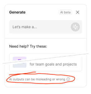
Figma added some AI generation tools into their FigJam product under a “Beta” caveat. I’m both impressed at how candid they are and troubled at how they are comfortable shipping a feature that requires such a warning:
“AI outputs can be misleading or wrong”
— FigJam product, which uses AI…
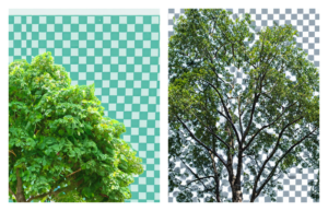
Also, if you ask the Photoshop’s AI-powered “Generative Fill” feature to draw something “with a transparent background”, it renders a messy checker-board background that is sometimes used to illustrate transparency.
Lots of power, lots of potential, lots of problems.
If you saw me laughing while walking home from one of my kids’ schools this week, it was because a podcast host said that the two subjects of his story:
“They go together like Jack & Meg White, or Ant-Man & The Wasp”.
This first episode is a great recap of their career — appropriately over-simplified, but nicely presented as a coherent story (which it really isn’t). I’m optimistic about the rest of the season, but this opening episode is worth listening to regardless.
Today, I acknowledge the punny genius of a vintage metronome/rhythm device for recording studios I learned of via a YouTube video. It was called the Russian Dragon. When you’re off-tempo in music, you’re either “rushing”, or you’re “dragging”. Get it?
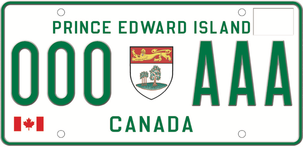
For my formative years growing up on Prince Edward Island, our vehicle license plates looked like this:
Prince Edward Island license plate from the golden age of PEI plate design: 1981 – 1992 (image from Wikipedia, CC BY-SA 4.0)
As we tend to do with things from our formative years, I consider this the golden age of license plate design for Prince Edward Island. With a family that would travel to the United States by car, we would often have people ask about the plate. They could clearly read the large lettering, and as many weren’t familiar with PEI, the inclusion of “CANADA” was helpful. The design was informative and an effective, uh, vehicle, for promoting our province.
I suspect cost and complexity kept the design as simple as it was, but whoever designed this did a great job within the boundaries (Let me know if you know who it was).
1993-1997: The Clip-Art Years
In 1993, things took a dark turn on the back of PEI cars.
The 1993 redesign did keep the large “PRINCE EDWARD ISLAND” lettering, but lost the helpful “CANADA” qualifier. It also included the addition of a low-quality illustration of Anne of Green Gables and Green Gables House.
I have no objection to the reference to Anne of Green Gables. When I tell people I’m from PEI, the Anne character is often their first or only reference point. It’s also a pretty good book. I object to the illustration, which is somehow too detailed for the scale, and not detailed enough, and gives of a 1,001 Clip Art CD-ROM vibe.
I heard first hand many years ago from one of the graphic designers who worked on the project. They were asked to provide a quick mock-up and were surprised to see their incomplete draft (it’s missing windows/bushes) ended up on the final product.
1997-2022: The Photoshop Years
In 1997, the PEI license plate was redesigned again. This time, it included the wild addition of gradients. There were variations featuring the historic Province House in Charlottetown and the remarkable Confederation Bridge.
The 1997-2022 era included several redesigns and variations on PEI plates. Again here, I have no issue with the topics. The Confederation Bridge is an incredible engineering feat and I still marvel at it 25 years after it was built. Highlighting the early adoption of wind power on PEI is also great (despite setbacks, PEI has done well with wind power generation).
All three major design variations are just too complicated for an object that is usually seen covered in dirt, moving at high speeds, and at a distance. Simplify, man!
The redesign revealed in 2022 is finally a worthy successor to the 1981 classic. This design is simple, readable at a distance, and includes the key information in the largest font size possible. The “Canada” qualifier has returned with an improvement: the simple and recognizable Canadian flag.
The coat-of-arms of PEI, with its imperialistic lion, and three small and one large oak trees is featured as it was in the 1981 design, but this time with much more detail. This is a case where the added detail helps. While you won’t discern the details of the crest at a distance, it simplifies into a recognizable shape. This is a textbook case of Edward Tufte‘s principle: To simplify, add detail.
The announcement doesn’t credit the designers. To whoever designed this and whoever had the authority to commission and approve it: Thanks, it looks great.
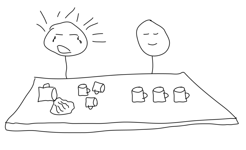
To oversimplify in order to make a point, there are two types of people: crumblers and rocks.
Imagine a coffee shop with a lineup growing faster than orders can be served. Some of the customers are getting frustrated as it’s take a long time to get their coffee fix.
Behind the counter serving coffee are these two types of people:
Crumblers are the people (like me), who crumble under the cumulative pressure of the needs of others. We feel the weight of the impatience (perceived or real) of every person waiting. Rather than working more quickly, the pressure gets us flustered. We make mistakes and end up helping even fewer people.
Rocks are the people who let the needs flow over them. They make coffee as quickly as they can, but they don’t take it personally that there are too many people in line. They keep working calmly, knowing that this is the best way to help as many people as possible.