 Much has been said of Apple’s use of the brushed-metal application/window theme (and their inconsistent use of it). However, they’ve really outdone themselves now. The new application, oddly named GarageBand (putting two words together to make a new word – it has so been done), has a faux woodgrain (as if you could have any other kind of woodgrain on a computer screen).
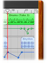
Woodgrain!?
You beat me to it… this is crazy and stupid. However, the application looks absolutely fantastic (I have already ordered it) and I will just ignore this crazy, crazy interface mistake.
Is this what became of eMagic?
How soon before GarageBand integrates with the iTunes Music Store so users can self publish their latest creation and completely bypass the music labels?
GarageBand isn’t even a new made-up word.
I think they stole the woodgrain idea from Cuban Council
woodgrain does look a little ass, but i’m so stoked this app is ready. i’ve ordered my copy already, and can’t wait to start recording and mixing my own music.
Don’t you guys get it? The woodgrain is supposed to emulate the look of a professional mixing desk. If you’ve ever seen a professional recording studio (I’ve only seen a few myself) they normally go in for the varnished woodgrain look for the cabinets that hold the consoles and such-and-such. Pine is popular. Sure, if you’re a uniformity Nazi I can see how it might annoy you, since it doesn’t fit in at all with the whole brushed metal thing. But personally, I think it was a pretty inspired decision on the designer’s part.
this is crazy and stupid
Why? Cause you don’t like it? What makes it stupid?
Jason–first of all, I think you can obviously take commentary on this with a grain of salt–my primary complaint is that I feel for a company that continuously publishes interface guidelines, they are the least uniform in their application/OS design.
Within Aqua there are several kinds of buttons, none of which are used for the same purpose application to application. The same goes for brushed metal–which used to be used only in digital hub applications but is now also used for the finder and several other applications. And now, apparently, Apple will come up with a completely new visual style whenever they see fit. Even if that style is the sore thumb in a suite of 5 applications, 4 of which have the same look.
Don’t get me wrong… I’m not opposed to innovation and/or new design. I am a bit opposed, however, to completely uncontrolled interface design… especially when it’s being done by the company setting the rules for others.
Don’t get me wrong… I’m not opposed to innovation and/or new design. I am a bit opposed, however, to completely uncontrolled interface design… especially when it’s being done by the company setting the rules for others.
Fair enough, but I really don’t see concern. The woodgrain style, while not my cup of tea, isn’t in the way, nor does it appear to interfere with the interface in any way. There’s no new behavior associated with it either. It’s just there on the distant edges to help a metaphor along. Again, I’m not a fan, and I don’t think metaphors like this are all that helpful, but it’s more a question of style than function. And that’s where I think people are getting bent out of shape for nothing. Apple isn’t introducing some brand new UI element (like a button or a selector or whatever) that we have to learn, it’s just a little eyecandy thrown in for good measure.
Personally i think its fine…
I don’t know much about it, but in terms of it being the “sore thumb”….is there any way I can adopt the woodgrain for all of my apps? It kicks ass over the brushed metal.
I’d say the oddest thing about the woodgrain in GarageBand is that it has nothing at all to do with the interface of a real recording studio. I could understand it better if it were an application that let you complete simple home carpentary tasks, but in my mind wood and recording studio aren’t one in the same.
That said, most interfaces have nothing to do with the applications actual purpose, it just seems strange to make such a specific choice when it is almost entirely irrelevant.
not to be asinine, but this really won’t be a new user interface paradigm. this is apple trying to be cute. hasn’t anyone seen an old mixing console before?
The thing(s) that bugs me is/are
1.Minimize button evokes windowshade mode
2.Close window button shuts down the application
Thats my 2 cents on the interface. However the app is AWESOME and I have embarrassed myself with sharing “songs” with my friends even though they are lame!