I’ve never been big on design competitions. Especially when the prize consists of your work being used without financial compensation. If you want good design, find a good designer and pay her.
That said, the Monson Snowboard Design Contest caught my attention because of the caliber of some of last years winners (I voted for Snow Burner and Relax 163) and because of the ultra-hip-hot-pants sponsors (k10k, surfstation, three.oh, designiskinky, etc.).
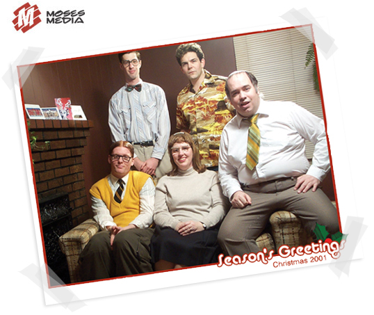
This year, the list of sponsors is longer and cooler, including Australian INFront and recent aov-linkers Coudal Partners. I thought about entering, but didn’t get around to it. Then yesterday, my good friend Ffoeg (the one in the yellow sweater-vest on Moses Media’s sweet xmas splash page) stopped by with his designs and encouraged me to whip up something quick. I did.
The trouble with a contest like this is, since the finalists are chosen by public vote, it’s more battle of who can design the best little-JPGS-shaped-like-a-snowboard rather than who can design the best actual snowboard. It’s hard to imagine these things five feet long. Still a fun excercise though.
Voting starts next month, but you shouldn’t vote for my designs, you should vote for Ffoeg’s drac or RoBo or one of these other beauties.
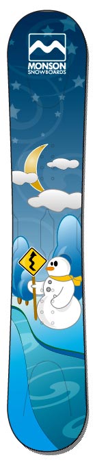
Some of my favourites include snowypeaks, flame, Giraffes Think, Paisley and pure novelty, see hotdog and slotcar.
Most clever entry: //STYLESHEET//. Best use of type (I tried to do something like this, failed, and gave up): racefortheprize. Generally cool: king of m.
Best entries so far, in my opinion:
Van Gogh Summer and winter. I can’t get enough of that Super-Mario-World-meets-Windows-XP soft gradient illustration style.
My humble entries are slice and blues.
hey steve.. nice Designs but first off.. Dont make fun of us.. I know you are jealous. i know you wish you had a yellow sweater like FFOEG does.. Merry Christmas Every one. and happy new year!!!!
yeah. i just saw the superfriendz.
I wonder if you would be willing to talk a bit about your design approach. I’ve been a designer for around four years, and I’ve been snowboarding for 16. While I have seen a lot of impressive graphics and illustrations (from last year’s contest at least), it doesn’t look to me like most of the entrants did a whole hell of a lot of designing with ‘snowboard specific’ challenges to solve or with the clients’ (read: purchaser) tastes in mind. It looks like most have approached this as just an art contest.
Simple things, like huge logos on the nose, generally considered ‘passe’ and went the way of the dodo years ago. Also, snowboards have bindings — in my mind, the most impressive graphics are ones that pay attention to what will later be obstructing these graphics visually. I guess There is just a lot to what comprises good graphics on a showroom floor or as a screen mock-up, and then there is what comprises pleasing graphics once the board is in use (being looked at from a different angles, edges generally being covered in snow, bindings attached, stomp devices, etc.)
Just some thoughts — none of this is meant to be accusitory in any way I might add.
fab, you make some good points (that’s kinda what I meant in the third paragraph of the post).
For example, I had originally planned on a design that would involved a large body of type – then it occurred to me that only enormous type would be at all legible in a tiny JPG (even though it would look fine on an actually board, which is printed at 150dpi).
I think your point applies to more than just snowboard design. Keeping in mind the end user and taking into account all of the variables (bindings and snow for snowboard design – and things like washed out LCD screens and old browsers for web design). It’s designs that really work in their environment that are truly great.
I tried to keep an actual board in mind in my two entries (slice and blues) but to be honest I was really just putting in an entry for the hell of it.
the winners are in – not the ones I would have picked, but the overall winner is a nice one
i want to be a snowboarder im gonna get a snow board in the winter
booo yeah man yo
I was thinking of a board with a skull and a black back ground and a line of fire under his jaw…………with a couple of blood drops shit man I even picture of it man sounds crazy (yes no)
so what do you say guys good idea?….
im a good drawer to and im only 15 man yo im a bad man yo.
its gonna be a blast people!!!
iv neva herd of snowboarding
what is it?
i am from africa
i am stupid
please reply
it is like riding on a wild elefants nose
Hello! I’m looking for an eMail contact and any genealogy, if you have any. Please write back!
Russell Monson
This is my second try.
Hello! I’m looking for an eMail contact and any genealogy, if you have any. Please write back!
Are you related to Thomas S?
Russell Monson