We don’t often think of Windows 95 as a shining example of user interface design and usability. It was slow on the hardware of the day, it crashed often, and many of its claimed “innovations” were copied from Apple and others.
All of that said, Windows 95 was a big leap for visual user-interfaces at the time. Even if it didn’t break new ground in design, it was significant if only because it brought many of the visual user-interface design innovations of the previous decade to a massive audience.
I was a huge geek/dork, still in high-school, at the time of Microsoft’s development Windows 95. I was one of thousands who paid $49.95 to order a special preview of Windows 95, which was still code-named “Chicago” at the time. Yes, that’s right, I paid for a beta. I can still remember, it came on 37 floppy disks (seriously).
Both Microsoft and their Windows product-line are often considered lumbering behemoths, often with justification. It is surprising to learn that the design process at Microsoft that led to such interface staples as the Start Menu and the window-list task-bar grew out of a small team (approximately twelve people, with another twelve programmers for implementing designs).
The Windows 95 user interface design team used an iterative design process where they would come up with an idea, build a quick/rough implementation, and try it out on users. Then, based on how people fared using the design, they would try again. Rinse, lather, repeat.
This process proved that basic design intuition is often wrong:
“Our first design idea for making window management easier was not very ambitious, but we weren’t sure how much work was needed to solve the problem. The first design was to change the look of minimized windows from icons to “plates”. (See Figure 6.) We hoped that the problem would be solved by giving minimized windows a distinctive look and by making them larger. We were wrong!”
All of this comes from a case study on the interface design of Windows 95. The phrase “We were wrong!” shows up several times in the document. The case study is a fascinating look into what went on, for better or for worse, to be one of the most widespread user interfaces in the history of computing.
Thanks to David Feldman for his article on file browsing in Linux that pointed out this Microsoft case study.
I always did like Windows 95. It was simple enough to use, and was just an operating system, before Windows 98 + MSIE started the long slide into the integrated everything concept.
Granted, OS/2 Warp had a few good ideas, like the floating pallet, but it definitely could have used a heavy dose of the kind of humility that Win95 design document shows.
On the other hand, and I hate to make everything about apple, but they seem to have a philosophy of not letting computer programmers do the design, but instead rely on the intuition of people with more artistic backgrounds. That’s why iPhoto uses a metaphor of rolls of film, instead of files and folders, which is the language of programmers and how they would naturally think of a bunch of image files.
Oh my God. The word is led. Led. LED!!!! The past tense of the world “lead” is “led.” Led led led led led. OK?
I think the reason this mental virus is spreading so quickly is that otherwise non-droolers see it on websites by supposedly non-brain-damaged writers and therefore assume it’s correct (like “loose” instead of “lose”). So forgive me trying to stamp it out quickly where outbreak threatens.
Unless it was just a typo, in which case sorry for the histrionics.
The Editor: I’ve fixed that mistake. Thanks. Now, I am running away from you…
For future reference, spelling/grammar/factual corrections are always welcome from readers. Email is the best venue for it, so we don’t bore other readers – that is, unless you’re trying to stamp out a mental virus.
Holy Grammar-Nazi, Batman…
I thought Windows 95 was good, but my biggest complaint about the Windows OS as a whole is non-continuous progress bars.
Apple can design a progress bar that goes from %1 to %100, and gives an accurate remaining time, whereas Windows is just all over the place.
That’s right, I am complaining about progress bars. How pathetic is that?
“Oh my God. The word is led. Led. LED!!!! The past tense of the world “lead” is “led.” Led led led led led. OK?”
Oh dearest Editor,
Do you mean the word “lead” or the world “lead”? The latter has a nice ring to it…world domination now!
geof
See Ryan, it’s not pathetic. Apple goes ahead and thinks about “small” issues like that and we all wonder why Apple has such a great GUI. It’s very important to think about things like that.
Steve, I noticed you did the website for Clearlooks. Good show.
Interesting. Some of the early versions of the Windows 95 UI remind me of quite a few Linux Window Managers I’ve seen…
Oh, I do agree with Ryan about progress bars though. They were bad in 95, and with XP, sometimes they actually count backwards!
BeOS had some nice progress bars. One thing I really miss about using it is how nice it was to start a download, and then hide the window and watch a progress bar drawn _on_the_file_icon_itself fill up. BeOS was really sort of like MacOS for the intel platform and I’m rather sad to see it die. Even YellowTab is just working with 5.0 Pro, and it still looks like it’s 6 years old.
Now there’s the crucial difference.
I recentely realised how, despite all its usablility enhancements, Windows is still a terribly technical operating system. It’s virtually as complex as large applications like Photoshop.
I was interested to see that context-menus are especially hard for users. Granted, they could be anywhere, but the user has to hunt them down. I do that by nature, because I’m curious. I suppose most users do not. Suddenly, Bryce having a little left-clickable triangle wherever there’s a context-menu makes a lot more sense.
But it seems that Longhorn strays a bit from the windows-95 concept. Windows XP is naturally just a refined version of 95: it’s what the makers of 95 really wanted it to be, I think. We’ll see how that works out.
I’ve often thought of Windows 95 as “the operating system we had to have” (paraphrasing Australian PM Paul Keating, famous for the phrase “this is the recession we had to have”).
As you say Steven, Win95 was slow, buggy and unstable. But it brought DOS/Windows integration (ok, to a point), 32-bit applications, DirectX, plug-n-play support… it was a huge accomplishment. Windows 95 also paved the way for NT 4.0, Windows 2000 and, eventually, Windows XP.
You have to hand it to the MS marketing team though: in so many ways to so many people Win95 was a horrible product, yet they queued at midnight to get it; and they did it again for Windows 98!
Interestingly, August 24th marks the 10-year anniversary of Windows 95’s release.
I get the distinct feeling that with Windows XP, the 95 idea has finally matured into something (reasonably) usable, stable and generally good.
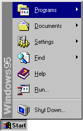
Maybe I’m just a bit odd, but I actually prefer the Win95 interface to WinXP. While it may not be as ‘refined’ in some ways (whatever that means), it is also far simplier – Microsoft isn’t throwing quite as much in your face with it. Take, for example, the Start Menu.
One exception: The Taskbar. Grouping windows by application makes a lot of sense. The Taskbar is still inherently a poor design in my opinion as it doesn’t scale very well as you open more and more stuff up, but the XP version is superior – as long as you get rid of all the little optional doodads Microsoft keeps tacking onto it.
I’ve found task grouping an incredible annoyance which slows down work considerably.)
I locate my open tasks by position, not by name. It takes TWO clicks plus a search for the right window to get me back, instead of one sure click.
How should the taskbar scale when you open more stuff? Scroll arrows are not an option, because you can’t see part of your open tasks, and making it bigger isn’t an option either, because it will eat into screen estate.
Granted, making the buttons smaller breaks the ability to locate by position when the amount of tasks gets very large (older tasks move to the left because everything gets smaller), but it seems the only way to keep things in sight while retaining one-click-access to tasks with minimal reading of button labels.
I’ve always been against any sort of hiding of active elements, like:
– The most-used menu system (‘click to show all menu items’): it’s too easy to completely forget the hidden items.
– tray rollup: XP doesn’t have the authority to decide what constitutes an ‘active’ icon, and often gets it wrong, plus same argument as menu-foldup
– task grouping: for reasons mentioned
I liked an windows design before, but now I think that Linux KDE’s design is more powerfull. There I can control everything, not like in windows. I think that was a main problem of Microsoft – they were needed to give to usersw ability to control everything from desctop till hard drive.
Actually, I’ve recently come into posession of a Mac, and it’s far less customisable than Windows or KDE.
But because everything works properly, I don’t mind. 🙂