The free version of Apple’s QuickTime Player software has, as far as I can remember, always presented a window when started up asking if you’d like to buy the full QuickTime Pro software. Putting aside, for now, the worth of this window, I have always been bothered by the implementation of this window.
Rather than using actual Mac OS X buttons, the buttons are faked bitmap images of buttons. As a result, when the underlying operating system changes the visual style of the buttons, which it has twice since the original Mac OS X release, the buttons to not reflect the change.
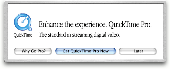
So, here in OS X version 10.3 (with 10.4 soon on the horizon), this old QuickTime window still has buttons that look like OS X 10.0.
For shame.
This panel should only appear once per session–e.g., you should only see it again after you restart your machine. None the less, it is an eye-sore and has been for quite some time.
QuickTime in general, though, has been a bit of an eye-sore for a while. The metal hasn’t matched OS X for a long time.
10.4 (Tiger) might put an end to both of these issues, however, because QT has been visually overhauled. One can only hope they’ve fixed this stupid panel.
Dear lord, Aqua has inconsistency issues? NEVER! There is reason I still use Mac OS X theme that originally was called “Apple is Lazy”. So many little widgets that have lighting at different angles and various types of gloss. Even the default traffic light buttons have a lack of polish to them. I love Aqua… I don’t intend to “theme” it to anything else, I just wish Apple would spend more time on the graphic elements. I will avoid a serious breakdown of these issues because, as Garrett points out, things are a changin’ in Tiger.
Plus they’re still using Apple Garamond….which they’ve phased out in favor (I believe) of Myriad. I also think they still have Adobe Garamond on some of the store elements……and as well the coloured buttons that date back to the colour iMac days. tsk tsk
I’m very anxious to see the final release of 10.4 to see if these inconsistencies throughout the entire OS are tidied up a bit. The majority of users probably don’t notice these issues, but to any of us that have a bit of an eye for detail, these things stand out somewhat.
As for QT, I hardly open it at all anymore. VLC is a very worthy replacement for most video formats in my opinion. The only time QT pops open on my Powerbook is if I happen to venture to the Apple movie trailer site to check out what’s coming up for movie releases.
having played with one of the 10.4 pre-releases a bit, i can confirm that the Quicktime Player has been significantly rewritten.
i may turn out to be an idiot for saying this, but i believe it is now cocoa based (my basis for this: ‘Get Info…’ reveals that it has cocoa style plug-ins, as the 10.3 Calculator.app. also it is possible to drag the windows around whilst the app itself is busy). also the quicktime player’s windows are now .nib based so they have consistent brushed metal appearance and behaviour.
(as an aside, is there any sure-fire easy way to tell if an app is carbon or cocoa based anymore?)
yes, many of the inconsistencies in Aqua are tidied up (even in these non-final builds). for example dragging icons from the dock to the desktop gives you the ‘poof’ cursor (as per dragging icons from the 10.3 Finder window sidebar). (see http://daringfireball.net/2004/11/poof_consistency )
as for replacing QT with VLC, well, you’re mostly only replacing the QT Player interface, every time you play an mp3 in itunes, edit a video in final cut, etc. you are using QT itself.
ok so you probably know this, but it frustrates me when people are not specific when complaining 😉
I guess I should have been a little more specific in saying that I enjoy the VLC interface much more than QT. As far as QT’s underlying functionality, it is definitely a great program as far as I’m concerned.
The Quicktime Plug looks like that on Windows too.
I’m going with Nick here. I think the purpose of not using OS buttons was so that they could support the same look and feel for the box on Windows as well as Mac. God knows that using the Windows standard buttons on the box would certainly take away from the aesthetics of the product.
Slightly off topic but you can get rid of the QT box by setting your clock forwards a few years, opening QT, closing QT and setting the clock back. Can’t remember where I saw that tip but it works.